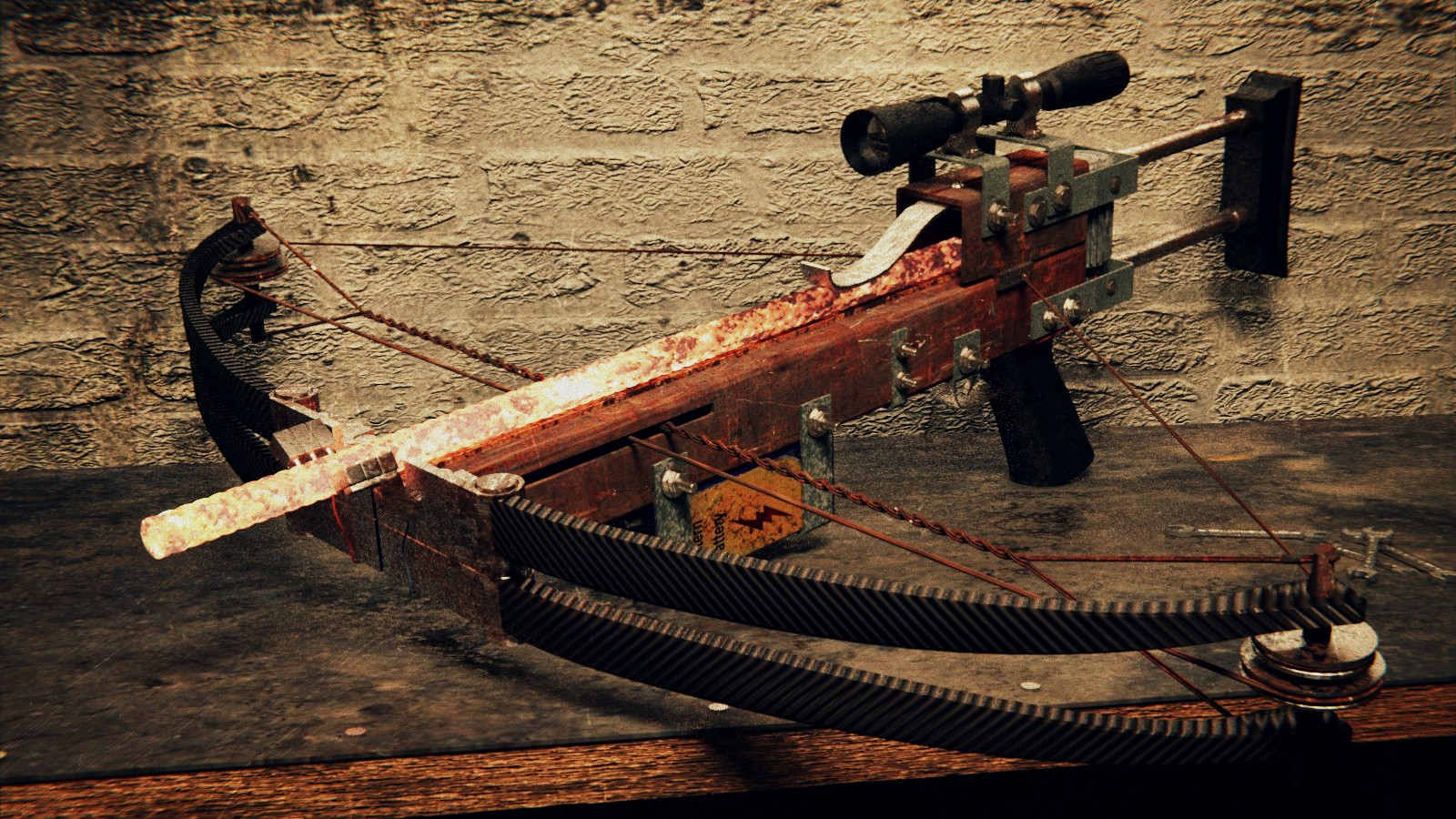
Hi guys, I started this little project yesterday and I hope you will help me with this, because it’s quite hard to find some good resources (maybe I wasn’t searching hard enough).Some resources:http://images3.wikia.nocookie.net/__cb58379/half-life/en/images/0/01/Crossbow_2.pnghttp://images3.wikia.nocookie.net/__cb20091005151917/half-life/en/images/d/d8/Crossbow_concept_art_1.jpgWIPs:


I did some modeling today and next I want to make electric parts, but I’m not sure what is that blue cylindric part supposed to be… Does someone of you know if it is an electromagnet, some kind of a reel or something else?
Attachments

looks very nice and clean, i don’t know too… maybe this is some weight setting? yo
Could be a winding spool for the cords, winds up to load, then releases to fire.
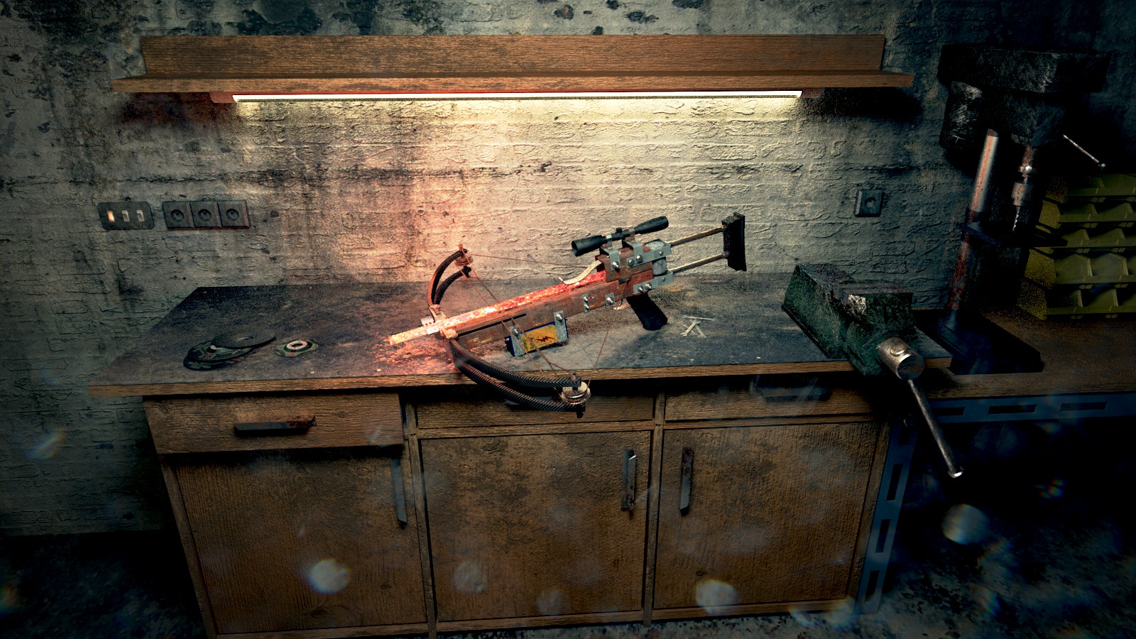
Today I finished texturing and started modeling the scene. Need to make some more tools and stuff and maybe improve post-pro, I"m not too happy with this. Your C&C are more than welcome.

Attachments

great model. looks really nice
I have to admit, I’ve never played the games, but the weapons I’ve seen always look cool. You’ve done a good job on the modeling and texturing! As far as how to present it in a scene, I will try to help as best I can.
First, I don’t know if it’s bump mapping or displacement (I assume bump) that’s applied to many of the surfaces, but it is a bit high. Whether you like the very rough look of high bump mapping or not, it is still distracting the eye from the main subject of the scene, the weapon. You may want to lower the levels a bit, and see if it improves the shot overall.
Next, the light that is illuminating the weapon feels flat. This is because we are using a long, fat tube to light it, and the gun is directly underneath it. If this were a product beauty shot, this could be fine, but we want this gun to look fierce!
If you really want to keep your main light the shop light, try putting a grid on it to force the light coming out of it to be more directional. Do a google search if you’re not sure what it looks like. They are very easy to model and give you great control over what the light hits, while still remaining softish.
Next, try bringing the weapon out toward the camera a bit. You may have to move the table with it, or make the table bigger or the gun smaller, but whatever you do, try to make that shop light a little more of a back light; even if it is only half a foot further from the gun. The rod that the weapon fires is glowing hot, right? Right now, there is so much light on the gun it is not so easy to tell. Pulling some of that shop light away will allow the rod’s light to illuminate more of the weapon around it. Try lowering it’s intensity, too, to see if you like that more. You may want to push the glowing rod’s light color a little more into the red, to differentiate the light sources a bit.
Lastly, just for fun, you could try putting in a very cool light source, perhaps a blue tone to mimic some very late evening light coming into the room, or perhaps even moonlight. The cool light will contrast well with the warmer lights and make the image more dynamic.
I hope these suggestions may help you. Remember, shadows help to define form, and lighting is just as much about what you can’t see as what you can.
Thank you James, it’s very helpful.
You’re welcome! Here’s an example I knew I had seen before; coincidentally it’s of another weapon from Half Life! http://www.blendernation.com/2012/03/02/half-life-2-gravity-gun/
Basically you can see the use of cool and warm lights to add contrast and shape, and allowing the glow from the internal parts of the gun to creep out and illuminate some of the surfaces as well. I hope this illustrates what my words may have not!
Changed color scheme, remodeled the main lamp, improved rod lightning - I had to fake it with another light source, and added dirty lens effect. The red light is causing some ugly sharp greenish shadows on the left, hope it will be better when the scene will be complete. It’s still quite noisy even with 2000 passes, final will need some more… Overall I like it so far, but if you see something what’s hurting your eyes, please let me know.
Yeah that area on the bottom right… it is too blue? - have a smoother gradient of colors
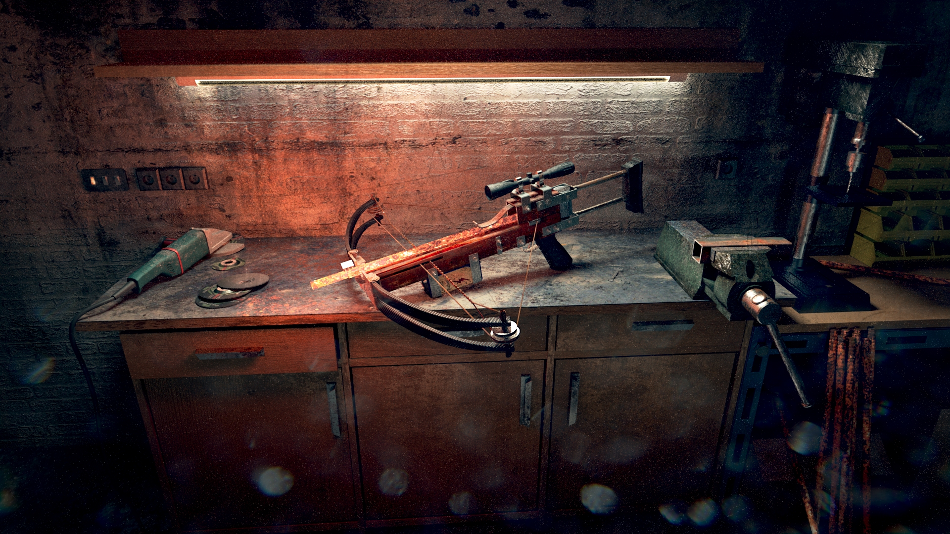
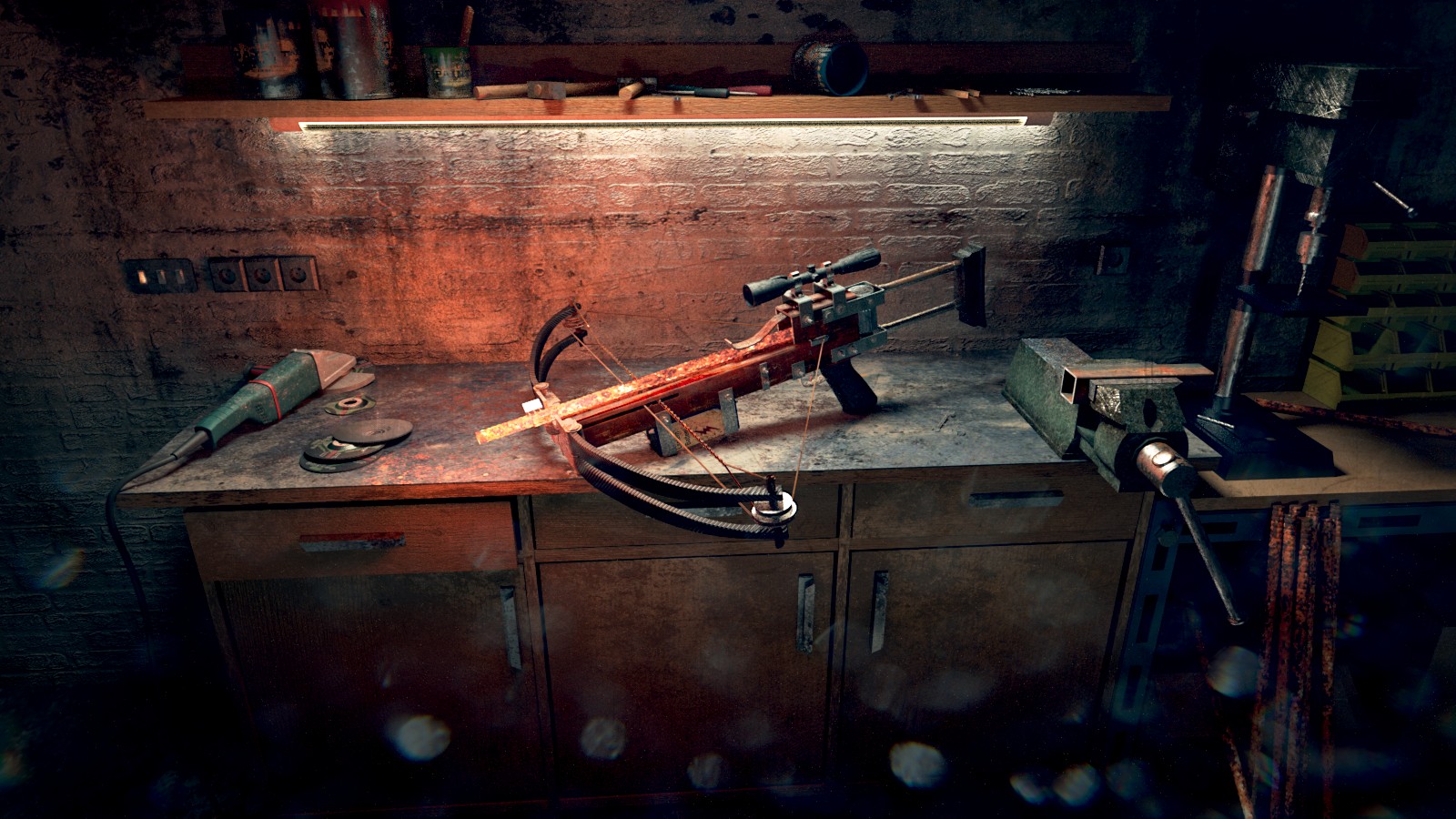
I think this is definately a marked improvement, AdamL! I like all of the other details you’ve added to the scene as well, it brings it more to life.
Have you rendered anymore close up shots? I was thinking the other day, this is a good environmental shot for it, but it’s also a shame to put all that work into the subject and only have it occupying ~10% of the frame! If you have the time for it, you should render another close up shot with the new environment! That way you’ll have both a near and far view for your portfolio.
Thank you James, again  It was hell to make the lights working. I also made a studio shot and I was thinking about to make some simple outdoor scene, something similar to the gravity gun render you posted, but wasn’t sure if it’s worth the effort… Maybe I’ll give it a try.