Struggling to get the exact, or at least something close, dusty, warm grey I want for the foreground of shot one of my little animation I was wondering why is it that 3D software such as Blender and other image editing software use RGB numbers and impossible little sliders that have colours grey out, lighten or darken to white or black. Why not a colour wheel such as artists have used at least since the Renaissance? Maybe someone needs to do a good tutorial on how to use digital colour - tertiaries are the issue - because it’s really frustrating when you know that were I painting or airbrushing this scene it would take me no more than a minute to mix the exact colour I want.
Or you can use resources to find the Hex value of the color you want, and then type that in to the input.
@craig blender has a copy and paste feature 
Okay traditional colour wheels(R,Y,B) were way after the renaissance after Newton published his paper on optics it based on his colour wheel but drops one colour. Renaissance colour theory is completely bonkers. As to why traditional colour wheels are not used in digital software is 1. the are seriously outdated 2. you are in an additive colour model RGB.
This,http://www.huevaluechroma.com/ ,is a seriously heavy read and full of theory but bar none the best colour theory website I have found on the net. I will admit I only understood it after reading James Gunary’s easier Color and Light book.
If you want to understand what is going on in most digital packages google RGB color model, HSL and HSV etc. But hue value chroma is really best resource out there and handprint.com is also in that league. Every important reads for digital painters etc.
For fun and useful color designing.
I was wondering why is it that 3D software such as Blender and other image editing software use RGB numbers and impossible little sliders that have colours grey out, lighten or darken to white or black.
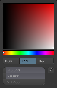
Actually Blender uses the wheel plus one slider unless you have it set in the preferences to use something else. If you think that a two dimensional arrangement (wheel only) can control a three dimensional array (RGB) you should rethink your understanding of color theory before going further… One reason that beginners need to understand some kind of 2D CG before attempting 3D CG IMEPO. (EP=egotistic and pompous)
Saturation/Value square + hue, and additionally HSV sliders for-the-win.
About traditional methods:
The Saturation/Value square + hue is actually the most traditional method.
First appeared in the classic greek period, introduced by Polygnotus.
He used a few basic colors only. Yellow ochre, red oxide, black and white.
It is the first approach in the history of art on how to paint shadows (depth) and colors simultaneously.
You start by using ochre (yellow) on to top right and mix it with black. After this, you start adding white on every of these steps.
You have a color grid, the yellow ochre table.
Then, adding a little oxide red on pure yellow ochre, and start constructing the second yellow/orange table.
It goes this way.
It is exactly the same Saturation/Value square table.
From a certain perspective it goes this way.
On a chromatic circle of the basic colors (red, yellow, blue) (pigments)
red+yellow = orange, the opposite of blue. Mixing orange+blue=dark black/grey something. Adding white you produce grey tones.
This is only theoretical because there are only a few pigments that will serve this approach (not the best pigments though)
Alternatively, mixing any pigment/color with grey is the equivalent of mixing the theoretical opposite color (on the chromatic circle)
Now, we managed a practical approach, supposed that introduced by Polygnotus.
Funny when I read that using black pigment is against a chromatic (impressionistic approach)
This is totally wrong (as explained above)
We read:
“black is the king of all colors” (Renoir)
“black is not a color? What about the 30 blacks of Velasquez?” (from the letters of Van Gogh)
I’ve been looking into this because I’m planning on writing a tutorial that deals with colour theory for drawing. And I’m currently digesting a 270+ pages thick book on the history of colour theory, and I can only tell you that what Tyrant Monkey and Michalis speak of is only the tip of the iceberg.
More satisfyingly, the reason Blender goes for red green and blue is because those are the three colours used for the mixing of light and the three colours used by your screen to display all it’s colours. They are nowhere near the primaries that are genuinely capable of mixing all visible colours, but it’s what your computer thinks in, which is why you should learn to deal with it if you’re creating art on the computer. Try finding the HSV or HSL colour selector, it’s a tad bit more intuitive than rgb, but nothing more of a reframing of it.
Some programs also allow you to work in the alien Lab, which is very close to full human perception, and HCY which is still a reframing of rgb, and rather intuitive, but also a little more close to perception than rgb and hsv.
You could also try to make and image in the uv editor, and paint an ryb colour wheel there to find your colour.
I generally suck at picking colours, but i love the hcy color picker in mypaint. Itd be awesome to see it in Blender.
On a side note, its a real bummer most screens cant display yellow.
I commend you for your good taste in liking the HCY colourpicker, have you seen that in the preferences you can choose from RGB, RYB and the psychological RYGB primaries? (But seriously though, if I could I would put that colour selector in every program that has selectable colours, it’s so intuitive I feel like it goes straight to my brain)
Most screens can’t display yellow, but at the same time, most screens are working within a gamut of the visible spectrum anyhow. I’ve heard multiple photographers tell me that colour correcting to them is not about how it actually looked like when they took the picture, but rather about how they felt it looked like. It’s a healthy way of thinking to prevent perfectionistic numbness.
Wow, that’s a lot of info! Thanks to all. I did see long ago a tutorial made by a graphic arts professional on the difference between traditional colour selection and mixing as against the CG variant but unfortunately think I chucked the magazine CD it was on, from memory it was all quiet fascinating. Anyways… managed to more or less work out something for my textures even if I then found the ground is so big the texture crashed Krita a few times LOL Going to break it up into bits and texture them separately and next time I’ll do a lot more faking than working at full scale. The things we learn when actually going about making an animated short…
I studied quite a lot of color theories stuff. Now that has become an obsession. Previously I can’t even name a color on the color wheel. Now I can go to any color and get very close by just looking. It takes time to get there, but worth it.
But there is one problem that I face often, but not only my problem. It is easy to differentiate hue (color of color) and value (how bright it is), but it is hard to say “that blue has 60% or 80% saturation.” So in Blender, I use the HV+S color picker.
I love to have HCY, since it is not in blender (yet), HV+S will still do well.
And for dull color selection, HV+S is the best (lower saturation slider, pick hue then up/down the square for value). As SV+H, hue is very sensitive because it has very small, very sensitive slider. A little clicking error, often by tiny dragging of the mouse before release will mean big hue difference.