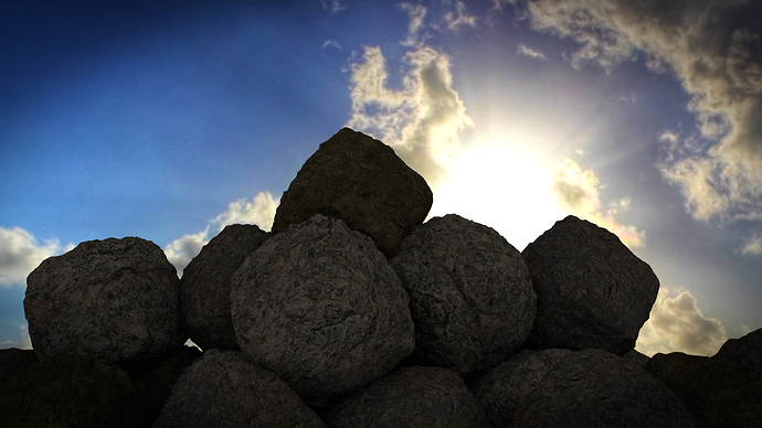
This is a pile of rocks I made by myself, NO Nature Academy. Please tell me what you think and critique.
That’s looking pretty good for not following the Nature Academy (really good, actually.) However it would look better with Nature Academy. Just some styles you should consider: 1. change the lighting scheme. It’s looking dark and the textures are not being brought out. 2. Give the rocks some more varied overall shape, they’re pretty much all balls right now. Well, roundish. 3. Make your scene more flat. When I look at that picture the first thing that comes to mind is a bunch of rocks sliding and tumbling down the side of a hill, probably with me among them…=0 Part of that illusion is given by the clouds in the background, if this was to be a physically accurate render, you wouldn’t be looking at the clouds that way. The photo was taken looking almost straight up, implying that this precarious pile of round boulders is sideways. Kind of gives me the impression of: “YIKES!!! LANDSLIDE!!!” =) Well, sort of. Also it looks like you haven’t gone beyond the vignette for compositing, I would add sun flare, bloom (a.k.a. background bleed) etc. to get a much more final result.
If you’re new to the Focused Critique forum I hope that wasn’t too nit-picky. =)
Pretty good. I feel the rocks have too rough of a surface though. When you look at a rock there isn’t so many indentations. I guess there is in igneous rocks but the indentations are more rounded into circles.
nice, but i think their general shape is too uniform.
Concurr’d. They look a bit like meatballs. Some variation could go a long way to improving this image.
Ah yes, meatballs, I couldn’t quite put my finger on what this reminded me of.
