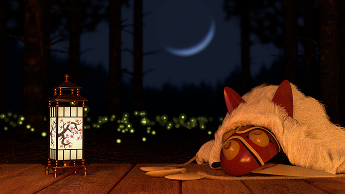
So I’m kind of in two minds about whether to post this here or in WIP, but since I’m drawing a line under it for now, I thought I’d post it here.
I also didn’t want to post it in critiques, because I think I know the major things that’s wrong with it, which is:
-
the lighting - there’s a flame image that was working as a key light which was kind of dim and grainy, so I added some fill lighting, but overdid it making the subject flat and horrible. Also, there should be blue-ish moonlight catching the edges of the fur.
-
the material on the mask - pretty egregious since the mask is the centrepiece of the image, but it needs a bit more… grubbiness to make it more realistic. I also thought about adding some chips to make it a bit more worn-looking.
-
the depth of field. Honestly, I don’t really know how to improve that, but it’s clear that the fireflies aren’t working with the DoF Bokeh. Actually, on that topic, suggestions would be welcome.
But yes, those are the major flaws with this image that I’m aware of. Perhaps some time down the line I’ll get around to fixing them, but since this was supposed to be a quick project, I’m going to lay it down and move on to something else.
But if you have any extra comments or criticisms about the composition, I’d love to hear them. 

