Should we use 'personal message bubbles' on Blender Artists?

There’s a new theme option available that displays personal messages in ‘bubbles’, to help distinguish them from public topics. I’ve been confused about this often enough to feel this might be a useful addition. See the example below (the colors will be customized).

Shall I add this?

  • Yes
  • No
0 voters

1 Like

I would very much welcome this with my scatterbrain. :slightly_smiling_face::+1:

2 Likes

I hesitate what to vote (but I kind of like it).

Would it be optional (a checkbox in the User > Preferences > Interface) or applied on the forum wide, as default for everyone?

As the theme component currently stands, default for everyone.

1 Like

Is there a Discourse beta forum where this new theme could be tested (with the dark theme) ?

Absolutely! I just hope that there’s a dark theme for it, and it looks decent! :slight_smile:

2 Likes

Afaik, there’s not.

I’ll look in to that :+1:

1 Like

I have been playing with the Stylus addon (available or Firefox, Chrome & Opera).
…It’s an addon to change the CSS stylesheet of websites, temporary or not.

I just made this Stylus script for fun, it needs more work, some divs are rounded whereas they shouldn’t be (for example: the Header).

Here is how the forum could look (with these “message bubbles”):

Here is the css code (just paste it in Stylus):

Summary
.contents, .avoid-tab {
    border: 1px solid #535353;
    border-radius: 0 25px 25px 25px; 
    padding: 10px; 
    margin-left: 20px;
    box-shadow: 5px 5px 5px rgba(0, 0, 0, 0.5);
    background: #2b2b2b;
}


.topic-body {
    border-top: 0;
    padding: 12px 0 0 0;
}


.topic-avatar {
    border-top: 0;
    padding-top: 15px;
}

.topic-status-info {
    border-top: 1px solid #313131;
    margin-top: 10px;
}
1 Like

I’m also a dark mode advocate. In case the personal message bubbles don’t have a dark mode, I can recommend the Dark Reader addon / extension for Firefox, Chrome, etc… It does a fine job customizing all kinds of sites to a faux dark mode in real-time.

1 Like

So it looks like borders around text and nested borders for quotes are making a comeback?

hopes Discourse R&D suddenly rediscovers the square avatar

1 Like

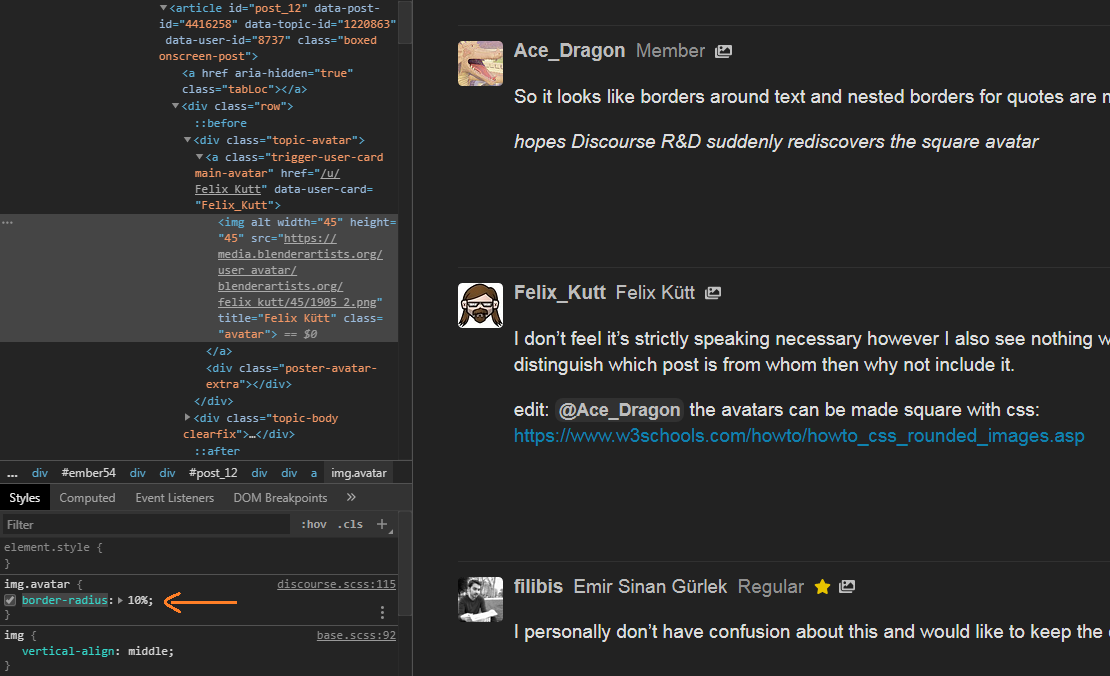
I don’t feel it’s strictly speaking necessary however I also see nothing wrong with it, if it can help some users, especially new users distinguish which post is from whom then why not include it.

edit: @Ace_Dragon the avatars can be made square with css:

Image Example

I personally don’t have confusion about this and would like to keep the current design if possible.

If this can be toggled on and off, then why not have it?

The theme component currently has no option to toggle this.

Oh. Well, I still say we add it.

3 Likes

I think it adds alot to the readability! I like it!

1 Like

I like how it looks like, visually speaking. It would make the forum more “fun” to read.
I just hope that these bubbles won’t increase the height of each comment too much.

Note that this change will only be for personal messages, but for public topics.

Oh, then, this is much less interesting. :slightly_frowning_face:
I should have read more carefully that it isn’t aimed at public topics.