Hi,
I am looking to model an animation of the board game Go, in a fairly realistic setting. The render still feels cartoon-ish. Any simple tricks to improve it (using Blender Internal)?
Thanks!
Hi,
I am looking to model an animation of the board game Go, in a fairly realistic setting. The render still feels cartoon-ish. Any simple tricks to improve it (using Blender Internal)?
Thanks!
High quality textures. Raytracing or High Shadow buffers. The most import, I guess would be the shaders, and the mappings (bump, reflect, etc).
I think tidying up your materials will help you here, but sizes looks off as well.
It looks like you’re trying to use tatami flooring, but it looks completely flat. Even from that far away, you should be able to clearly see the weave of the straw. Also, you can always see the line between two mats. They never align perfectly.
The wood grain of a go board is also important. The one in your render looks like a flat color. Take a look at the overall colour variation in the last picture on this page.
The zubon (the little cushion) needs a real texture.
The dimensions also feel off. Tatami mats are 3 shaku by 6 shaku (about 90 cm by 180 cm), but a typical go board is only 1.4 shaku by 1.5 shaku. In your version, the go board looks as wide as the tatami mat. The bowl for the stones also looks too big considering it’s on the floor.
Also, when there are sliding doors opening to the exterior, there is usually still a floor outside bordering the garden; it shouldn’t immediately drop to the ground.
Good luck with the stones! I always have trouble getting the shape right. 
Hi,
I am having a great deal of trouble trying to get the tatami to look weaved.

That’s what I’m trying to reproduce (using textures). The closest I’ve come is the attached image. It’s using a brick plugin to get a series of thin lines (to represent the weave). I can’t seem to do the following:
a. Make the pattern weave.
b. Change the colours of each weave (within a random range variation).
c. Change the normal to give the weave the appearance of height.
Any ideas on how to go about making tatami weave?
Thanks!
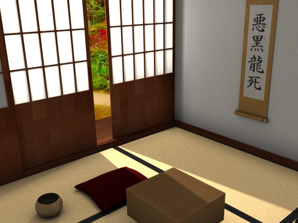
And thanks for all your suggestions to this point. I’m finding the result to look a lot more realistic.
Nice
the back wall seems really bare, how about orniments (sword stand or flower arrangement) or some kanj on the walls
like this http://www.markhemmings.com/MarkWebsite/design/images/Japanese_Room.jpg
theres loads of examples on google images
Is this for animation or using BGE?
Hi, denshidan.
The walls have picture hangings – they just can’t really be seen from the camera angle, which is focused on the tatami. I like the idea of a scroll and a sword – representations of knowledge and power, both of which embody the game. Those should be relatively easy to add into the scene.
The tatami mat weave, on the other hand, has me stumped.
Any other ideas on how to produce a realistic weave?
This is an animation that uses physics from the BGE, using the following tutorial:
Your improvements are looking good so far. ![]()
I think it would be easiest to use image-based textures (diffuse, normal, and specular) instead of procedural textures in this case. Then again procedural textures have never been a forte of mine.
I’ve tried using image-based textures. They turn out horrible – although that’s probably due to my inability to create a good looking normal map. It’s quite a challenge!
Not only does a tatami mat weave, but the weaves are different colours and different heights. Most of the solutions I’ve tried end up with an obnoxious zebra-stripe pattern. (Well, obnoxious for a tatami, not so obnoxious for a zebra.)
Any other tips or tricks?
nice room =) .did you try radiosity .it will be more realistic and can be used for the cardboard game too .
Try the new light-cuts from graphicall.com.
Edit: It’s not the newest version. There is newer but I don’t know where to find it.
Hi,
Thanks to the area lighting suggestion, the shoji illuminates like a good shoji should (http://en.wikipedia.org/wiki/Image:PICT0148c.jpg).
@GE-FORCE: I haven’t tried with radiosity.
@bigbad: Nor have I dared to use the new light-cuts.
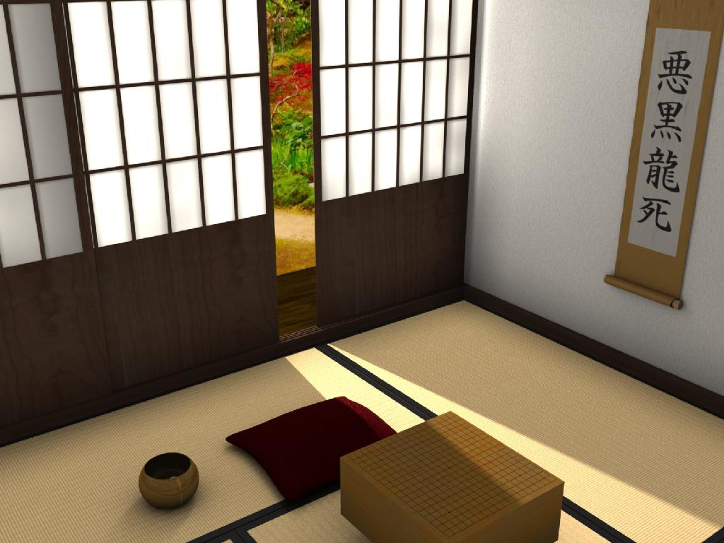
While better lighting will certainly help the scene, the big problem is the tatami mat. I’ve attached the lastest render.
Does anyone have any other ideas to reproduce a realistic looking woven tatami?
And is it possible to texture a dupli-group or linked object to be different from the original object? (You can see the doors in the attached render have the same texture pattern …) I tried the “Object” button and using an Empty, but the texture would not change on the other doors. (It’s a minor quibble at this point, as I can always just duplicate the door normally.)
Fixed the weave using a plugin. It’s not perfect, but it should be enough to fool the eye.
Comments?
You should add some depth between the windows tiles and the frame. It will make this look alot better. Also the background (outside) color scheme do not fit in this picture, its exciting bright colors vs. nice base tones.
Other than the background, I like your choice of colors.
I actually think the backgound colors themselves are almost okay. In the fall, it’s not horribly uncommon to see brightly coloured leaves in a garden contrasting the bland palette of a traditional house. However, they do look overly saturated. Also if there’s colors that bright outside a shoji, the colour will shine through ever so slightly.
[edit]Any particular reason for the characters on the wall scroll? They just seem sort of random to me.
Hi,
@Farthioner: Good call on the shoji being too thin; thicker is better.
@Koryo: I think the outside colours are okay, too. Getting the splashes of colour to shine through the shoji makes the render far too time consuming to be practical in an animation.
The words on the scroll, as I understand them, are meant to poke fun at a part of Go: white stones pestering an eyeless group of black stones around the board.
I think it’s time to buy a quad-core. The single frame took 14 minutes to render and the animation has 48,750 frames. (Of course, the animation will be rendered at a lower resolution, but still …)
Thanks for all the comments – they helped a great deal.
Hmm, i just can’t stop thinking about how the background could be a zen garden of sorts. The idea of the setting being calm and about thought just seems to fit with the idea of a board-game. It would also mean that the lighting would fit as you could quite easily model it (displacement maybe?), perhaps a simple white terraced wall around the edge of the garden too, although it would be barely visible. It would definitely add some more depth to the scene along with the fell that it isn’t only the room that exists (possibly the reason for the so called cartoonish feel).
I was going to comment on the names in this topic.
At first Shusaku and Gennan Inseki seemed weird to me. I just realized the reason for this is that the romanized names just look weird.


