Hello Blenderartist community, this is my latest scene.
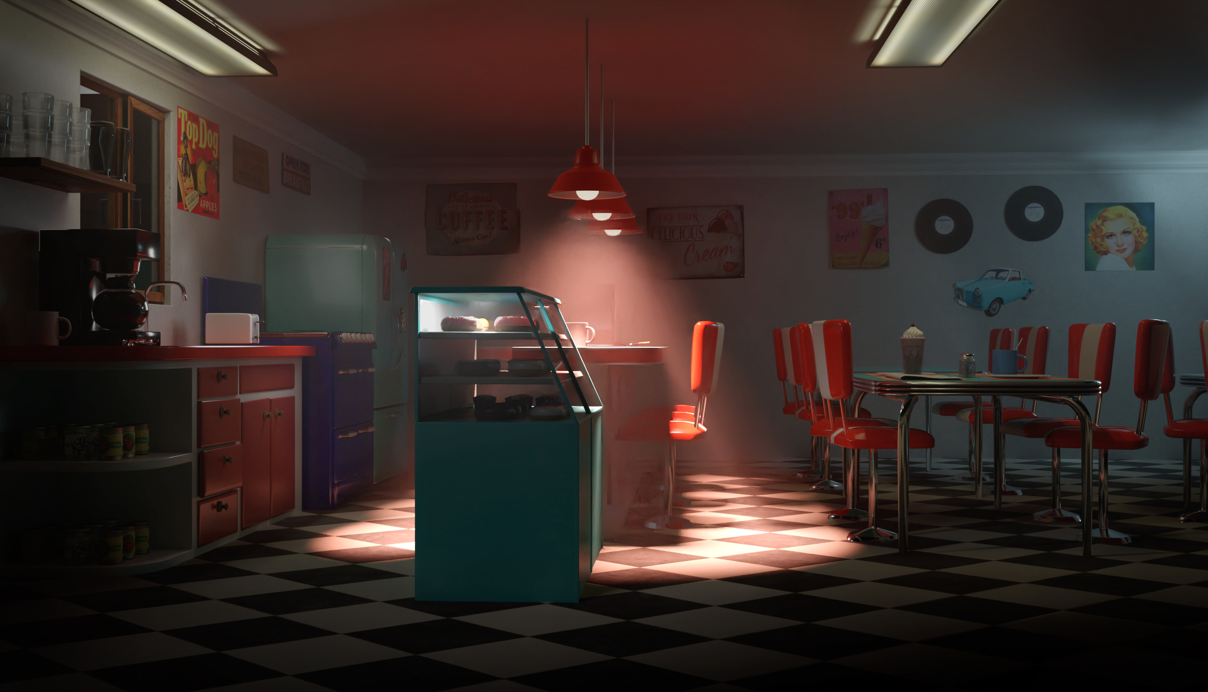
My goal was to make a small 50s diner.
I envisioned this to be a house turned into a diner and business at times can be slow. Then later decided to try to add volumetrics which is new for me, and go for more of a moody night scene.
Still learning and getting the hang of final renders. Thanks for looking and feedback is always nice. Thank you.
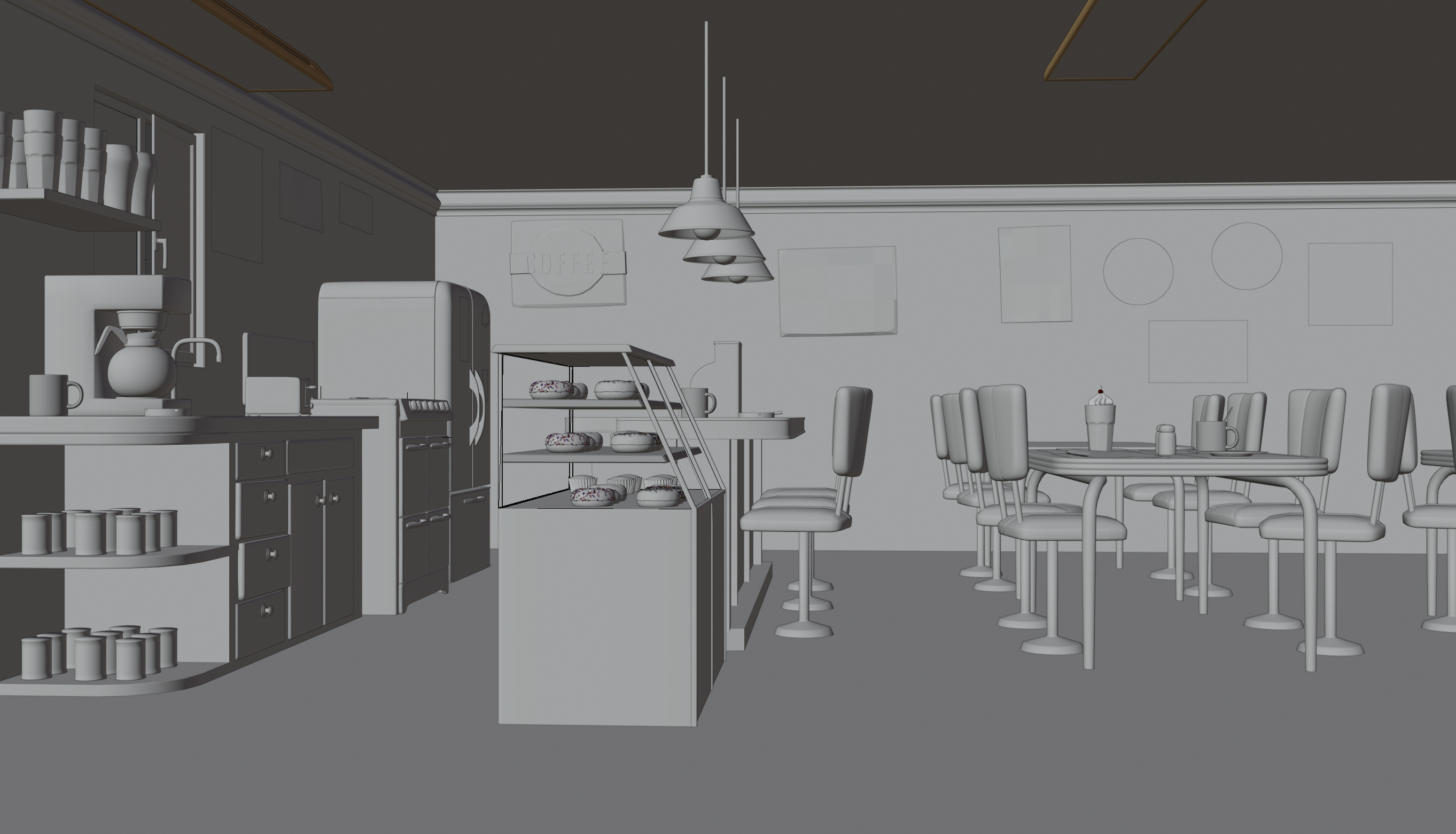
Getting there, something about the floor is not right. the objects don’t look like they are sitting on the floor correctly. Also consider adding a baseboard, where the floor meets the wall. Like you have done on the ceiling.
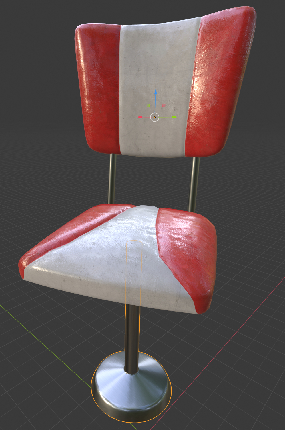
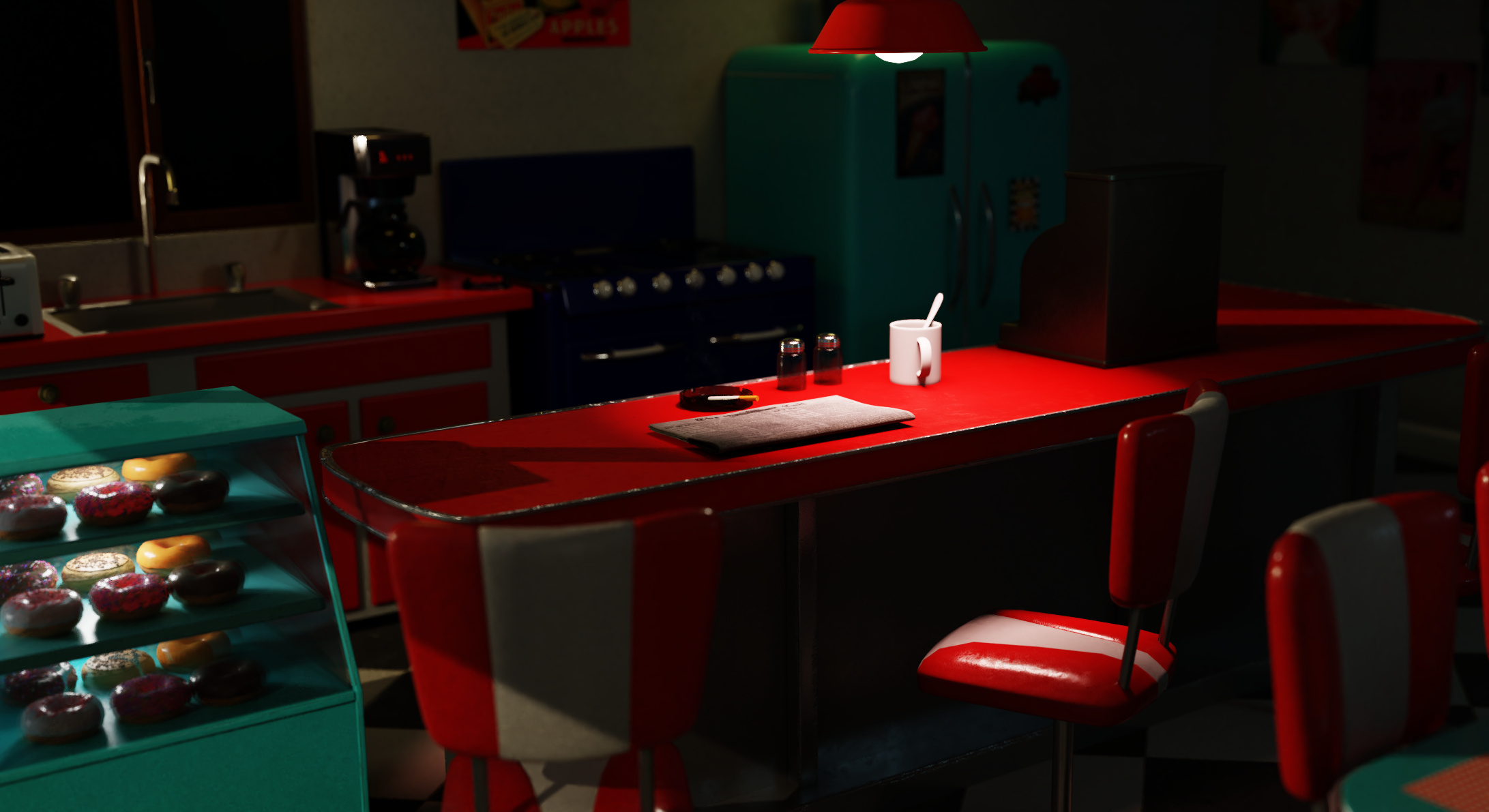
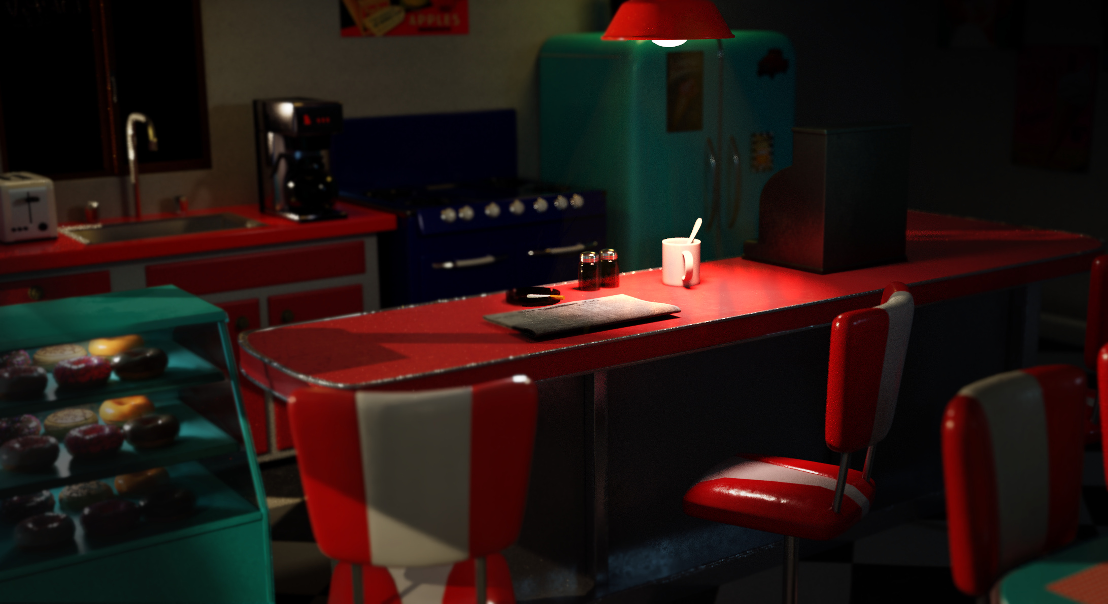
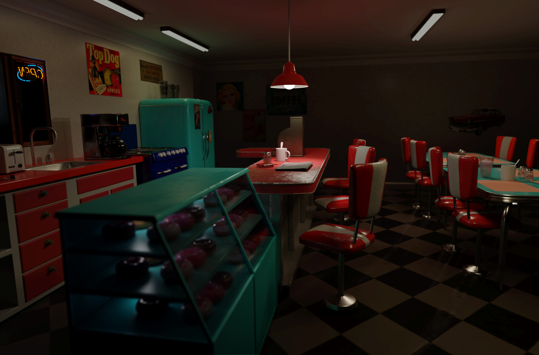
Looks like a good start. I would change the chairs by the tables. They would not be the bar stool type. They would be more like regular chairs so they can be put on the tables at night for cleaning. Booths were also fairly common. The reflection in the floor needs to be broken up some. In the night version The lights over the bar are too bright and the rest of the room to dark. Then again maybe it’s closed? I might add exterior light sources. At the moment it’s too “neat” it needs little stuff like Photographs, Nick nacks, ketchup bottles, menus on the wall. I was looking up “Greasy Spoon Dinner” for reference and realized what it’s missing, A JukeBox.
ok i will add the bottom trim, i think that’s what it’s called. and i will investigate if everything is on the floor. i thought it was anyways. Thanks for the feedback.
ok got it, different chairs. I am really uncertain how to change and break up the reflection but i will try. yeah i am really struggling with the lighting and getting it how i want, i noticed when i added more light to the room the moody lights completely seemed to disappear. But i will tinker more with the lights. I did consider it could be closed. Hm exterior light could be interesting, will give that a try and see what happens. hm i will try to add a few more things. Thanks for the feedback, probably will post with changes in a few days.
I watched this tutorial from chocofur the other day on reflections. Hopefully it will help. https://www.youtube.com/watch?v=_KXXyPd83s0
As far as lighting goes there was usually a neon sign out side.
That might be a good motivation for a light and add some color.
Lighting is always hard to get right.
ok yeah i will look at the video. Thanks. Yeah i have been thinking of making a neon sign, you’re right, it will probably help with the lighting, Thanks.
So your thing looks really good, but I think it just has tons of wasted potential and therefore, I’m writing you this wall of text.
My biggest complaint: You have no art direction. I can’t find anything you want to communicate with this scene except for “Diner”. But then why are you making this artwork? Try to give it a purpose.
Usually some kind of story helps: Why show this place and not a diffrent one? Has something happend here? Was it abandoned 100 years ago? Has the owner taken pictures from his tours around the world to display it in his tiny village? Is it a crime scene? Is there something supernatural? Is ist a recreation of an old Diner in a futuristic Cybercity?
Just figure something out you want to tell with this thing and this will not only make your work more intresting, but most importantly: it will give your work direction. I always imagine some kind of thing I want to tell with an artwork before stating work on it, because I need it to fill all the blanks and add all the details, you need to say the thing you want to say.
but now to some more easy to improve on things:
To improve realism:
Moar Details and Grunge! Everything looks kind of too smooth and clean and therefore also too small. It looks more like a 1:3 miniature model and not so much a real place.
Details can be Fingerprints, scrateches, Scres, Dents, Rills, Leather Pores, Cables and Dust.
Moar life! This looks unused. Put the toaster at another angle, displace the cans, Make the Chair Rotation more random, make it a little more messy and add some more lovely details, you’d find in a place like this.
Your lights are too dim. Lamps are always overexposed and have some bloom in photos and that’s a common and easy to spot mistake in a lot of renderings. Also fix that light emitting plane, ad the top right, where you can see it’s weird shadow…
Use HDRs on the walls hidden to the camera. This will give you much more reflections, save a ton of render time and will drastically improve realism in terms of lighting and reflections. Also use textures of actual light scources on your out of camera light planes for imporved reflections.
Fix the glass Material. I can’t put my finger on it, but it looks off. Probably too litle reflections -> see above
Add material interactions at intersections of Objects: The objects do not look like they’ve stood on that floor for any amount of time -> basically a more specific vewrsion of moar grunge
To Improve Art:
Work on lighting, brightness and Contrast. I can’t put my finger on it, but play with the values, look at the histogramm, take some inspiration from photo editing/night photography tutorials.
Add a foreground (and potentially backgound). It’s generally desired for image composition to have something of a foreground, background and something inbetween. I’m 90% sure something closer to the camera woudlt be great for image composition and a window to the outside will probably also not hurt.
Elevate the camera angle: I think I see you are going for a look, where the camera is on the same height as the table, but I don’t think it works, it looks kind of forced and also odd, because noone takes pictures like this.
Put more stuff on the walls. Those places wither have cool grafitis on their walls or are just jammed with plates, posters, clocks, memories and stuff.
Add a register.
Add some nice decorative colorful lights -> e.g. neon signs or a jukebox both within and out of frame (for reflections and diffuse light)
Wow thanks so much, reading this was very motivating, gives me a really clear idea of things I can try to do. I will work through this.
yes I thought it was fine as a diner, but i see now it maybe needs something specific. I did avoid just copying other diners and thus somewhat slowly picked out the props for this reason cause i don’t want to blindly copy other diners. but yes now i need to add something identifying about this one.
it makes sense that there is an issue with direction. I started making the diner cause I felt inspired to make the fridge and stove first and then wanted to figure out how to put them in a scene. So I did not start with a story. But working on that. So yeah I have a couple stories in my head but they involve characters and to see the story without the characters is harder. But i have a couple things to try.
Thanks for the story prompting ideas. That is nice.
yes I will try to work on grunge and texturing. texturing is harder for me and so i kept things very clean, but will work on adding more details like that.
lighting has been a real challenge, definitely going to working on it.
for the hidden Hdrs, I will try that, things that save render time are great. only problem is when i tried that the first time all my atmospheric lighting flawed as it is, basically disappeared. and watching one of glebs videos about the city night and the atmospheric lights is he said for the atmospheric effect to have more strong/small lights. so i don’t know, it needs to change but i still would like to keep the moody atmosphere in some way if possible.
hm adding grunge at the intersection sounds like an interesting idea, will try to figure that out.
For the other things, I will work on those too, thank you very much for the long detailed answer, gives me a lot of ideas on things to work on. And as I say I feel much more motivated now.
Just make the HDRs darker, if they take too much away from the lighting. I tend to do use hdrs at like 30% strength and then add in some “style lights” but those are way stronger and usually even clip somewhere in the scene (e.g. they overexpose some parts of the image)
But it’s just a great foundation for starting to build your lighting. And it’s also, what we’re used to see from movies: have some realistic scene lighting, but then also some key light on the characters and important assets…
Example from my own work:
(ignore character Lighting) For the scene, Sun and LEDs make 90% of the lighting work and those are really basic. I didn’T even bother to use textures for the LED strips or the sun. Altough I’m now realizing I shouldt have put a shadow casting twig in the sunlights path…
But then I have a dim box with a purplish miscolored HDR on the inside and a totally outblown HDR on the outside.
Also … if you’re doing this because of the fridge … make it a central piece! Anything can be the starting point of a story. I once created a character just to have a story for a lighsaber.
One Tip for the object grunde: You can use object coordinates of diffrent objects in cycles! That way you can make the grunge dynamically move if you want to displace the object it surrounds.
Also I just remembered a performance saving tip: Make your volumetrics in a seperate render layer or even with eevee. Saves a ton of performance, because that way, your scene won’t have any volumetrics bounces and by turning off light visibility and only having your object collections as a mask for the volume layer (outliner -> filters -> restriction toggles), you can have the volume be occluded by your scene assets but only interact with your light sources. Lights need to be in a seperate collection for that to work.
(Altough I’m not 100% sure, if mask object cast shadows … if they don’t you need to think of something … mabye have a seperate collection with only holdout materials for colume shadows or something like that…)
Volume-object interactions make up 1% of the lighting and 99% of fireflies, so they are really not worth it. Altough in your case, you probably want to add an area light/light emitting and slightly textured plane in your volume collection, where your table sits, because the secondary light from the table is strong enough to have noticable effect on the volume. So just fake it. ^^;
Having some textured transparent planes with smoke trown in there probably also helps. with giving the volume more texture. Use a diffuse(max roughness)/transluscent mix and mix it with a transparent node. Kust make sure, they don’t clip into objects, because of sharp intercections…
Hi took a long break from doing anything. I guess I felt a little overwhelmed with the amount of things to do. But just want to give sort of a mini update. Sort of say hey I haven’t died or forgotten about my project, but it still has a long ways to go too.
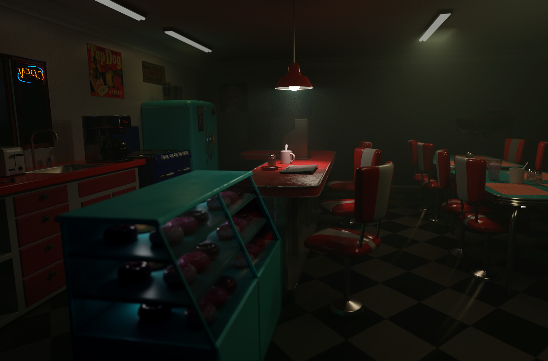
I changed the perspective in the scene to have a ‘focus,’ I turned off atmospheric for now just cause the render times were too much before but probably will put them on at the end. I am currently trying to learn to use Substance Painter and plan to put several things here into it for some texturing. At that point going to see where it’s at,.
reading through the notes above: Mash3d says I should add more stuff to it still. And a neon sign. Not sure if the shadows still are gonna be an issue from this angle.
betalars posts I should add a story, I have a little more now that the focus is on the bar area on a specific seat but definitely could figure out more and tell more here. I thought about modeling a coat and putting a coat on the chair but that turned out super hard for me for various reasons.
Anyways when I look at this scene now I envision a waitress behind the counter and a male at the bar.
Definitely will try to bring it to life more, gonna be reworking the lights soon. Not sure what exactly to though. Great idea with adding bloom to the lights.
hm yes glass, always kind of tricky, ok.
anyways, I am still way behind so haven’t been able to get to a lot of these yet… But have reread all of the notes. Thanks again for the detailed feedback.
~
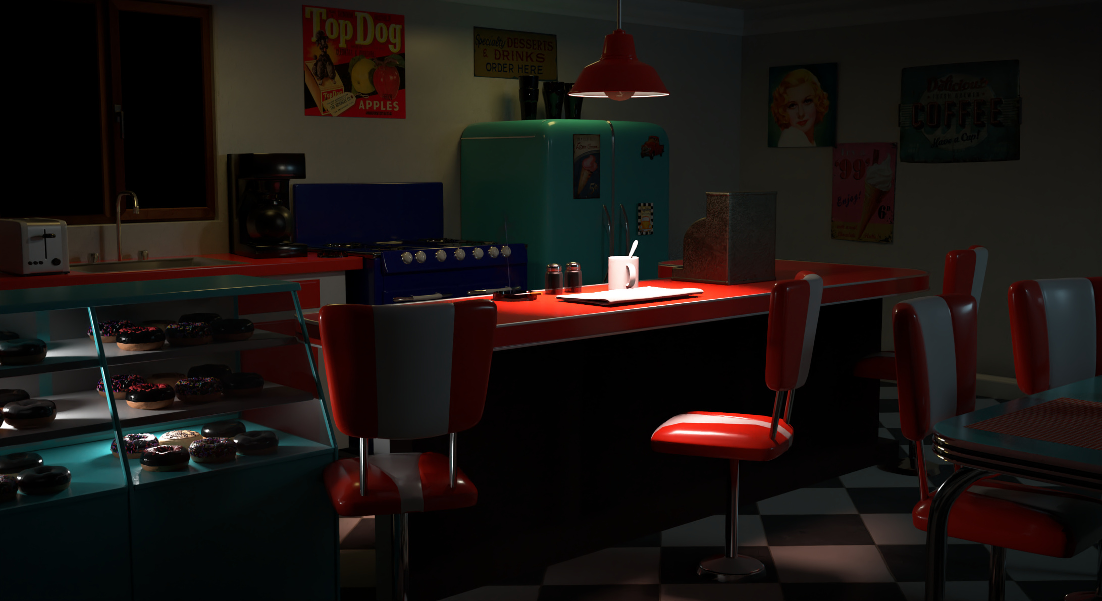
So I guess will need to completely redo glass. I haven’t wanted to deal with an ‘outside,’ so I cheated and made the glass black. I don’t know why the bulb doesn’t look lit, it’s lit in the scene. I am seeing how everything looks too clean, so will try to make things look more used. And again I guess the scene looks really dark. I miss my atmospherics, but it’s just so expensive.
so i spent a lot of time rendering and then trying to fix things in post, but i feel disappointed somewhat in the scene now and feel i liked the early look better, and have not been able to get that look back. so when i come back from holiday vacation feel i will either make some big change to the scene or take a break and work on some more lighting and rendering skills on a new scene possibly.
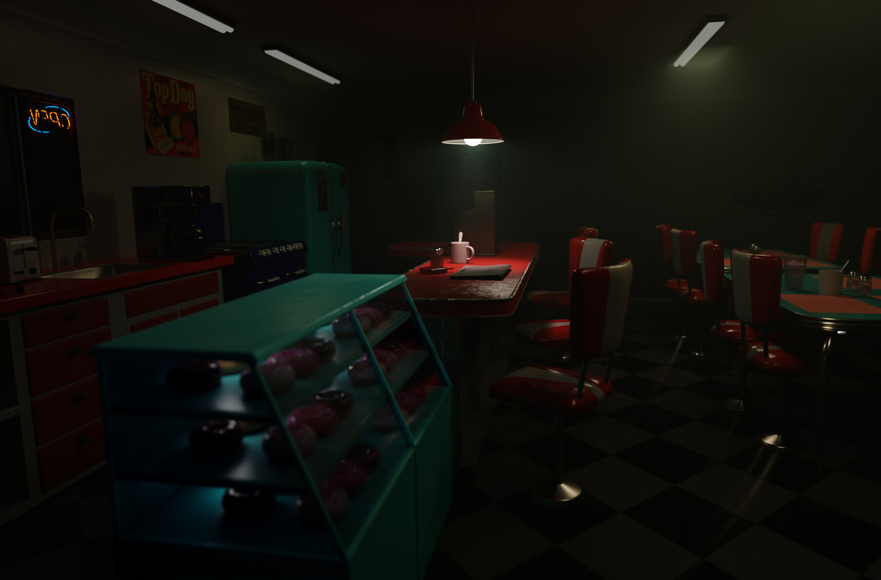
rendered this one last night, took a while but I wanted to try volumetrics with a higher sampling then I had previously and it did seem to get out the noise. I think if I try another render like this I will tone down the volumetrics a little bit, and maybe make it a more neutral color.
here is the same render but this is the original darkness, and in a way it kind of fits the fogginess better? anyways I still feel there is more to do on this, but just wanted to post the update. Thanks.