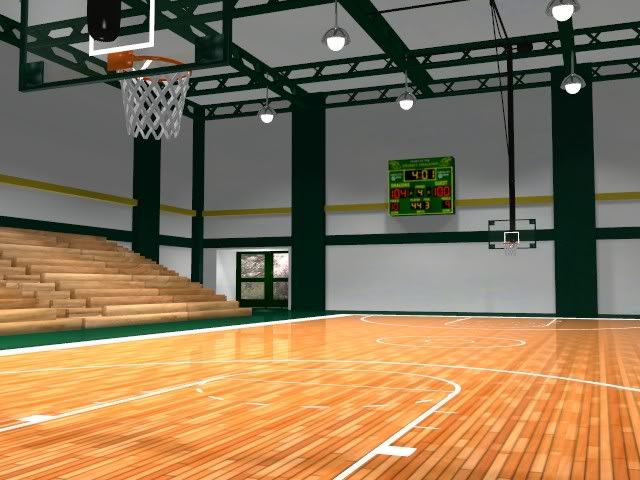
I’m working on this for work. It will be a “fly through” that will showcase different components the company sells. I’m pretty pleased with the way it came out. I’m most proud of the lighting (no AO), but I’m looking for C&C for improvements. I’d like it to be as (nearly) perfect as possible.
Edit: Any suggestions on how to darken the roof a little?
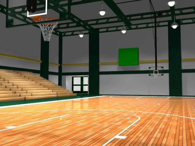
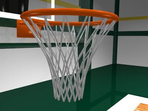
The net looks very very odd. The ceiling needs a texture. Often the ceiling in those sort of places looks kind of like crumpled paper. I don’t know about the standard, but the schools in my area have clocks in the gym with, metal cages over them. That might be an interesting touch.
I love my new net. The basketball hoop was actually given to me by someone at work to save me some time. When I went to fix it I realized that the net was a freakin mess. My “upgrade” looks better and has probably a 6th of the polys. I also darkened the roof (lowered the “ref” setting, thanks Kansas).
Since I’m working at home I’m missing the scoreboard and outdoor textures but I’ll have em monday when I go back in. Also, the bleachers are wood, and I’m going to leave them that way. Most of the small gyms I’ve seen have wood bleachers. I have to model some larger ones, I may change the material for those.
Sorry Grim, I don’t think I’m going to mess with the net anymore. Other than the fact that it’s perfect (perfectly circular and not bent up) it looks good to me. The camera will never get this close, but even here it looks acceptable.
It looks a bit like a bottomless metal trash can this close, but I still think it works as a basketball hoop net.