I always wanted to do a spacefight-animation and now that i know how to setup a nice space scene i’ll try it. Ships and scene are done what’s missing are the special effects like shield hits, missiles, lasers, sounds and stuff. I also need to get a feeling how fast the ships need to be, how to use the camera and so forth, so when anyone has some tips whatsoever, i would like to hear them :).
I made a test animation which i uploaded here ~11MB
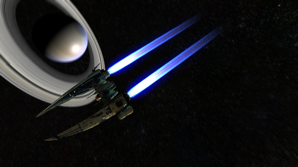
The ship designs are from an online game called Eve-online (cool game btw ;)).
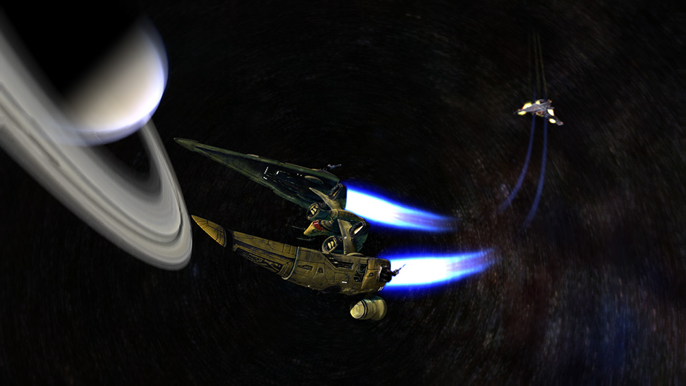
In both your images, the ship is quite dark, could you lighten it up a little bit so we can see some more of the detail maybe? The rest of it looks really good.
Sorry economy games like EVE also make me go “blah” but the image here, and those in the game look very nice. (one thing i dont like about EVE is that you never leave your damn ship…)
Trails are looking better, but I still think you should blend the actual trail with its glow if ^possible, because well light doesnt just go from “light beam” to “glow of light beam”.
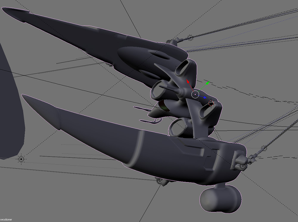
like the ship so far. Could you post a few untextured shots of it just to see the modeling. I noticed that you added a little light to simulate the engine light.
A nice trick for showing speed is adding space debris. Stars and planets in the background won’t be close enough to make the things look fast. Add just a crappy particle effect or something that they can fly through.
A trick for showing off the detail on space ships while keeping accurate dramatic space lighting is adding lights to the space ship itself. Think like boats. Put a red light on one wing and a blue light on the othe ror something. Make it so it only lights up a really small part of the ship, but still gives a good idea of the detail and stuff.
Also, the specularity on your gaseous planet looks way too high it should have a really low hardness value. I’d go so far as to say 1.
>Borgleader
I think i missunerstood you at first but now i probably got what you wanted to tell me
>way2lazy2ca
I will try to add some light sources
Had also the space debri stuff in mind but i havn’t figured it out how to make them good lookin with some woosh effects
changed the spec of the planet (hard:2 muhaha in your face :D)
>Anthony
It’s a combination out of: halo blend texture with a cool colorband, vector particles, ipos to shape the trail and try and error and error and error
When you want it more precise i could make a short explanation, perhaps tutorial style…
completely disagree. it’s almost too bright now. Space light should be highly directional with really sharp shadows.
It adds so much to the image. If you want it lit up more use a trick like the header for this site. Put some very dim lights on the opposite side (I wouldn’t because a huge black contrast really makes a picture come to life).
If you look at that same header. Imagine if the ship were lit from the top. you’d see more detail sure, but it’s not as visually appealing. Honestly, if that were rendered again with no light from the other side other than a little bit of engine light, it would really pop out.
I popped that same picture into gimp, messed with contrast and brightness to get two more images to compare to that one. (note: that one actually does a good job with it, but I’d probably err on a little darker for personal preference.
Here’s the first one darker:
here’s the second brightened up a little:
The second you can easily see more detail on the actual ship, but I have more emotional attatchment to the first one when I see it. When you add more lights you do the same thing. It just makes your picture less interesting and more flat.
I didn’t get very good results from the tutorial. Lots of the time there was too much white, and I managed to get it looking ok, but it was all liney at the edges. Any ideas?


 and even sadder that my beloved YouWhat was nearly disintagrated


