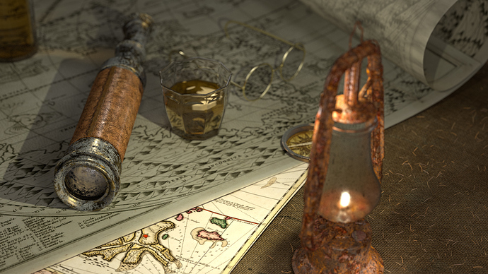
rendered in cycles
Nice One - I like the Textures and the composition (diagonal ftw). But I think Lightning lacks something… Espeacally the petrol-lamp in front seems to be flat and shapeless. I dunno if you petrol lamp should be the “only” light source (it is obviously not) - but you should ask yourself - should it be? Or should there be an window outside? If either of these, make a more “consequent” concept of light (more contrast between shadow and light, faking a general light direction and so on.
But Idk, maybe realism is not even your goal?
The textures on the lamp and the spyglass looks odd. Not sure if you are trying for old or leather, or rusty. And the specularity on the spyglass is way too high. You might want to add a yellow tint to your lights as the light from the lamp would be more yellow. Also where is the light that is shining on the top of the lamp? The maps look laminated to me. Not that they are shiny but they are so smooth, like lamination. Maybe roughen up the maps. Give one a tear maybe? And the compass looks way too thin.
Good job, but the textures need a bit of work.
Agree with what others have said.
- I think you have only placed a single light source in this scene (besides the lamp). That might be the cause for the flat and burned lighting. You could look up “3-point lighting” on google or something. This’ll improve your render drastically.
- Composition wise, i think this render could do a lot more improvement. It seems like you just created random objects and scattered them all over. There is no clear focus at all. Try to change the camera angle and even go far enough to remove the lamp. It is not doing a lot of good.
- Concept wise I think it is a very cliched idea. The same old spyglass, compass on a map. I think this idea is not appealing anymore. You could perhaps think up of something cool and new.
- And yeah, the map seems too new and clean for this classical scene. Texturize it and give it some folds and stuff.
I would love to see more development on this project!
Cheers
I’m fine with the textures of the spyglass and lamp but I think they look odd because the maps look like you just bought them five minutes ago. I think the maps need to look old and decayed to really work with the rest of the scene.
This is great work! The rust on the spyglass looks great. There are, however, a few improvements I think this scene needs.
The Depth of Field is too strong. I like a good Depth of Field effect but in this scene, it just comes across too strong. Because everything is pretty close to the camera and bunched up, it looks odd when one thing is in focus, and just a few centremeters behind it, something is completely out of focus.
The lamp is modelled very well, but it looks too rusty and the textures don’t look particularly high-res. If you clean up some of the rust, you should be able to hide some seams in the texture (if there are any). Even if there are no seams, get rid of some of it.
But On the whole, great scene.
I hope this helps!
I don’t whole heartedly agree with every thing that was said previously.I don’t think that the maps look laminated. I think they look new. And as far as the textures go with the rest of the scene, I would throw those maps I to gimp, or photoshop, creat a new layer and add some dirt, grunge and grime. where the glass is sitting I would have a liquid spill ring, or a few randomly placed on the map. I would also use a crumpled paper texture applied to the map as a bump or displacement. I would add rips, tears and overall get rid of the perfect edge on each page of the map. I like the texture on the spyglass and everything else except the lantern. I wouldn’t do a rusty lantern. I would do an old lantern with some spots of rust. And I agree with the dof…I think that’s all for now.
Glaring problem: the texture/bump map/whatever on the lens of the telescope . . . if you want to be able to SEE anything through that thing, it needs to be as smooth as . . . well, as a lens. 
Also, the lamp looks like it’s completely rusted, and the metal parts of the telescope seem to be badly corroded; no competent mariner would allow his equipment to fall into such a shameful state of disrepair.
Other than that, it looks okay to me, if a bit uninspired. The maps DO look new, but not everything in 3D modeling needs to look like it’s been beat up and left outside for a few years . . . seems like lots of people go overboard on the dirt and grunge.
