I took my little girl to see “Cars 2” yesterday. The movie was okay. Typical Pixar-quality visual excellence, but it kind of failed otherwise…
Anyway…
My kid recently took over my old phone. She’s discovered the camera, and takes pictures of EVERYTHING. She figured out how to take video clips while we were on the way to the theater.
I had to take the camera from her when the previews were starting, because she was recording those, too…
Anyway, I figured It’d be a fun project. I think I’ve flushed Rift out of my system, so I should have time enough to work on it.
Yeah, she’s a smart kid. She I’ve been trying to get her to do her drawings and paintings on her computer, but she loves her watercolors. I go through a lot of paper with that kid.
The thing with the camera had me slightly freaked out. Didn’t want to get banned from the movie theater.
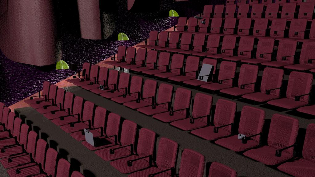
Minor update. Added curtains. Added the little light-thingys. Applied some basic materials to everything.
No i wasnt talking about your modeling. I meant in real life the actual theater you modeling has crappy seats (judging from the image…)
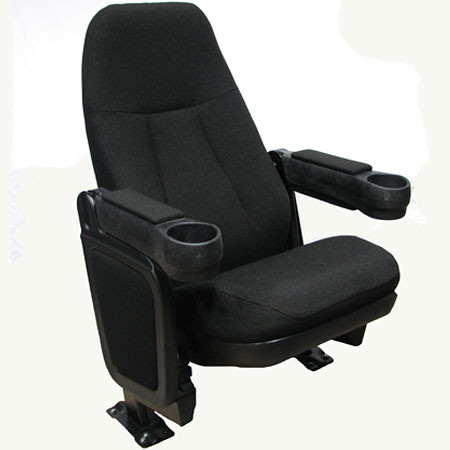
This image is as close as i could find to what our theater has: http://farm4.static.flickr.com/3530/3750893953_1d0b667b4e.jpg
Btw, please change your materials, they are really awful (sorry but its true)
Curious why did you put a camera in each seat for…?
Lighting also needs to be improved.
Take a look at this vid somewhere in the middle he shows an auditorium,
Bragging about your local movie theater, and then referring someone to The Third & The Seventh which is one of the most highly regarded CG works because their materials are “awful.” C’mon man, really?
I think the theater is coming together quite well. How do you plan to handle the walkways leading up to the back? A lot of movie theaters will sort of extend the larger “staircase” that the seats are on, but add another step between each one on the walkways. (Just carpeted rather than the usual smooth concrete.
Some other things I think you should add would be one of those tall walls you usually see along at least one side of the theater where you enter (this could be specific to theaters near me, maybe you enter in the back in yours.) Also, add an exit door! There always seems to be at least one exit located to the left or right of the screen.
Other than adding details like the things I’ve mentioned, I think you’ve got what’s looking like a theater!
I mean no disrespect, but i dont want to say it is looking good if it is really not.
I would rather tell the truth so the artist can improve rather than hold back.
Reason for The Third and The Seventh is for inspiration. Do i expect that quality from him in this project? No, but i hope he does improve so maybe one day he can do something like that. What would you have me link to? The higher you set the bar the better, why set it low? Again, if i set the bar at his level and say this image is great, he will not improve much.
So what is letting this image down the most? The materials. The next? Lighting. You cant say i am wrong in that.
As for the bragging…all i meant is to show the difference to clarify myself.
And the images can also be use as a references.
@Morichalion - as i said i mean no disrespect, i just want to give my 2 cents to make you a better artist.
I have to agree with DDD set your bar high there is no point in aiming low. Even if you don’t achieve the same level as what you are aiming for setting the bar high often forces you to look at your work more critically and really see where you are failing short.
Its also important in WIP to give honest critiques so that the artists improves. If you are an artist I think you have to separate your self from your work and remember that when someone give you a negative crit especially one which points out where you are falling short take it as an opportunity to improve.
I am in complete agreement about setting a high bar! I just didn’t think there was that much actual constructive criticism in the post. Just a “here’s where you are, and here is where you need to be” with no indication of steps to take along the way. If someone has lighting that is clearly not right (and this is certainly an example,) you can assume they wouldn’t know how to set up a working light system, and that to just direct them towards what amounts to a photograph isn’t going to actually help them in any way other than inspiration.
WIP is about progression, and I feel like to progress you need to move steadily forward, step by step. If he were to consider the project done then sure I’d stop him and say “no you aren’t!” but it’s clear that progress is to be made and providing more clear, “bite-sized” steps I believe is more beneficial to the artist.
Nah, it’s nowhere near complete… Maybe I should have been clearer on what I envisioned the final image to be.
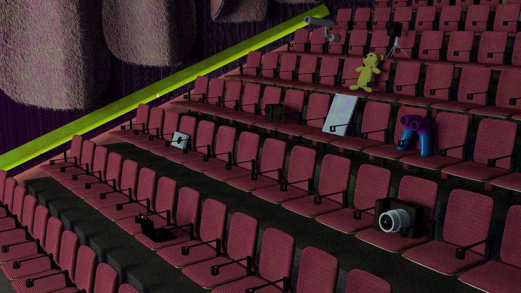
Essentially, it’s a theater with the seats populated with cameras, rather than people. Cameras in the theater being equal to piracy. Still kind of early, only a few different cameras modeled so far. I’ll work on lighting, then materials, in more detail when I get six more cameras, I think. Maybe a few more.
@ DDD and Tryant Monkey:
I appreciate any and all crits anyone has for me. I will say that the more specific the criticism, the more I can benefit from it, though. If simply looking at an awe-inspiring piece of art would make one a great artist, I’d be a great artist.
@H3X:
By the time I read your comments on this piece, I’d already decided on the perspective shown, which makes the wall and the exits pretty much moot. I’ll probably end up turning the ramp into steps, though. I wanted to stay with a ramp, but it’s really too steep.
Image Update:
Added a few cameras to the scene. One’s a tablet computer, another’s supposed to be a laptop with a webcam on it.
The material on the seats looks much better now.
If you have not already done so, turn on environmental lighting and ambient occlusion on.
Work on the purple material, (i have no idea what that is supposed to be or wait the wall?)
Curtains need a new material too.
What are the green things?
Also, it may be a hassle at this point, but the seats themselves seem kind of thin. Maybe add a metal/plastic piece to the underside of the seats, or buff up the cushions a little bit.
Have you considered the seats not in use being flipped up?
@DDD
The green things are supposed to be lights for the floor. Y’know, so the patrons don’t trip over their own feet when their small child wants to go to the bathroom. I’m going to start on the materials and lighting a bit more next chance I get.
@H3X
The chairs and armrests are all still under an array modifier, which is why they all look the same. So changes to them is easy. The final image will have all the unoccupied seats up.
Update:
Added colors to the cameras I had, ran out of imagination and/or inspiration for other cameras, made a teddy bear. Like those nanny-cam teddy bears. Also started playing with the lights. Current setup features an area light roughly the size of a movie screen, where the screen would be. Gonna go mess with the cushions.
I made all the cameras bigger. For some reason, keeping things to scale doesn’t seem important to the rest of the image. I unwrapped the seat backs, the normal map doesn’t look so stretched out now. I turned off rendering of the bear’s fur, takes a bit too long to render for preview purposes.
Probably just gonna kill the light fixtures and put something else there…
Anyway, next thing is the materials on the wall and the curtains.
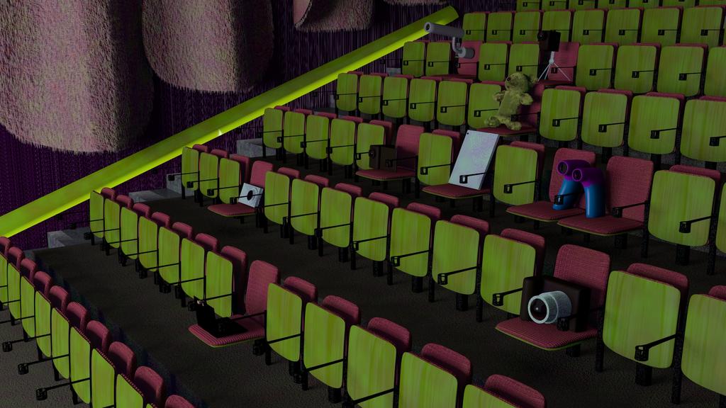
On a side note, I tried out luxrender on the same scene, and came up with the following render after just under an hour. The particles on the bear is missing, as well as all the textures. Colors are all there, though. Can someone point me to a primer on luxrender?
I just started using Luxrender too and I had a problem with textures. If you go in to the materials tab and about half way down is a section for diffuse colors. If you hit the ‘T’ button next to it, you can then add a texture, and then it will render.
That was my problem, yours could be something different.
Added fur to the curtains on a whim. I kind of like the effect. Also changed the wall texture. Seems to work better now. Also traded out the little floor lights for one long one. For some reason, the lamp is shining through the reflector. o.o
Anyway, I’m going to bed. I’ll mess with it some more tomorrow.
Okay, lessee another update… what’d I do since yesterday…
Ditched the ramps in favor of steps. Put up the the unoccupied seats. Changed the material where the seat backs meet the ground. I think that’s about it…
I think I need to add rivets to the seat bottoms. That and maybe more detailed mounts for the chairs? Can’t see them very well, anyway. The texture on the seat bottoms needs to be improved…
I think you should work on the armrests a little bit, they seemed sort of thin before and that is more visible now. Perhaps a bit wider and thicker would look better.
The seat bottoms still seem a little thin too, and maybe too long. It seems like in most cases, when the seat is flipped up, the edge comes up only about 2/3 of the way on the seat back.


