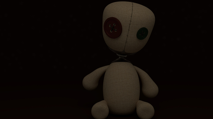
I made this recently and It’s one of my first renders with Cycles, so please critique, good or bad! Thanks!
Well, it might be a bit premature to ask for “critique” of this … and I’d say that it’s never the appropriate thing, to ask someone to reduce it to “good” vs. “bad.” This is your work, your artistic statement, and all that anyone can do is to make constructive suggestions.
I think that this is a nicely-done rag doll. It’s kind of interesting that he’s sitting in shadows like that, with nothing visible between his head and his body. This little guy does look like he’s made of sewn cloth. All of these things are, in fact, quite nice.
Now, I do feel that the image is a bit under-exposed. It’s muddy, lacking in contrast. If you were to look at a histogram of this image, it’s going to have a lot of midtones in it, and of course some blacks, but nothing yet that’s really white. The tonal range from darkest-to-lightest, say, across (well …) any visible part of this figure, will be, well, “not very ‘lightest.’” Just like an underexposed photograph or print.
Now, you certainly could “fix this in post,” using the Curves tool in the compositor, in Photoshop or in GIMP. But if you want to tackle it in the original render, it’s basically going to be a lighting concern.
If I were talking in terms of Ansel Adams’ “Zone System,” I’d say that you’ve got a lot of “Zone 4” but not yet enough “Zone 6.” (Google that. Please.)
Welcome to Blender! HTH.
iam curious as to how this is at all steam punk. steam punk is usually a combination of old fashioned and futuristic. but i don’t get this feel from it. the render is a bit to dark and hard to make out. also your composition leaves a bit to be desired  its kind of uninteresting. but other then that what i can see looks pretty good as far as textures and shaders
thank you for all of your critique, I will see ow to change i!t!
Great post Sundial! i liked your point of view and ill like to add some more criticism.
i think it need some small hair particles to simulate the cloth, and maybe a broken part to break the perfection and get more realism. Doing this and the Sundial tips you will be on the right way!
Firstly, this is not Steampunk. This is stichpunk. Do not confuse the two…or confuse either of them with Dieselpunk or Cyberpunk. All very different. All that stated, I think you have a good beginning.
I’d like to see a brighter render. Cycles can be a PITA to get the lighting working. So, try adding a spot light or two and see what happens.
With the given suggestions, I’d like to see how you play with it. I definitely think that it has potential.
I agree with all above suggestions and would like to add one myself…On the head you have a nice “Stitched” seam, yet on the body there is nothing and I can clearly see a “texture” seam on the right side of this character. I understand that you are new to blender and all but I would look into some sculpting tutorials for blender and do a small bit of sculpting to create some folds or creases or even sagging parts to add to the character.
This is however, your creation, 100%. Take everything that everyone says and apply it if you will or listen to none of us. YOU are the artist and it is your CREATION.
This reminds me of the rag doll from one of the Korn albums.
