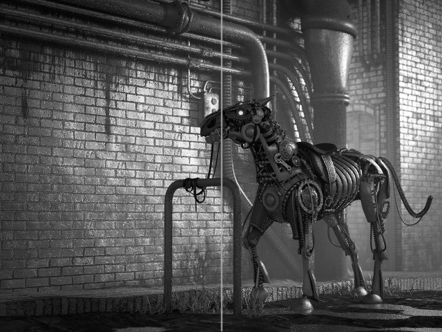
The pose and camera angle makes it look much more powerful
Agree, to me looks better than original. My attention is alwais on the horse and not “wandering” too much on the background as before.
I think an interesting pose would be that he’s trying to free from the tube. The rope would be fully tensioned, horse legs giving all their power, maybe steam coming out from the joints becouse of the effort needed…but again this is an idea, no need to follow if you had other clear plans .
@JA12 Your artificially crafted focal-point counter-examples are only a spam here. The eye is sill most sensitive to the value! Pls keep it relevant to the image in question, dunno why you posted apples here lol.
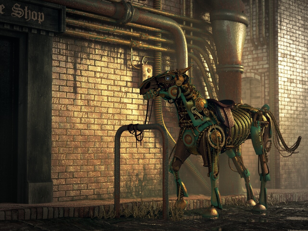
@Rachel You are definitely going in right direction! This new image is much better.
Thumbnailing should help testing the ideas but if you’re planning to finalize the latest render, maybe balance the image a bit
The visual weight is on the right side of the image. Simplifying the area behind the horse and placing something on the left side of the wall could balance the image. Could perhaps make the big pipe cast a shadow over the smaller pipes behind the horse, move or remove pipes, or replace some of it.
The left side could suggest a reason the horse is there. Perhaps a part of a door that could indicate it’s some place where the owner went and left the horse on the alley. Maybe it’s a steampunk shop selling sport gear (just actual gears), or maybe it’s a bar called “Blue Valves”, anything really, but it doesn’t necessarily have to show what place it is.
I’m going to change the colour of the door to a lighter gray or brown, it’s a bit distracting now. I worked on the mist a bit, putting the noise pattern over-top of it for more variation. I don’t have much time to work on this project this week, only about an hour or two a day. I hope to get this to a presentable stage soon.
it seems good, i just think there’s a little too much gloss on the wall and it’s detracting from the horse as the centerpiece. maybe, i like horses so… oh, also the position of the front hooves, they seem slightly off balance/out of line with the shin. i can’t put my finger on it, because the front right hoof looks fine but the front left seems forward. not to be too forward. it might be an optical illusion. :o
update------
here’s a link to a video i found on one of my conspiracy theory side-quests,
at 2:27 there is a perfect shot of the rear ankles and hooves. it’s still hard for me to put my finger on it tho.
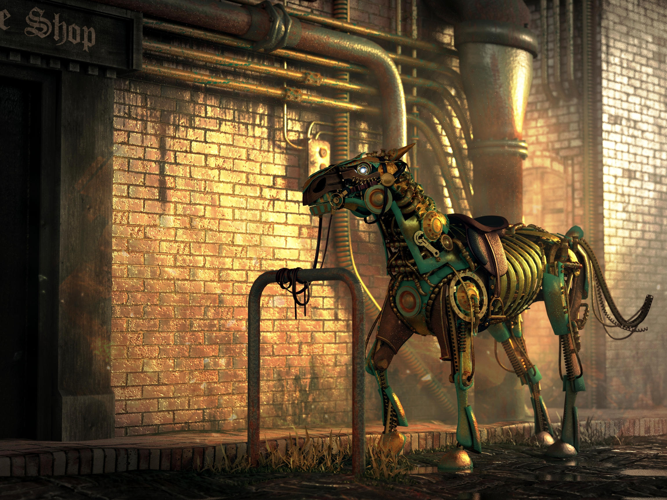
Not the final image, I was just playing around with the compositing. I plan on moving the little control box that is resting on the horses nose right now along with some other pipes. With a few other little changes, mostly tweaking the materials, some look like they have too much bump. Needs to be rendered at a higher sample rate anyway because of it’s fireflies. I’ll have the finished render soon enough. Thank you all for your wonderful input!
TARDIS Maker:
I did some tests with the Fresnel node in the shader when I was building my materials. The problem was that most of my objects are small individual parts that are mostly mechanical and flat, I didn’t like how the Fresnel looked on them so I decided to exclude it.