Thanks for looking and thanks in advance of any comments.
Els
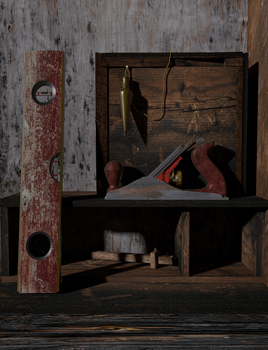

Having had no response I began to wonder why and realized that it is just an unremarkable image. Now what to do? Well keep working at it is the only answer, so I pretty much revamped the whole thing…lighting, texturing, composition and new elements. It still may not get any comments but I like it better.
Els
Attachments

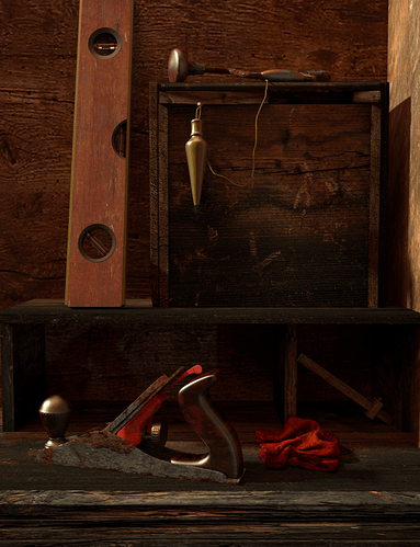
It’s much better now.
I like the bottom table very much, the upper “cabinet” looks great and the rag - while very saturated - is also looking nice. However, to me the image still suffers from the same problem as the first one - why should I look at this, why would anyone take this photo?
I would choose some clear focal point of the image - something very interesting or something that tells a story… At the moment, the plumb line seems to draw most attention as it is brighter and has kind of a prominent spot, but I do not find it interesting enough to hold my attention… If you for example had some new, bright, polished object that was created with those old tools, it would (in my opinion of course) add a lot of interest and story to the image.
If you do not want to go with the focal point approach, you would have to work on your composition hard to make them all and the image overall appealing. someting like this:

is usually the simplest approach to such images.
In no way is this a bad image, you obviously know something about blender and I love the general idea of showing the old, wonderful tools. Your objects look mostly very good, it’s just that the resulting image needs a little push and somewhat better composition.
minor ideas:
- the back wall texture seems a little too big
- the handle of the “jack plane?” (not sure about the terminology in english) is incredibly clean and polished compared to the rest
- some dust particles in the air or some volumetrics would greatly enhance the mood I think.
keep at it and it will be a great image soon 
I actually liked the original, toned down version. It looks very realistic. Possibly you could add a few wood chips and sawdust to the scene; have a loose nail sticking out of the wood.
Thanks guys for the comments and insight. rjshae I think you’re right about the small details. .Adam. I had hoped the handle would read as having been polished in spots where the oil from the carpenter’s hand touched it. Guess not. And, you’re right about the back wall texture. Also I did play with the volumetrics a bit but still can not find the right formula.
Els
I had hoped the handle would read as having been polished in spots where the oil from the carpenter’s hand touched it
I see what you mean, and it is a nice idea actually, but still, I would at least downplay it a little…
And yes volumetric can be very annoying. Sometime it’s much more practical to fake it in post (using mist output for example).
Or just try making a simple particel setup with some translucent object to imitate flying dust. It’s much faster than volumetrics and can look very good when done right.
The second image has a bit more “warmth” to it. Perhaps some roughening up of the glossy materials would help a little. Right now they seem very clean. In keeping with a worn look, it might suit the image better if there were a few dents and scratches here and there on the plane handle and similar surfaces.
Did you use any ambient occlusion?. At the moment the plane seems to be hovering above the table top. There’s little to suggest it’s in contact with it. If you see what I mean.
Wood shavings and sawdust might add some interest. As if there was some work just completed.