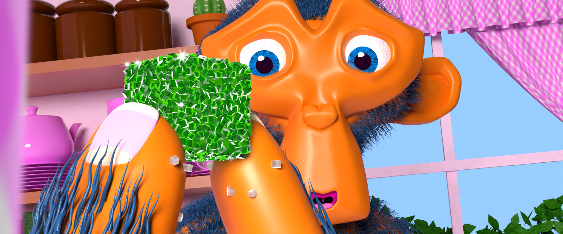
My entry (plus padding) to Bad Normal’s Default Cube Render Challenge, done in Blender 3.3.0 alpha/beta with some frames touched up in GIMP 2.10. I’ve done very little animation (and I’m currently working on an underpowered laptop, Cycles at 8 samples plus compositing effects getting about 20 frames rendered per hour), this is easily the longest piece I’ve attempted. Learned what I did with Suzanne’s geometry node hair mostly from Johnny Matthews’s New Blender Hair Tools vids, and the sugar-coated thing I did to the Default Cube came from Blender Guru’s latest geometry node tutorials – my gratuitous abuse of their teachings aren’t their fault, especially not what happened with Suzanne’s body fur.
The dishware’s all from Martin Newell’s teapot / teacup’n’saucer, and I made Suzanne’s body / hand from a MakeHuman model.
The blend file’s a smidge less than 10mg, so I’ve made it available for download at Dropbox for anyone interested. Please note that this isn’t a presentation file, just the last one before I split for rendering. Although this isn’t Focused Critiques, I’ve no objections to questions or concrit.
Really original idea !
didn’t even think about the option to make the cube „move“ by moving the environment.
One question i have is (and don’t take this as criticism, it’s only curiosity):
Did you intentionally make the scene very plastic/unnatural looking? This may very well be an artistic choice.
If you would like some constructive criticism: i would have refinde the lighting some more. At the moment everything has roughly the same brightness, which makes it a bit flat looking.
if you want some low performance real looking light, have a look at using Gobos with spotlights.
Yeah, going for a CG-toonish look, even the gingham texture was as simple a procedural as I could make. Although I used CG Guru’s recent tutorials for the candy-cube, I couldn’t use the materials he included because they were too realistic for the style.
The lighting’s a dark blue-gray World and a single big Area light warmed with a touch of that orange hue – I planned for flatter using Eevee, but most of my experience is with Cycles and I couldn’t get the shadows to work right in Eevee.
I’m pretty happy with how most of it came out, the two bits I found frustrating were Suzanne’s body fur (a monkey’s fur is supposed to be kinda sparse, but not patchy like that) and the room animation (I started with a simple three-point path intended to smooth out the middle in the Graph Editor, but everything I tried made it worse). It’s not like I’m in it to win it, although I’m hoping to get into the compilation vid.
Didn’t get into the top hundred, I have a sad. Didn’t expect to win of course, magnificent entries. But the lack of reciept confirmation in the entry process makes it impossible to tell if mine was acceptable / considered or if something went wrong and it never even got looked at – there were several stylized entries in the top 100, enough to make it clear the judges weren’t relentlessly pro-realism (even a couple Suzannes!), something like mine had a shot. Now I’ll never know.
Oh, well. I like it, I enjoyed making it, and I learned a lot.
Sorting by “Rank”, there are 70 people in the same rank as me and we run from 189 to 258, so I can’t tell if I’m in the top 200 or top 300. But with 509 entries considered I’m upper-middle of the pack, so pretty decent.
Thanks! I wish I’d been able to do a better job of it. The movement of the room+ that brings Suzanne’s mouth to the candy has some retrograding vs the camera movement (required unchanged for the challenge, you’ll recall) that I tried to fix or at least mitigate, but couldn’t. But I’m glad you like it!