It’s got a mood and atmosphere, but it also hits a lot of rookie notes. It’s tough to get noted and especially when you fall in love with a piece. If you really ran it through the community and did a FC and really listened you could have increased the impact greatly while also letting go of many of the CG cliches. I’d take another crack at the piece, do FC with the new one and get the thing to the next level.
The big stuff the jumps out:
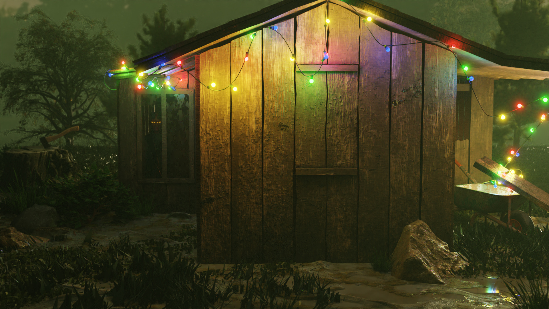
The bump on the wood is clunky and ham handed, everyone uses wood and often use the colormap for bump, it has this weird uncanny look to it.
The tree in the background appears hand drawn, and has style clash. jack the volumetrics on it, or get a better tree. (or move the rest of thew piece to a painterly style)
The uber saturated chrismas lights and the glare. glare always get an eye roll. and the lights also seem bogus. like they’re too big and havey but don’t really obey gravity.
the rock and surrounding grass are budget cg rocks looks plastic. the ax also has this trite feeling to it, and seems out of scale, it’s like maybe there’s a killer inside.
the scene overall, kind of cool. I like fog, I like little cabins in the wood. but the shot is bizarre a huge chunk of canvas is this empty wooden exterior wall.
revisit the camera angle, go with white/yellow lights, experiment with light glare, mist/z blurring. make the cabin more intricately modeled, and relying less on wood/bump texture. add more geometry on it, moss, vines, paint, rain, squirrel shit…
kill the grass or buy grasswald, hand paint it, increase the numbers and makeit all smaller.
It’s good, it a really solid start, but needs some love.