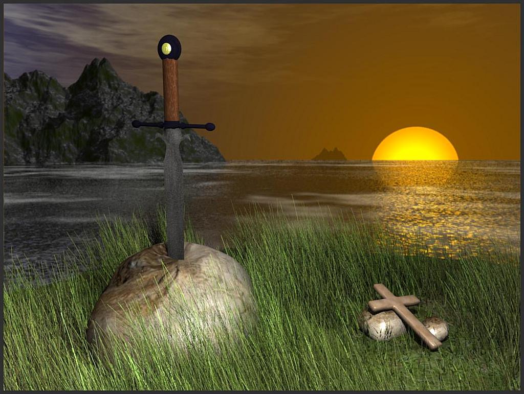
Alright, this is my first halfway serious render after getting Blender 1,5 month ago. So… Be gentle
Anyway, this is your average sword in rock thingy, i’ve tried to make this thing look like its on a small island in a great mystirous lake. ( think lady of the lake).
I haven’t done the background and the grass has been “liberated” from someones great .blend file on grass (love it), only changes to it has been on the modelling part, to look a bit more roundish.
But hope you like it, and plz tell me what i can do to improve the pic. Have a few ideas myself, but would like some inspiration thats really… uhm… inspirering??
try playing with the spec and hard values-the cross looks too shiny, and the sword doesnt look shinynat all.
also, try playing with the lighting to get it more "yellow so it looks like its lit by the sun in the background.
i like it.
Tigger. You say specularity and hardness… I hear lighting. Just discovered that my lighting hadn’t changed from the beginning, one simple lamp was all.
So did some improvements. The sun now shine!!
Anyway, the light from the sun is yellow, and coming from the place where the sun should be. I’ve tried to give the sword more reflections, think it helped. Also tried to use the lighting to highlight big stone/sword while kinda hiding small rocks/cross.
Also tried to give the handle a bumpmap, don’t really know what i think about it…
Only big lighting problem that i see right now is that the lighting on the water does in NO way correspond with the lighting on big stone.
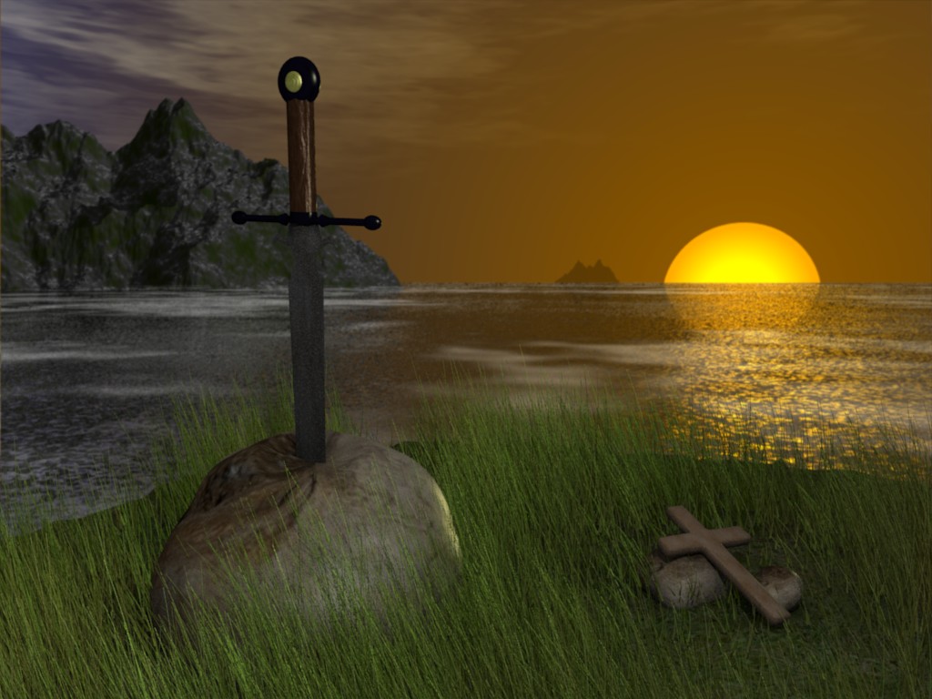
All right, have been loooking a bit on the lighting and tried to change it.
You can see the results at the buttom, its now a lot darker, and hopefully a bit more “mysterious”, i espacially like the bluish glow on the big stone now.
But i can see a few problems myself, the cross+small stones look to be levitating above the ground, and the grass looks a bit too uniform and perhaps a bit too gloomy espacially on the right side.
Don’t really know what iøm going to do next, so some c&c will be welcomed, i am thinking about doing a crown instead of the cross. Or perhaps reduce height of the grass? In particular the background grass, looks to be a bit too tall.
I know… And i have made severel modifications to spec and hard as you suggested, but i think of them as a part of the lighting/shading a render. So i just referred to it under lighting…
I agree… And i would like the sword to shine. But its not really working. Look at the pics below, the first is what i have now, the next is reduced hard and the last is enlarged spec.
I think the problem might be because there’s not direct lightsource that points toward it…?