Lovely stuff! I think I like the girl more, dunno why…
Also, as a Greek dude; I approve this! Wife teaches ancient Greek and they’re tons of stuff one can tackle on the Greek mythology. Nice!
The right side (male).
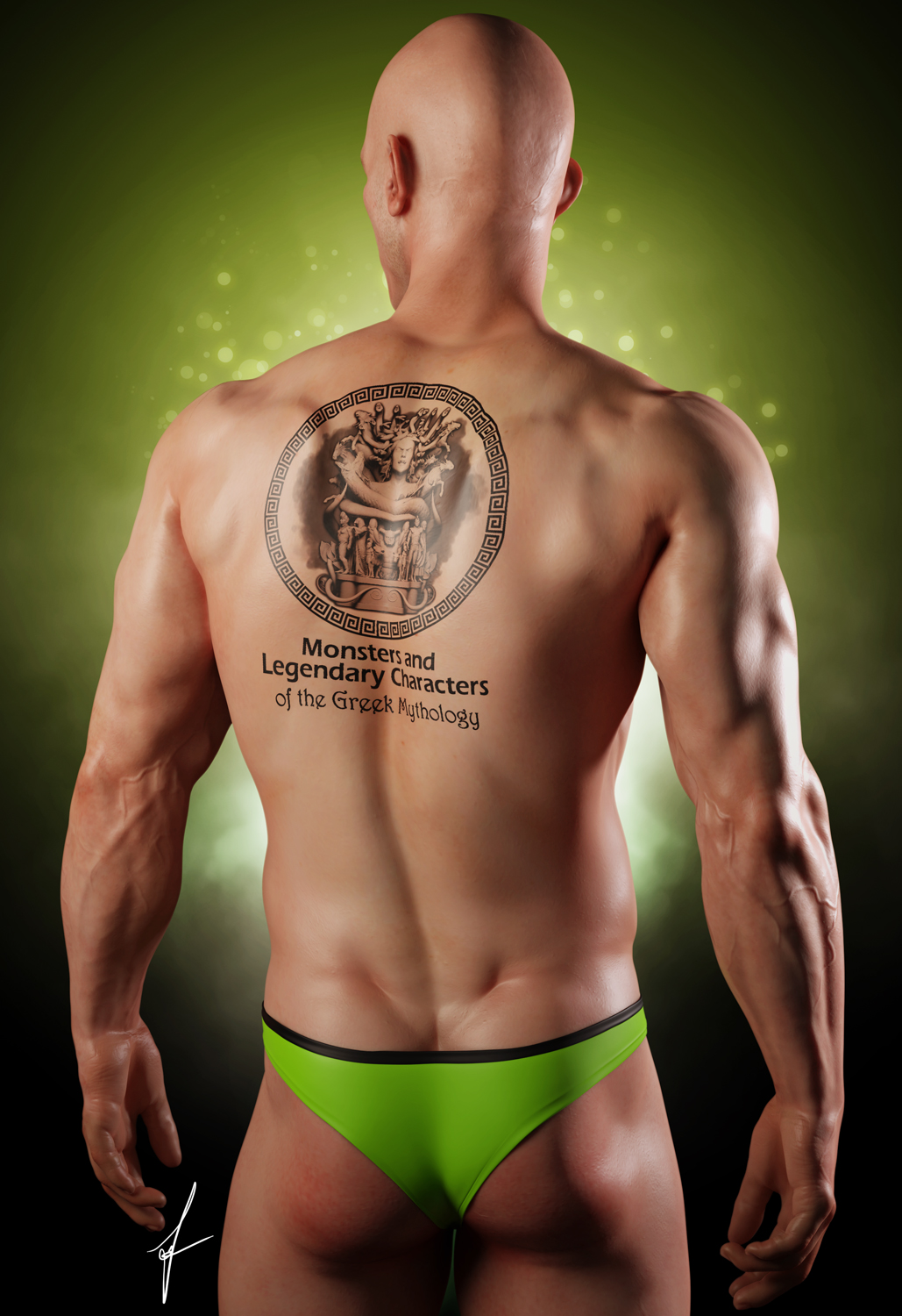
The background fits better makes the art pop out. As a tattoo, i would not want that wall of text on my back. I also would have gotten rid of the outer circle, replace that with the text, if you really need the text in there. Personally I would just tattoo the art itself without all the fancy ‘crowded’ outline and text.
I would prefer to say the woman, of course, but the male pose is better. Also shows the human body better i think because of the male body autonomy.
I would drop the weird tattoo on their back though. place that logo at the bottom orso. Is the image meant as cover. Its not very clear why we need to choose or for what the usage is.
I think i t would be indeed also better if the girl had a blue background. As we can see the green with the guy (hue from trunks) makes the figure pop more. This also makes a nice theme color.
i’m purely talking about the tattoo, nothing else, the male or woman i do not count, because as he stated in the OP, people wants a tattoo of the art of his books cover. so everything i said, is purely about the tattoo it self, nothing more.