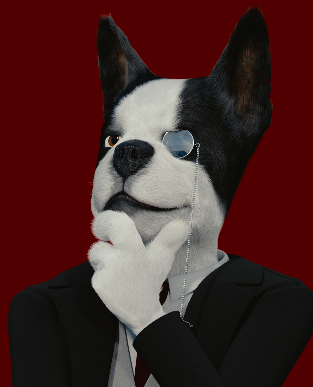
This is a few weeks of work and this test is unedited. With some boost hints with lighting curves. The character is fully rigged but just needed a portrait style photo. Main issues were hair particle placements and getting the fur’s material to look right. Can’t tell you how many holes you get with these simulations… Or the hair being influenced by more than just one finger :mad:! Found somewhat of the cause and the influence isn’t as horrible now:spin:.
Does it read as part Boston terrier or a different breed? Does the hair still seem too long? I still think I may need to work on the clothing material. Especially with the jacket. I have a basic clothing bump/normal on it but haven’t found a good material setup to use for the jacket. I was going for a dull polyester jacket. Please, critique as harshly as you guys and girls want :D!
Heh, cool portrait The only thing I noticed is, that the head momentarily looks like a flat cut-out. I recommend you play with the lighting a bit more. Or maybe it’s because of the intense red background. Kinda reminds me of a dog “Hitman” game cover
All-in-all cool idea, cool project, I’m curious to see what you’ll come up with after a few modifications
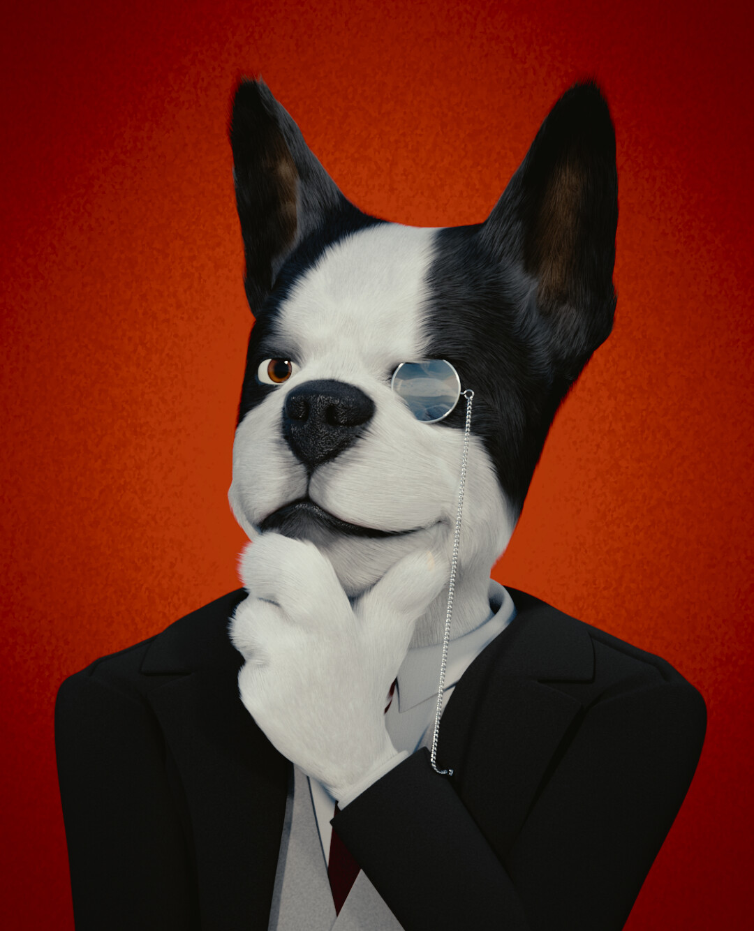
Thanks! I think I have my camera Focus setting a little too high, 78.18. I will post the next render by tomorrow. Changed focus and camera placing a little. Will also have a color gradient in the background. The matte color did throw things out of whack lol. The raw pic will be edited little in post this time around.
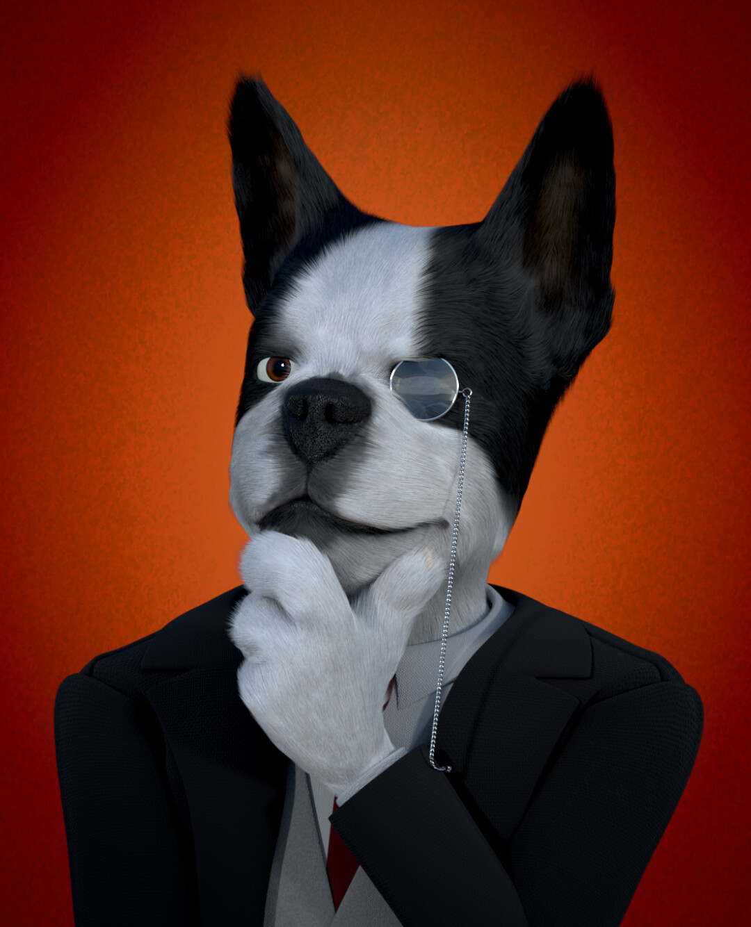
Here is a fuller res that shouldn’t have artifacts in the pic… Don’t worry what I said about the hair because I am still willing to change the fur size. Main issue was when I was rigging the hands and mouth lol.
Because this image … this dog … is “black and white,” you have to think (I think …) about the subtleties of shading in an uncommon way. Right now, I think we see a “blown-out white” area in the center of the forehead, and “featureless black” between the left eye and the left ear. The paw can be seen as (of course … he’s a gentleman …) wearing a white glove.
A very slight “defining texture” might be good on the tuxuedo, especially along the shoulders. The eye, the nose, and the lens all look very good.
And then, my friend, I’m afraid that this image must be thereafter immediately consigned to: The Gallery.
I did update the background but I really need to change the gradient a bit. As sundial said the character was over blown. This is my latest test. Main focus is the character now. Things just feels off about the character or the fur. I can’t place it.
Sorry for been late!
Really nice render, and the hair… so difficult…
Maybe some rim light?
I think that the in the suit the unions of the pieces are to obvious, maybe yo can go more shuttle?
Nice work! The fur actually looks pretty good, although a terrier normally has shorter and shinier fur.
There are some other things you can do to make it look more like a Boston Terrier as well:
They have big bulgy eyes with large dark pupils. Try out a bigger pupil size and maybe some bulges where the eyes pop out.
He looks a bit skinny. While they’re not the biggest dogs, Boston Terriers do look a bit butch and have a rather muscular the back. Widening the neck and back will make a world of difference.
Some long white whiskers and dark spots on the snout could add some detail (look at a reference too see what I mean).
It’s always a good thing to look back at a reference to see which characteristics really stand out. And if you’re making something cartoony, exaggerating those characteristics can be a lot of fun.
I hope I didn’t offend any Boston Terriers.
Good luck!
@Tonatiuh Sorry it looked terrible this morning so I had to fix up several things. Sorts like clothes pinching and making a slightly better cloth material.
Hey! the suit looks so much better now!
I think that the light need a touch or two, Just try to put a light just behind the character, just to get some rim light effect, to see how it gets, I find that the hair looks just outstanding with a rim light. but it may not be what you are looking for.
Here is an update. Kept the body shape. The fur started to reflect too much of it’s surroundings when I made the material shiner. The shorter fur does make the fur seem shiner with it’s last default material. I do like the rim but the hair doesn’t want to catch it well. I’ll try an emission plane behind him and test it.
In my case with hair is the opposite, I get to much translucency… all over! Maybe my way can help you. (also I see some people using a translucency at the end of the shader, to bust the rim effect, in my case I mute it) I’m sure you know all this, but maybe it can help you remember something.
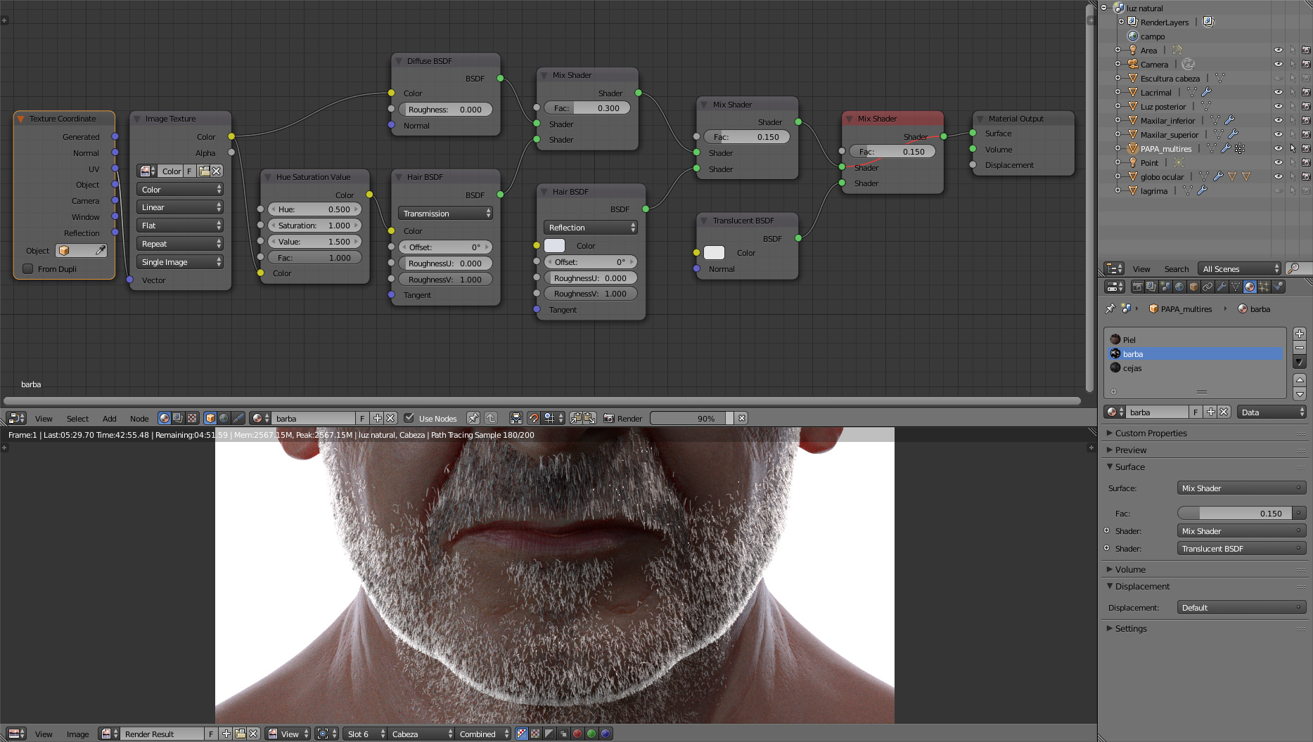
As you can see here this is the node for the hair: (as you can see I fix the color not coming from the shader, but from the image of the colors, Thank you for that!!!)
Here is the emission and pupil edit. Thank you Tonatiuh I will try that translucent trick. I’ve never heard about it before, but first I need to add a translucency to the fur… No wonder I’ve been having so much issues with the rim! Sadly, I really need to study up on hair materials. I need to adjust the whiskers as well so they will be seen. I am starting to wonder if the background is just a little too blurry. Just only a few more days can I work on this. Got to go up to Michigan for a week to see my family and siblings.
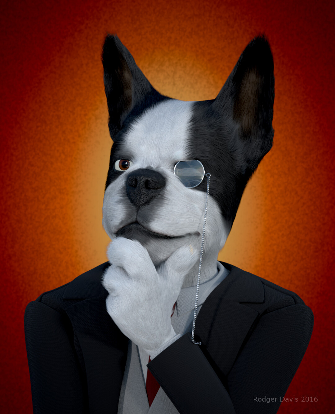
Here is my final render. The translucency was a bit too much at the end but I did add a transmission node. I am very happy with this result! Thank you Tonatiuh and everyone for the feedback and help :)!

 The only thing I noticed is, that the head momentarily looks like a flat cut-out. I recommend you play with the lighting a bit more. Or maybe it’s because of the intense red background. Kinda reminds me of a dog “Hitman” game cover