Update:
I finally got a good expression. I cant say is perfect but at least I got one. I tried to copy the conductor from image above. Im not starting to sculpt the hands and the clothes.

nice work!
Here is my update:
It took a bit more than usual. I finished sculpting the under cloth and Im almost done with the main one. Im still learning the folds. This is my first cloth sculpt I think.
Update:
I finally finished the cloth. I hope Ill be done with the hand and pants soon so Ill publish them on the same post.
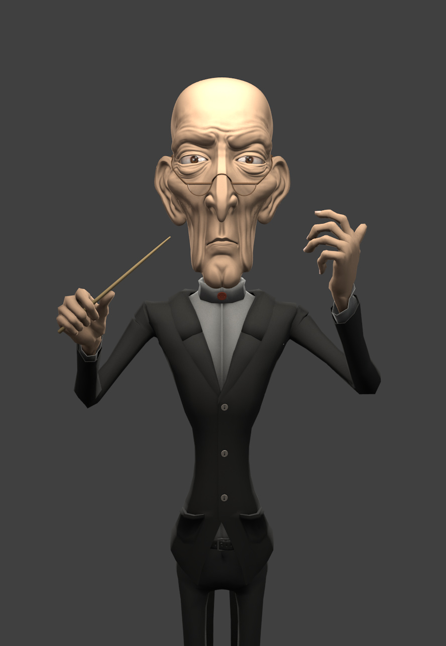
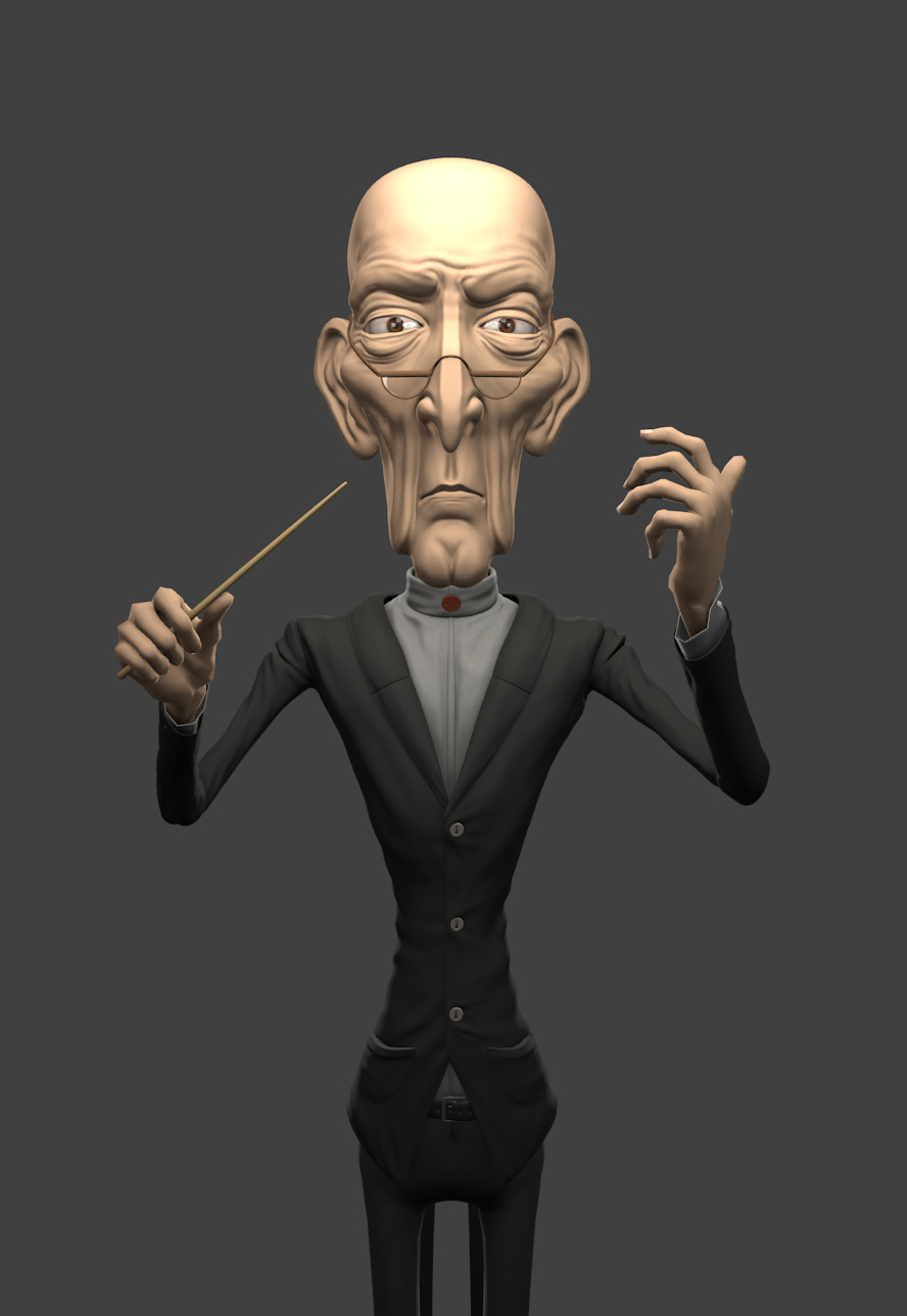
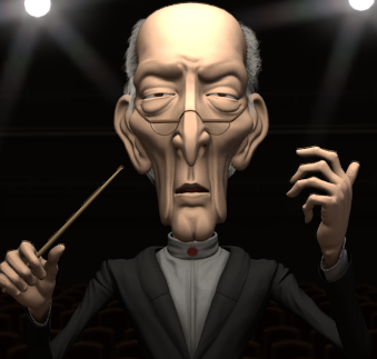
Here is the render. Critiques are always welcomed.
Update:
Im finally done with sculpting cloth. It wasnt that much of a pain as I though it will, It was actually fun. ![]()
Here is the clay render:

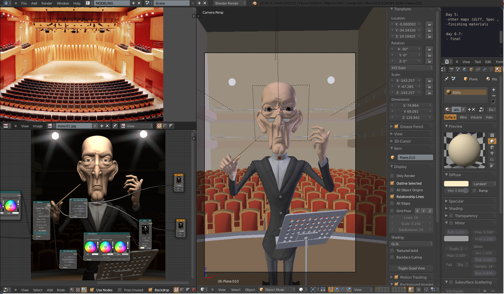
Im now starting the hands but I faced a problem: When I sculpt on the hands, It looks like the normals are facing in the opposite direction in some areas but when I check them, everything is alright. ( the topology of the hand is not perfect because its a hand I did a while ago)
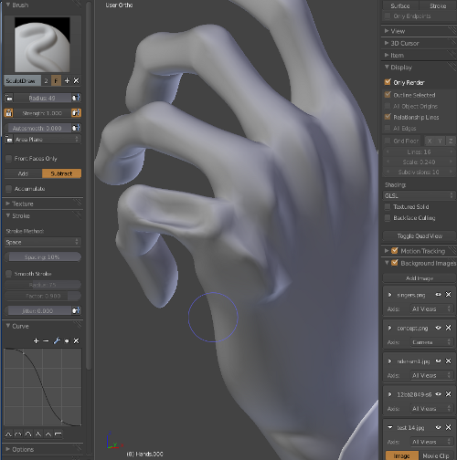
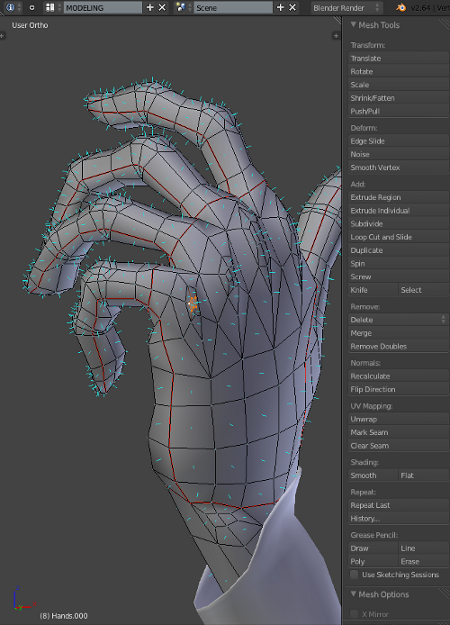
I did some searching now and I partially solved the problem. If I turn from Area plane to View plane I stop getting the normals problem but I have to sculpt more carefully.
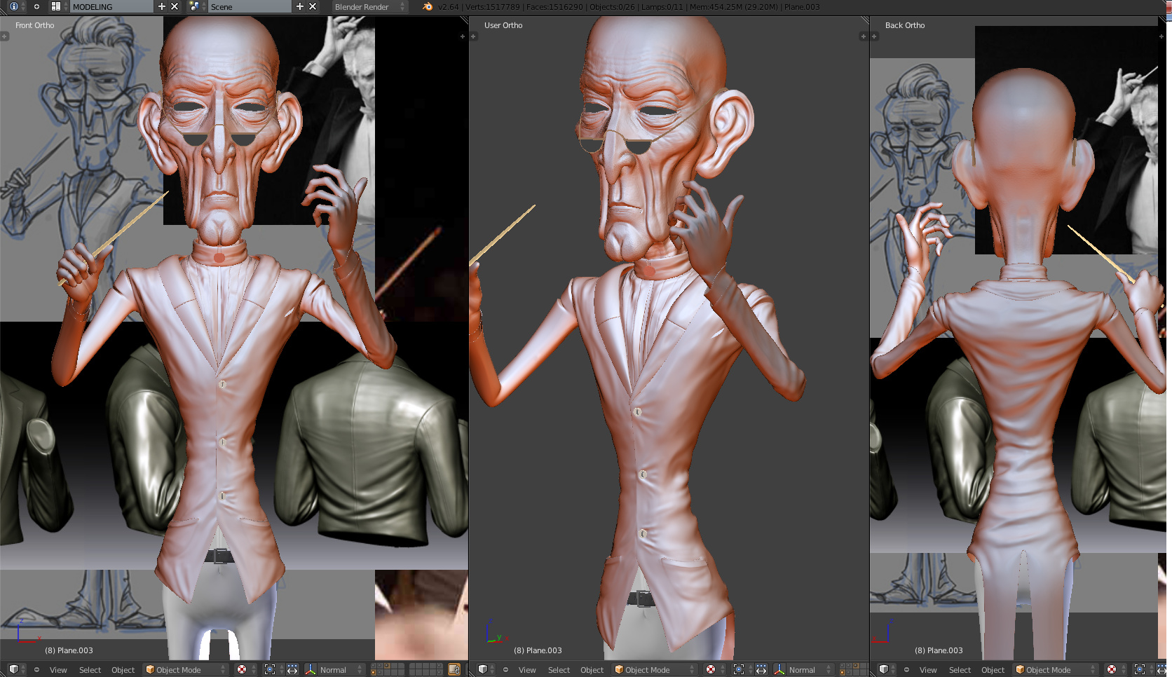
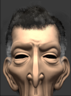
Meanwhile, I blocked the concert hall and I adjust the lighting.
Here is another clay render: ( I couldn`t resist to add some glare and play a bit in the compositor)
it looks like you had your brush set to ‘subtract’ rather than to ‘add’.
It doesnt metter if its on add or subtract I still get that thing. (I didnt changed from add to subtract when I was sculpting the hands above) It is something wrong with the brush or with the normals. I tryed other build and I played a bit more with brush settings and now work almost fine on the draw brush but I thats the only brush which works ok.
I also tryed to export into zbrush but Its even worst. It is nearly impossible to sculpt on that. Anyway, I finished one hand so Ill hopefully finish the other one the same way and it will be fine.
I tested the new tyntopo trunk, (very cool build) I enjoyed that a lot. I was also a bit lazy today thats why Ill post a new update tomorrow.
Update:
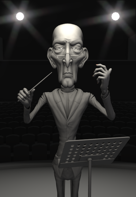
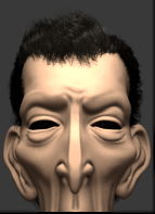
I finally finished sculpting, now Im serious. I added some more details to the concert hall and I played a bit more with the lighting and camera etc. Im not working to the hair.
Loving this but one thing stands out to me and that is the way he is holding his baton. If you look at the example photos you posted, they tend to hold it much more delicately. Excellent work though and great to see your progress.
I think the very bottom of the image (the stage) should be a lot darker; It’s kinda throwing off the balance of the composition.
Also, the perfectly symmetrical view of the head and body is really distracting.
Nice, this guy is looking very good! I like the stylistic look of his face. Great crafting of a character. Did you use edge-loops or some other method?
Thanks to all for the encouragement.
I know the hand is not perfect because I havent got enough time to rig the model so I posed him manually. Ill maybe play a bit more there with shape keys because I already sculpted the details.
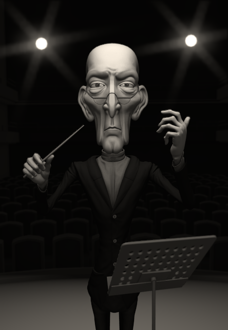
The model is asymmetrical (notice the eyebrows and some other areas)
Ill make the floor a bit darker because if I turn the light down this will affect the character too. Im not sure what you mean by edge-loops on this situation. The whole model is made of edge-loops and faces etc… ![]()
Anyway.
I was a bit busy yesterday because I kinda started the new project. It started being a test/ study with tyntopo but I turned out being a bit more that a test.
So I wasn`t able to finish the hair yet but here is a preview.
I added some stuff in gimp to make a idea how should look like.
I still think that the hair is too dark for his age.
I actually quite like him bald. Perhaps something like http://www.moviepilot.de/files/images/0487/2774/Sean_Connery.JPG would look better than full grown hair?
Hehe thanks a lot mate, that was just what I was looking for. You are totally right.
Ill make one more test render with full white hair and if doesnt look good I`ll try that. 
Looks really good so far. The one thing that keeps bothering me though is how similar both sides are. I noticed you do have some slight variations but to me it isn’t enough and messes with the whole character. I think some more obvious variations are needed.
Update:
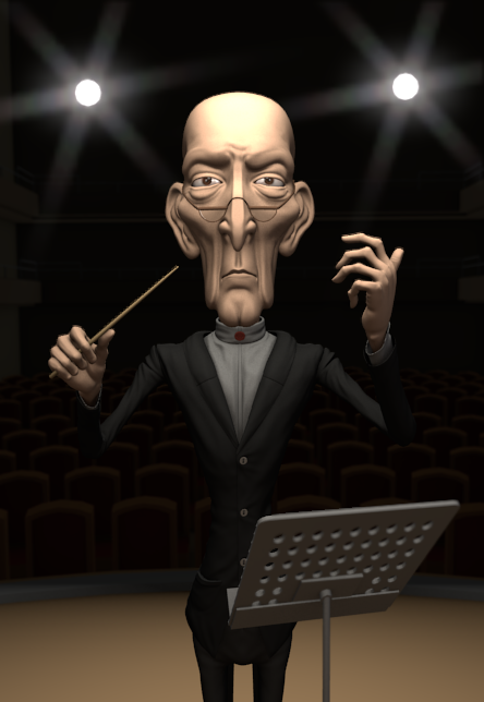
I end up with this haircut although I found that Beethovens haircut might work too but Im not sure if Ill manage to spend time on that. I also made the face more asymmetry and I found that he might look nice with eyes close too (like he is feeling the music or something) I added the eye lid movement as a shapekey so I can switch between eyes closed and eyes open. Im still not sure what should I use so any opinions are welcomed.
When playing with the eyelids and shapekeys, I noticed this creepy and funny face. He looks like he is sneezing. lol
Soon Ill start baking textures normals maps and all that stuff which means Ill start texturing so stay tuned for that. ![]()
Update:
Im progressing a bit slow unfortunately because Im doing other project at the same time but thats fine. :) I finished baking the normal maps and cavity maps and now Ill get into gimp and start painting some textures.
I also added the eyebrows. Ill add some hair on the hands too but that will be later. :D I played a bit with SSS too. Thats all for this update.

looking great, man.
i like it, wonderful project.