Tick of the Clock [WIP Thread]

Hello

im trying to do a render of this concept art for training purpose.
https://www.artstation.com/artwork/vlar6

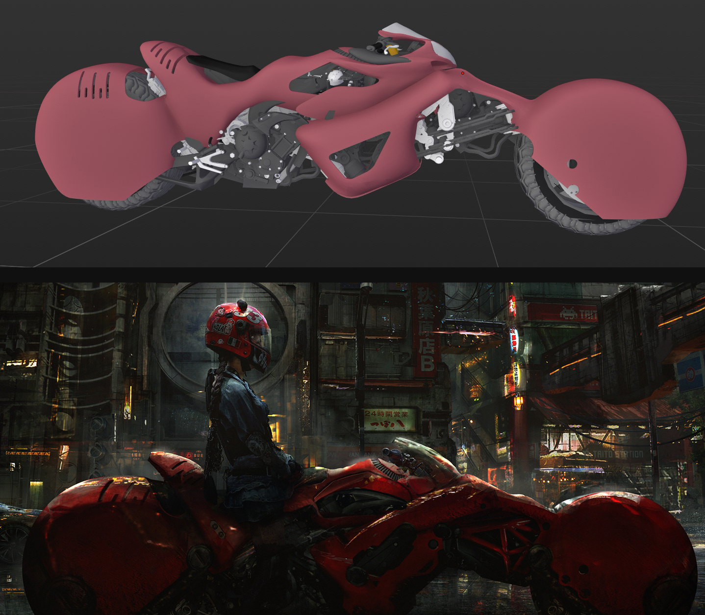
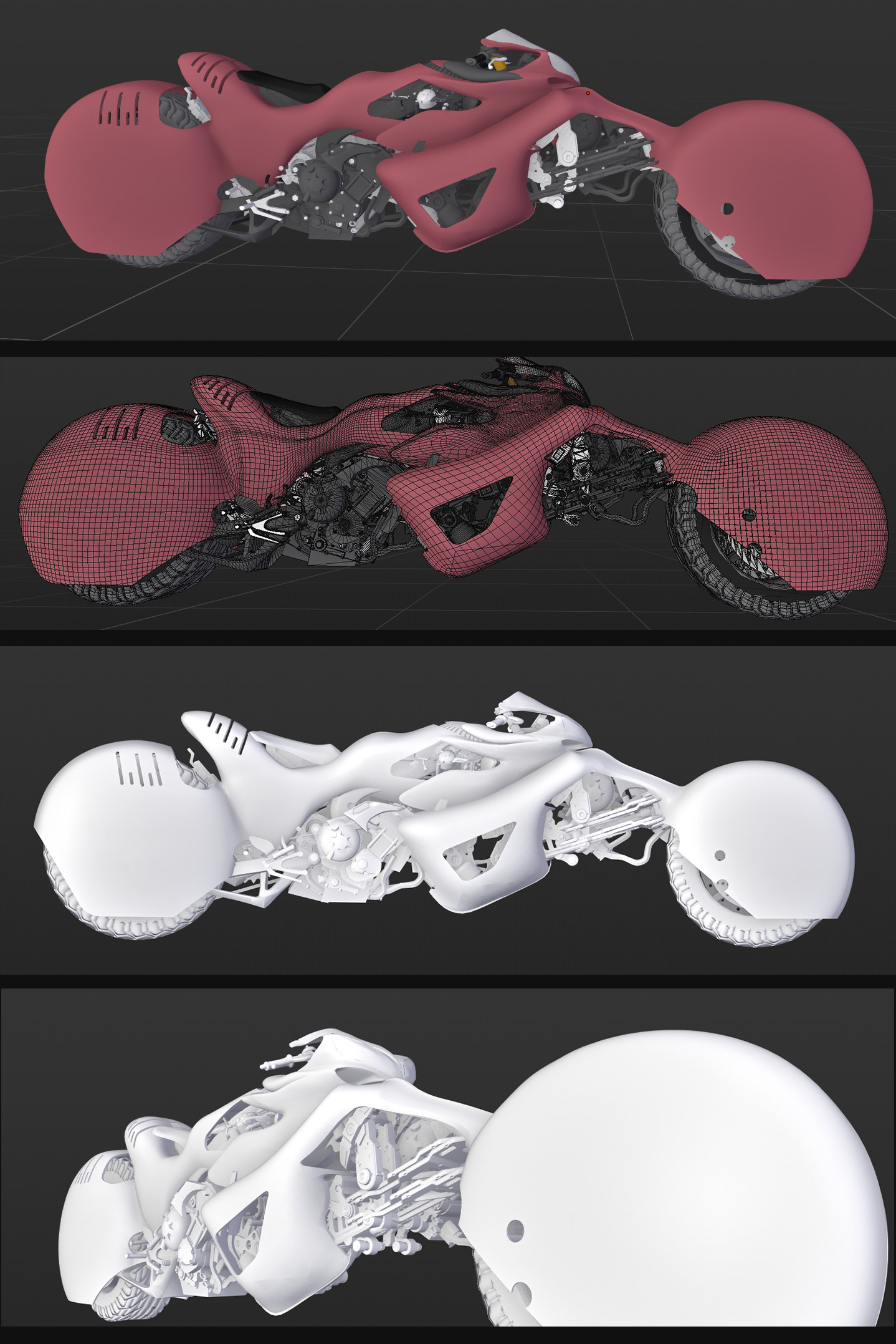
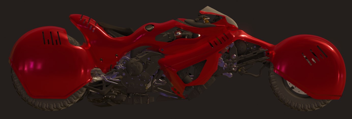
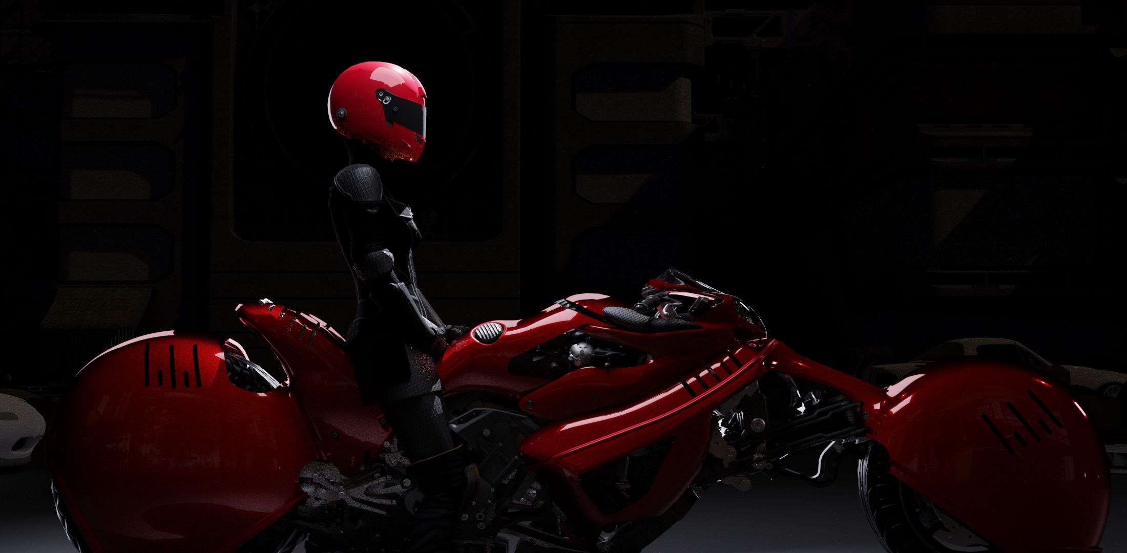
this is my current state,im currently still in the modeling state, texturing is next. Its also my first attempt at hard-surf modeling, so please if you have any advices on the design, modeling ect, tell me. :slight_smile:
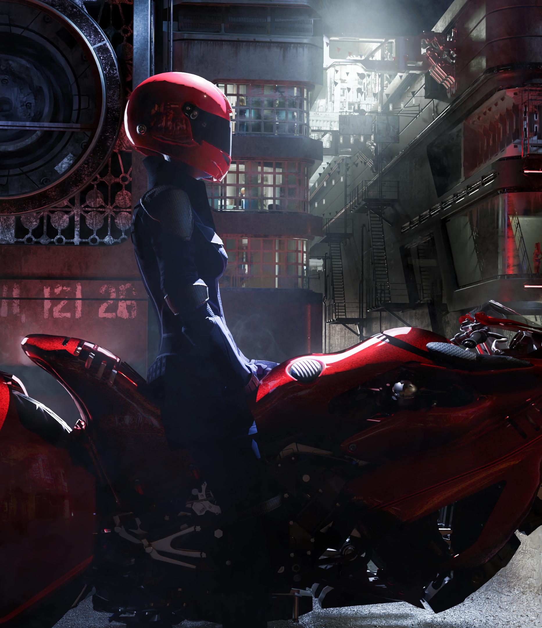
this is one of my biggest project yet, normally i use a lot of premade assets, this is kind my first step into becoming i hope an environemental generalist.


current state of the bike below, i got my hands dirty with the main metallic sheet body of the bike the hardsurface then use this free model from sketchup wharehouse https://3dwarehouse.sketchup.com/model/5e4fe8a57130744dece0b0a75f5fc9f6/Bikes-Yamaha-YZF-R1-2007 and kitbash some of the pieces for mechanics and bike head, also use this free kit-ops pack https://www.kit-ops.com/store/andrew-averkin-kitbash


current state of the decor, Kit-ops https://blendermarket.com/products/kit-ops-pro-asset--kitbashing-addon and Box-cutter https://blendermarket.com/products/boxcutter are real time savers ! killer plug-in really.

6 Likes

i have a big cycles bug related to modifiers. this is not present for eevee renders. I hope its fixed in the last release otherwise im stuck


bike done added some minimal decals from decal machine add-on https://blendermarket.com/products/DECALmachine, also cut some holes with Box cutter

Okay, got a free rigged model from adobe maximo https://www.mixamo.com and adjusted the pose.
also added a free helmet from google wharehouse.

next step: a new skirt in marvelous designer, with a lot of highly defined wrinkles. and some hairs.

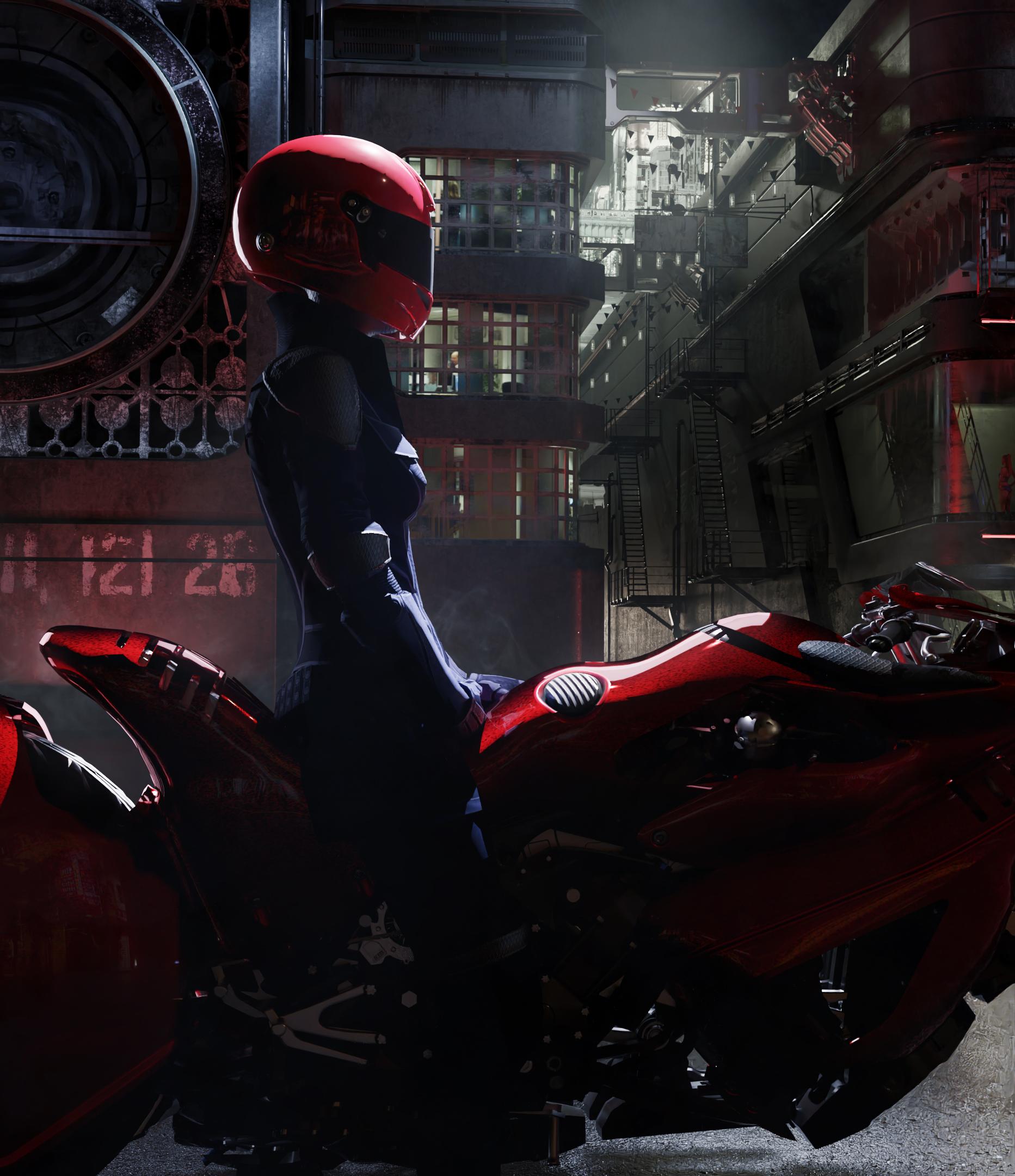
The seat angle of the bike look weird, also need to correct that

Well see what the bike look like when rendering… right now I really don’t like te design of the middle part… I will follow more closely the reference if it doesn’t look good when rendered


did some changes
i may need more details in the building just behind :thinking:

2 Likes

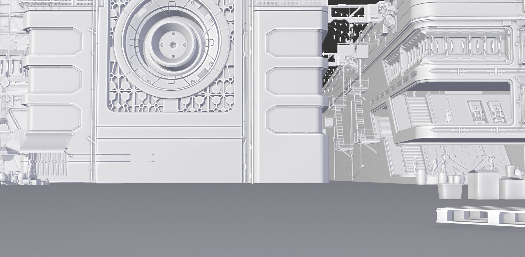
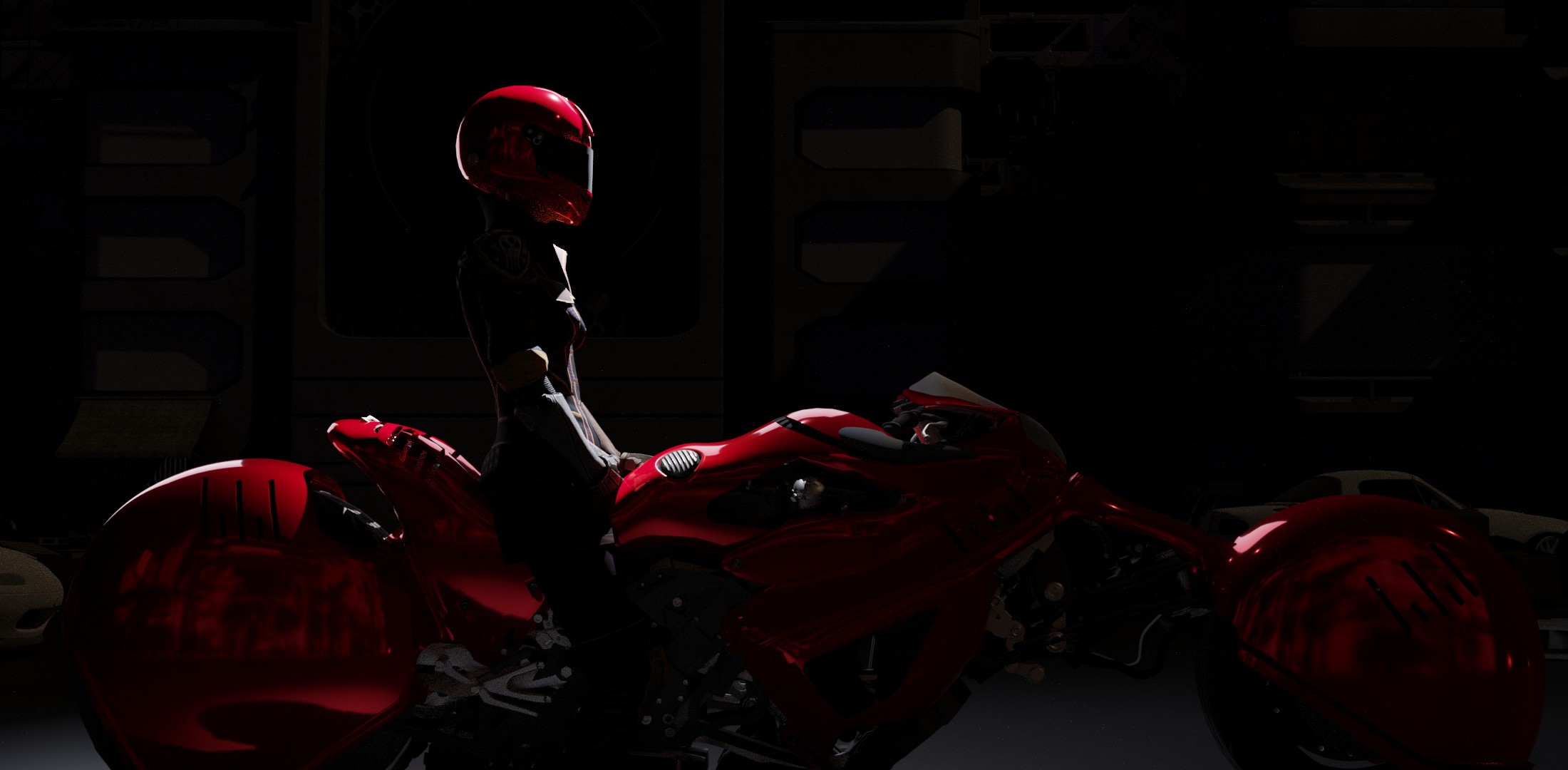
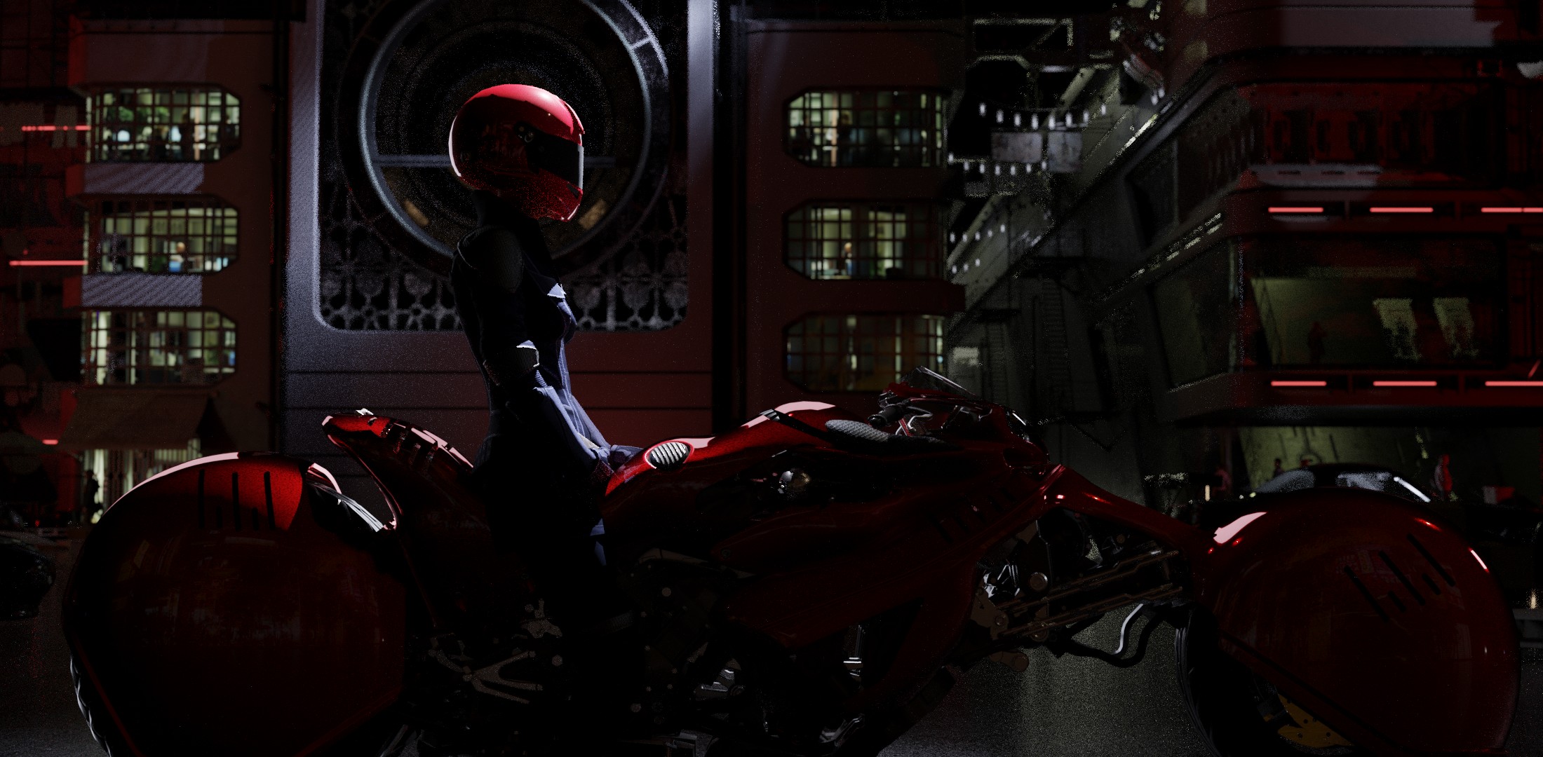
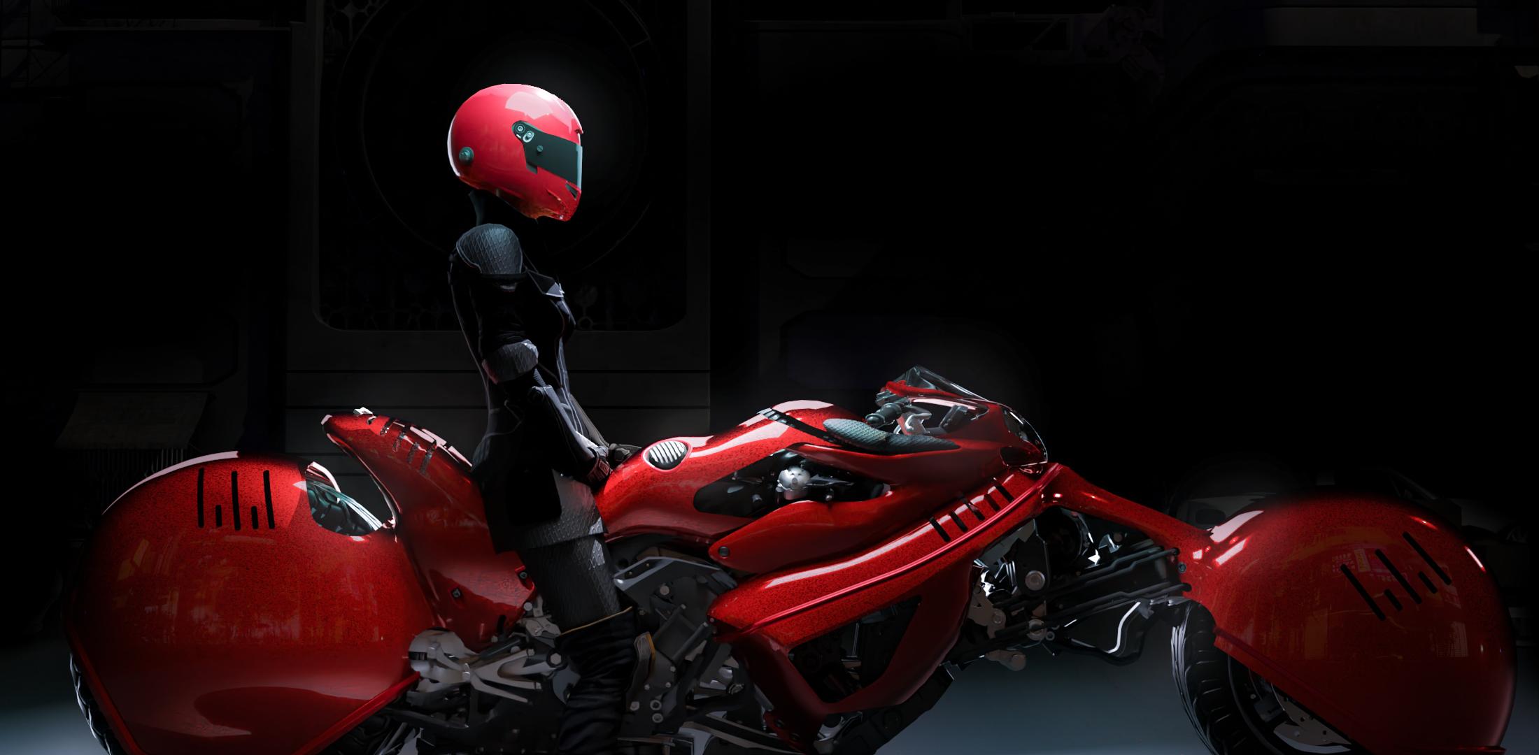
Okay got a little bit of time
did some quick triplanar material set up, i want no uv map at all in this render
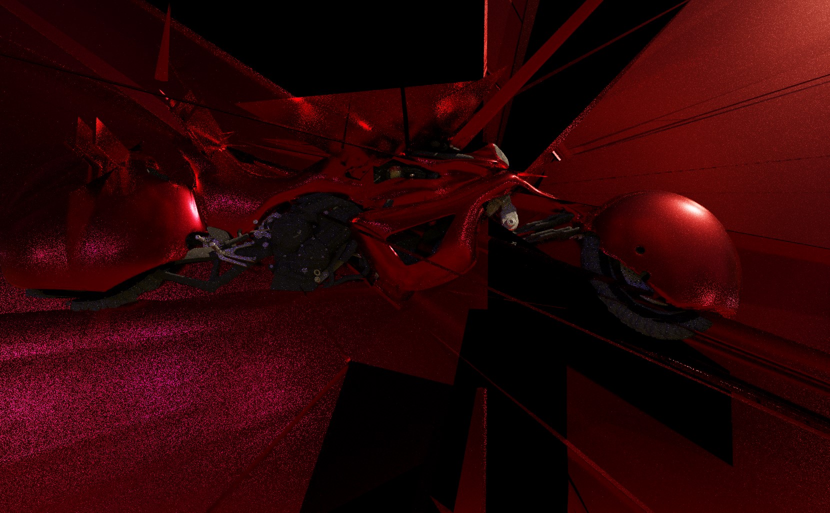
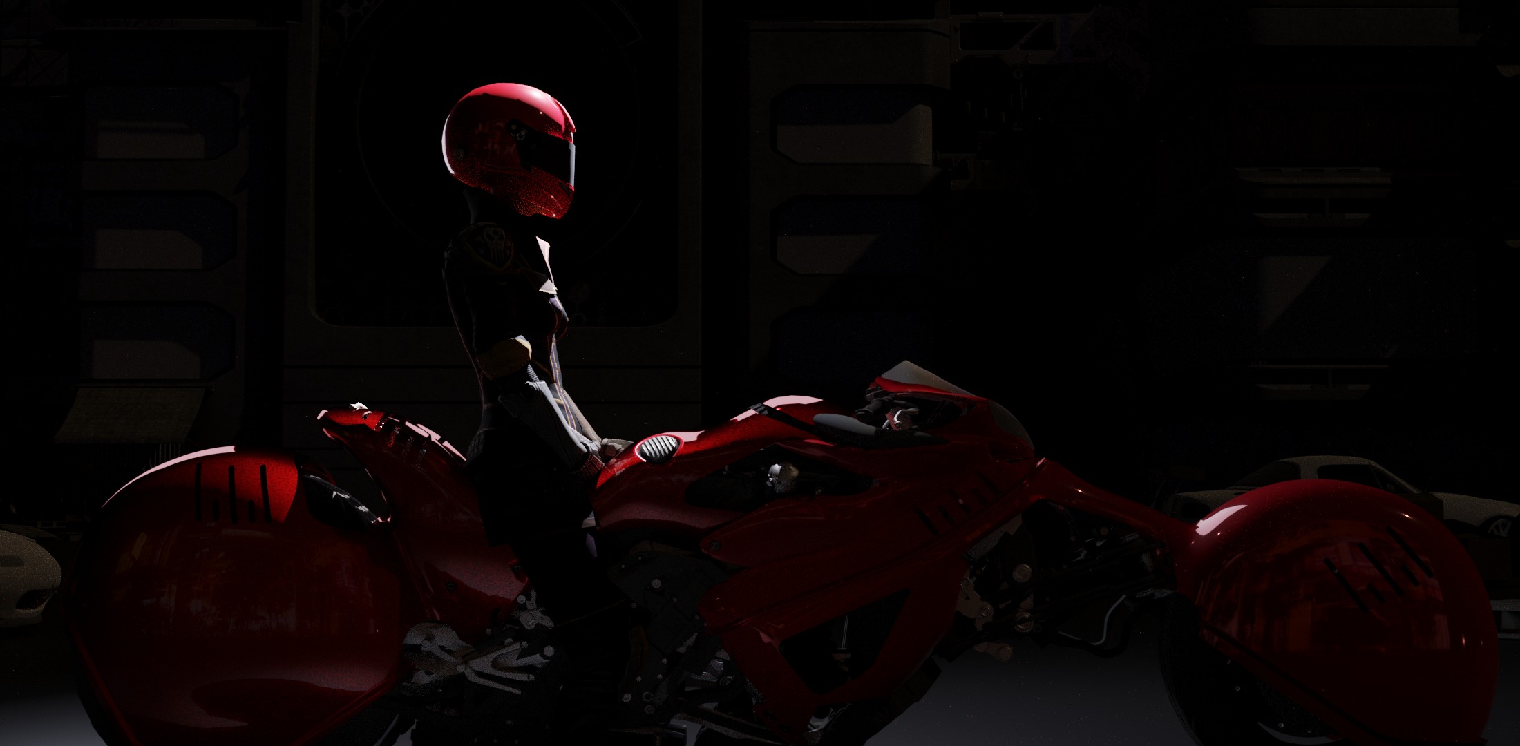
now its time to experiment with the light

here below is the same light set up but with 3 different car paint material


trying the back of the city


blue light

thats it, i got it

i didnt realise but the color form a triad

i need to improve the composition of the upper right corner with some light spot

Annotation%202019-05-12%20214243


slowly getting there

almost there ?


hmm now the concrete is more dark … ill add more light then


no my scene is not a mess, not at all :thinking:

added some car headlight, some green light background, and some plane smoke


i think it need a bit more smoke
i will aslo try to add a graphitty, but it may be tricky because i dont have any uv map in this scene

Final, post process next

GIF post process in 3 step, theres a step 4 wich is just some desaturation
compressed, bad quality
axis

here is the final render just below

all of that is possible because i saved my image in PNG 16bit, otherwise i couldn’t tweak the black that much

i will do some other view later this week

i dont know is it was fine before or not? it was quite too much in the dark ?

4 Likes

Hi BD3D
You’ve done a great job, Loved It!!

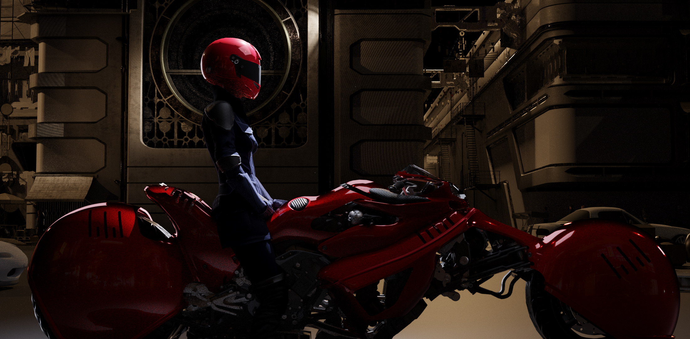
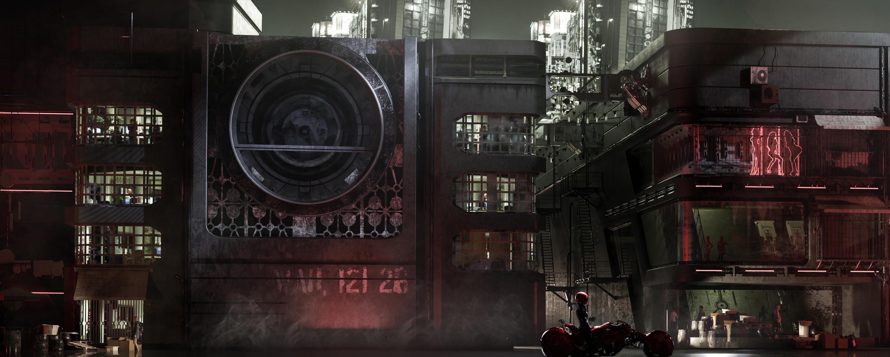
Just one or two things will add. When i compare your final image with the original concept, i realize that this is a scene, maybe of a marketplace(?) at night, and so you might want to add some sign boards it will help your scene pop out a bit more and it will add little more colour in the background, also, since we are on colour, the lighting on the character could be a little warm like its coming from a street lamp or something.

Hope this helps, all the best.:+1::grinning:

1 Like

hmmm, i could try the warm light on the biker, the problem is that it may beak the blue/warm light contrast :thinking:

also id like to put more signs but where ? im afraid that id may be too much ? :thinking:

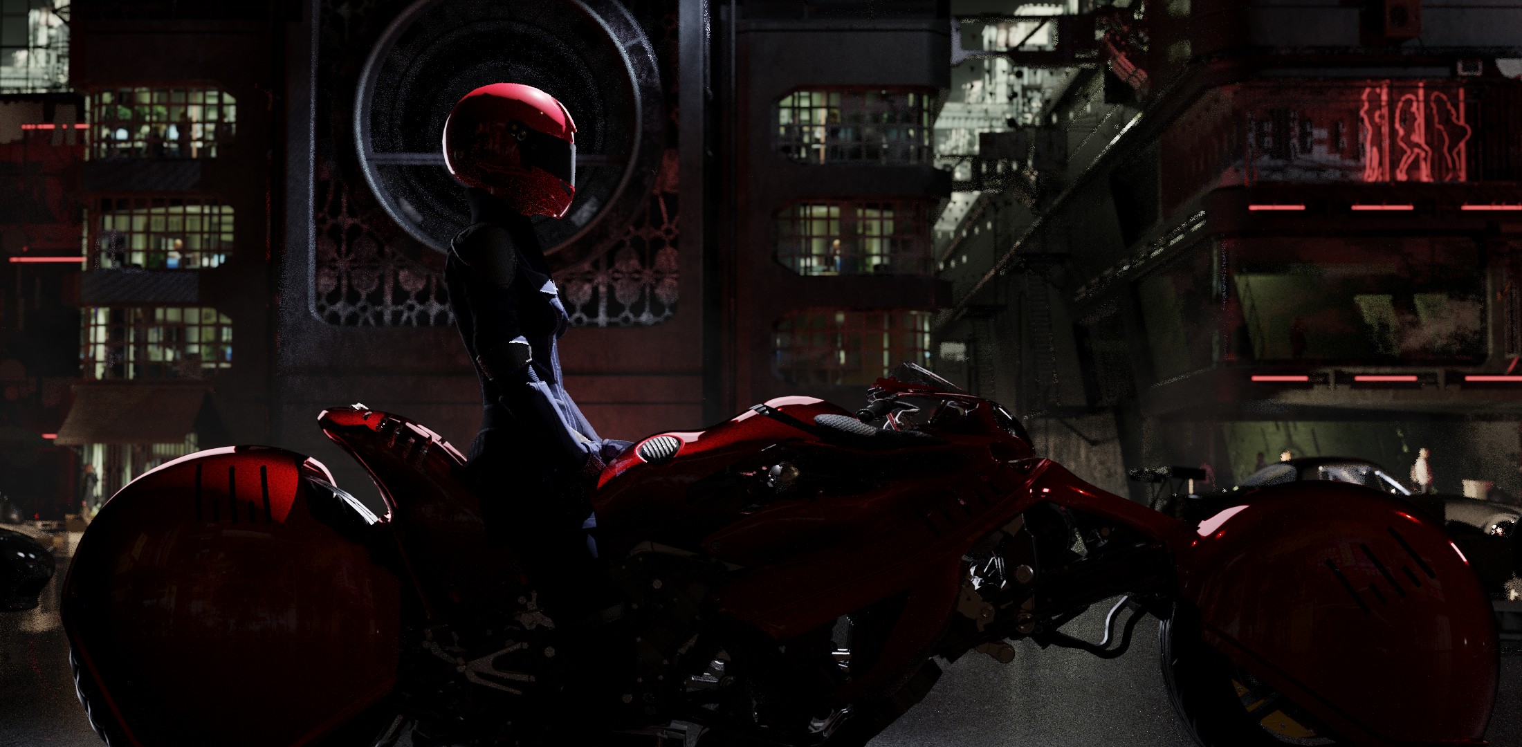
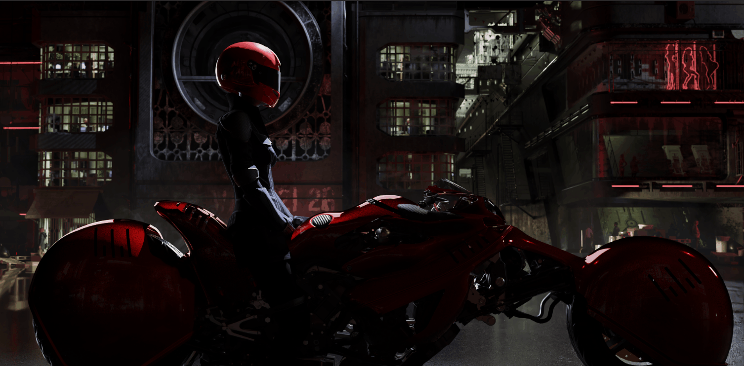
any more feedback about this art ? i don’t know what to think about this one, after going a bit on artstation i feel like its quite bad but i dont understand why :grin:

Okay

some other shots before and after


meh too much post fx


this one is good


hmmm dont like it, to the trash

So ill take this one, that i just denoised with D-NOISE

and this one, which is the post process dimmed 50%

1 Like