I’m totally with you on that.
Where on earth you saw a 3d software working like this?
This is the most convoluted way of work man.
What’s convoluted about it? It’s the most natural thing. When you draw, you put your pencil and your eraser next to your paper where you can reach them, not on the shelf or in your desk drawer, as neat and organized as that might be.
Next to the paper is where it is now, as you can have the tool settings next to the viewport at anytime. You want it on top of the paper, which is weird.
No. The topbar being immovable, it is quite literally where my wooden shelf over my desk used to be before I had to remove it from the wall to make room for a larger screen.
Please don’t make the tired old argument of me using a non-typical setup. Monitor sizes only get bigger over time so while it may not bother you today if you’re using a small one, it will bother you tomorrow when you upgrade.
Oh, I was talking about the tool settings in the properties editor. I don’t see the point of using the topbar for settings.
The properties editor is fine, I was only talking about the top bar. I mean, come on. If you have to duplicate all your tool options into the properties editor, then the topbar is clearly not doing its job. It should be cut.
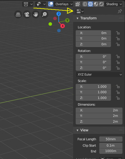
I do not mind the tool options remaining in the properties editor. It’s good. I would however like a panel like the old t-panel or n-panel, or even a little pop-up-on-demand menu where the tool options could also be found, so that a standalone 3d editor wasn’t functionally crippled without the props editor or topbar.
Well, not quite. You still can’t actually get rid of the topbar. But that’s a nice step forward 
Why tool options are symbolized by two progress bars on an otherwise empty line where a nice descriptive and unambiguous text label would have fit is a question for another time 
What you mean?

N panel 2.0 
This would make many people happy, I guess.
I approve of the new UI… it’s nice.
One thing I haven’t figured out though is what is the new command for SHIFT+SPACE (full-scale of a window section) …haha… does anyone know?
edit: DOH!
…actually… this is a little weird. I used to be able to hit the combo anywhere within that window and it would maximize… Now I have to hit the header or something in order to switch back and forth
Ctrl + Space is not working?
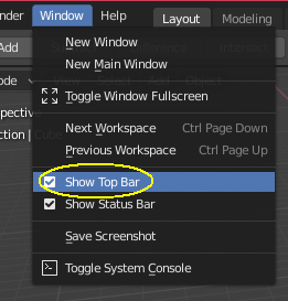
Topbar can be hidden in any layout, why not just hide it and use the properties editor? The tool panel in the properties editor is what we had in the tool panel in 2.79 for the most part. Top bar is great for using a maxed window workspace, my only gripe is that it cannot be centered to the window instead of left justified.
I believe easier customization will be possible once we can click any part of the ui and like in 2.79, show source so we can edit in scripting workspace.
Didn’t see your post and already replied as well.
yes and no…
It will not work when hitting it in a minimized workspace window to maximize… but it will go from maximized to minimized when hitting Ctrl+Space while having the mouse hover over the bottom bar.
It will not work like in 2.79 where I could just hit it inside the workspace window… no matter where the mouse is (as long inside the workspace window which you want to maximize or minimize ).
This is a little frustrating because this is what made working in Blender super efficient. I zap in and out from editor window to editor window. Right now in 2.8 I have to click the header of minimized workspace hit right mouse and select maximize …
hmmm…
What you mean by "minimized workspace??
one of the divisions , I guess.
Post like these are helpful. Part of the problem is that one significant camp dismisses all critique of the new UI as being shallow and rooted in unwilling to deal with change. But it would be more proactive to Blender development if the community expressed what changes or adjustments they’d like to see, even if they’re mostly satisfied with the 2.8 UI. After all, nothing is sacred, not even right-click select.
Can we get some constructive discussion going on about what the weaknesses are? It’s obviously going to keep undergoing updates and revisions, and a few enterprising developers are going to be making paid add-ons.
See, this is what happens when you say something about Blender and your build is a few days old 
Nice!
