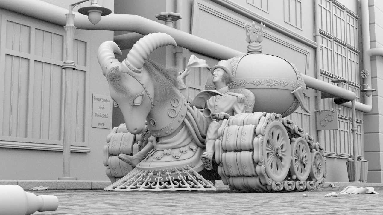
the way my eyes sees it is as follows, the head or the left post will grab your attention, the left post directs you back to the head again, the right horn directs you to the man and even if the horizontal pipe leads your eye astray at this point it is interrupted by the boiler which then directs you to the man and the tracks. this is all OK if all other eyes work like mine.
I however think it is a good idea to keep the right post dimly lit, also maybe the vert pipe in the right corner to be dimly lit because it is maybe leading the eye out of the picture.
minoribus, honestly I would have said the setting itself. And, then it dawns on me you might be thinking the tank tracks. To be frank I don’t know. Hell for that matter it could be your precision modeling.
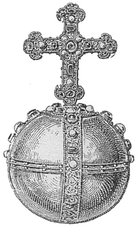
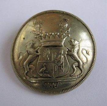
Well, I really didn’t thought of the tank tracks, when I asked what was the German flavor. Did we invent them? I don’t know. I was thinking of the boiler, which reminds me of an imperial orb. Here is an image of the Imperial Orb of the so called “Holy Roman Empire of German Nation” - they called themselves like that back than
Thanks for the heads up on the second street light. I fixed that. And I gave your suggestion with the bottle a try. I kind of like it. But I don’t know if I keep it, honestly. It will be heavily blurred because of the DOF. Could be helpful or distracting, once we see a real render.
High Key with a vignette or maybe even low key.
I thought about a high key lighting, so far, and that’s what I’m playing with behind the scenes already.
@Speed, thanks for the confirmation about the composition. I’m glad that your eyes see it that way. We have only a few seconds to catch the judges’ interest, I think. And thanks for your kind compliment
Cheers, Xerubian, and thank you. And I understand your point. Very often I see a good clay render and after a while the whole thing is textured and falls apart. Too sad. And there is no guarantee that it won’t happen here.
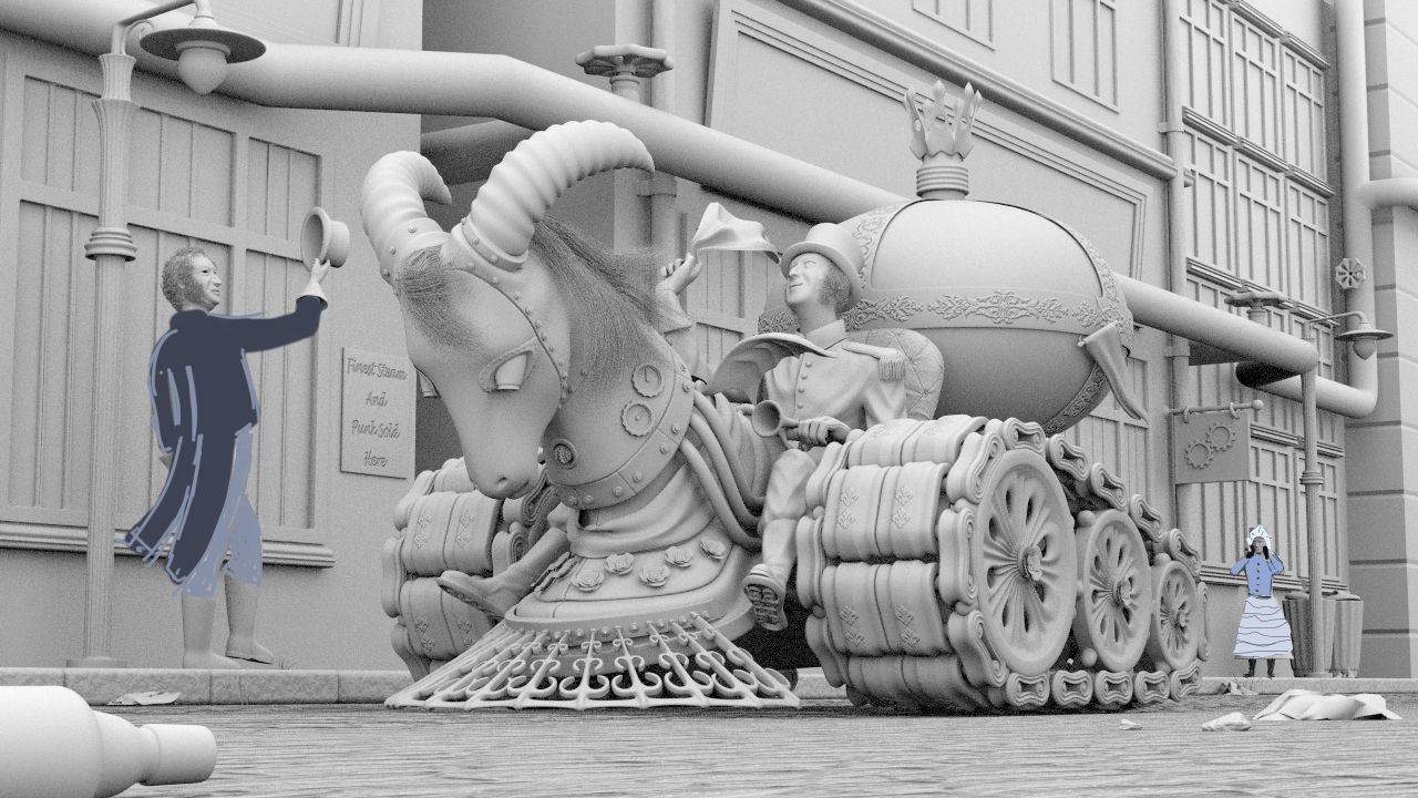
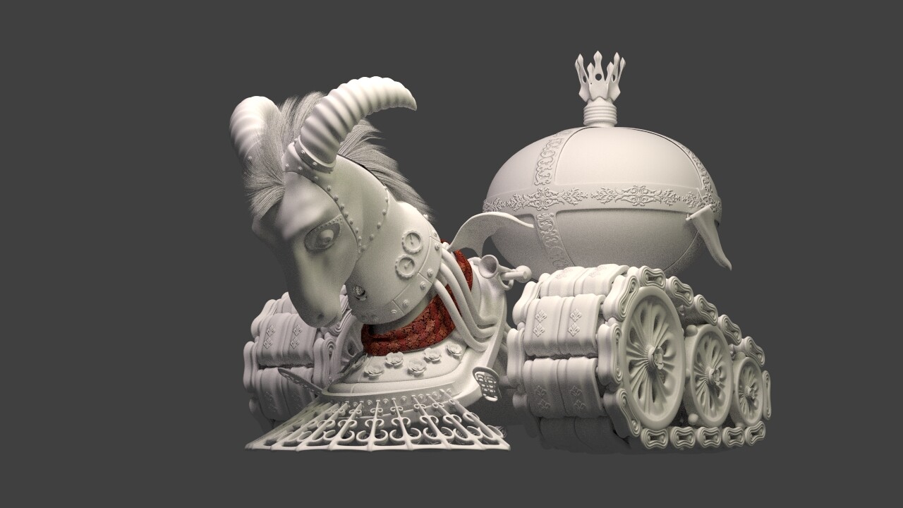
Now I’m onto the last modeling tasks. Here is again a quick paintover for the last two protagonists. Done with Krita. I must say, this program behaves nicely under the pen. It offers canvas rotation - yeah, that’s what I need.
Of course the man on the right will get another face. My wife said that the little girl on the right is too much. Is she right?
Now here is one thing she was right with. She said the ramhead must be more masculine again. And looking back this had unwillingly turned into something young girls would like
Something I just noticed now as you added the man on the left who according to the light-post seems to scale, is it just my eyes or does the driver look oversize?
minoribus I agree with the wife and will go a little further. I think your story and composition were just great with one character. To me he is acknowledging someone in a upper window. A really strong composition and he could be the only real color in the frame. Most of the rest being conductive material.
Seeing the bottle in the corner I have to wonder what big would look like moved about 1/4 off the edge. With no top. Would it reflect all the color. Something to maybe play with at the last. No way of knowing now how much interest, depth, it could add or if a total distraction.
I like the changes you made to make the horse more “masculine”. I do agree with ghost regarding the new man character, in someways, it may be taking away the viewers eyes from what is the main thing you want them to focus on, but at the end of the day, this is an artistic choice. If you do choose to keep him in there, than I would have the driver looking more and acknowledging the sidewalk man rather than looking in the air.
I think I also agree with ghost on the bottle… if it is laying in the street, most likely it would be without a cap.
Personally I hope you " go to town" with the texturing on the entire scene.
So the majority votes against the additional characters, which in this case means 3 against, 1 for them (me) and 1 abstention And I can understand your point. The image is more readable and easier without the additions and there is exactly one clear subject to focus on.
But now I’m in a conflict. The original story was that Mr. Scent is a municipal officer (hence the uniform like elements on his clothing), who’s job is to care for the scent of the city. He is the Scent-Man. Therefore I added all the floral elements and the ornaments and so on to his vehicle. That’s because of the nature of his duty. And I thought that in the final version the boiler will emit flower blossoms. I tried to depict that in the next q&d (quick & dirty ) paint over. The red dots are the flower blossoms which are coming out of the little holes in the boiler. And his vehicle will be bright and blue and red and gold and polished and flamboyant. In contrast to that is the debris. And the walls of the buildings will show a considerable decay. All in all the environment will be dull. And the pedestrians who show their appreciation are an important part of that storytelling. He’s accepted and his service is welcomed. And he knows that and enjoys it - hence the vague greeting with the old fashioned handkerchief in the air.
(Maybe the more feminine and softer ramhead will work quite well with that theme!?)
If I skip all this elements there is a somewhat kinky gentleman on a kinky vehicle, taking and enjoying a ride through the streets. Is that enough? Does that make a story? I need your help in this point, so let’s discuss this a bit further,please.
Edit: Of course everything is and must be kinky - hey, it’s steampunk
I would say stick to your guns, having a backstory gives a consistency to the image (even if it is barking mad). The only thing I’m not so sure about is the hair.
Also I really like the discarded bottle in the foreground.
minoribus you have a point. I went looking for German city vehicles from the turn of the century and came up with very little. My thinking was a insignia that said ‘German City municipal vehicle’. I do have one thought. With two small openings on both sides of the tank the rose pedals could form almost a V coming right back to him. Great idea, I can’t think of anything else that would say scent.
It’s coming together nicely as the scene fills out. I think you can get away with somewhat less story with steampunk, provided you fill that in with needless gears and trinkets. The vehicle is looking a bit too functional and symmetric. I would take a swing at crazy ornate junk that servew no obvious purpose. The gears on the neck are a good start. I also keep coming back to the rams head. I think you are right that it is too toyish. My gut feeling is push it one way or the other. – that is, either trick it out mean and punk or go for a laugh and make it clearly a pink toy pony. It’s so fun to watch all these scenes, because of this style you have absolutely no idea what comes next. Keep it up!
Despite from that wifes are always right :), in my opinion the woman contributes a lot to the story playing in my head when looking at this picture. It’s one of the typical nice side-objects that you notice, after your eyes leave the point of interest. Don’t highlight her too much by contrast or colors, but leave it!
I think you can get away with somewhat less story with steampunk…
After doing the Google thing for half an hour it seems Photox has a point. But, then if a book in the Steampunk genre was being illustrated for the cover… since those illustrations are usually a specific scene from a book. It seems you have a dilemma here minoribus.
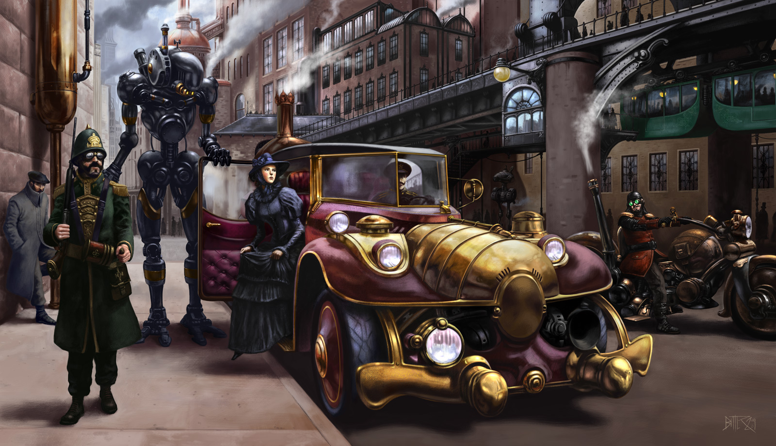
On the one hand yes a kinky gentlemen riding through the streets could be enough. And, on the other… In my little research I happened across the picture below. City street with not a lot of story telling going on. But, with enough elements where the viewer starts connecting dots. But, this was one of the most elaborate ones by far. Don’t you love it when everyone is right.
Carel de Winter, clockmender, Harleynut, Ghost, Photox and centauri, thanks for all your input and your thoughts. I appreciate the time you take to comment! Great to know that my concept isn’t completely nonsense and comprehensible in some way
So let’s continue with the original concept. Here is where I am right now.
I think I’m more or less through with the modeling. Perhaps I take your suggestion, Photox, to add more useless ornaments. But facing only 12 days left I must take care for the materials, lighting and compositing now.
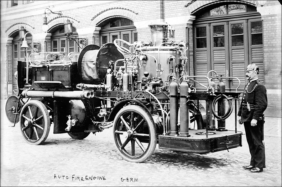
Thanks for the research and the reference images, Ghost. Especially that one with the contemporary fire engine is interesting. Perhaps I should add more of such pipes when time allows.
Thanks again for all your input and now let them colors and that light come. That will be fun.
All that beautiful modeling and you still persist in showing the top of the foreground street lamp that kills the perspective and forced you to shrink the man on the street (midgetize him) out of proportion with the driver. And, I hear you yelling, “But I want that street lamp to show!”
I’m honestly not getting this difference in scale between the figures. One is a much larger man. That could be the difference between 5-6 and 6-2 Imperial of course. No one mentioned the second (Right) street lamp being raised which is now perspective in reverse.
But, the placement of his right foot does give me a problem. That simply can’t be right if drawn through minoribus. Even with foreshortening of the left that right leg appears to be longer. And, with the clay renders I just noticed that. That pedal could be drawn back and angled up a little more. Now that has me wondering about how long to stay with clay renders.
IMHO it’s a whimsical illustration from a period which existed but a time that never did. And, from what I’ve seen Steampunk pieces take liberties with proportion and perspective. Steampunk is often referred to as the ‘greatest era that never was.’ You really need to see this with some material on it, minoribus. If this was a drawn illustration you would simply flip the visualization paper over occasionally to get a fresh view. But, in our viewport and with a clay render too…

 And I can understand your point. The image is more readable and easier without the additions and there is exactly one clear subject to focus on.
 ) paint over. The red dots are the flower blossoms which are coming out of the little holes in the boiler. And his vehicle will be bright and blue and red and gold and polished and flamboyant. In contrast to that is the debris. And the walls of the buildings will show a considerable decay. All in all the environment will be dull. And the pedestrians who show their appreciation are an important part of that storytelling. He’s accepted and his service is welcomed. And he knows that and enjoys it - hence the vague greeting with the old fashioned handkerchief in the air.
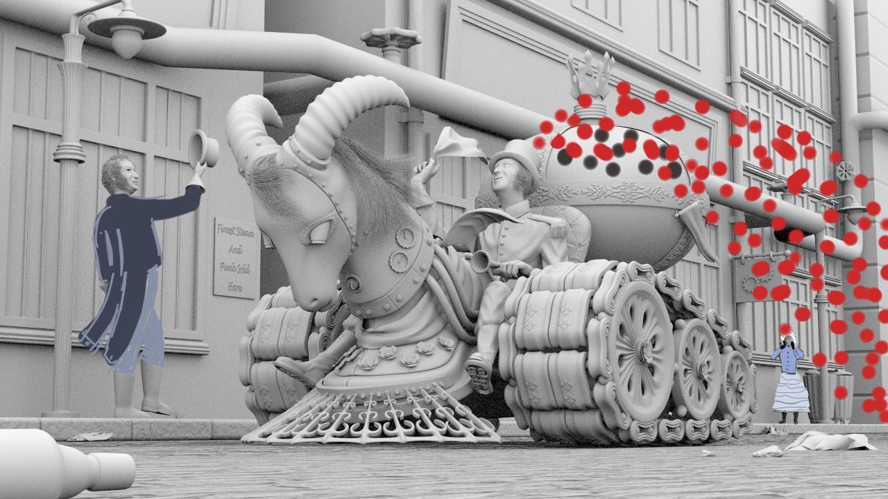

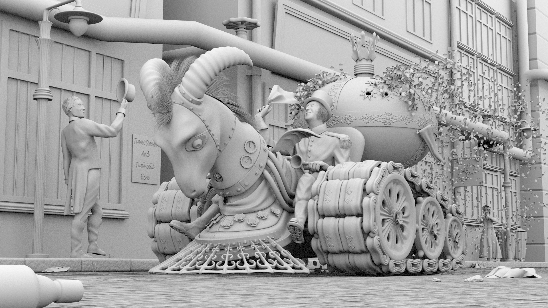
 No one mentioned the second (Right) street lamp being raised which is now perspective in reverse.