i’d say get ride of the hand. also try to make the sun a bit dimmer, i think it takes up a bit too much of the focus and its frustrating to look at. another thing, try to reduce the red’theme inside the ship. keep it around the edges of the window, but for the rest i would say make it more blue.
since the sun and the earth is now red and hot, and a bad place to be, you can use a collor of the opposite “feeling?” i dunno… it just feels like the spaceship is just as bad to be in make it more blue/green ish.
I like your idea to make the inside of the spaceship blue. I didn’t want to make the sun dimmer, as it’s what’s making the earth too hot to inhabit. It should look bright.
no just dont make it so blinding to the viewer. the earth is fine, but try to do something in the compositor. just make the sun less blinding.
also i still think you should get rid of the hand. either that or make it 80% transparent. it looks like someone had paint on their hand when they touched the glass. also scale it down, i know the window is supposed to be small, but it looks more like the hand is dam big. to us (or at least me) the window looks like it has a desently big size, so the hand is kinda of.
edit:
i compared the two last images, and i see you did turn the lights down. i actually prefer the first one, but make it slightly weaker. keep the streak size, but not as blinding. the latest render has the same problem, but with a smaller sun, so it didnt fix anything.
i love the blue theme inside the ship, but i still think its too much “hot”. maybe try to add some “blue’ish” stars in the background? you know, the white/teal collor. or maybe a blue fog?
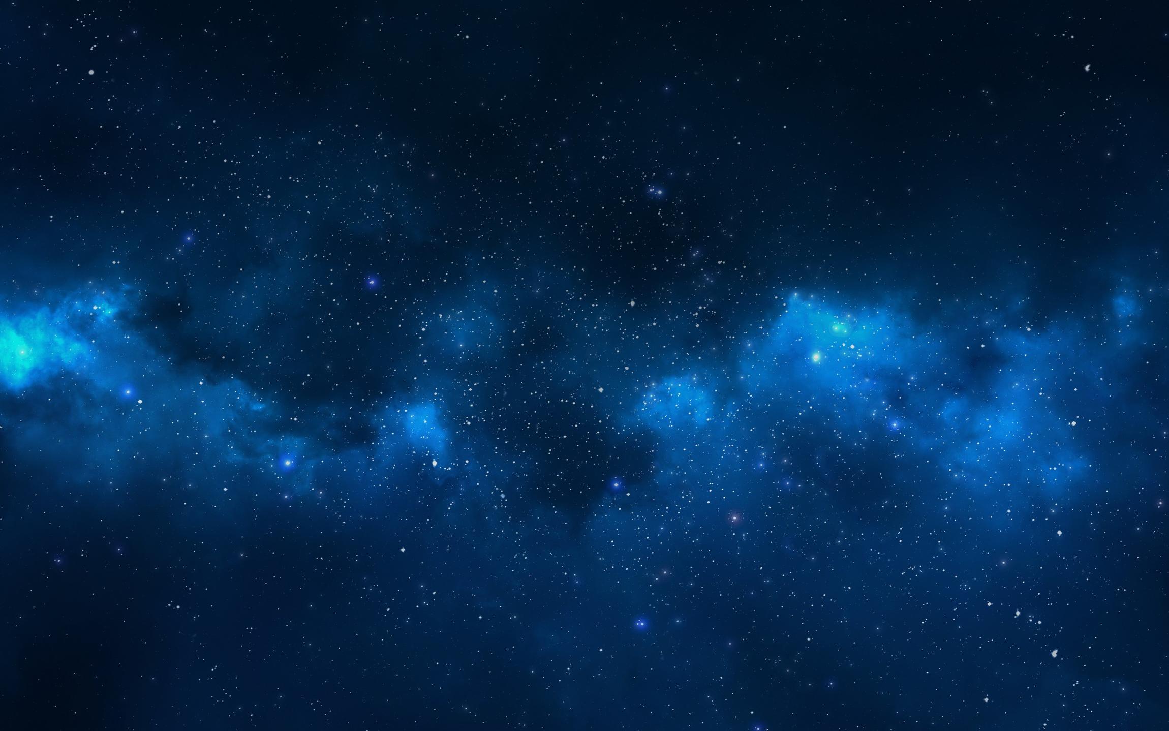
here is some referance of how you can go with the blue’ish themed background:
here is an exsample of what i mean about the sun. its too bright and blinding. this image also has a bright and red strong collor, but its not blinding. however the collor is spread over a large area.
also the earth does not look really good to be honest, but you can keep that for now. but you should rework it later.
the shuttle, and all the other shuttles outside looks great! maybe add some glare to the blue lights inside the shuttle. it might be too much, but try it.
Can you explain what you mean by the Earth looks bad? Also, while I will try adding a blue star field, there aren’t any space clouds like you posted around Earth.
 make it more blue/green ish.