Thats coming along very nicely.
I would suggest you also work on the lighting more. At the moment your scene does not look like it is lit light a typical outdoor scene.
Thats coming along very nicely.
I would suggest you also work on the lighting more. At the moment your scene does not look like it is lit light a typical outdoor scene.
This has come a great way!
The elbow of the farther has some weird artefacts. You might have to actually model the elbow sticking out to compensate for that.
What references did you use for the child? I’m trying to model a child but I’m having a hard time finding good references for front and side view and when drawing my own I have a hard time getting the proportions of the mouth to nose to eyes correct.
ChojinDSL: Yes, you are right, it seems to be a cloudy day  I used a crowd of buffered shadowspots to get short rendertimes with good quality. after finishing the work on the models I plan to ad harder sunlight.
musk: My two references are running between my feet and playing with my wacom tablet while I am blendering - thats the reason why the progress is soo slow.
I dispair of getting some emotions to the characters
So you somehow managed to take a picture of your children in side and front view? I tried that with my daughter but she wasn’t interested…
wow 2.5 mil faces!
I looove bobby cars, still ride one of and on even though I’m 15  …your render is looking really nice, but I read an article yesterday and tried it out here…gamma correction 2.2, some saturation and light changes…looks a lot better IMO.

+‘´¯)BonE(¯`’+ … I read this article too but didnt understand each detail of it. In my opinion your example is a little to drastically - gamma correction somewhere inbetween should give a good result - I will try it on the final, thank you.
here the link of the article:
musk … you should try to convince her … with jelly beans :eyebrowlift2:
yeah actually looking at it again i think you’re right:o
so, whats new?
the childs hands - not perfect, but new
the light - I tried to let it look like it was a sunny day.
the mans pose - should be more logical
few hair on his head
I blurred the background a little bit and played with saturation
what’s to do? what do you think about it?
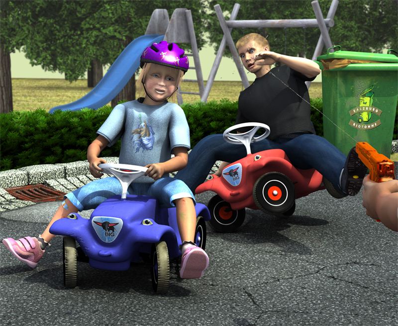
The guy who’s falling off isn’t quite believable. The direction the car’s front wheels are pointing suggests that it should have spun further inwards by now (to the right as you’re looking at the picture), and he should be pitched further off the seat, too. Essentially meaning the guy should be rougly where he is, but with near leg further up in the air and bum closer to the ground, but the front of his bobby car should be further to the right. As it stands it looks to me like there’s some kind of brake clamped onto the front wheels and he’s leaning on his right hand.
Somehow the water pistol just makes it all better…
I agree wtih fudje about the wheels on dad’s car- turn them the other way
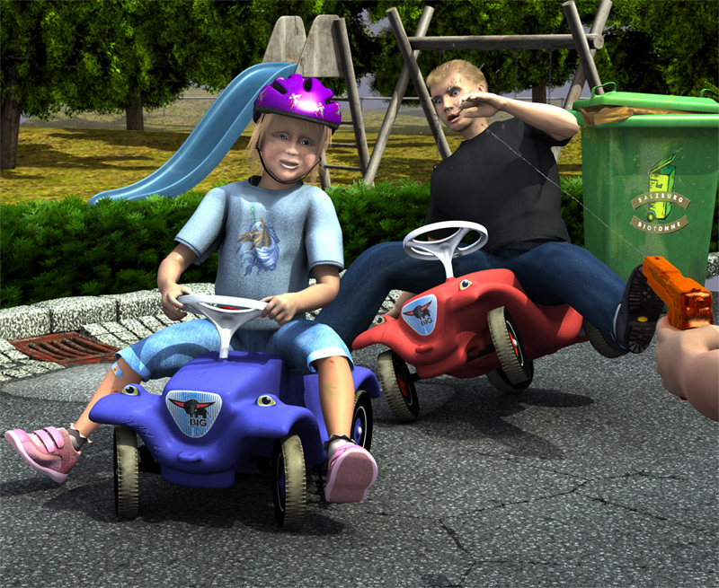
Also, everything in front of the curb is great, but everything beyond the curb is bringing the image down.
->The bushes at the curb edge looked much better to me in the image in post # 40 (at the bottom of page 2)
-> The slide and swing stand out like sore thumbs due to the simplistic modeling and way overdone texture. Despite the fact that they are 20 ft away, if the modeling does not correspond to the level of detail of the foreground it is obvious. However, textures frequently work just the opposite- all these need is a slight, barely visible noise pattern to keep them from looking perfectly smooth. The rust on them is too visible and mapped too large.
-> The trees seem OK, but do not appear to be lit the same as the rest of the scene. They look like UV mapped planes standing like signs. There is nothing wrong with this technique but can detract from a scene if the lighting of the texture and the light environment of the scene are not matched very carefully.
This scene is getting much much better and is already very good. Keep up the good work.
Well, really everybody told me to turn the wheels, so I turned the wheels. Looks good :yes:.
bushes have still too much contrast, I will fix this.
slide and swing are made of wood - I’ll work on it.
background got some hills, new light and new trees (made with the tree generator script) To keep the render time as small as possible, the background ist rendered seperately and mapped on to a plane.
The vehicles dont look … “real”. Specially near the Axle areas. Maybe sharpen the edges bit and add metal frame under the cars.
Eradicor, this cars are very popular in Germany and Austria. Maybe the are not so well known in the rest of the world - but they look as this look.
here the photographic evidence

DO NOT CHANGE THE BOBBY CAR as they are spot on!
The turned wheel make it look much more believable.
I dunno why but the kid freaks me out 
You’re a real good modeller, I like the hand a lot.
It’s starting to tell a story and nicely too. Just an idea, but if you used DOF to get rid of the distant detail softly (Or simply blur unfocused stuff post proc) it might make the scene a little closer to reality? Just my 0.02c
Nice progress. This going to be a great image.
A couple of things I think are still off:
The kid on the blue bobby car looks sad. I think it is the expression she has and the high spec in her eyes. She does not look like she is enjoying herself.
The hair of the boy needs more strands or maybe a second particle emitter. He looks like he had a vacation in Tchernobyl.
Make the background a little blurrier but not much very slightly to give more focus on the foreground.
I also think the the curb could use some smaller grain texture. Same with the street.
very nice stuff, exceptional modeling. But why so high-poly!? so many unnecessary edge loops, unless you are viewing with subsurf in edit mode?