This piece was done for a contest at the Danish 3D community 3dmaxer.dk with the
theme The Silent Killer. I quickly decided that I wanted to do an alternative interpretation
of the subject (which sadly meant no cool, dangerous and sneaky ninjas for my part).
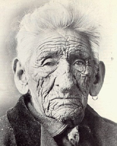
“the silent killer” focuses on a very silent killer that we all can be very sure will get us
someday: Time. It is one of the things in life we can be completely certain of - it will not
last forever. The old man in the picture is on the edge of life, reflecting upon his past.
Sadly though, not all pass away of natural courses, but most do, and I wanted to show
that in this piece.
I worked pretty hard for about a month on this to get it done in time for the deadline. The
old man is a combination of polymodeling, sculpting upon that and use of the (new in
Blender 2.43) displacement modifier for even further detail. The head ended up in multires
level 5 with over 300.000 faces. On top of this is also a bump map, adding even more
details.
The grandfather clock is polymodeled, and details were added to it with a bump map.
The photos on the walls were actual photos I manipulated and “grotescified” in Photoshop
to fit the toony look of the old man better. It took around 15-16 hours to render this at its
native 1750x2000 pixel resolution.
The image is composited, retouched and post-processed upon in Photoshop. Due to
the deadline things like subtle hair strands on the old man’s head and his sweater had
to be painted in afterwards.
Thanks to all who posted feedback in the wip-thread at 3dmaxer.dk! (If anyone dares
enter a Danish forum, the exact thread can be found here).
Something doesn’t seem right about the old man- his face is far too flat. This really shows on the left eye. There’s a similar problem with the mouth, and the wrinkles on his face don’t look too real when you compare them to an old man.
That aside, the scene was very well done. Modeling and textures are nearly perfect. I particularly like that grandfather clock :yes: It shows just how far you can go with normal mapping…
And the concept, of course, is the strongest point in this image. 4 stars
wow.impressive! im curious why you have rotated the camera that much…its kind of too much i think and ruins the picture for me. but on the other side, the diogonals (the old man and clock vs. walls and room) gives a nice effect. ill give it 5 stars…i feel good today!
Nice image! I wouldn’t (as others seem to want) make the old man more realistic- he has a nice style that has much more character than “plain” realistic modeling, but to make the photographs and set “belong” in the old man’s world.
On the other hand, This image could easily be a “toon caught in the real world” - instead of sadness of lost time, conveying the feeling of fear this toon has under the whithering gazes of the realistic people in the photographs…
Ok, I’m being silly, great work overall.
When I saw the title I got my hopes up thinking “Oh boy, something about farts!”, but then I figured out the silent killer was time . Nice stuff bro, great job
His “funny” face wrinkles make him look not just old, but desiccated, like a mummy. I think the look works really well here!
At first I thought he was a very old assassin; I imagined him slowly and laboriously walking up a flight of stairs to go kill another old man… then I read your description!
Really cool! I like it. Have to agree with Alden though that the face is rather flat, and there’s something strange about the wrinkles. But it has a nice atmosphere to it.
I give it 4 stars because, as already stated, the wrinkles are just a bit overdone. But I do applaud you on the lighting, modeling, and composition. It’s AWESOME.
This piece reminds me of Edgar Allen Poe’s The Tell-Tale Heart. The lighting makes for a great dark scene. For the wrinkles, I’d say that’s a style and I wouldn’t change that at all. Great Job. The man looks so innocent, as in the story. Any inspiration from the story? Five Stars!
I love this piece, i really love it. When i first saw this i thought i was looking at an 85 year old assassin, but then sense came to me (it would work either way though).
I have a couple of crits and suggestions:
Firstly, some kind of SSS around the ears would be cool, although the light setup wouldn’t allow much anyway if you could somehow fit that in there would be an imprvement.
Secondly as other people have stated the wrinkles look a little bit iffy and this is because of the direction of the wrinkles.
This isn’t an ideal example but it makes a point. Around the mouth and infront of the ears, the direction of the wrinkles need particular attention as those wrinkles are incorrect as far as i can tell (i havent actually studied anatomy or art at at any advanced level so this is probably a bit vague).
I think that to add to the already great atmosphere you have here you could add some subtle volumetric lighting and nsome air particals, the sort you get in an old home when its just been dusted but someones forgotten to open the windows.
Whether you do anything to this or not its still great and easily deserves 5 stars.


 . Nice stuff bro, great job
  For the wrinkles, I’d say that’s a style and I wouldn’t change that at all. Great Job. The man looks so innocent, as in the story. Any inspiration from the story? Five Stars!