This is what he was doing for 55 years.
Used 3DCoat, zbrush, blender, Ps for sculpture and textures. Background in 3DC. Rendered in BI v2.49b, SSS and particles system.

Shirt material is near perfect, skin shader is a litttttttle bit plasitcy. Other than that I give you 4 stars! This is a work to be proud of!
Agree with Keith M about the materials, but, man, do I love your sculptures! Very realistic modeling/sculpting.
Wow! Excellent work here michalis!
My only criticism is that his skin looks too shiny. Too much specularity?
Other than that it’s amazing!
–Robo
Agreed on the specularity, but assuming you’ll fix that, 4 1/2 stars from me. Oh wait, you can’t rate with half stars; I guess I’ll just have to give you 5! 
WOW WOW WOW!
Respect.
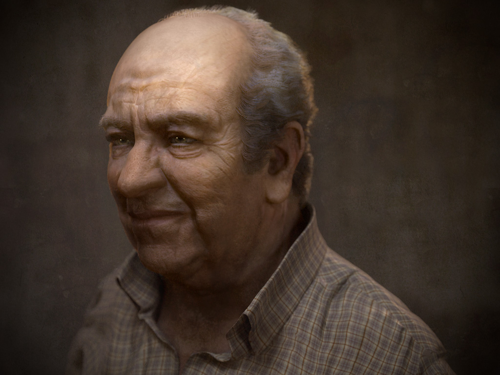
Agreed too about specularity and the rather bad pp. Meanwhile the new 2.5.3 here so used some GI and more sss. PP just for levels and a little glow effect.
Attachments

Skin specularity looks way better but i like the first one more, it has more definition to my eye.
man, you rock! 
however, I think that combo between those two versions would give a perfect result. You propably shouldn’t get too much attention on effects, so the glow effect in my opinion is needless. Otherwise everything is absolutely great! 
5 stars from me
Thanks FloorPlay, Duffy,
the glow effect in my opinion is needless
Not much though (5%), the most of this comes from dof+moreSSS+GI.
I use a slight bloom to emulate lenses. SSS is much more dangerous.
BTW the shirt needs some sss translucency like effect but sss distroys everything with this waxyness.
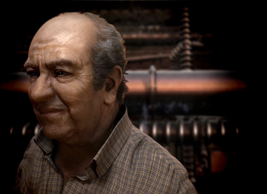
blender 2.49b vs 2.5.3, render time, 20min/3min, even using indirect lighting. At ~3000x2000 px. On a macpro 16 threads xeon.
Wow, good tired eyes 
I think the facial expression is perfect, he looks like a man who has worked at this all his life. And is mentally and maybe physically worn out.
Looks great. I like his hair and skin now. One problem I see is composition. There is nothing on right side so just crop it, and add some more area above his head. Space on left is good as it is, because he is looking in that direction. Anyway this is one with most realistic head bust rendered in blender imo.
Wow Awesome work,
Personally I prefer the sharp contrast in the first one, I think the GI virtually eliminated those dark areas which helped put feeling in the image. However I like your materials much more in the second. If you could recreate the second with the same contrast as the first it would be double awesome!
Thanks koolean88, Keith M, JoseConseco,
I hope its OK to post another one, slightly different (wider lenses was killing the likeness), added some overlay just for color. Some different sss again. Still can’t master this beast. :eyebrowlift:
About photo composition, I always like to make something wrong, I know the rules very well (if they exist). LOL its a game anyway, why not?
Attachments
mad skillz. it’s really good! *****
Thanks aermartin
Based on a photo and a watercolor I did in front of him, I did’n have a side view though.
A question. How can I achieve some translucency on the shirt? Without transparency of course. Without waxy effects too.
Attachments


another sculpt from michalis!
the sculpt and renders look totally incredible
you really need to do some sculpt, material, and rendering tutorials
5 stars from me!
Hey jeeepster, thanks, you’re the one with the nice tutorials. Mine have to do with complicated workflows between several apps. For example, I sculpted this in 3dc, zb and blender. I had to re-bake normals and textures again and again. I had to re-sculpt in blender after first test renders. Where to post a tutorial like this?
Still have problems with sss, blender has a problem here too, whatever others claim.
But I came to a conclusion. All displacement maps (normals, bumps) at maximum when SSS is in use.
See how it looks without sss. And an alternative lighting.
Attachments


Wow! All your tests look pretty good, although the 1st one on your last post is definitely the best! Now just add that to the background of your original post, and you’ll have a masterpiece!