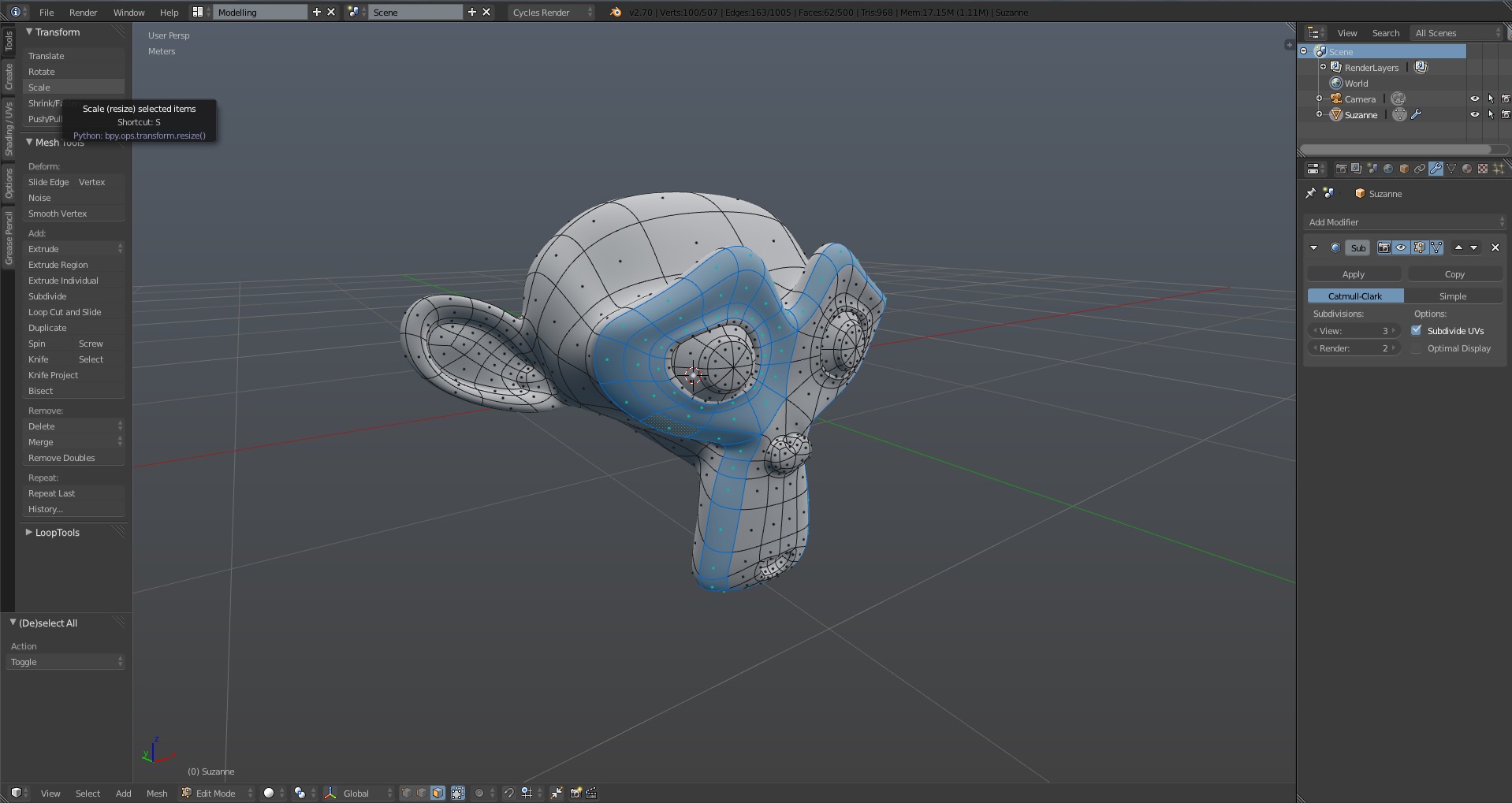
Not sure if you’ve fixed this yet, but it’s basically impossible to see which UVs are selected - all verts are blue and all selected verts are a slightly brighter blue. I’d suggest making non-selected stuff black - colours are meant to indicate something.
I installed the newest theme, only thing I can’t figure out really is that in the video when you go into sub-d the wireframe actually wraps around the model, where is the setting to change it to that? Mine at the moment is just the default. Sorry I’ve never really edited the blender interface before, I’m more used to Modo.
This is really impressive! I like this a lot. Keep at the good work, blender looks much easier to use now for sure.
This is the one of the best themes for Blender
Thank you guys, hope it’s useful to you both
I installed the newest theme, only thing I can’t figure out really is that in the video when you go into sub-d the wireframe actually wraps around the model
I’m releasing a new version so it’s in 1.23 (changing the version control format too) for now. I will keep working to improve it, suggestions are well come. Blender 2.70 is out, so Graph is now compatible with the last stable blender release.
Graph 1.23 Release Log
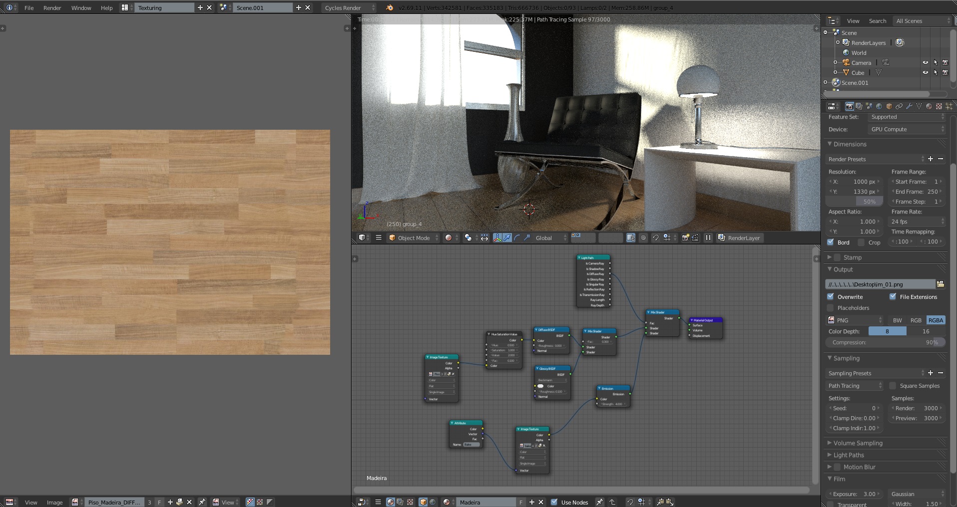
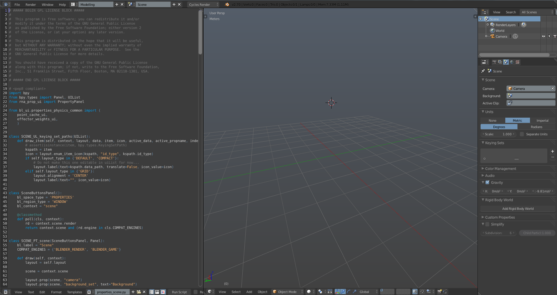
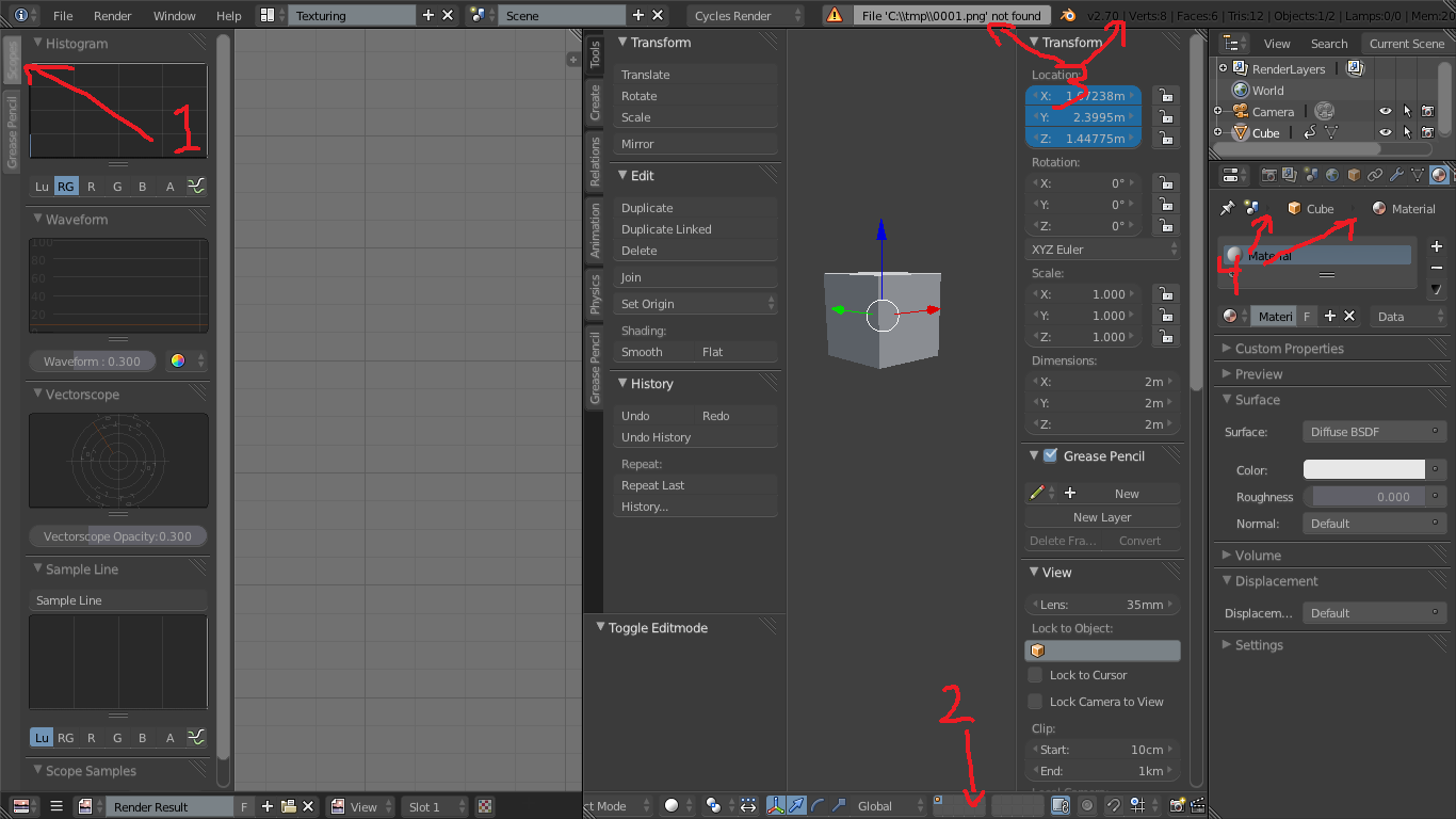
Texturing Workspace
“Only render” in Render area of Texturing Workflow
Minor Fixes
Others
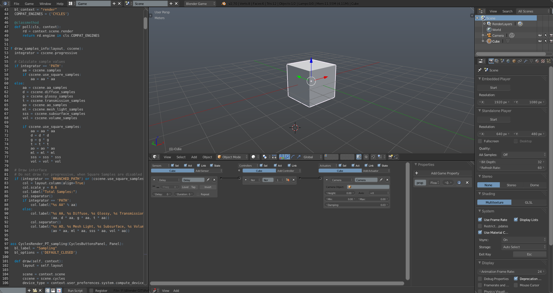
Logic Editor Starting Theme
Minor Fixes in Text Editor
I don’t include a “Code” Workspace by default cause it’s too much specific task. But here are two suggestions if you use it a lot (as me)
Looks really nice. A good candidate for the new default theme
That would be a dream, how could maybe it be included as one of the Build-in Themes in a future release? There’s a place to candidate it ?
The purple tint of the percent sliders bother me a little.
I don’t even notice it before. My bad. :o Will be fixed in the next iteration
Is it possible to make the dots in the center of the faces in edit mode a tad lighter?
When it’s not selected the dot in face center copy the wire color value. But the ones in selected faces have it own color that i set to the same color of the selected Vertex (will be brighter) in the next iteration.
More suggestions are welcome, thanks for the feedback
I really like this theme, and I’d like to help you get it in trunk. I’ve been using it for a few days now, both at work and at home, so I’ve found a couple things that really bug me. Unless it’s really perfect and looks good in all cases, we’ll probably have a hard time convincing the devs about putting it in trunk.
It’s a short list, but fairly important things imo:
Unselected verts are white. This is confusing, first thing someone would ask is “are the blue verts the selected ones or the white ones?”. Usually unselected items are dull and don’t attract attention. In this theme, it’s the other way around. I suggest making unselected verts completely black, so they blend in with the edges.
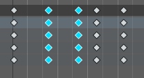
It’s the same issue with keys in the dopesheet - unselected keys are white, selected keys are blue. Perhaps you could make the unselected keys a light grey, but with a black border (similar to the default theme), and the selected keys blue (as they are) with a lighter blue border (like http://gregzaal.com/ss/2014-03_57.jpg)?
Active vertex is hardly different from selected vert. I would really suggest making it white. The difference between active and selected edges, and active and selected faces is great - just the active and selected verts look too similar
The timeline is quite bright, so it distracts from an otherwise dark theme. I’d suggest making the playback region the same colour as the non-playback region (area below 0 and after end frame), and then make the non-playback region a bit darker (not too much, contrast is distracting)
Faces in wireframe are very opaque (in edit mode). I know it can look cool, but I think it’s overdone here. The difference between the brightness of the surface in wireframe and solid mode is really not much, so it’s not immediately obvious whether you’re in wireframe or not. If you have Limit Selection to Visible on, then solid and wireframe look even more alike.
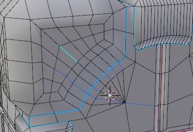
UV seams are a very similar colour to the selected edges in edit mode (img). This makes it hard to tell which edges are selected and which are seams, especially when some seams are selected and some aren’t. I’d suggest making the UV seams a reddish orange perhaps, would go nice with the blue
Wireframes in object mode are light. Yes, I know Andrew Price thought this was a great idea, but imo it’s a terrible one - mainly for this reason:
Showing the wire overlay in solid shading looks really crap. It’s hard to see the wires and also messes with the perceived shading of the object. If you don’t want to go back to black, then perhaps a much darker grey would do.
Finally, unselected UV verts are basically the same colour as selected ones. I mentioned this earlier, and you said it was fixed, but I redownloaded just now (after deleting all previous versions of the theme here, and resetting to the default theme) and it’s still like this:
Try guessing which verts there are selected and which aren’t
There’s also an orange tint to the unselected faces - since orange hasn’t been used in excess anywhere else, it should only be used to draw attention to something.
gregzaal : Really thanks for your time working in this review. I will get point by point to investigate about and make here a proposal for that. Anyway i think is not a so arrogance think that Graph in future can be a build in Theme ( no Default aspirations though) , “Black to Black” is a really weird theme and it’s build-in, i can’t think graph is worse than that, in fact Elsyiun is the only one theme that i like in build in theme list.
I’m working in a new version with many fixes and a start theme for the others editors. Hope i can post it here this week. Thanks everyone for the feedback =)
Hi, first of all thanks for the great theme, I’ve been working on a flat theme myself the last while and I can testify to the great amount of work here!
It’s definitely an improvement on the default theme.
Just a few opinions and/or oversights:
1: the UV editor tabs don’t have enough contrast, and don’t match the others
2: these layer tabs are very hard to differentiate; depends some on monitor brightness
3: this is a problem I couldn’t solve myself - if you make the scene stats text here white, then you cant read the notifications;if you make it dark you can’t read the stats. we need to decouple the text colors here or add control of the notification area background.
4: we also need to control of the color of these arrows -their almost invisible with a dark background.
5: overall I think more contrast would be good on the buttons; their very hard to distinguish on dimmer monitor settings.
6: overall the blue is a little too saturated to my eyes ; especially the keyframe color
7: and just one more, the lighter color of the percentage sliders gives me a “disabled” message ei. looks grayed out.
thanks, hope this helps - it would be great get it included in trunk.
Also here’s a link to a copy of my theme so far - you might enjoy comparing it. It’s based off the elysium them, but with a lot of modifications for flat shading. also its not complete- I mostly worked on the 3D, UV, and Node editors, but its pretty much workable.
the UV editor tabs don’t have enough contrast, and don’t match the others
noted, will be fixed in the next iteration
these layer tabs are very hard to differentiate; depends some on monitor brightness
noted, will be fixed in the next iteration
this is a problem I couldn’t solve myself - if you make the scene stats text here white, then you cant read the notifications;if you make it dark you can’t read the stats. we need to decouple the text colors here or add control of the notification area background.
The same here, i choose let it Dark so we can at least read everything (i don’t like it too)
6: overall the blue is a little too saturated to my eyes ; especially the keyframe color
The original was a Bright Green so it’s a improvement, i’m ok with that for now, but i can test some other configurations later
Also here’s a link to a copy of my theme so far - you might enjoy comparing it. It’s based off the elysium them
Elysium was my theme for many years until Graph. i love it =)
Nice customization too! Hope more people can do more good themes for blender. Blender default UI is too bad
I fixed two little errors and updated the github file for Graph 1.3 :
Fixed some purple tint in percent buttons ( was not fixed, now is ok )
Gregzaal: Hope i can take it to a full featured and consistent Theme soon
The next iteration i will work in keep a complete overhaul in color consistence of the user interface components ( Numbers, Sliders, Text, Objects, Radio Buttons… ), i want to start to working in the Movie Clip and improve the VSE and UV Image Editor too.
I did a little proposal to UI improvement in the Mockup Thread, if you have some suggestions about it please post there :o


