Hey, just tested your 2.2.2 theme. The label names in the dopesheet are incredibly hard to read on colored tracks. Just test your theme with Rigify in 2.79 and you’ll know what I mean. I guess the only solution would be to make the label text pure white, or your darkest gray. Graph window has the same issues. Love the big curve handles though.
The keyframe colors seem a little washed out at first, but maybe that just takes some getting used to.
I see what you mean about Color Sets making the text hard to read. I think it is common in
dark themes.
For these updates, the Graph Editor and Dope Sheet text is slightly increased. I didn’t want to
change it too much because I wanted to keep it consistent with the rest of the theme.
Here are some things to try:
In the “Color Set” menu for each Bone Group, select “Custom Color Set” and lower the value
and saturation of the colors to allow the text to become more readable.
Change the text value to anything you want by going to the Themes tab in User Preferences.
In the Graph Editor and Dope Sheet settings, adjust the “Source List Text” color.
I brightened the keyframes for the Dope Sheet and changed the selection colors to cyan.
These include updates to all versions (1.1, 1.2, 2.1, 2.2 and 2.2.2).
For explanation of version 2.2.2, read post 16.
For explanation of the other version numbers, read post 15.
The colors of the sliders in the Graph Editor and Dope Sheet were too bright in the last updates.
I reduced the blend amount to make it easier to read the numbers.
I fixed an issue that occurred when renaming a List Item: The highlight was the same value as the text.
I changed the highlight to a medium gray and changed the selected List Item to a dark gray.
This includes updates to all versions (1.1, 1.2, 2.1, 2.2 and 2.2.2).
For explanation of version 2.2.2, read post 16.
For explanation of the other version numbers, read post 15.
I made more adjustments to the Bone Color Sets. I realized that the colors that highlight the lanes
behind the keyframes were much too bright, especially in the Action Editor. I reduced the intensity.
The saturation and value of the other colors has been reduced to minimize clashing with the cyan text.
The color wheel shows the new sets. Compare it with the one in the previous post.
The Tool Shelf tabs are darker so that they match the tabs in Painter.
The main menu bar (Info) is darker so that it matches the tool bar in Painter.
The Node title bars are also darker.
This includes updates to all versions (1.1, 1.2, 2.1, 2.2 and 2.2.2).
For explanation of version 2.2.2, read post 16.
For explanation of the other version numbers, read post 15.
For previous updates, I had been using screenshots of Painter 2.4 to sample the values.
I am now using the trial version of 2017.4 and noticed that the tabs are lighter than they
were in 2.4, and the tab background bar is darker.
This includes updates to all versions (1.1, 1.2, 2.1, 2.2 and 2.2.2).
For explanation of version 2.2.2, read post 16.
For explanation of the other version numbers, read post 15.
Thanks for making this theme disOrder66. This is now the theme I have been using since I bought painter and designer last year. There was something about the text editor I wasn’t a fan of. I’d have to look and see what it was exactly.
I found some things in the Text Editor that needed to be fixed.
The Line Numbers background was the same value as the window background.
This could cause confusion, especially if the text contains numbers. I changed
the Line Numbers background to the same value as the Properties panel.
I changed the Syntax PreProcessor color because it was too similar to the
Syntax Numbers color.
This includes updates to all versions (1.1, 1.2, 2.1, 2.2 and 2.2.2).
For explanation of version 2.2.2, read post 16.
For explanation of the other version numbers, read post 15.
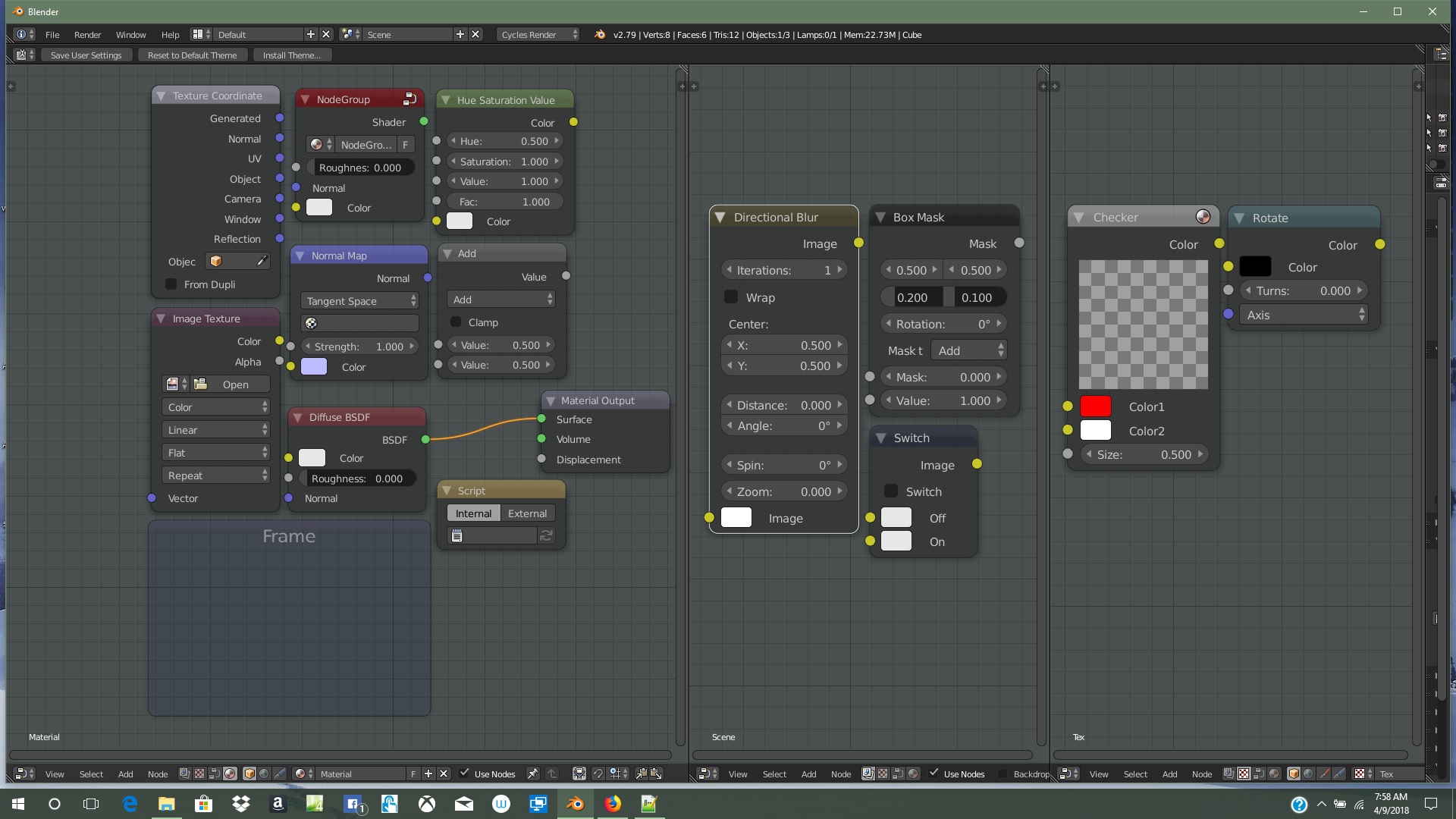
That’s a pretty cool idea. I ended up tweaking the node part of theme and added some color to mine. I’ve been using the Substance 2.2.2 version. I haven’t tested any of the other ones to see how different they are.
In screenshot here is kind of a breakdown of colors going from left to right.
I looked the other day ,but didn’t notice what I didn’t like. I just finally figured out what it was. The selected text color almost matches the background and you can’t see what’s selected easily . Needs to be like a light grey maybe.
Also, this theme is more of a combo of both painter and designer? I’ve been making some small tweaks and one thing I did was change tooltip to match designer. It’s something you might add to the theme to match it more. I also made the logic editor background match the node editor background.
Thank you, zaha.
I lightened the wireframe and the background. You may have to adjust the Viewport Color of your mesh so that it is
darker than the wireframe. I darkened the grid so that it doesn’t compete with the wireframe.
Back when I started making this theme, I experimented with different colors for each node type, but considered them
to be distracting. Based on your suggestion, I decided to make alternative versions that have color-coded nodes.
Thank you, AFWS.
I was preparing to post these updates when I saw your post. I tried your script and liked your color assignments
more than the ones that I had made, but I did change some of yours.
For the Pattern Node, I used the Emboss color from Designer. It is similar in hue to the Input Node.
The Group Node color has to remain unchanged. It is a lighter version of the Node Editor background.
When a group is opened, the color of the node is used as the background color.
The color of the Normal node in Designer is too bright. I sampled the color from a Normal input on a Blender node.
For the wires, you assigned the bright orange to the inner and outer colors. This made the wires too intense,
so I used light gray for the outer color.
I changed the Logic Editor background to match the Node Editor.
For the Text Editor, I used a lighter gray for the Selected Text.
I changed the tooltips to match Designer.
I lightened the wires in the versions that have gray nodes.
These include updates to all versions (1.1, 1.2, 2.1, 2.2 and 2.2.2).
For explanation of version 2.2.2, read post 16.
For explanation of the other version numbers, read post 15.
In the previous post, I incorrectly stated that the Group Node color was a lighter version of the background.
It was actually more green, and the background is cyan. I had taken that color from the default theme.
For these updates, I copied the background color to the Group Node and lightened it.
The Face color was darkening the mesh with a transparent black overlay. I set the Alpha to zero to fix this.
I reduced the strength of the shadows around the text in versions 1.1, 1.2, 2.1, and 2.2.
These include updates to all versions (1.1, 1.2, 2.1, 2.2 and 2.2.2).
For explanation of version 2.2.2, read post 16.
For explanation of the other version numbers, read post 15.