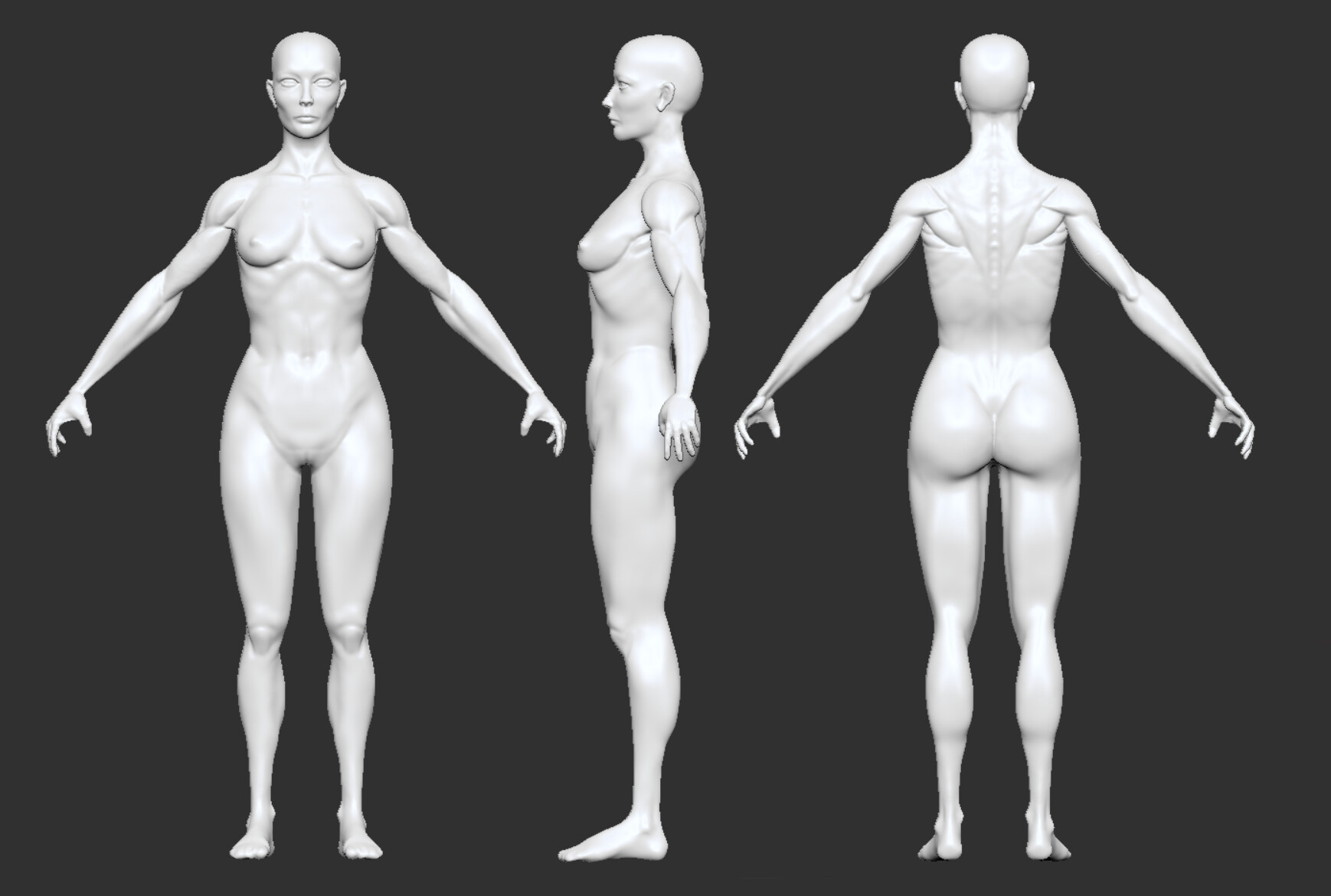
Update:
This is my first ever attempt at female anatomy sculpting (Not that I have that much male sculpting experience…)
So before I dive into higher resolutions, can you help me to spot mistakes and issues I’ve missed?
Thank you!!
Update:
This is my first ever attempt at female anatomy sculpting (Not that I have that much male sculpting experience…)
So before I dive into higher resolutions, can you help me to spot mistakes and issues I’ve missed?
Thank you!!
The anatomy itself looks good, well except for the wrist looking too thin, and also the breast is a layer of fat on the pectoral muscle, here it looks like a muscle itself, try dissolving it into the chest.
And lastly women don’t have pronounced external oblique (love handle) but all in all it’s a good job.
Good start! I see that you made her approximately 8 heads tall.
In my opinion the size of the feet is correct. Their length should be nearly the height of he head.
Other suggestions are:
But you are definitely heading in the right direction and most of the landmarks are in the right place.
Thank you! Will update!
Thank you!
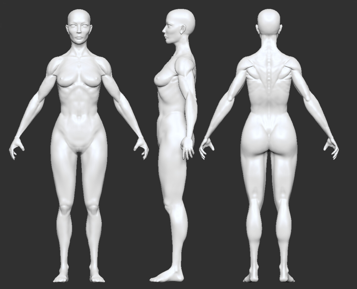
Good progress, the lighting on the right render is nice. As light from the side reveals the structure nicely, I think she has too much body fat on the lower abdomen. Additionally the lower legs need a bit more volume. The calves are not as defined as the other muscles are and the tendons at the ankle would be much more prominent.
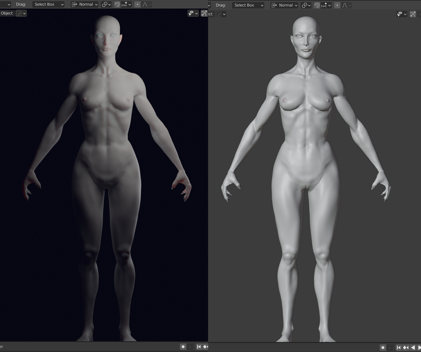
My two cents here:
The head:
Thats it for now. It a good start.
Proportions of the upper body are very well done now. While a broad range of variation in body sizes and shapes can occur, there are some minor adjustments if you are going more for standard / average proportions, especially for the lower body.
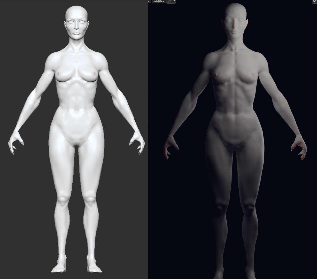
The eyes are still too wide, and I’m struggling with them myself always. But the width of one eye should be 1/5th of the width of the head. The distance between the eyes should be also 1/5th of the head.
Other than that, good job and in the end it’s a matter of your artistic choice of course!
What came to my mind: The proportions of the face could also result from the focal length of both the viewport camera and the render camera. When these are below something like 50 or better 85 mm, proportions get distorted.
It’s Orthographic view 
Reference are always nice, one can’t get enough of it.
This sums it up.