

1 Like
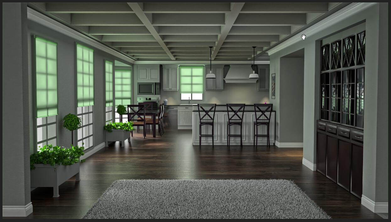
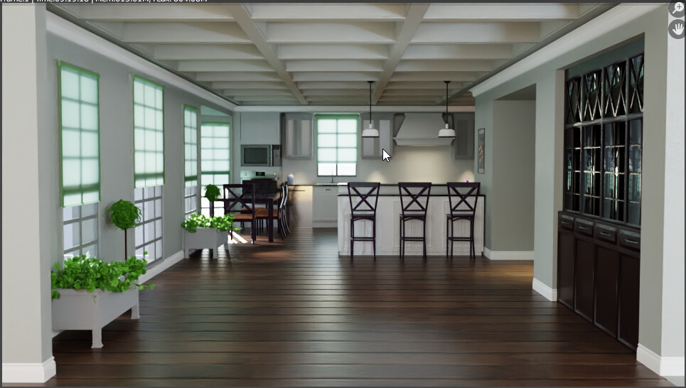
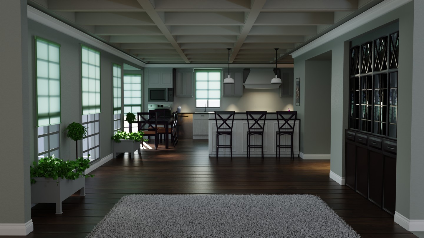
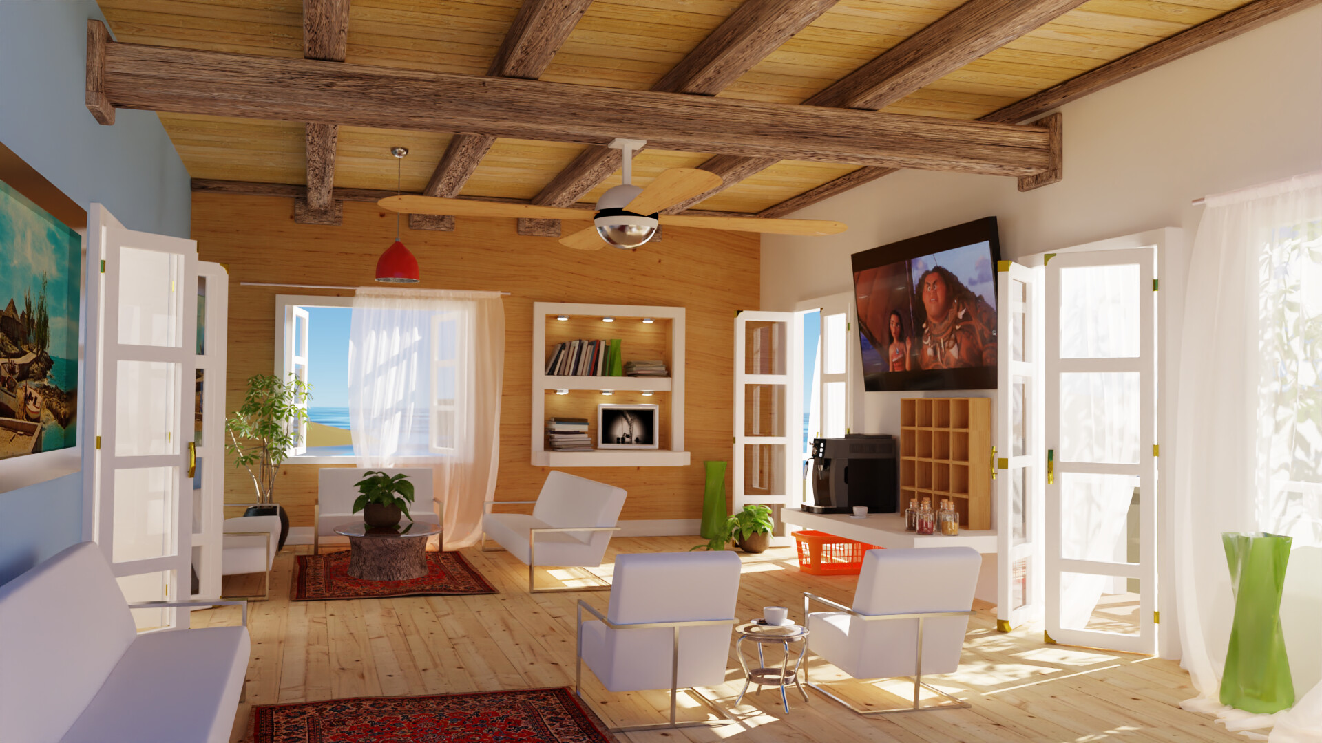
Many months ago I was helping someone troubleshoot the noise in their indoor scene. I suck at indoor scenes mainly because I have no idea about how to get rid of all the noise. This is their scene. I can’t remember their name. I redid the textures and lighting and tried numerous approaches to try to get ride of noise. Also their original file was something like 107MB and I could barely move the viewport. I moved a few heavy objects to their own files, used collection instances for the leaf particle systems, un-subdivided some things and added the subdiv modifier, made low poly versions of things you don’t see from either of the 2 camera angles, used collections and/or shared mesh data for repeated elements etc. Now the files all together are only around 20MB.
1 Like


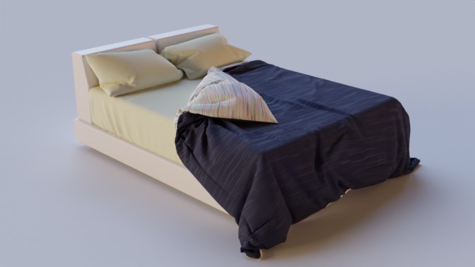
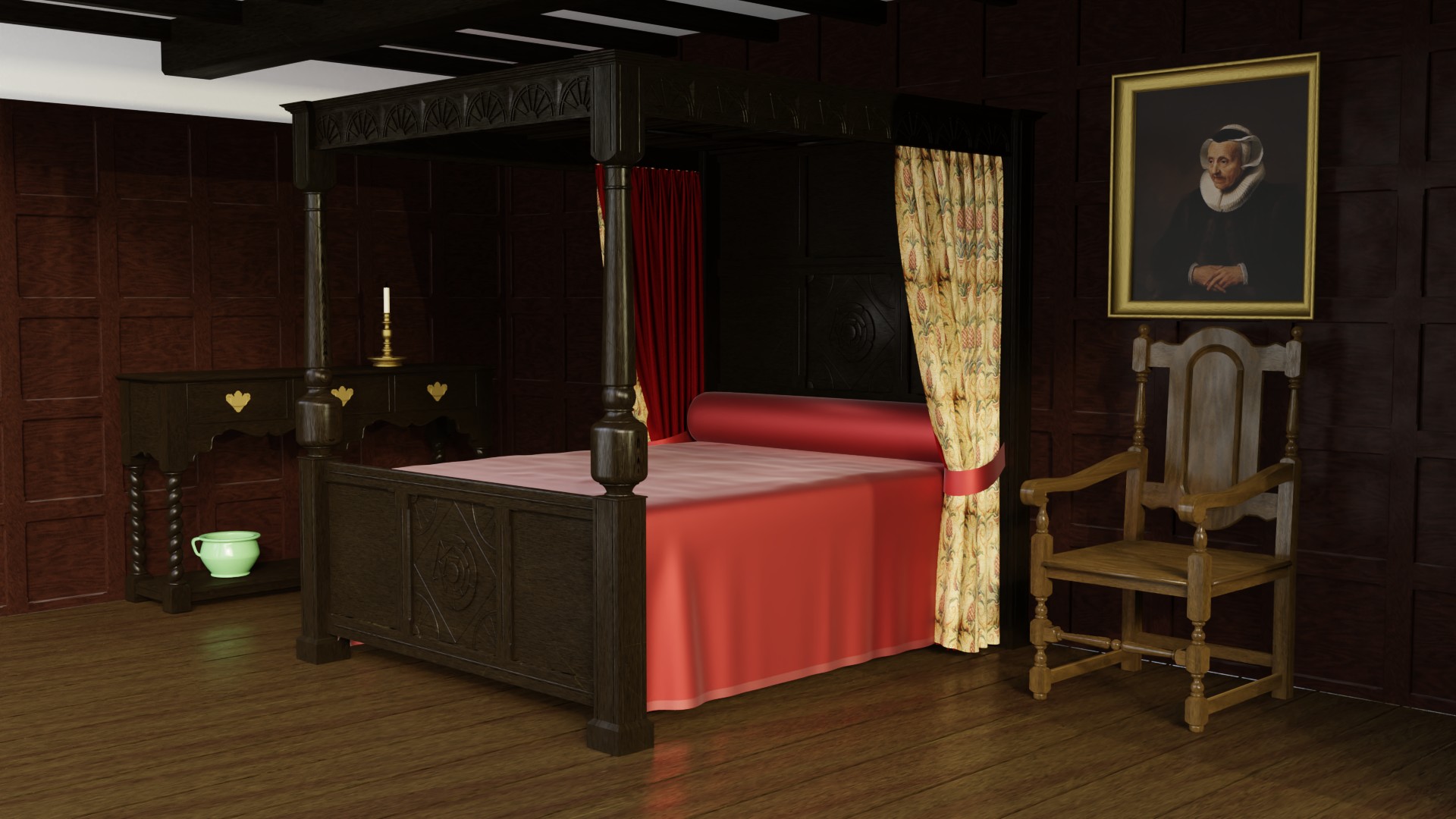
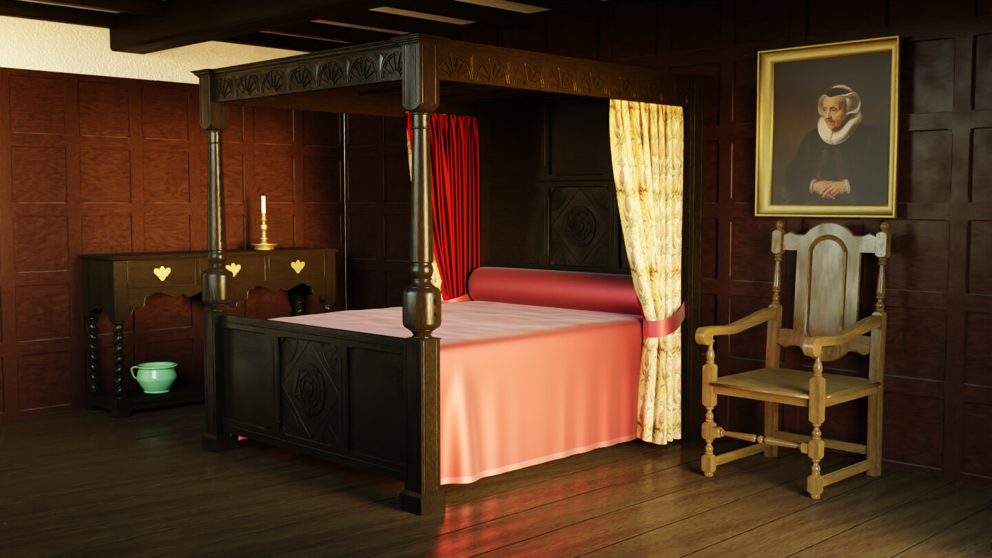
Another old blender file: https://www.blendswap.com/blend/2701 “Interior Scene of Bedroom” by SlykDrako
It was originally using Blender Internal render engine. I found out later SlykDrako had already made a cycles version.

Adjusted the quilt material to make it easy for the top side and under side of the quilt to have different colors/textures/materials. It is based on the position of the original UVs.
Unfortunately the UVs of the mattress and pillows are not as good as the quilt.
Decimated the quilt to drastically reduce polycount and remove subdiv modifier.
Added feet to the bed and zeroed out the location/rotation/scale of everything and made collection for the bed that can be easily linked to other files.
original:
Creator: Wig42
2 Likes
These procedural wood textures absolutely murder viewport performance in eevee.
I dissected the scene and replaced as much as possible with mesh instances, collection instances, arrays, mirrors, etc. Rebuilt some very small objects that had obscene amounts of geometry.
Brought the file size down to 14MB from the original 43MB.
tudor bedroom by clive9
2021-04-12 Used Nishita Sky
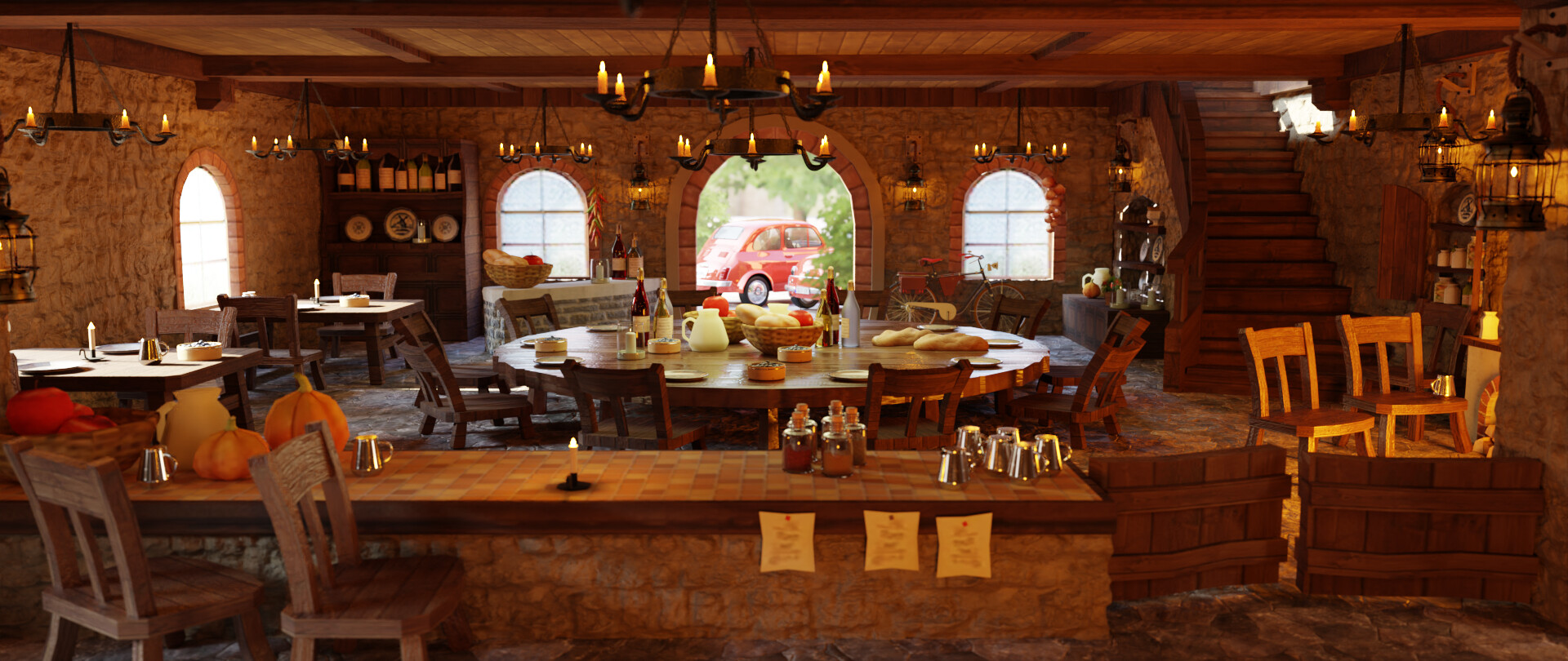
This crap took 8 hours to render ![]()
I wanted to have more realistic candles but now I’ve lost the vibe of the lighting I had in the earlier version at the top of this thread. Added lots of random assets from blenderkit and blendswap.
More playing with files from Blendswap https://blendswap.com/blend/5315

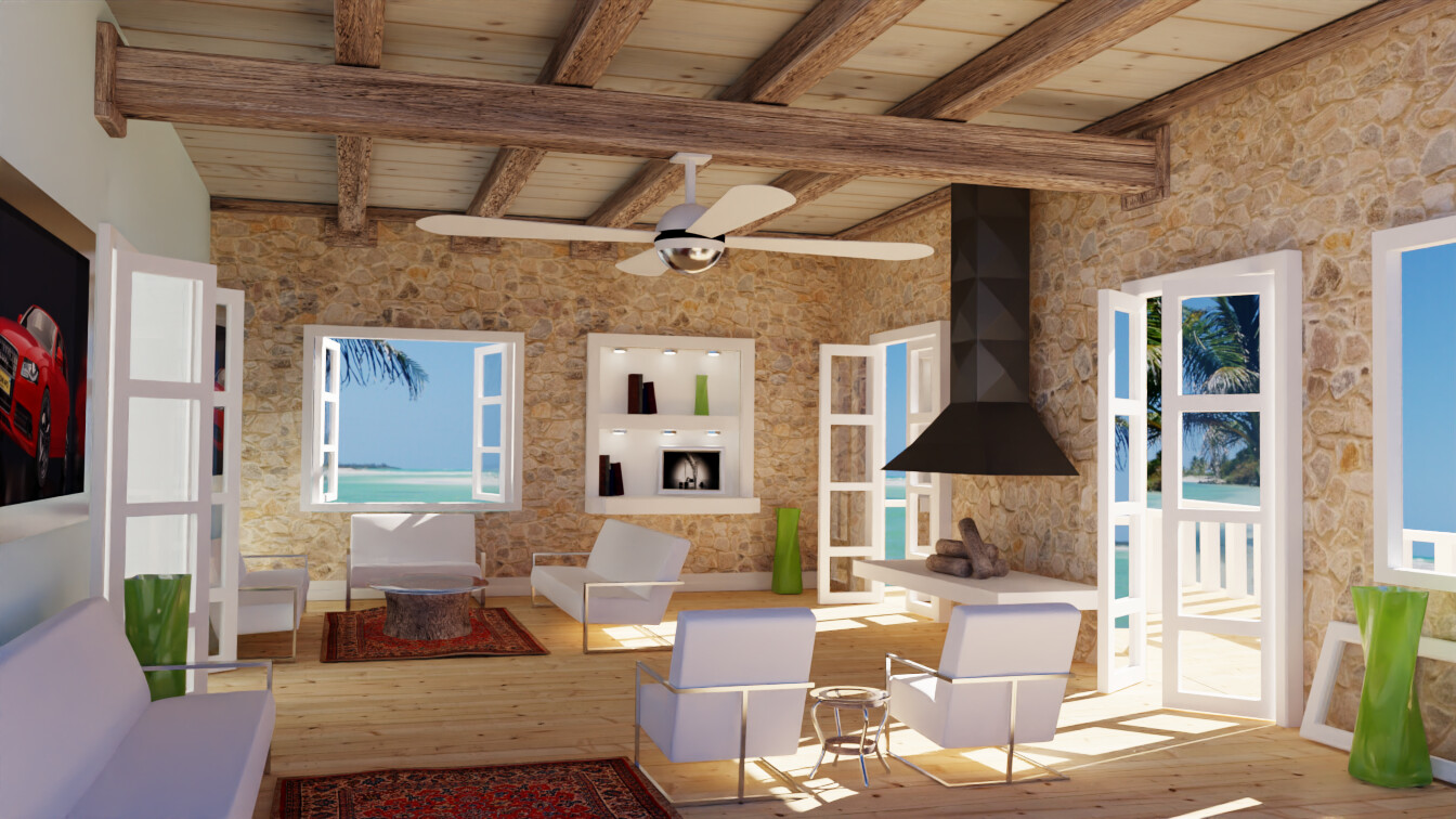
interior3 2021 pkd.blend (4.5 MB)
original:


Increased bounces to 32 and all the original materials went crazy.
LOL, the most shadowed part of the chair started glowing:
Replaced the worst of them with Principled BSDF


ideas of things to add: exposed aluminium tube ventilation/airconditioning, ceiling fans, footstoon, bean bag, another tall plant, striped rough/clear/rough/clear patter to glass around stairs, sprinker system pipes, hint of texture to the white ceiling, fuzzy white rug, christmast lights on a string,
1 Like

I think a big source of noise originally was the render setting Clamping > Indirect Light being set to a value other than zero. It reduced the strength of bounced light and resulted in “dark noise” instead of the typical overly bright fireflies.
With that changed I could greatly reduce the Max Bounces down to just 4 and the scene remains bright using only the HDRI lighting.
Then I adjusted adapting sampling again and again with smaller values. 0.01 gave a good enough result in not much time. Min samples set to 100.
In CyclesX the lighting is a lot warmer than previous renders for some reason.
1 Like


2021-05-28
notes on making blenderartists header more responsive:
The 4 links in the middle need to have .hidden-for-mobile class name removed
ul.nav-link-container li#top-donate.hidden-for-mobile
also there is css specific to each item that hides them at breakpoints.
.nav-link-container li:nth-child(1) {
display: none;
} and child 2 and child 3 etc
The whole header is in div.contents - .d-header > .wrap .contents
Both the logo and the 4 links are within div.contents > div.title
The social media and profile icons are in div.contents > div.panel
I want the logo, 4 links, and icons to all act as 3 sibling blocks.
so set div.title to display:contents
The UL containing the 4 links is position:absolute 
Disable all of its original css positioning and override margins to zero.
Remove the left margin on the icons div.
Everything still looks nice and vertically centered at this point.
setting .d-header > .wrap .contents to justify-content:space-between should have spaced out the header nicely horizontally but a lot of ::before and ::after elements are in the way.
Remove them with this:
.d-header > .wrap .contents::before, .d-header > .wrap .contents::after {
display:none
}
Header looks perfect now at full width.
Set flex wrap on .d-header > .wrap .contents
Remove height from .d-header rule.
Now the header (black bg and red bottom border) expands as the 3 main blocks wrap to a second line.
make the 4 links not wrap and have a gap between them instead of padding.
Reverse the flow because that’s the order it is on the original layout.
.nav-link-container {
display: flex;
flex-direction: row-reverse;
gap: 10px;
}
I just noticed the y in community in the small text of the logo is being cut off.
It is actually cut off in the image itself.
Reorder the main blocks at smaller viewport size to keep social on the right
@media( max-width:939px )
{
.nav-link-container { order: 1; }
}
center everything at even smaller viewport size
@media( max-width:613px )
{
.d-header > .wrap .contents {
justify-content: center;
}
}
Problem at this point is the badge over the news link indicating unread items is covering the S in news.
Remove position:relative from #bn-news-counter to fix that.
Now that this is fixed the viewport can go a bit smaller before I need that media query above so changed its trigger point from 999px to 939px.
