Time Theif - The Lost Inventions :D

Hey everyone! Ive been working on a game for the science talent search called Time Theif - The Lost Inventions(Yes, i left that spelling mistake in the submission lol :D, oops). Anyway, I think i have finished one of the set pieces, and thought it would be a good idea to post it here so i can get critique :).

Anyway, the storyline is that an unnamed person(ill think of a name soon lol :D) has gone back in time and destroyed or ruined the credibility of famous past inventions(The telephone, Spray on Skin, and Eniac). By doing this, the person will later claim to invent these machines, and will be able to make them work, effectively becoming the first google(in the world domination sense, i mean this guy would have control over the telephone, over the first computers, some of the most important inventions!).

In the game you are sent back to each of these events, and have to stop the person before they change the future. While doing this, the player would learn about the device, a little bit about how it works, and be able to communicate with the creators themselves to learn about them. This will then allow the player to figure out what has been tampered with, and fix it.

Anyway, for those people who are going to post saying that if the devices didnt exist, how would we know to go back in time and stop them from not existing, please dont lol :D. I know this isn’t consistent with any time theory at the moment, but its a fun plot for teaching kids about important inventions :).

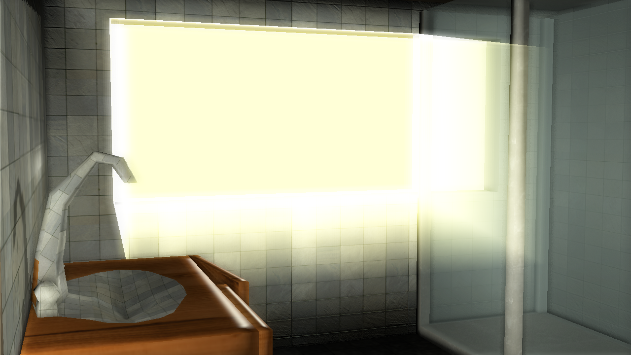
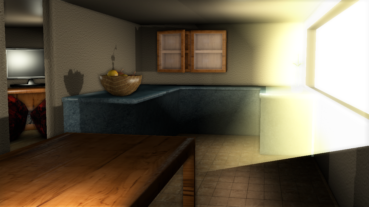
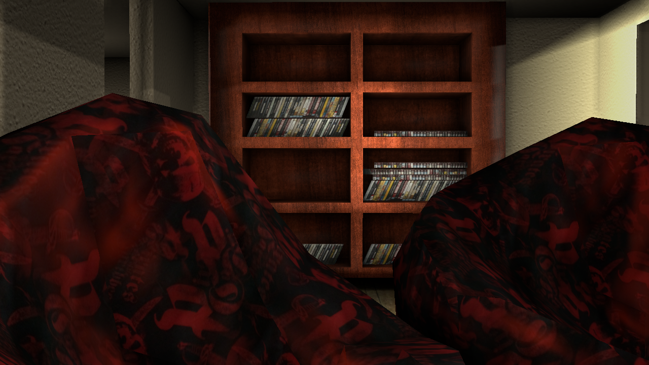
The games graphics will be a colorful realistic approach, think edward scissorhands(although maybe a bit toned down lol :D). Each time period will have a distinct color pallet, so hopefully they stick in the players mind more :).

Anyway, enough talk, here are some images!
(btw, all the images use Bloom and SSAO, and run at 40fps on my computer. With no filters i get a constant 60 :D. This is with real time shadows and stuff like that(although soon they will be baked :).) A couple more things, at the moment it runs with glsl, but soon it will be multitexture so that will be cool :D(also, it looks good without the filters as well :D)
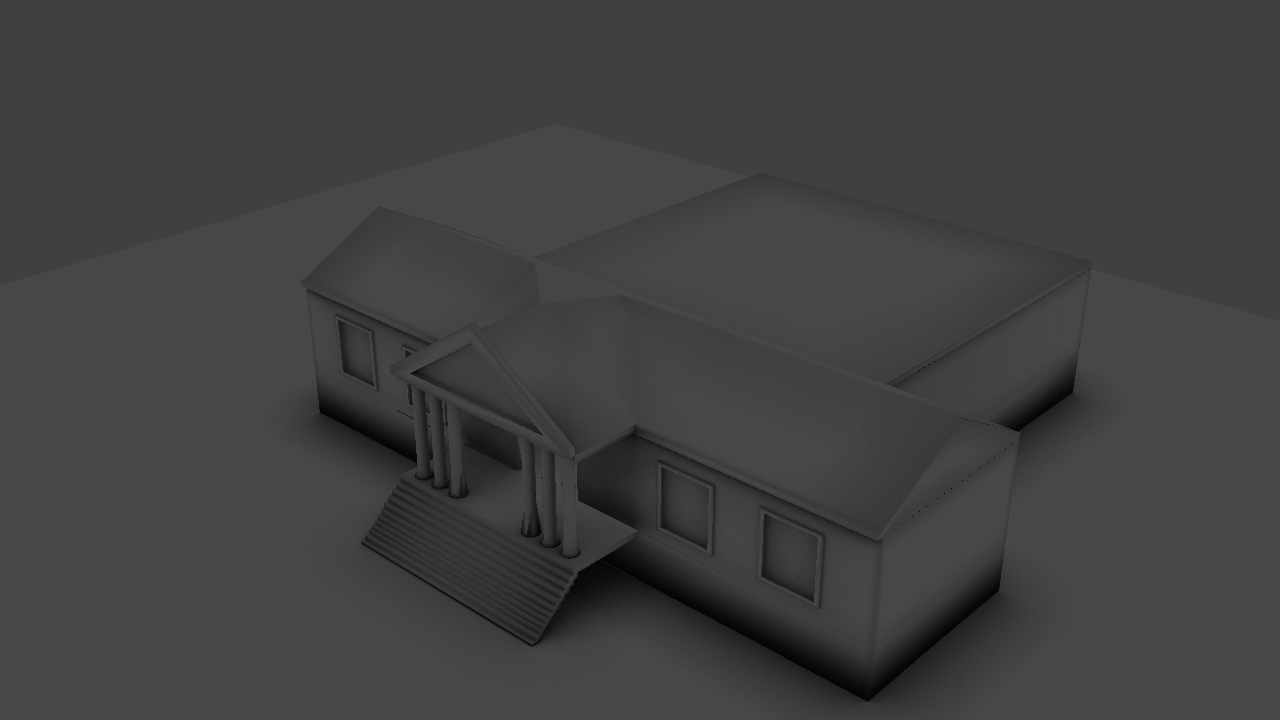
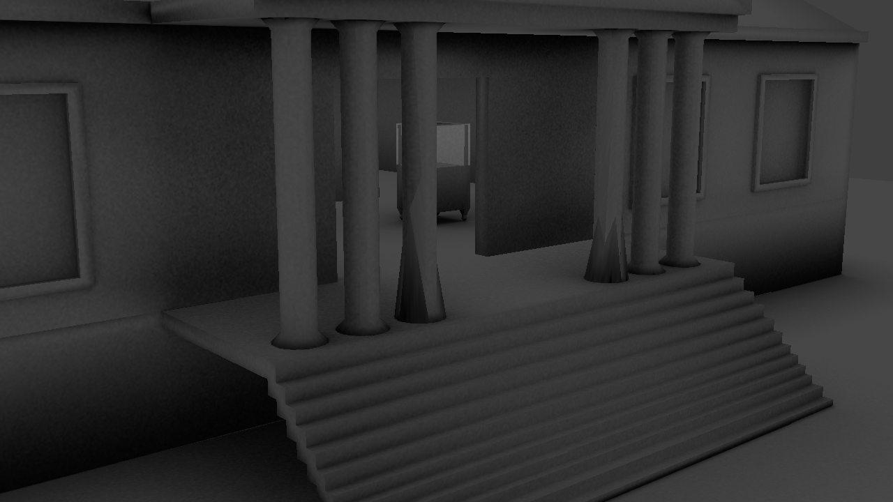
Set pieces:
House 90%


Museum 10%
Telephone 0%
Hospital 0%
Eniac 0%

Thanks for reading!

Credits:
Martinsh(I think that’s how you spell it? lol :D)
CGTextures
The Blueprints
Simo 3D
Gimp(For making some of my own photos seamless, gimp is awesome!)
Crazy Bump
And of course Blender! :smiley:

Looks pretty good. Critic: The sink looks. . . :confused: well, it might replaced be in the last 10% of the house. And I don’t think everything needs to be smooth shaded. I find had shading on objects that aren’t organic or meant to be smooth looks best.

I love the concept…

I found a book called “Energy does Matter” by westinghouse when I was 11…

It’s an interesting concept, sounds vastly more interesting than many other educational games out there.

The graphics are not too bad, some dodgy geometry in places(the sink), and I’d say the ssao is a little too strong. however it’s got potential.

The lighting could do with some tweaks, you have very bright windows but the lighting in the scene is comparatively flat. you could maybe do with upping the brightness of some of the lights.

It’s nice work so far and you’ve got an interesting idea! Good luck with it.

Thanks for the feedback everyone! I’ll update the images at the top with new ones later today :). I’ve fixed the sink, looks much better now :D, and the lighting is a bit brighter. All the lighting is now baked, and no filters are needed for it to look good(It runs on my 7 year old computer at 50 fps :D(although i find that weird as theres only 12,000 tris, lol :D).

Im not sure if i will be able to make it multitextured though, as the baked lighting is applied on top of all the other textures, and you cant layer multiple textures in multitextuer(at least not that i know of).

Ive almost finished the outside of the museums geometry, so I’ll post some images of that soon as well. Anyway, with the smooth shading, because there is no lighting anymore(All baked), it dosnt seem to matter wether its flat or smooth, so yeah :D. Thanks everyone!

and you cant layer multiple textures in multitextuer(at least not that i know of).

I think you can to a degree? MultiTexture cough the name cough doesn’t do it nearly as well as GLSL as far as I know. I always had problems with it.

You can indeed do multiple texture layers easily enough. Here’s some of the levels for DEEP Space, all in multitexture.

What you do is you have two texture slots, color and lighting.
You also have two UV layers, colour and lighting.
Then you make sure that the lighting texture slot is combined to the other one with the ‘linear light’ mix type.

I made a tut for this a little while back:

The first bit may cover what you know (baking), but at the end I talk about mixing multiple textures together.

Thanks for that video, but i cant get it to work lol :D. I always have trouble with multi texture though, so its not surprising i cant :(. I cant get it to be the texture i want lol. Anyway, I’ve almost finished the house so ill post a blend file soon, but for now here are some pictures of the museum :D.


The pillars seem to go a bit crazy when in the exported runtime(although they are fine in the viewport and in-game in blender), but it is a work in progress so ill fix that soon :D. Its just showing with ao, but its looking pretty nice i think. Ill be posting a character soon :slight_smile:

Ok, here are some pictures of the character. He definitely needs work, and doesn’t fit in with the attempted photo realism environment(Ill re-texture him soon unless you guys like him :D).


What do you think about the proportions? I think the head is a bit small but i cant get it at a good size, so maybe its just me :D.

I also made the telephone that Alexander built(no textures yet). Heres an image:


Ive been having trouble with the AO of the telephone, mainly because it is inside one of the glass display cases(in above images). Once its out of there the AO is fine, so i think i may have to bake it separately to everything else(i use one AoMap usually).

I reach my image limit here lol :D, so i cant post updated pictures of the house, but only one more thing to texture before i release the house blend. It wont feature much game play, so it will be more of a resource i guess, so i was wondering if i should post it there instead? Thanks for reading!

use pasteall and post a url pic link like this

http://www.pasteall.org/pic/show.php?id=53196

Step 1 upload a pic

Click the pic to get alink that looks like this
http://www.pasteall.org/pic/show.php?id=53196
then do insert image from URL

then uncheck remote local host…

Thanks, but I’m not sure if i will use paste-all, the images expire after 5 months which is why i haven’t in the past lol :D. Thanks though! Anyway, what did you think of the character? Ive started texturing the museum, so here are some images:


Are the textures ok? Also, how do you think i can make the rocks look less flat? thanks :slight_smile:

Um, have them less flat? By moving some verticies around.

Otherwise, play a little with vertex colors to give a bit of variation.

Thanks, the vertex colors where pretty useful, although the vertexes where a bit more difficult as i didn’t want to add too many more. Anyway, the house is done, same with the museum(although bits will be added when i model them for the other rooms :D). The Eniac room is what Ive started working on now, and its coming along well:


I’m going to ask again though lol :D, what do you guys think of the character? Feedback is better than one liners :). Thanks!

Ok, I’ve almost finished the Eniac, just creating some more components and doing level design. I also took a break and made a simple logo, what do you guys think? :slight_smile:


Also, here’s another picture of the Eniac setting :slight_smile:

A few tips for logos:

  • Altering Text makes it unique(and look like you put work into it) Like the first and last letters of Metallica’s logo.
  • Keep it compact/all together. Don’t have any awkward parts sticking out.
  • Real world logos stick to a max of three colors(including black)
  • NEVER EVER EVER make a logo too busy. Keep it simple. That makes it more memorable and easy to read.
  • Hierarchy can be big with logos. Like a big symbol, and small letters underneath. Notice you see Jets first (and it is all compact, no more than three colors, altered text, and simple!)

There are some exceptions to these. But they are the best way to make a logo.

This video has a very good tutorial on how to make varying rock formations all using Blender. If your graphics card doesn’t support GLSL you can just bake the textures.

Open game art and blend swap both have good human characters. I prefer OGA.

do you wish that you were alexander graham bell instead ?