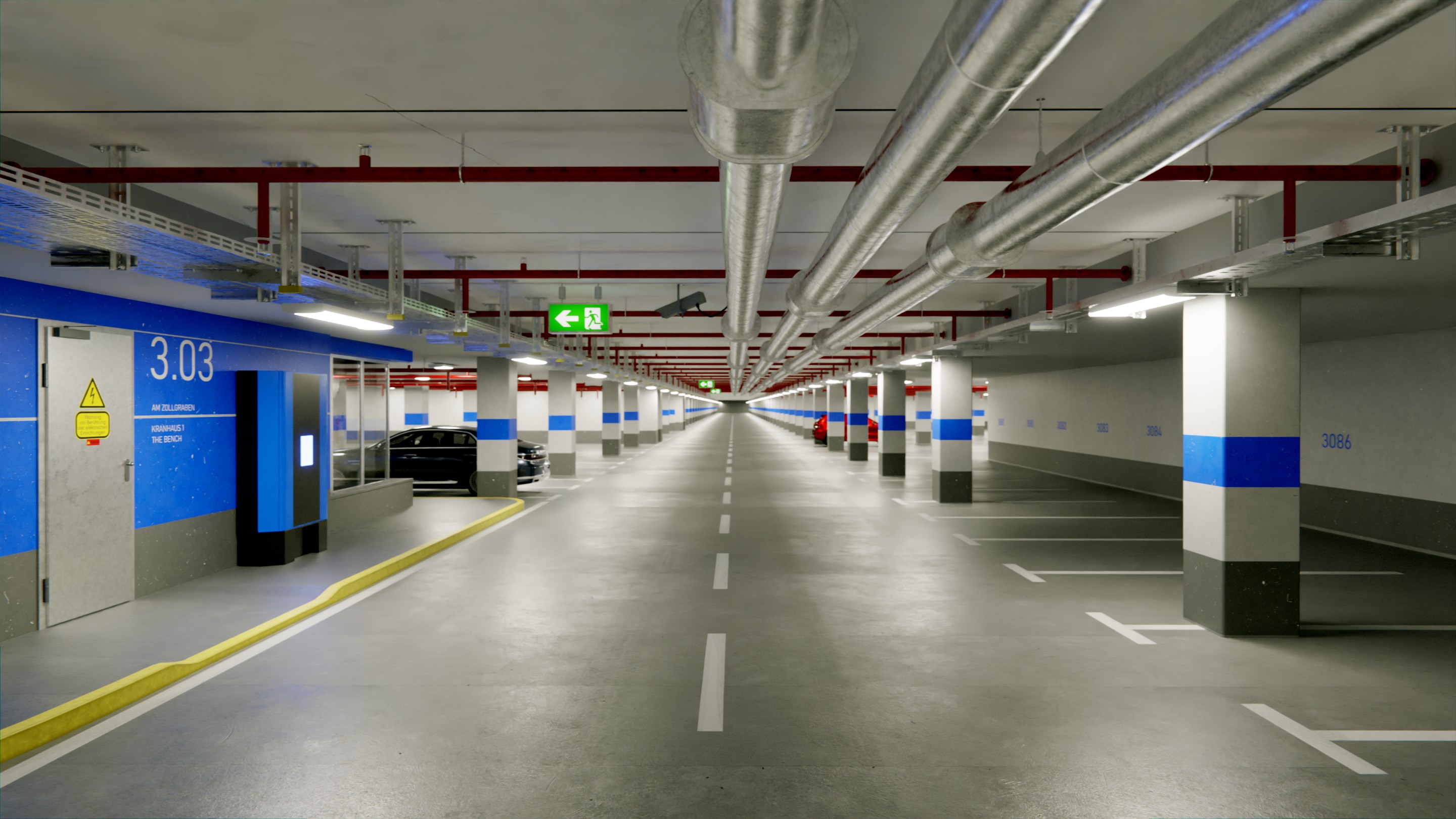
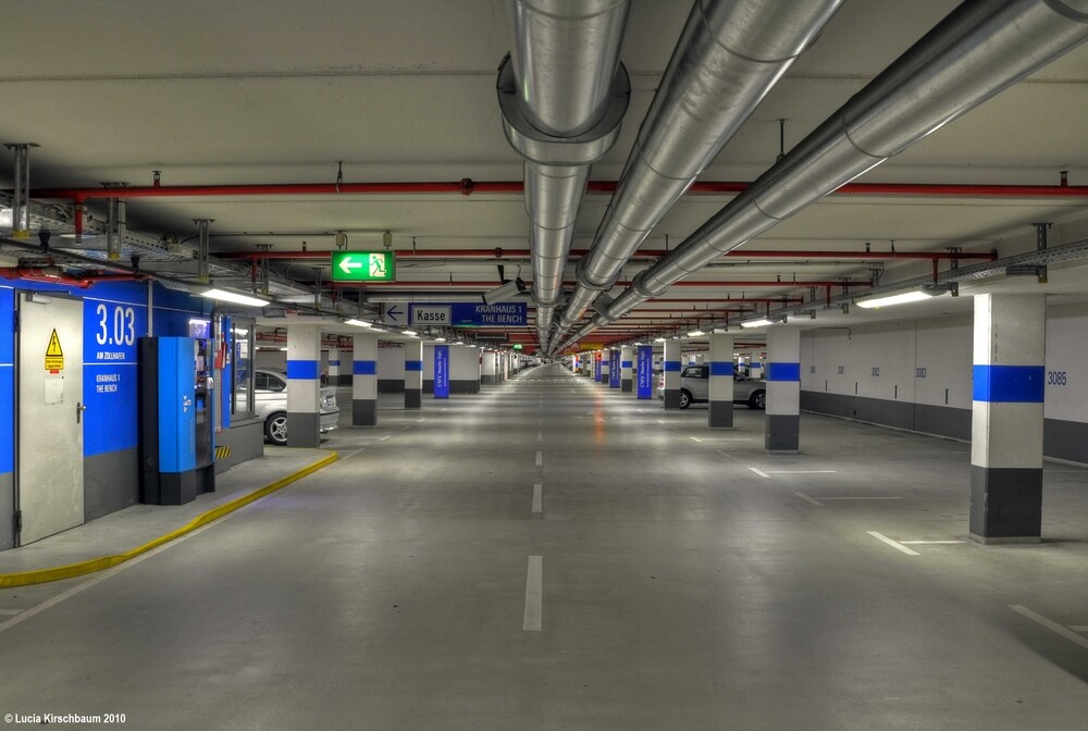
I started this project years ago (with Blender Internal ). My goal was to create an image as close as possible to realism, primary to understand what things are needed to get this. I reopened this scene 2 days ago, recreating all materials in cycles. Not all objects are added (or completed, or 100% identical), but this is not my goal. But comparing the original photo with my result, I still see a huge difference.
I have no idea what how to increase the quality. Anybody can give my some advices how to get closer to the original image?
Lighthing is done with the top lights left and right, which are just unicolor mesh lights, plus a large unicolor plane behind the camera (plus this emergeny exit signs), so especially the area above the red pipes is just indirect light. As this scene is completely indoor, a HDR image has no use (I think at least plus have no idea how to use one inside a closed mesh).
Walls and ground have different layers of grunge maps to reduce repetition and I’ve tried to replicate the original look as much as possible (still not accurate and the wall has a little bit too much scratches atm).
But the render still looks too synthetic. I have no idea
Many thanks.
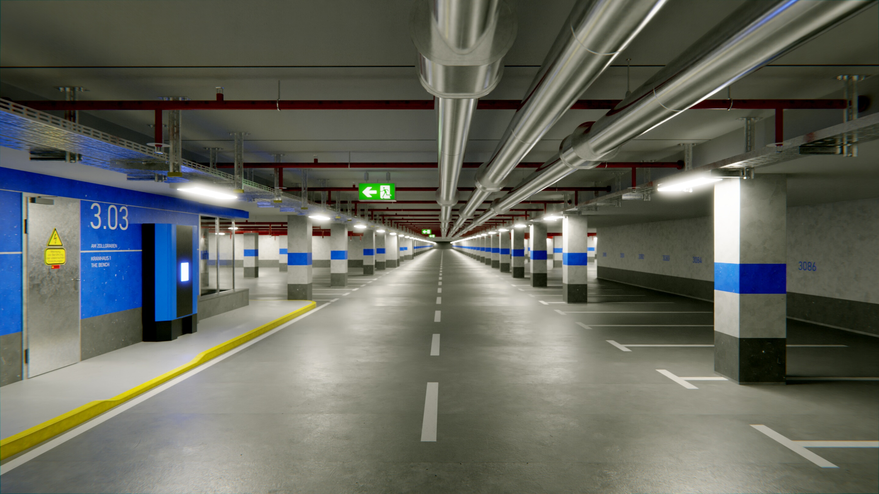
My latest result (higher sample counts are useless, I’ve seen close to no differences between 700 and 7000 samples, the denoiser creates really good results):
Wow this looks like it took so much time and effort
I don’t know too much about photorealistic lighting, but I can give some feedback with a fresh pair of eyes
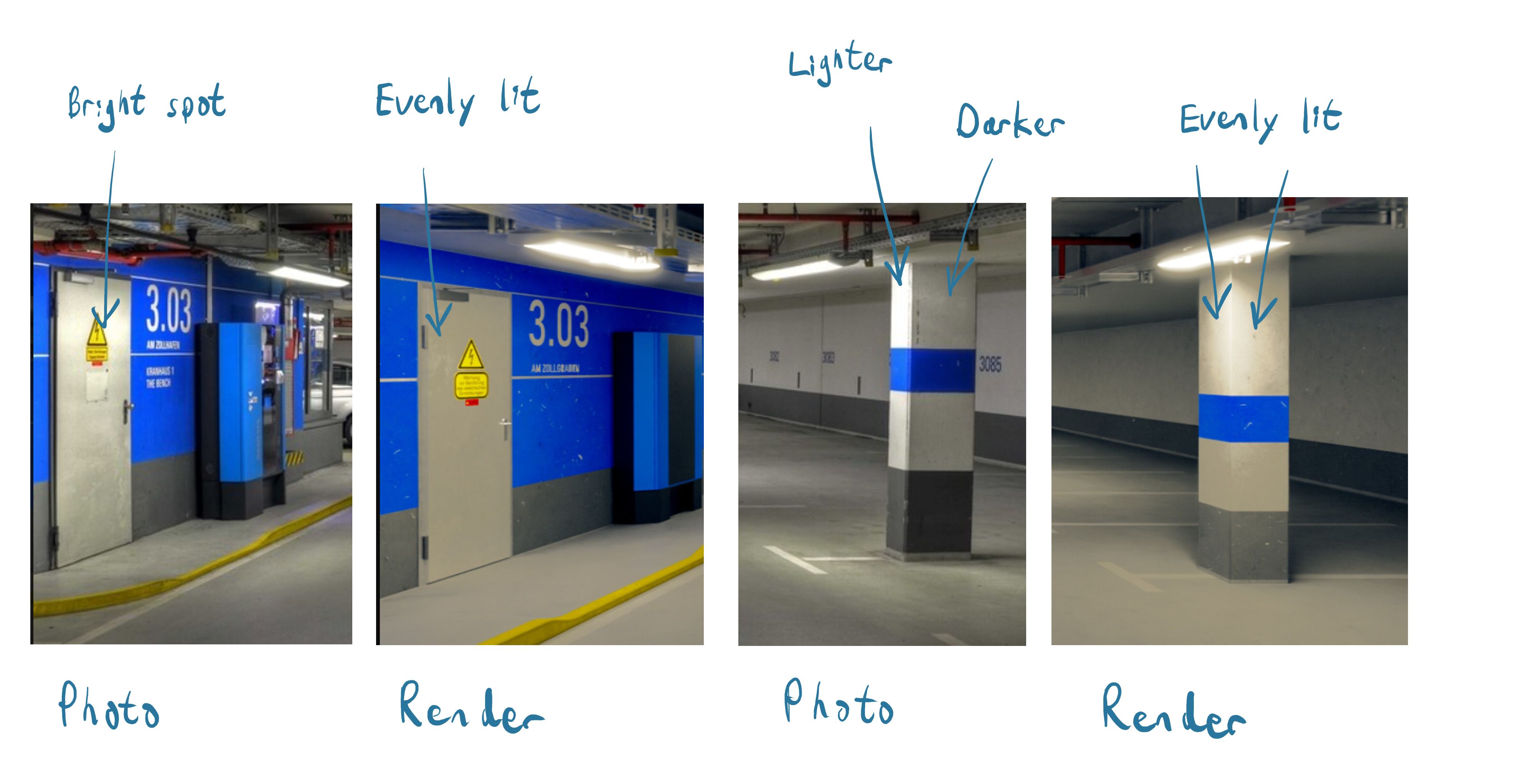
The biggest difference I see in the photo is more passes of light bouncing around (global illumination). For example, in the photo there is quite a bit of blue on the floor from the blue paint, and very little in the render. Maybe slightly increasing the specularity of the floor could help? I’m not sure…
Additionally, the walls and pillars appear to have more depth and shading in the photo; they look a little too flat in the render.
The grunge on the floor looks spot on though, and you really nailed the perspective and overall look. Hope this is helpful!
I also think this is very good (it’s liked now). You did already some speckles in the paint which are from the scratches in the wall… nice observation. Doesn’t need to be modeled . Some (texture for) numbers and markings and the complete blue pillar/indication label pillar (to break the repeatition in the background) and some simplest assets cashpoint, camera (maybe a simple horn like exteroir load specker; not in ref). And yes: more grunge (i’m with @ZachDude : perfect on the floor ), dirt, speckles… (maybe look for a nice car on Blendswap to give the apsolute final touch ?) Lighting: IDK i’m not good int that.
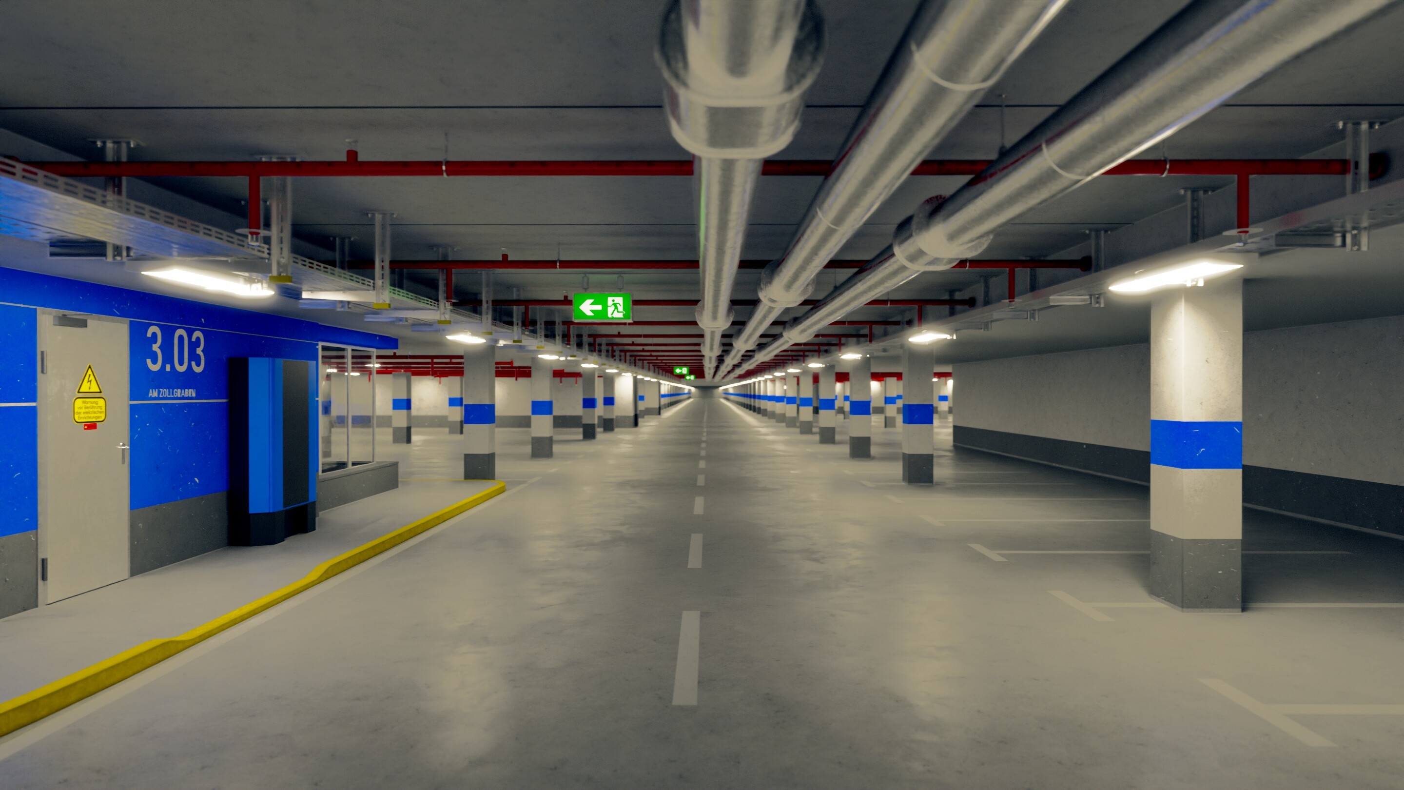
@ZachDude I’ve tested increasing the specular and saw little more blue there. But I think the most blue comes imho from some illumination source from the ticket automat (which I haven’t completed yet. Maybe a blueish LCD display). But I wasn’t really happy with the ground shader, so I’ve recreated many parts and do all things with grunge maps now:
Hopefully this image helps, but there is more contrast between light and shadow in the photo, particularly in these two spots since they’re in the foreground more.
Suggestions: It seems like the light above the pillar is further away in the photo, and maybe decreasing the radius of the light could help produce more contrast?
With the door, do you have any metallic in the material? It seems like the issue there is it’s just not reflecting the way it should.
Btw I think in your latest update the floor does certainly look better, it’s getting hard to distinguish between the two images
thanks for your points. I’ve tried to fix those and it looks better to me. Parking end is a theme were I’m not sure to.
Blur it out
Enhance scene more into depth
Or just do a blocking wall, so I’ve tried this
But I’ve to admit I’m a little bit bored on this scene, so I’ll do something different. Adjusting details is a very time consuming, but less rewarding experience
So this is my current final state, maybe I come back in the future to finalize this:
Cars & CCTV added + several material & post processing adjustments. Adding some tire tracks makes to ground looking very good, at least to me. Maybe some more tracks + randomness would increase this.
I will now try to develop some procedures to add tracks, cracks, dents … to a material without the need of texture painting (which is imho not suitable for such large areas). Maybe using specific UV maps, decalmachine, whatever


 . Some (texture for) numbers and markings and the complete blue pillar/indication label pillar (to break the repeatition in the background) and some simplest assets cashpoint, camera (maybe a simple horn like exteroir load specker; not in ref). And yes: more grunge (i’m with