I’m not an highly skilled user as many of you, I came from Sketchup & Rendering Kerkthea & Thea or Autocad & Max3d
Now i have grown to love the power and versatile power of Blender Still hitting some walls with Architecture (Buildings and floor plans to scale e.g. 1-100 or 1-120 scales)
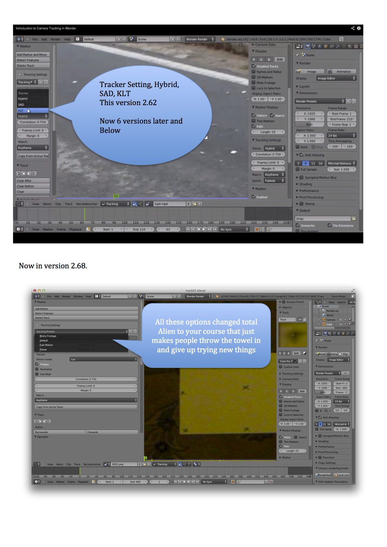
For a little fun i thought i would try out this Video tracking and make a 3d object to drop into the film, now in version 2.62 there was one set of options that worked very well, as i returned to doing the project later after a few updates from blender, all the options had changed and totally confused me. Now tracking is not my thing but to try a new item blender can do is key point of growing with the software,
But in fairness it must drive you that offer services training videos and lose of business when people dont subscribe due to issues like this or think your service is wrong so the courses offered must be wrong.
I have made a screen shot to show the issues encountered and now have to look for help how to use this tracking to implement 3d objects, and video taken with a samsung s4,
If any of you know of a good fully detailed course on this tracking 3d objects, that is done with version 2.68 please reply below and thanks for putting up with my rant…
The concept behind my tracking is my daughter wants a tea party with Tinkerbel so i will try my best to build this for her with the help of video tracking as learning loads of new things thanks to the CG Cookie team I’m driving nuts (High five Jonathan and team)
I love some of the mockups of this thread, and hope to see some more with functionality improvements instead of aesthetic.
Also the defaults so far, shown in Andrew’s video should be considered for future releases. As he said, may be a 5 seconds change to expert user, and a nightmare for new users.
Now breaking the ice of this thread, here a video for some who don’t remember.
The best Blender UI made so far:
I agree with a lot of the suggestions folks are bringing up. The tool tips need to be reworked made clearer and more descriptive. They should show the key commands for whatever tool you want to use when you hover, with the possible option of mapping the keys right from the tool tip (with a hyperlink to the key editor).
I also think that the devs need to take a break from adding features. Features are all well and good but I think it’s time we focused n existing features and making them the best they can be. There are so many half implemented or badly implemented features in Blender that could use some attention. Have the devs focus on what is already there instead of the new shiny. I also think that with the refresh should come a focus on what exactly Blender wants to be. I personally think that the highest chance of success for Blender would be to focus on indie game content development. Indie developers have limited resources but they still need a powerful application to create content. Blender is perfect for that. Tailoring the UI to those kinds of uses requires ease of use, but without dumbing everything down.
As for the UI itself, the issue for me is one of clutter and inconsistency. I don’t like the N panel. To me it makes no sense. A lot of what’sin there should be in the menus. I also think that because every feature in the book is being thrown at it you have to scroll too much. I think there should be workflow or object specific functions there. The transform/rotate/scale panel should be there the redo panel should be moved there. So you choose the tool on the left and edit the tool on the right and edit the object property further to the right. Establishing a left to right workflow. Lock to view should be in the view menu, grease pencil should also be in the view menu or put in the tool menu. XSI is a good example of the workflow I mean. You create object choose tools, do actions on the left and have the transform, selection, options on the right.
i just have a few suggestions and please give me your honeset opinions:
tap; double tap operation
basically, tapping does an option and double tapping it does what is opposite for it, this greatly decrease the learning curve for you don’t need to learn as much buttons, if you’re not understanding what i’m trying to say because my explanation is bad, then i shall give an example. press “A” to select all and “AA” to delect all; “B” to box select, “BB” to box deselect, p to parent, and P*2 to unparent, etc, etc
pre-custumize buttons
when you first open blender after installation, there will be a pop up with the changed buttons from according relative the previous version, and after customization, you can choose to send it back to a server and it will do a calculation of the most popular button and that will be changed to the next version.
a loging event
most of the time, things are not created with thoughts in, ie, in old phones the letter s needs 4 presses to input then letter “s” when is it one of the most commonly used alphabet, therefore what is think is that we should do an event where you enable an add-on which sends every keystroke to a server, and the most commonly used one would be moved to a closer position to the left hand rest position, seeing that the right hand would be sticking to the mouse(less movement = better flow)
the “shift button” operation
in paint and others, when you press shift, it creates a straigh line, scales a square as a square and not be able to deform into a rectengle, and i think this should be added to blender too, + align an object to a mesh surface, so that agustment of placement does not have to be manually made
A point that should be improved - still is about interface is as follows:
Beside blender, I use Vue. And, I must to say, Vue is deliciously plug-and-play. There are libraries of materials (.mat files), objects (.vob), atmospheres (.atm) - Vue has a powerful atmosphere generator - also armature’s movement (.vom). What about create - with the contribution of us all - a Blender library that should come within the Blender download? For now, we could do it in .blend file format.
On YouTube, Dominik Rabatin alerted me that there are an addon called Online Material Library for cycles. After a search and a substitution of an python file, I got it. And the materials are in .bcm format. Why not turn this addon on an official part of Blender, with an especific format for materials?
An artist - and most of Blender users are artists, professionally or not professionally - want to create his (or her) piece of art. A painter doesn't want to know about molecular structure of the ink. He want just to create, let's say, a morning scene, without concern about the carbon molecules on the brush.
In the same manner, a CG artist want to create this morning scene without needing too much know about python scripts or worst, about where is the command to do something.
After seeing this topic come up some time ago, and now after watching Andrew’s video, I might put my 2 cents in (I’m a software dev who is anal about UX). Starting with right-click select.
When I started with Blender last year (I’ve now cancelled our 3dsmax subscription), it’s was BECAUSE of the right-click select that made me dive head first into menus, shortcuts and layout. And I have benefited infinitely more than the alternative. If it had been left-click select, it would’ve set my brain into it’s usual rut and I would begin making many more assumptions that may have ultimately led to me not using the software.
Let’s assume left-click was default, and the icon toolbar existed. What need do I now have to learn shortcuts? Everything is presented on a platter - or at least some of it is. When I get to an operation that isn’t on the toolbar, I start hunting. But since my mindset is now ‘click to perform’, I’ll continue to use whatever menu contains the option that wasn’t on the toolbar. This has now made me inefficient as I’m not learning the shortcuts that make Blender so powerful.
With the same thought process I now attach every other paradigm. Ctrl+Z or Y for undo/redo. Except Ctrl+Y doesn’t work. Ctrl+C to copy an object. Nope. Ctrl+X to cut. Nope. Shift+D to duplicate, fair enough. I use After Effects and it uses (D)uplicate too. However Ctrl+D in Premiere is cross-dissolve. So Adobe doesn’t have consistency across it’s own product range. Is this an issue? Maybe. But then the target audience is different between the two products.
So what do I agree with?
External consistency (matching existing conventions) is not a deal breaker for me. It’s a plus in Blender’s favour. However, internal consistency is imperative. Shift+A works everywhere. G/R/S is core. Physics systems using seconds rather than frames - now THAT is an issue. Some sliders having min/max but allowing numbers outside that range, also an issue. Unexplained show stoppers like black render in Cycles certainly need some feedback. These things certainly need addressing.
Now this is my personal experience and I understand how some users will absolutely be put off by Blender’s differences. Usually I would be too, but they’re not that difficult to overcome. A couple of weeks of on and off use and you’re set. Maybe I got lucky and the mindset of the developers is similar to mine. I don’t know. Just remember there are those of us who actually benefited from the way Blender works when we first started using it.
I’m equally a bit puzzled as to the panic mode people are in recently concerning blender’s “state in the industry”. Andrew is entitled to his opinion and makes some justified arguments, but he also makes a lot of unjustified assumptions and IMHO he loses credibility by asserting from the start that blender is “broken”. That’s simply unnecessarily alarmist and completely untrue. There is more than enough artwork in these forums to display the contrary. Such a statement also undermines a lot of quality work done by blender devs in the past years, despite him saying the contrary in the intro.
Personally im not a fan of the Maya interface, and i find ZBrush is just horrendous. But both these softwares get rave reviews and are industry standards. Go figure! Blender really isn’t as bad as a lot of people are making it out to be. I think there is a bit of grass-is-greener syndrome going on.
For example by default left click should be selected for the mouse - agreed.
I don’t know, i find that debate to be a bit petty. Ignoring that adjusting to the right-select really isn’t that big a deal; It takes all of five seconds to open the users preferences and switch it to left. Is a 5 second detour really keeping people from learning blender? I doubt. If this basic task is making users throw in the towel like Andrew states, then they should throw in the towel ; 3D production will be much too hard for them.
I found a lot of Andrews criticisms of the interface to be a bit petty. Really far from the insurmountable hurdles he makes them out to be. I was expecting layout issues and major show stoppers. Instead was a list of slight annoyances and non-issues. Stuff you can find in pretty much every software in existence.
Some of them are just nonsensical; different light types and procedural texture inputs require different numerical inputs because they are, well… different! And of course 1-2 is twice as strong and 100-101 is not… the first is a 100% increase and the second 1%.
Does this really “drastically increase the amount of thought” required in the workflow? Again dramatic vocabulary to describe small details that arguably are not problems at all.
I’ve never run into this “unspoken unit system” he speaks of. If you don’t understand the unit value of a given input, you probably don’t understand what that input does in the first place.
And too many decimal places? really? common… (And decimal places in frames is probably to account for subsampling)
So if after all I think what Blender really lacks is a thorough manual.
Opinions?
Blender does have a manual! It’s even the very first link under the Help button in Blender. Being a Wiki, it requires user participation for maintenance and improvement. But its actually quite good and up to date right now. So the information is there, ready to be learned. Being a technical artist I’ve written a bit of technical documentation myself for work : unfortunately people generally don’t read it. Some people do, which is awesome, but a lot don’t. They want a hand to hold and a quick fix. I’m all for helping out but at some point it becomes difficult to empathize with people who wont put in the effort to educate themselves.
For the jobs argument. I just don’t buy it.
Yes, blender is hard. But not because blender is “broken”, but because 3D in general is hard. Thats why the salaries are good and relatively not so many people do it. Thats why it takes millions of dollars, several years and a small army of developers to make a game. All this talk about making blender relevant to “the industry” so that people can get jobs is moot. You don’t get hired because you know what every button in Max or Maya does. Anyone can memorize a keymap. You get hired because you make beautiful textures. Because you sculpt/model well and you understand proper form and topology. Because you animate well and understand mass and timing. etc,etc. They are looking for skill sets, not software lists.
Besides, if you want to make a career out of 3D, you should fully expect to have to switch softwares every once in awhile and have to learn new tools and get accustomed to new pipelines which you may not necessarily prefer or even like.
I used Softimage3.7 in school (thats’s long before XSI for you youngin’s). That’s the last time i used it More importantly i learned the basics of 3D. The software being taught wasnt important.
anyways, enough rambling.
I think the UI can be worked on. There are some cool ideas and visuals in this thread. Some areas need some love. But i think the panic button is stuck in the ON position.
I think it wasn’t a clever idea to compare Word, Excel, Outlook… They are all of the same package. It would be better to compare office XP with office 2010. Big changes with these ribbons and also a lot to accustom for an experienced user. Like blender. But yes, there are good points in Andrew’s video, but to call blender broken…?
JoHal: I agree it’s a bit dramatic, but it does grab the attention. Much more so than the people who’ve been quietly working on mockups and proposals - which is kind of annoying, but he started some broader discussion on the topic, so that’s positive.
At the risk of coming off much harsher than I intend to, this for me summarizes everything that is the problem with attitude with regards to the Blender GUI. Read that quote again, and you will see it precisely.
You see, it’s not hard to change the settings from right to left click. It’s not really hard to calculate from frames to seconds in the physics panel - all you need is a calculator to do the job the UI should be doing for you in the first place. It’s no problem to manually type numbers into sliders that according to the UI shouldn’t be possible. Hey, it’s all no problem at all! Well, as long as you already know, that is. The problem is, the GUI is supposed to remove confusion, not add to it.
If you know that the tiny CUDA error that pops up in the console means “our of GPU RAM error”, then that’s no problem. I run a blog about GPU hardware - do you have any idea how many times people ask me this very question? How hard could it be, to add a box like Andrew suggests?
A small digression: my brother does a bit of open software development on the side. He told me the other day something I thought was spot on: the GUIs of most open software has traditionally been very bad, as the devs weren’t interested. However, lately, a lot of devs started making tutorial videos on Youtube to increase interest in their software. This lead to an incredible improvement of the GUIs, as the devs then themselves had to say out loud why they had made the GUI choices they had. I for one, would love to hear an explanation for the seconds in the physics panel (sorry, it’s my pet peeve)
In the Blender universe, this job falls to people like Andrew who makes tutorials. To dismiss Andrew’s efforts is unkind, but to dismiss Andrew’s authority as someone who has a hell of a lot more experience than you and me explaining Blender’s GUI to people is not only silly, but it is not recognizing it for what it is: a fantastic opportunity to make something great even better. And that would be a real shame.
We are all incredibly grateful to the devs for the great work done in bringing out Blender - I know I am. And yes, 3D is not word processing, you need to invest serious time and effort. But to this, the GUI should be your guide and help, not an obstacle to be overcome.
To not realize that from a GUI perspective, this many inconsistencies amounts to a broken GUI, isn’t helping anyone. I am not saying the devs are not doing a great job, they are. But Blender is a community effort, and GUI work is, at least in my own experience, neither as fun nor as challenging as working in core functionality. This leads to GUI decay over time in most such projects, and Blender has decayed quite a bit. If there is no responsibility by someone in the dev community to enforce consistency, this will continue to deteriorate.
@Olesk: Agree. This is the most important part. Yes maybe some of the wordings are a bit petty but at least now the issues are in the light and people are listening. This should not evolve into a discussion of whether not to do anything or do something. This should be used as an opportunity to something. The question is what.
Work like the screenshot of PLyczkowski is very good at showing options to what that could be.
I would have outlined what in his screenshot I find especially sensible but on second thought I agree on almost all of it… It does not solve everything but its a good example of a well communicated opinion.
Lets get the problematic areas on the table so to give the devs some help in this subject.

 People have to know about this!