I have 1 week to tidy this up and this is my to do list:
Make the boy more pale and the mom more “rosy”
Give the angel transparency
Fix the little specs on the wings
Add a few more things to the hospital room like a failing hear rate monitor, a Bible, and a ceiling trim.
Make the ghost’s transition more smooth.
Apply armatures and sculpt out bad deformations and add more detail into the angel, boy, and mother.
I need to render the hospital room starting Tuesday or Wednesday because my computer is so slow, so please share!
The room looks quite good, i think. Maybe an infusion bag or something like that.
I personal don’t like that glossy angel. It looks a bit like the Silver Surfer from Fantastic Four.
And I would flatten the bed. It must be annoying if you dont lie on an even floor.
Hope I could help. Good luck with the rendering process. I have also a bit trouble the get ready in time.
Thanks, I will add an IV bag on the stand and move it to a better place. Great idea.
Haha I was wondering what it reminded me of. Anyway, I don’t really have any better ideas for him, so if you’ve got one I’d love to hear it.
Many hospital beds are inclined, that’s just the way they are. I believe it helps circulation or something.
Well I have yet to re render the hospital backround, but I did finish the ghost. Now the hardest part will be the angel. Any creative Ideas? Any critiques?
This does look pretty dope! The “angel” is nice - go with a transparent ghosty look and it wont be so IM A BRIGHT LIGHT IN THIS ROOM - leave more to the imagination to fill in the blanks and it will sell this image WAY more
I think the view through the window is a little over-saturated compared to the rest of the image. It’s a little destracting. I guess sun-set is fitting for the scene, but its so much brighter than everything else! try an overcast sky.
The stool the guy’s sitting on. It just doesn’t quite look like his waight’s on it. could you shift it up and forward a few inches?
Haha wow, thanks guys. I planned to render the changes overnight, but for some reason my computer restarted in the middle of the night?
Wilmaciii: Sorry man, but I can’t really fix the skin at this point unless it ruins the whole thing. I have tried many times to get it too look nice in cycles.
yogyog: Thanks that was incredibly helpful!
Samuel: Kindof in cycles but partly in BI. I’ts actually pretty simple because it’s just a trick of the eye. I can give y’all the file when the contest is over.
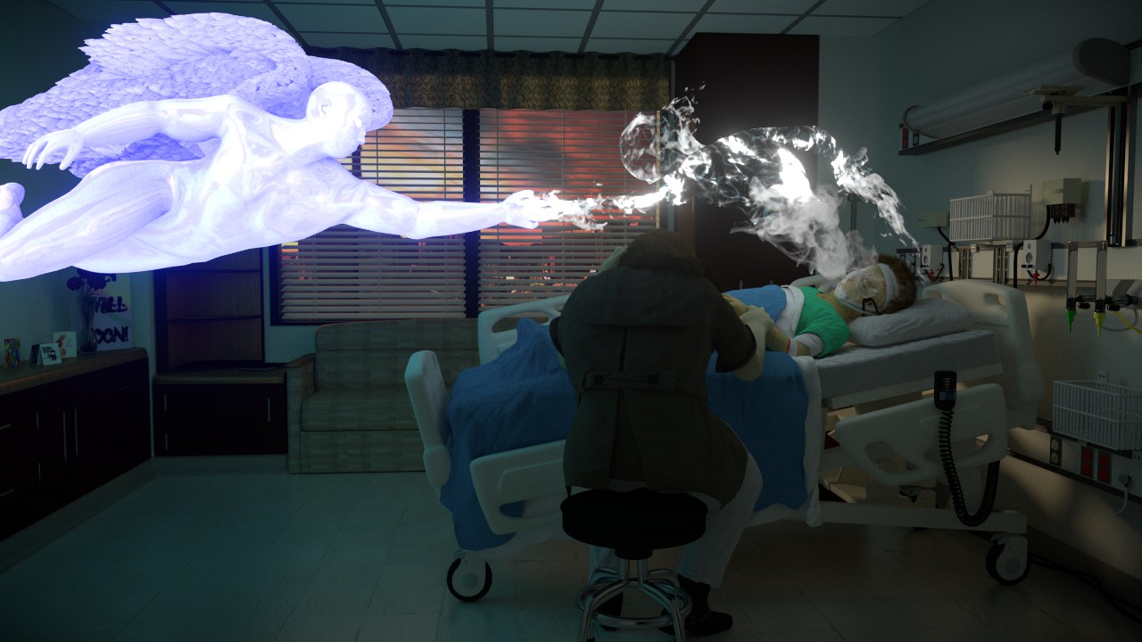
If the intended subject of the scene is that the little boy has just died, then you need to light-balance the various portions of the shot (probably by compositing each one of them separately). The actor who’s getting the short-shrift right now is the grieving parent, who is almost invisible. The back of this character’s clothing is dark.
I would also seriously reconsider the sculpting of the boy’s face. The eyes are noticeably unrealistic and perhaps should not be open.
The emerging spirit (especially, because of visual interference with the face) ought to be desaturated and somewhat translucent. The angel must also be, and perhaps his/her color should be a little more golden.
There are lots of opportunities for adding additional colors to, for example, the apparition of the boy’s spirit. The overall effect here is good but somewhat one-dimensional. You can get a lot of good out of layering slightly-offset images of the same shot, with different color-casts and transparency, to add volume.
You need to be very careful that the angel doesn’t look like a flat photograph that you grabbed from a story-book somewhere and pasted over the top of it.
You really need to be sure that the viewer’s eye registers three things: the grieving parent, the boy’s face, and the flatline monitor (which is in a very peculiar position given actual medical practice). Right now the eye “hits” either the angel or the spirit first; has to dig through light to get to the boy’s face; doesn’t really see the opaque-shadow parent at all; and might not observe the monitor due to its peculiar position for quite some time.
I don’t think you need to do much at all with the hospital background, particularly if you have separated the shot into enough “comp” layers. Perhaps you can simply adjust the color and saturation levels of those layers without burning more render time. You don’t want the darkened room to be pulling the viewer’s attention away.
If the intended subject of the scene is that the little boy has just died
The intended focus is to be on the spirit grabbing the angel’s hand, symbolizing the hope that is there even if it all seems dark to the loved one.
The emerging spirit (especially, because of visual interference with the face) ought to be desaturated and somewhat translucent.
I understand what desaturated and translucent mean, but I don’t understand what you mean, sorry.
flatline monitor (which is in a very peculiar position given actual medical practice)
Ha ha yea I had some moral trouble putting it there because I know it’s not correct, especially not connected to the bed controls:eyebrowlift: I placed it there just so it would be visible
Thank you for the thorough crit. I really appreciate it. However I’ve got a big paper to write in the next couple of days so I’m sorry to say that this won’t get too much farther except for the compositing tweaks and obviously completing the angel.
Well, I made all necessary changes on the room itself and am rendering it now. On my mediocre computer it has taken 22 hours to get 1166 passes. I will probably settle for 3,000 to 5,000 so it looks like I have a long wait. So I guess now, please just critique the ghost, angel, and composoting.
Good luck with the final composition Jonathan you have done a great job, the lighting looks much better than where you began…but thats the process right:)…just a few more days now:)
Alright! rendering done. I’m glad it’s the weekend so I can crank down and finish this. This is what I have so far. Any comments/ critiques? Only on compositing, ghost, and angel. high res
So Im thinking of last minute adding a demon coming through the floor about here (oh, the angel would be tilting downward):
He would be textured like the ghost, except in fire. Good idea or bad idea? Would it make the scene too confusing of crowded? I kind of need to know soon, so please comment any thoughts. Of corse I’d have to add a red light to the room.
Edit: well, thinking rationally after my initial “ooh I just thought of a potentially good idea” high, I think that I better not for the contest because it kinda destroys the hopeful goodbye that I was going for. Perhaps I will add it after the contest because it looks cool.