I hate to say this because I know you have put a lot of work into it, but the sheer curtain on the window is really standing out too me. It looks very geometric and unnatural. Maybe a roman shade or nothing at all with just the blinds only might look more realistic. Again I’m just sure that you dont want that to take away from the real focus of the scene:)
Yeah I agree it looks unnatural, but I am not sure what to do. I don’t think a roman shade would quite fit, and just leaving the blinds would feel bare. What if I destroy the symmetry by applying the mirror, and then sculpting some nice wrinkles into the fabric. Its the same technique I am going to use for my bed sheets, so I may as well get practice. I have yet to find a good texture for it, and I have just about exhausted CGTextures library.
Thanks!
Quite frankly, I’d go back to your first, BI-based render and start there … because there is absolutely nothing going on with regard to the mattress of that bed; nor, particularly, with the plastic parts beneath it.
In short, there is nothing “going on” with regards to the single most important part of any image: the light. There’s no variation. The lighting is absolutely flat. The textures, therefore, are “at best, uninteresting; at worst, non-existent.”
Stand in the middle of the room in which you are now sitting or standing, and take a very careful 360-degree view of the space. Can you find for me even one surface upon which the lighting does not have some, however slight, variation? I won’t ask you to start taking measurements with a photographer’s “spot meter” but you’d be absolutely floored if you actually did so; at just how wide of a range of numerically-quantifiable variation is actually going on all around you, all the time. It is these differences, often occurring within the space of just a very few inches, that make an image real.
Now, if I may, let me briefly go one step farther. You are the Almighty Photographer. Therefore, you are in control of the shot; you mustbe in control of the shot. Where do you want the locus-point of the shot to be? What do you want me to feel about … what do you want to makeme, nay, compel me, to feel about … that hospital bed or the person who is in it? You have four controls at your disposal: color, contrast, saturation and brightness. With those four controls, and in the exact same setting, you can make:
A publicity piece for a manufacturer of hospital equipment.
A place where a mother just gave birth to her firstborn child.
A place where a very sick person is just going to make it. (There is hope.)
… or a place where he will not. (There is none.)
A place where a person has just died. The undertaker has taken the body away; the grieving family walked away, just moments ago …
Wow, thank your for your awesome critique, I love it when I get those. I will try to keep the light variation thing in mind, but I’m not sure if I said this well enough before: since I am laying a character in the bed, I will wait till he is finished to put wrinkles in the mattress, add a pillow, and 2 layers of sheets. The sheets will drop down and cover all of the bed until about that lower bar, which will then certainly have variations in the lighting because the sheet will be all wrinkled. Thanks though I really appreciate honest critiquing like that, it really does help me improve.
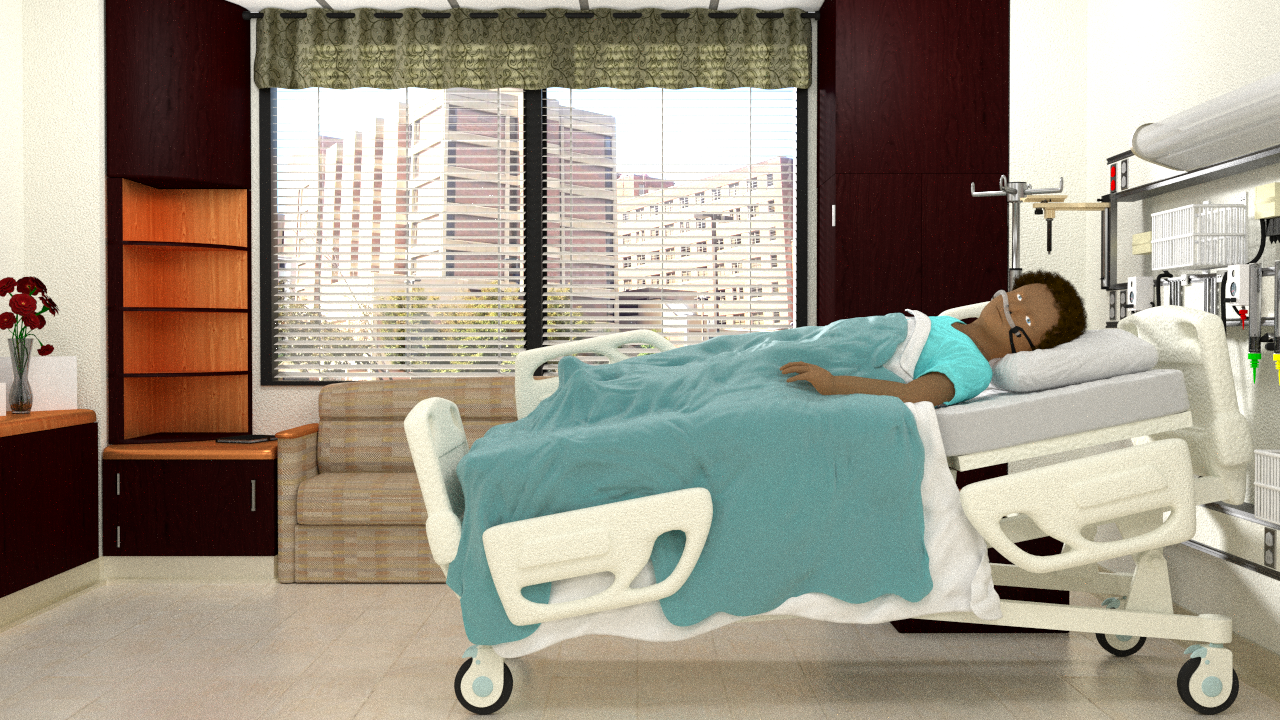
What about just some simple drapes (sheer or pattern solid) going to the floor with the blinds behind? You could shift the couch ahead a bit to make room. Just google hospital room window treatment and you can find tons of reference images like the one below. If you do drapes I would suggest not only making then wrinkle different but also make the symmetry off meaning one drape is further closed than the other, seems more natural like that. For the most part it looks like most hospital rooms are pretty bare and usually just blinds (horiz or vertical). Hope this helps more:)
In regards to Sundialsvc4, he is correct but I see nothing wrong with fully lighting the scene and making sure all the textures are correct and that in optimal lighting the colors are correct as well. Then with the beauty of cycles, completly rework the lighting to make the viewer focus and feel the scene the way you want them too.
Derek G:
Thanks, I will mess around with it to see what looks good.
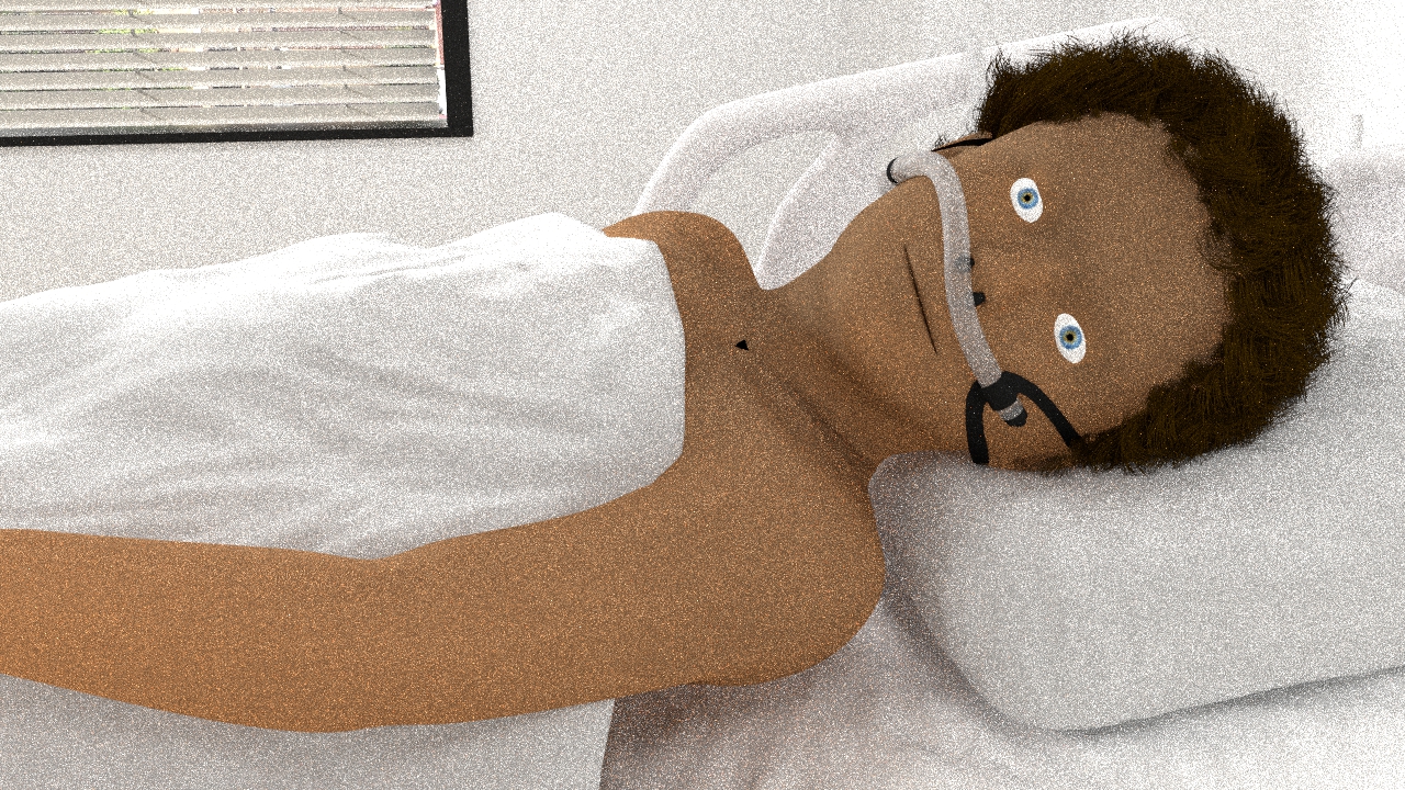
Also since no one else seems to have done this before that I have seen: HAIR IN CYCLES! I only rendered 100 samples cause they hair made it a lot slower. It doesn’t look the best, but from farther away it should be pretty decent.
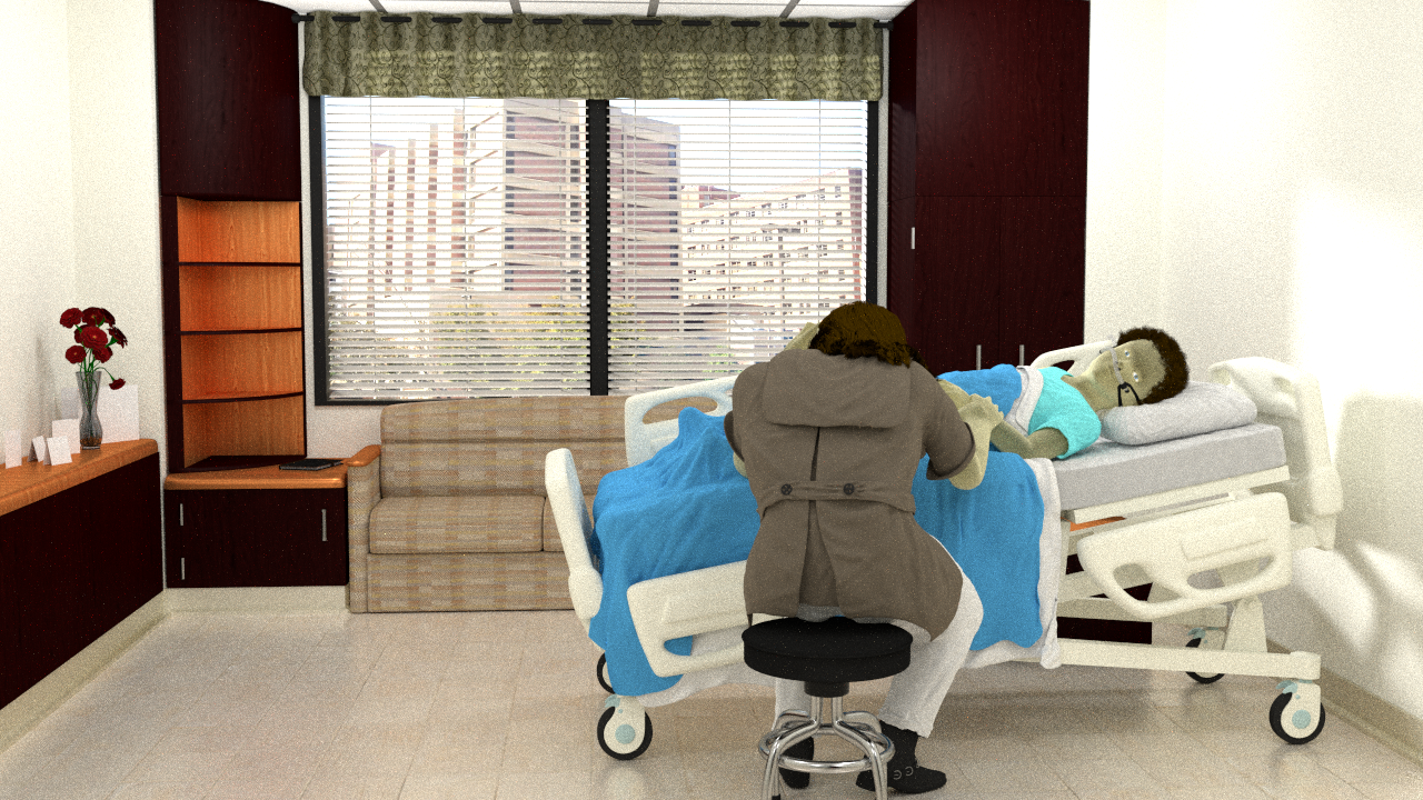
So I tried for a lace kind of thing above the window, not sure exactly what its called, but it looks horrible for some reason so I will try something else. The boy’s hair I think looks quite natural, but his posture looks very fake and stiff. He also needs eyebrows. I think in the future I will only render the parts I’m working on because overnight it only got up to 900 samples, and probably because of the hair. Also I need to make another person to sit on the stool.
I am already doing different render passes, but I figured it would actually be more realistic to have the kid and plants in cycles because then they would react with the environment and lighting better and they are not super complex anyway.
BTW, does anyone know where to get children textures? 3d.sk only goes from 18+ for rather good reasons, but I cant even find face textures anywhere.
So I posed the mother and am working on her cloths and hair, but I realized I have no idea how to get the hair to flow along a curve. I know it’s probably something stupidly simple, but even Google couldn’t tell me.
Also, any critiques about the composition or “story”?
I updated the Girl a lot, but since it is only 720p you cant see the nice leather texturing on the boots. I am also going to add a denim bump map for the white jeans, and thin out her hair a little. I think it’s time I start focusing on the spirit, but I am at a loss as how to accomplish it, so I will have to experiment a ton. Oh well, I hope I get it done in time!
Jonathan, what focal length are you using here? It looks slightly long. Maybe get a bit closer and use a wider angle ‘lens’, give it a bit more depth. Other than that i cant critique, you’re doing a great job.
I went and sketched out what I thought I should do, but then I had and idea. So I posed what I had drawn and rendered a my idea. It was hurried, but this is what I got: