There’s some logos that are really nice. My favorite so far most be Maujoes when there’s nothing more than the logo. No text.
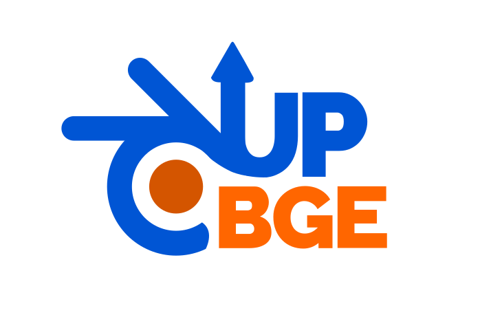
I did a few tries and came up with something that includes the letters U, P and B in various ways. As most of the options it’s also based in the original Blender logo.
OK, no problem so basically upbge is a fork of blender with the target to improve the bge. It’s not the official blender (bge) but it has some nice features (see website) and at the moment it should be up to date with the last release version of blender because it was parallel updated.
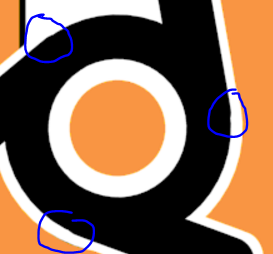
Just thought I’d point out, there’s a small issue with the join between each arm and the circle, which looks bad in high resolution. It’s probably easy enough to fix, just have to scale the circle a bit. It might be good to re-make the circle anyway because I don’t think it has enough vertices. I was rushing when I made the .blend
yes, because I really like it…it’s simple and iconic…I mean who does not know pac-man?..but that is the only thing…the licensing of that pac-man icon might be a problem…what I do for my upbge icons is simply invert the bleu and orange colors on my desktop, so the blue is orange and the orange is now blue…here is an example…someone else could do much better, but it fits my needs…besides this is an old thread.
I see no problem in simplifying logo by substracting the typography. Here you got logomark only without typography. Seems it would look pretty okay even in 64x64px.


