I’d like to ask opinions regarding my WC entry, Word Macro. See the WC thread for an explanation. And I know it’s too dark, and I don’t care. It’s supposed to be dark.
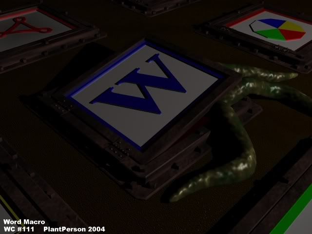
Maybe you should care. The darkness gives it a washed out feeling and makes me not even want to look at it at all. The darkness is very disturbing, and in a bad sort of way. By tweaking the lighting you could still give it the “dark” fell, but make it a better image. Experiment with some other colors, positions, and intensities of the lighting. Also, the tenticle/plant matter seems a bit boxy, and should probably be smothed out a little bit. All of the textures are dull and uninspired, making this a very drab image to look at. Give this image some life.
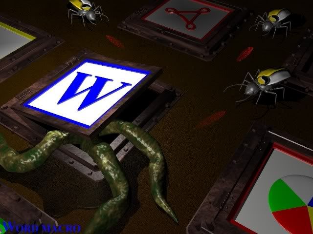
Well, I listened to TGinn. It’s brighter (I always give in  ) and more interesting. The tentacles are less boxy. The Symantec Scouts are on their way to the scene of the crime. I also rounded out the color wheel icon. Oh, and, of course, a puddle o’ slime. Is it better now?
This is much better. There is still one thing nagging on me though, but I cant think of what it is. Anyways, as soon as I think of it I’ll post it. Good work, much improved. 
i like the laser effect from the bugs. thought the thing that “bug” me4 is that there is no ehought detail on them. As they are very shiny. i start by looking at them and so i find them odd. maybe it’s a material problem… refine material.