So I don’t think you many of you folks are understanding the issue. I am not after setting an rgb value and rendering that exact value. What I’m wanting to make sure is that I am providing the correct RGB value, so that cycles, eevee, or realistically Any render engine treats it properly according to it’s physical values.
PBR workflow tells artists that every color value should be between 10-240 to be physically accurate. Any color outside of that range is outside of reality. So if someone tells you “Pure red” should it be 240,10,10, or 255,0,0? And then I wonder if there is a curve in there?
If someone gives me fully saturated, bright, etc graphics they picked and designed in illustrator, when I bring it into photoshop (I do that Mostly so I can define it’s size in DPI as illustrator is still stupid and assumes anything you export is dimmensionless 72dpi) I’d love to just be able to add a saved “look” (even if it’s just one adjustment layer) to fix the colors to be within the realistic range. And I wonder if a curve is needed also, because of sRGB curves being abnormal, and previos workflows were gamma 2.2 vs the render engine which uses everything at 1.0, so you’d have to tell it your image was 2.2 or it’d be wrong.
I slapped my colorChecker passport on our scanner to get an even, single lightscourse image. That didn’t work out for me though, because X-rite lists the RGB colors for each of those, but Not the colorchecker Video passport. So I should be able to make a color swatch for each of those and overlay them on the image. I hope to be able to make as smooth layer adjustments as possible to those colors to try and get them to match the actual scan of the colorchecker, which would hopefully get me close to a color converter to “real-world” values? Does that sound about right? That’s about the best I could come up with. The only alternative would be for me to calibrate my printer, and print out the colors I need, then take a picture. Having to do that every time would be Very time consuming. If I actually have a pantone color, I could do the same, just take a picture under a controlled light, and get the color value.
BUT of course, I ran into a bigger issue, making me fee like a complete idiot. I noticed the ShareX isn’t giving me correct values. Then I noticed also that photoshop Also doesn’t give me correct values of screengrabs, and if I sample a color with photoshop outside of photoshop, it’s wrong. So I have some further research to do. My windows color management isn’t playing nice with reported values. Both values look correct. I pulled up this page: https://www.pantone.com/color-finder/2226-C and it shows 60,203,218,. but it samples at 142,196,216
The only way I can get the colors to actually copy/sample correctly is to set my windows color profile to sRGB rather than my monitor’s icc profile.
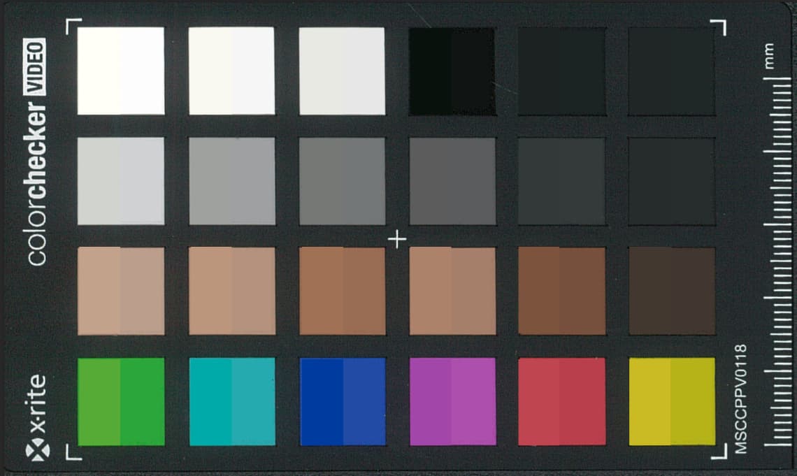
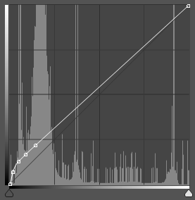
I did do one experiment with my color checker. It looked like DaVinci resolve might show you the actual RGB values after it corrects the colors. So I tried matching those color swatches to the original in photoshop. I ended up with a value curve that looks like this:
Where this is before:
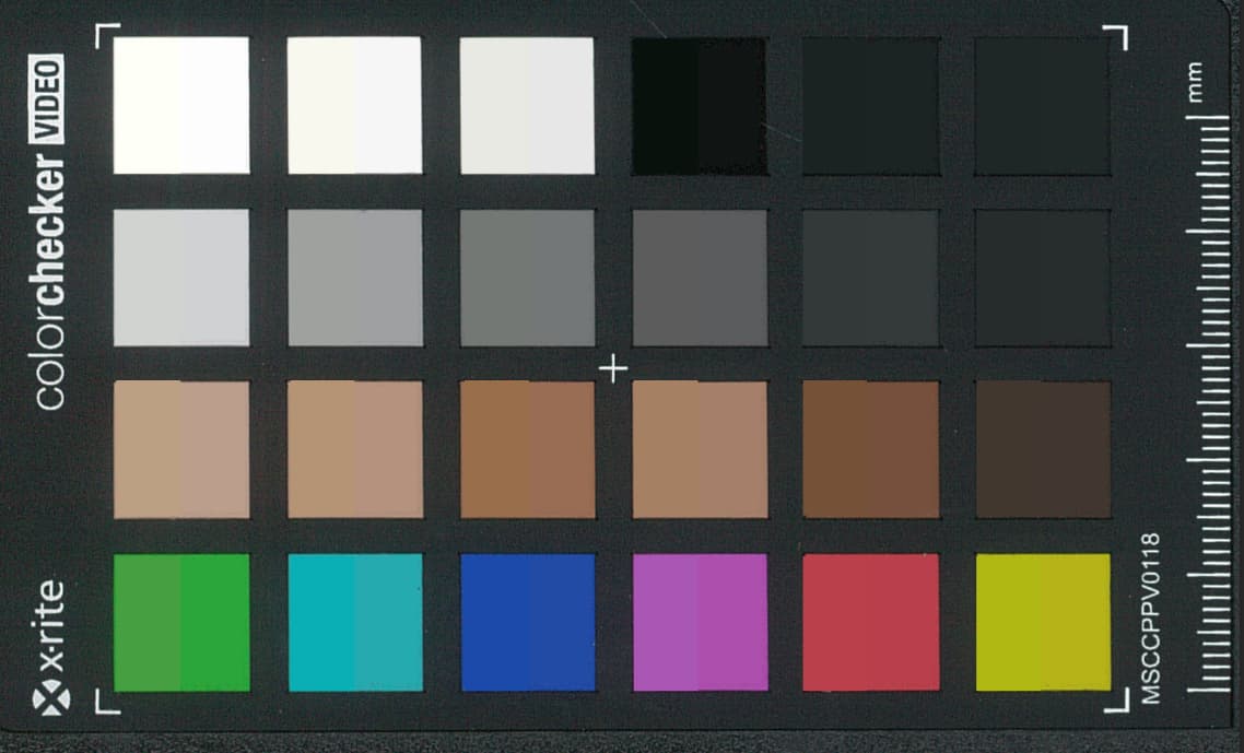
This is after the value curve applied:
And then I added a selective color adjustment to get here:
Does that clear up what I would be hoping to do a bit more? If you pick a color of a physical object on your screen, you’re basically making the same mistake lots of graphic designers make when they intend to print something out. Of course, once you add finish to the colors, you’re still making a huge mistake, because you can take a saturated red, then add a texture to it, and suddenly it looks pink in most light.