Vectorscope - RGB colors

A potential client has 4 specific colors he want me to use which are fully saturated. Like in RGB terms: FFBB00.
Those colors are not suitable for broadcasting or to play back on smartTV. (though most likeley the video’s will be watched on pc’s).
So I thought to use the vectorscope in Blender to find out the best way to present these colors (less saturated but within boundaries) ?

My question: I can;t find an explanation of the vectorscope in Blender… I supppose I have prevent them to go outside of the marks (little squares). Or is there somewhere an explanation to find? The Blender’s manual doesn’t say much about it and it seems there are not much video’s.

Blender’s vse does not do a great job with color fidelity but essentially yes you need to keep chroma levels within the circle of the vectorscope. Also you may have issues with Blender’s color management which will not allow you to make super saturated colors. But this very.much depends on the source of your images. Also make sure that the brightness values of tour image do not exceed the top line of the waveform display.

And as you suggest, there will be problems with displaying accurate/similar colors on a range of displays as well as operating systems and media player technology. Lots of.points of failure for you to asses.

Hi, thanks for the reply.

Maybe I will take a look at the manual of Fusion, or use that.
Indeed it’s a bit mind boggling to figure out how to manage colors.
I made a mistake I think by providing them a “broadcast-save-color-palette” for their house-colors. As first step I used Filmic to ‘transform’ the colors to what I thought its a broadcast-safe range. Then the colors were still way to saturated and bright and turned the value a bit down and the saturation. And then I put some shades for hightlights and shadows in the colorpalette. And now it’s mindboggling how I can use these color’s and how I have to render them out. With Filmic (which I already used to ‘convert’ these colors) or the default view. Pretty sure that I mix up quite some things, but at least the color-palette I made for them is safe to use when designing something that has to be presented directly in the video.

False.

The REC.709 gamut is identical to sRGB, and given those values are almost certainly RGB, they are by definition within the gamut.

Thanks for reply. I hope you can advice me.
I thought the colors are to bold/bright/saturated for elements like tickers in a video.
Here a comparison. From Left to right: a) Official colors b) With Filmic base contract and c) Filmic medium High contrast

I expect that if we use these colors for tickers and other elements in the video with these official colors directly on screen, it would look distubing like this;

Therefore I am looking for a way to convert these colors in such a way that they are still recognizable but less disturbing. I came to a colorpalette, but that turned out to be very muddy:

MS_FilmicPalette_Value_0-65_MediumHighContrast

(Ah I have to reply on post, not topic)
Here a table with the vectorscope included: ( a very small dot near the read line)
Orange_Overview

One of the other official colors show that they are outside a mark on the vectorscope.

I think the palette I made is not to bad for albedo-colors though?:

I am not sure how to deal with this.

You probably need to take a step back and think about what a colour is. I’ve written up a good number of answers on Blender Stackexchange, and I’d encourage you to try and find the ones that make sense for you. I’m going to grossly oversimplify things here for the sake of explanations. Apologies to every colour science fan out there…

First, we need to understand that a colour is a byproduct of three small lights in your display. Those lights have well known and well documented colours according to a specification. That is, the most highly saturated reddish colour we can mix is by setting the emission of the reddish coloured light to any value, without turning the other two greenish and blueish lights on. Knowing this, we can quickly see that we are unable to mix any colour that is beyond the gamut of the display’s lights. Typically, these three lights are the colours of the lights in the REC.709 standard. sRGB adopted those colour lights for the sRGB standard.

HDTV uses REC.709 lights. That means that sRGB content and REC.709 content both use the exact same coloured lights, with the only difference being the intensity curves that are applied to the encoded signals. The TL;DR of this is that there are no colours that can be mixed with REC.709 / sRGB that are out of gamut of HDTV.

So where does this notion of “safe” colours come from? This started with analog, then moved into digital, and now is a result of cameras.

The legacy analog signals permitted colours to be encoded in the analog signal that couldn’t be represented in the display. Hence legal colours came around. Same happened when we started encoding digital signals into YCbCr streams; only 16% of the combinations of YCbCr signal represent valid RGB values. That is, if we were futzing with the actual encoded YCbCr streams, we could easily generate invalid “unsafe” colours. But we never do that.

The third and most contemporary place where we can hit invalid colours for HDTV is with cameras. Most cameras capture colour via three little coloured filters in their sensor. Those colours are typically not the same colours as REC.709. When you are importing your footage, you are supposed to properly transform the colours into REC.709 / sRGB based material, but alas, that is another subject.

The TL;DR is that when dealing with RGB, it is virtually impossible to encode “non legal” colours. I say this because it’s pretty common for folks to totally screw up encodings and they still display perfectly fine, albeit totally wrong. We can’t magically encode some strange series of bytes that will cause the display to explode.

What becomes clear is that your entire question has nothing to do with legal colours. It has more to do with designing colours that fit within your footage for CGI, and that is a wholly different question that is about properly decoding your footage along with all sorts of questions about albedos. No amount of vectorscopes and such will help you here, because the vectorscope is a load of rubbish at this point.

So let’s give up on the first set of questions and talk about how to integrate CGI into your photographic plate. In order, you’d need to:

  1. Properly decode your footage into REC.709 lights in the scene referred domain.
  2. Select physically plausible albedo values for your surfaces.
  3. Properly composite the work and render out via a unified view transform.

That’s sort of a bare minimum.

When attempting to integrate brand identity colours into work, it is trickier still. The reasons might be:

  1. What are the values encoded to? Are the sRGB? Are they some foolish idiot’s idea of “for print” values? Etc.
  2. Even suggesting that a pure emission off of a display with sRGB values, to try and get a perfect match from a render is challenging. It would be the same as taking a photo of the precise colour on a perfect display and expecting the photo to encode the values exactly as the reference colour is. It’s impossible due to the hardware and software of the camera. The same applies for a virtual camera in a CGI domain.

So there are some starting points to consider. I might be able to help you out further with further information. It’s a challenging topic, and it isn’t nearly as simple as some folks would like to believe.

So the first question is, are you starting with scene referred and properly transformed plate shots, properly transformed to REC.709 / sRGB lights?

PS: To address why your orange looks different is because the hex values (facepalm) you were given are likely sRGB display referred encoded values. When you put those values directly into the scene referred domain, the values will be darker because they don’t represent the exact emission levels of the display referred encoding you were given. If this seems like mumbo jumbo to you, you might appreciate how much you have ahead of you to understand the depth and breadth of the problem at hand.

3 Likes

Ha of course, sRGB colors as reference. Of course :wink:

If only it were that simple. Sadly, I’ve seen brand identity guides that list hex codes for the CMYK encoded values, and not even list the CMYK model they use. It’s really bad, and there’s plenty of cluelessness out there. LIke “this person should be fired” clueless.

1 Like

But theres still a problem getting very saturated colors on screen. I think the OP could use color traps around their images as well, but then compression will become an issue?

There’s no saturation issue if you sort out what I listed above.

What an excellent reply, nearly a chapter of a book. I will surely come back to some more points after work. The hexcodes were indeed sRGB values, or for web-usage.

Making the table with the vectorscope, what I did was making a plane with emissionshader, and set everything on default in colormanagement, curves off, nothing in compositor, no environment map or other lights. Assigned the hex-value in the emission’s node color and rendered it out. and then brought the render into blender via texture-image node and used the eyedropper to find out the hexcode of the color that was rendered. That was indeed the same color as I had given in in the first place. Next step was turning on filmic, render out, get the hex-value. (I could make a video if that’s better).

The footage you see here is not a footage but an HDRI from Greg Zaal. I suppose het made it ready to be used for in blender.

I realise that I asked actually multiple questions. The leaders of the team gave us some tasks, and I volunteered to find out the Official colors (RGB). And then I saw those colors and wondered how they will use those in a video. Should we stick to the original colors, or make them a bit more friendlier for the eye. (Well isn’t it really saturated to look at when use this on top of an “average” footage)?

I will find more info about the camera’s they will use. It seems to me these are not very professional cameras but a “semi-professional” in mainstream terms. A camera you could buy in a shop in your city-center. (English is my second language).

Maybe for the team who will make tickers, I will give them the original colors and let the video-editors decide what to do with it. For my rendering or CGI work, I will find more plausible albedos (maybe the palette I made) and use that.

Oops I really have prepare myself for work. Thanks!

Maybe you mean it different than I understand because I experience the other way around: If someone gives me display referred values and I put them in the scene referred domain, the colors after rendering are way to bright.
That brings me to another question: Do you know a dirty/rough way to turn those display referred values into more plausible scene-referred values? I know you probably don’t like rough estimates or promote such, but most of us don’t have expensive devices to measure albedo’s. (And probably not the knownledge to do without … pyranometer?).

What is best to do in order to no to mess to much with (the harmony of) the colors and get more plausible albedo-colors:

a) Turn the white/black slider in the RGB node down.
b) Turn each R, G and B value down.
c) Add a Hue/Saturation node and turn the value down. (HSV)

d) probably not: turn lights/hdri emission down, play with exposure in colormanagement.

(There are also addons like colorpalettes which give you albedo’s brighter than snow but have maybe a nice palette. If turning the value down is the best bet… )

Or what should you actually do in blender?
And after the render (with filmic it’s hard to get over 80% in the waveform-scope without to much desaturation. So I leave it usually with the highlight untill 80. Is it a bad idea to turn the use the well-known “levels” tool in a photoprogram and turn down the white so that the brightest color is now (nearly) white. Do I mess everything up or do I mess everything up and I know what I am doing? Isn’t it like I fully use that capacity of the display. Or speaking as loud in the microphone without clipping. When a recording of a sound is not loud enough, you can normalize the volume until the highest peak reach the top, and you are not changing other characteristics of the sound or you are not messing it up. That should be also possible in this scenario I hope.

Perhaps you are confusing linearized values with scene referred values?

While linearized values are critical for values to be scene referred linear, they are only a component. The nature of scene referred versus display referred values is well covered over at BSE

There’s no real way to go from a typical display referred encoding back to the scene referred domain as the values are tweaked to be aesthetic, and worse, one has no idea as to the characteristics of the encode. Log based encodings are well documented, and about the only method to reliably go back from an output referred encoding to the scene referred domain. This of course applies to a typical photo for use as emission.

Somewhere I’ve answered this before. The best method is to look up the rough albedo of the surface in question and estimate the colour you need. From there, you can scale the colour value down into the albedo range using averaged luminance.

That is, for REC.709 encoded values, I covered a luminance based appraoch in another thread. Also note that @J_the_Ninja has some valid points in this thread worth reading.

Thanks a lot.
I think one last question; Should I be concerned that Filmic is also changing the hue (HSV)? Is that intended or that shouldn’t happen? Sorry for my terminology; I understand the reason of desaturation at higher levels and compression of the values from the scene referred data to the display domain. But can’t think of a reason that hue of colors should change. Why is that?

First, HSV is an arbitrary non-colour science based thing. If we think about what saturation is, we can think about it in terms of the ratio, or spacing, between channel values. So if the distance between the red light at a certain level and the other lights is large, the saturation of the colour is greater. If the differences are less, the lights result in a desaturated looking output.

Filmic does a log-like compression on the values, which will immediately compress values more closely together than they were in the actual scene. There’s not much that we can do about this, as the values need to be crammed into the display referred domain. And of course, as you cited, at the upper intensity levels, we have to try to keep some semblance of the original intention of the colour without too much skew, so we tack on a controlled desaturation as we reach peak.

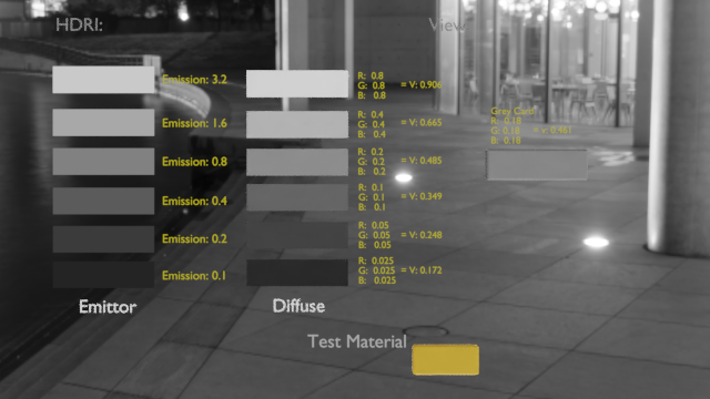
In the area of the curve with a linear segment that is step, the ratios are pulled apart a bit, and the result is that the original intention of the scene’s colours are closely returned. In the nonlinear curved part near the toe and the shoulder however, the values are going to drift.

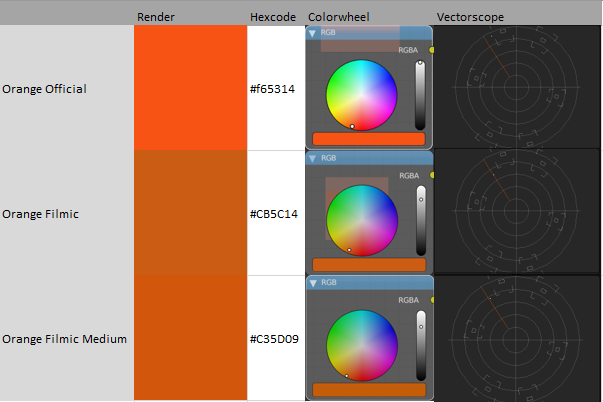
Not many folks pay attention to the need for desaturation, hence many think Filmic is “just a tonemapper”. Equally important is the higher end desaturation. If we didn’t do this, the Notorious Six (Pure Red, Pure Green, Pure Blue, Red + Green, Red + Blue, and Blue + Green) would never desaturate, and folks would be doing all sorts of contortions to cheat the values. Worse than this, we would still get quite undesireable colour skew as values get intense. Hence, a reasonable view transform absolutely must have a desaturation component.

How we achieve that though, drifts into the domain of colour science. With Filmic, the ratios are desaturated in the linear domain. After all of the nonlinear bending via the compression and aesthetic curves however, we run the risk that the original intention in the scene cannot be maintained. This can result in the hue drifting a bit. Worse still is the nature of colour perception.

Colour perception is a tricky creature, and part of that is the nonlinear psychophysical response to spectrums. This means that hue linearity is virtually impossible to achieve. Filmic’s approach is good, but not as good as it might possibly be. Even if it were, there would still be problems as the entire transform chain is quite a complex beast when you dig into it like this.

The next iteration of Filmic has a more sophisticated approach to the saturation problem, but again, it will still have problems as given the constraints, it is all about minimizing issues while giving a pixel pusher a good degree of creative control. Nothing sadly, is ideal when it comes to perception.

If you are trying to nail down brand identity colours, the best you can do is as follows:

  • Identify the brand identity colour and the colour space it is described in.
  • Translate that colour to the colour space you are working in.
  • Expose the brand identity colour as best as you can within the known constraints to deliver the original ratio without destroying the creative intention of your work.
  • Do a secondary grade on the key objects and try to push them more closely to the brand identity colour.

This of course might mean that you actually get dead on the brand identity colour but it doesn’t work and looks too surreal in the context of your other assets, or simply doesn’t work within the creative need of a work. If you familiarize yourself enough with the colour science side however, you can at least make a strong case for yourself and ease the mindset of anyone you need to. Not knowing or understanding can put you at a significant disadvantage, and make everyone uneasy.

TL;DR is that it is a challenge with brand identity colours. I helped two studios deal with this very issue, and in the end, the easiest analogy is that you are trying to end up with a colour exactly as some designer might have designed in a completely non-photographic situation, using photographic tools. Secondary grades are the best way to dial those values in, but even then, as noted above, the overall results might not meet the creative needs of the work.

Ah, ofcourse. Why didn’t I think of that. For years I know that there are renderlayers but never really bothered about it. I gave Natron (nuke-like open-source program) a try and that seems that will do. It has OCIO-CDL-Transform, OCIO-colorspace, -looktransform etc. It can load OpenEXR-multilayer and has now Filmic view-transform it seems.

So my workaround so far:

  • Get the definition of colours (sRGB) of the brand.

  • Bring the “level?” down to albedo plausible values. (tricky, only rough estimation possible)
    (Don’t use exposure, or gamma, etc for that. Maybe output level of image with all the colours in a photo-editor). Probably the ratio of values depends on the dynamic range of the HDRI as well. So most probably you need to adjust the values for each colour separate.

  • Create scene in Blender with the albedo-values.

  • Maybe whitebalance the HDRI

  • Use renderlayers for each brand-colour, or object that uses the brand-colour. Eport in multilayer-OpenEXR.

Then for post-process, Blender will give a bit cramp in the hand, even when you use the shift-key. Probably other programs are more comfortable for fine-tuning:

  • In my case using Natron (could be Fusion as well probably):

  • Read file: File-colourspace: scene-linear (rec709) with same output colourspace: linear. (Or Raw?)

  • Then try to do adjustments for each layer as much as possible in the scene-referred domain with for example OCIO-CDL or other tools that are suitable for in scene-referred domain.

  • After that: Apply a OCIO-transformlook to Filmic for example and finetune the colours of each layer with any display-referred tool like HUE-correction, etc.

It would be impossible otherwise to keep or control the brand-colours if you use only one renderlayer to render out your scene.

That seems to work for me so far, roughly.

I made a this card below (render) and try to attach a .blend-file as well, just in case it’s handy for some.
Just append the object “albedoCard” in your own scene and under Contstraints in the property panel you assing the rotation to your active camera.

Use the view transform “False Color” and adjust the exposure so that the greycard turns (from green) to grey. You have now an impression of how to set your albedo-values.

Final_BuildingsNight

Here the blend-file: Albedo_GreyCard.blend (2.3 MB)

The environment map as shown in the render is bit tricky. Better was a cloudy daylight hdri. I suppose best is to check where you are in the HDRI. Maybe it’s best to look down, not to far away. In this case the tiles, close.