I’m experimenting with textures and lighting a bit. Comments and criticism is VERY much welcome. I know it’s not good at all but some tips would be VERY helpful!
I’m experimenting with textures and lighting a bit. Comments and criticism is VERY much welcome. I know it’s not good at all but some tips would be VERY helpful!
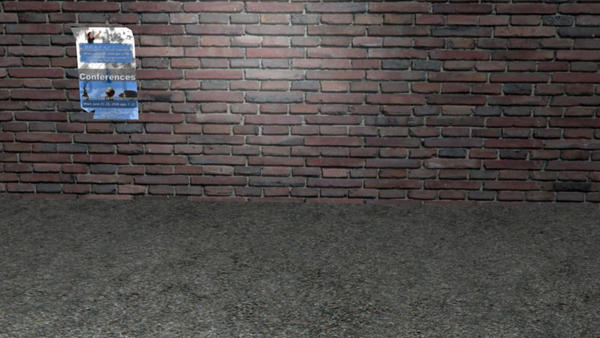
It’s not bad but the bricks are too shiny
looks good
maybe the light source shouldnt be that obvious and thepaper could use some more polygons
Dirt and rubbish often pile up along the edge of such old walls. Also Bricks aren’t generally laid 1/2 course deep along a pavement, often there are gutters there or foundations or drains poking out from the wall. There seems to be to much variation in texture on the tar/pavement, I have found that it is better to not draw attention to it and make it more or less flat in tone.
Good start though.
Needs bump maps. At the moment that brick wall looks like the bricks are painted on a flat surface, that is why the specularity looks so bad. Also might pay to mess around with the specularity ramps and the general settings of the specularity so you have a general diffusion of light over the surface of the wall instead of a harsh circle where the lamp is.
Poster looks good, but it looks like you have cut a few polies off the bottom left hand side of it. Instead of doing that, leave the faces there but go into your image editing program and draw in some transparent areas where it would be ripped off. Makes for a whole lot more detail and less polies to worry about.
Also, as David McSween said, it is better to have something covering where the wall meets the pavement, that way it is not a focal point of the image. At the moment I look straight at that join when I look at the picture. Add in a trash can with some crap spewing out of it, maybe a rusty old downpipe or something to take attention elsewhere. Usually there would be a bit of concrete (the foundations of the building) where that join is, and there would be some leaves and rubbish at the base of the foundations.
Google images search for city street pictures or something, have a look at that and try to replicate it.
Good textures, though, did you make them yourself? Keep blending!
Thank you all for your replies I’ll go fix a few things and update the new photo:)
way better
there should be less light on the wall, it doesn´t fit to the light coming from the left side (which looks nice btw), so i would decrease the wall material´s ref value in the shader settings significantly and turn down the lights illuminating the wall too much
TBH, i liked it much more when it was darker.
and i agree with what David said about the bit between the wall and ground, the transition you added is good but perhaps it could be added to? howabout continuing the bricks, only make it so that its forming a lip of sorts? or use larger bricks as the base?
also a rusty gutter pipe would look schweeeeet.
Great work though, it would make an awesome scene for a short dialogue between two people…
That’s waaaaay better. As a etxturing test I guess it’s ok, but what are you really expecting people to look at? Maybe it doesn’t work because there isn’t a point of focus, it’s just a background. I wouldn’t bother photographing it so why bother making it? try a different angle or put something there to look at.
yeah man, this would make a great “stage” to animate on.
can i have it? :o
It looks like an in-game screenshot. And David is right;“on what should we focus?” For this i guess your camera should be closer to the poster.And this means more effort on the poster work.
As well,what i can recommend you to improve your work regarding the wall is some additions on the wall material.A simple texture with bump is not enough.U should add some layers of dirt,cracks and maybe some moss.
I dunno if i’m wrong but the bricks look a bit stretched horizontally.If you did so ,u may choose to tile the same texture twice about x axis instead.
