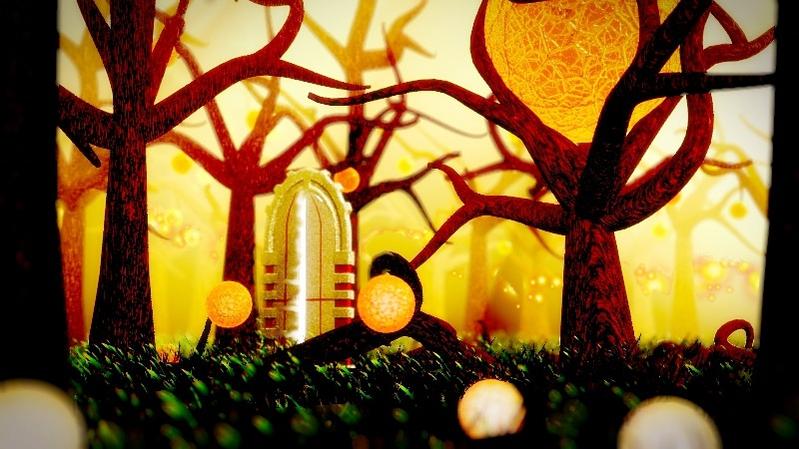
always wanted to make a mystery (at least try to be) forest scene. hope you like it
make in blender 2.56
render with blender render
also did little bit of work in Gimp
always wanted to make a mystery (at least try to be) forest scene. hope you like it
make in blender 2.56
render with blender render
also did little bit of work in Gimp
“and on the other side of the door, a monster awaited in a forest.”
it’s pretty good.
Hi there, would you give me permission to use your image in a pdf manual i am making for blender 2.5 ? You will be credited accordingly
You can find more info here , thanks .
http://blenderartists.org/forum/show...18#post1784518
I love the childish feel of this picture as well as the autumn colors. It has a mystery yet it also has a sweet sadness. Well Done!
top marks here  colours fit nicely and the composition has a fresh sense of depth. thanks for sharing!
@Kilon: yea, no problem you can use this image in you manual, but do inform me if you are going to use it in some other places.
by the way, the link don’t seem to work
Hate when this happens. Try this link
http://blenderartists.org/forum/showthread.php?t=198633&page=4
Absolutely, this image is going to be used ONLY for my manual and for nothing else. It will be used as a Chapter cover.
Byt the way, If I am not asking too much and its not to much of a trouble, please provide me with a version that will contain a credits box on the bottom. In that box you will include your name, the year, the copyright and the website of your choice so people can visit you. Have a nice day. And thanks for allowing me to use your work.
cool, you can just credit me as my user name. I don’t even have a website so that don’t need it…
Ok I will create the credit box myself and credit you as you have instructed me. I will inform you when the new update with your image as well as other images offered by other forum members will be uploaded. Thanks for allowing me to use your work.
Pretty good. Reminds me of:

But I like the mysterious door…
glad you all like it. although it does resemble little bit of that picture.
@Kilon: good luck with the manual!
The sharply contrasting between bright colors and black seems to be working pretty good here (as the style and colors are consistent through the image)
I honestly like this one better than the ruins one, it shows you are improving nicely in your skills.
just uploaded the new update to my manual that includes your image. This the link to the thread, I hope you approve.
http://blenderartists.org/forum/showthread.php?t=198633&page=4