I started this with the only idea of making a some steampunk-like goggles, but now I really think my image is dull, and I don’t know what to do to improve it.
I don’t know what to change, should I add more details to the goggles, should I change their material, shoud I add details/objects everywhere?
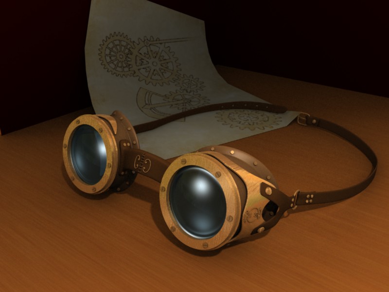
The paper with gears was an attempt to add something to the background, but I’m not sure it succeeded.
(Maybe I just need to forgot about this for a week and have a fresh look at it after…)
So, any idea, criticism, opinion, etc. is welcomed!
Nice Job.
For steampunk, the metal could be rustier. (Good texturing though)
and the glass could be dirtier. Maybe the top quarter of the glasses could be flat, to give a stern and concentrated look.
Looks more Victorian Sci-Fi to me… the background doesn’t do much to add depth.
Speaking of… if you’re focusing on such a simple/small subject, try using some extreme depth of field.
I agree with sebbonaparte regarding the rule of thirds but remember it is a rule of thumb: don’t get lost in it. Also, you are losing a compositional opportunity with the strap. Right now it curves around to … nothing. (Well, actually, it draws the eye to the corner of the paper which is not good.) If you can offset the straps, perhaps left strap curved in more and the right one outward, the resulting path will pull the eye towards the goggles.
The paper is a good idea and serves to draw the eye to the goggles as well as providing contrast. The amount it is raised off the table is somewhat confusing but I don’t have too much of a problem with that.
Hehe, you know, that’s why I posted in “Focused Critique”, so really, no problem with criticism even if it may sound harsh to someone else
Now, yes, long shadows, I tried, I failed, but I suppose I didn’t try hard enough. Will try more
The goggles are indeed too “clean”, as many of you noticed. I’ll rework on the material, to add some stains, dirt etc. It’s funny, because now that several of you told me it, it looks obvious, but before I really didn’t realised the problem.
(Well, before that image I did another tiny project with a very clean look, almost vector-like. So I suppose I started this project with that same subconscious idea, but really, it doesn’t fit the subject).
I’ll see what I can do with the strap too (eww, Curve Deform I don’t like that).