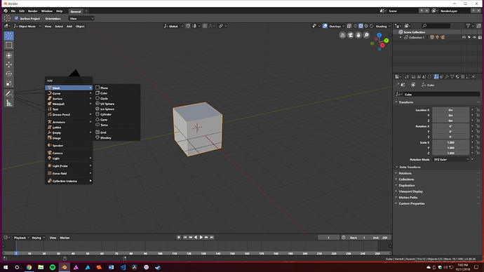
Does anyone else find the font rendering in Blender to be pretty bad? Hinting set to full, slight, none, auto. Anti-aliasing turned on or off it never looks good. I’m kind of hoping they address that at some point in 2.8.
I agree with you
Unfortunately, fonts are a bit trickier to get right in FOSS because of design patents. Open Sans for instance cannot have the exact same design as Arial, and the professional-grade fonts like what you get with Microsoft Office can only be used if the source is closed.
So Blender’s font display is always going to be a few steps behind Maya because of the reasons above.
I’m still using good old Arial as UI font with turned off antialiasing, looks nice and crisp. The old MS fonts were designed to look good without antialiasing, while most modern fonts weren’t and need to be smoothed to look acceptable.
Blender’s font rendering isn’t the best, but I find using bolder fonts negate a lot of its downsides.
I use Segoe UI Bold as my default, and I think it looks great.
That looks pretty good. I don’t know if it’s the font or the font rendering that’s the issue but on higher UI scaling it looks atrocious, borderline unreadable on my end.
Fonts are an issue, but the culpirit is not the font rendering engine. Due to licensing issues, Blender cannot use any of the “good looking” but “closed source” fonts. They reused the droid fonts and added others for asian/cyrillic support that are mainly designed for cellphones in mind, just not looking good on PC/MAC monitors.
The Segoe UI font is really a good looking one, but is a Microsoft licensed font, created by monotype inc. and is commercial. Cannot be distributed legally.
Maybe should be a good idea to look for open fonts that can be used in Blender. Google fonts can be a good starting point. What is required is that support all the languages supported in Blender, and that includes asian languages/cyrillic ones. (or somebody can ask monotype inc./microsoft how much will cost to pay one time licensing to use and distribute the segoe ui with Blender… to put things in perspective… or kickstart it)
I believe we use a variant of Droid Sans in Blender?
We could upgrade this to Google’s newer Roboto font, which is Apache 2.0 licensed, so it should be compatible with Blender’s license.
Roboto can be a good alternative, probably need to use a bigger size for all menus tho… Also kerning should be forced full, otherwise it does look TERRIBLE. Segoe UI doesn’t have any of these problems, at least on windows.
Roboto looks quite nice and definitely an upgrade from blender’s default. I’m still using tahoma without antialias for it’s clearness.
I just tried out Roboto, specifically Roboto Black, and it actually looks better than Segoe UI to me. The individual letters are taller, more closely kerned together, and it’s better centered inside all the individual UI elements than Segoe was.
I’m sticking with it.
I speak for all windows users when I say Comic Sans is the only real choice.
BRILLIANT! \  /
/
A lot of designers still use Comic Sans regardless of its status as a hated font, including the guy who created the BA logo.
I think most of that hatred stems from the fact that Comics San was so abused and overused way back during the early days of the internet. There are probably hundreds of designers out there that put it to good use every day, but the font itself will always be an easy target for a cheesy joke.
This. Comic Sans has it’s uses, but I was just making a fun jab is all.
Now if you’ll excuse me, I gotta get back to my project. It needs more lens flare. Can’t have enough lens flare!!
Fonts is srs bidnizz, brah.
Lens flairs might be more srs, tho.
You just lost all credibility you had left. You clearly have no clue about typography at all.
Alright fellas, no need to turn this into something bad over a stupid joke. Go enjoy the rest of your weekend. 
Yeah. I think Roboto would be a good replacement.
