I guess you are right. I guess I just want the option to use bbox sometimes without having to select the vertices individually to get the actual centre. If I select a face and move the cursor to it, it seems weird to get the face centre as weighted by the vertices around it.
I’m not seeing this. If I double the UI scale the color picker it is drawn twice as large. If I move a window to a monitor that has higher OS scale I also see it increasing in size. Could you explain the issue in more detail?
No, not me. I did make a change so that the eyedropper works when it is started from a popover. And I have an (unreviewed so far) patch that allows the use of the eyedropper outside of Blender windows (only on the Windows platform so far).
2 Likes
With a linked Collection Instance…
Object > Library Override > Make (works as desired)
versus
Outliner > Right Click > Library Override > Make > Selected (does nothing)
versus
Outliner > Right Click > Library Override > Make > Content (does not do what I want when I want to use the rigged asset more than once.
Outliner > Right Click > Library Override > Make > Selected and Content (same as above)
This shit is annoying.
If I drop in 3 linked collection instances of an asset that is a rigged object/character and I use the first option, each instance becomes in independant collection where I can go into pose mode and pose each uniquely.
If I use the other options, the first one I use Library Override on becomes the source of the other collection instances and anything I move around in that first one is reflected in the other 2.
3 Likes
I want that. If I make my complaint that Blender can’t do that, will they review it faster? Granted, I can live without this, honestly, but I’d really like it.
1 Like
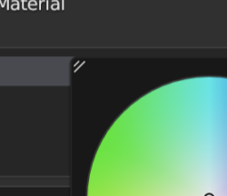
The color picker is simply too small.
You are right - it scales down with the UI, but should it?
I think not. Its the one exception that should be bigger (+scalable by the user).
It was already too small on 1080p IMHO, with 1440p it becomes a miniature color picker which makes it very fiddly and uncomfortable.
For reference: I have 32" monitors + excellent eyesight, I STILL think its too small.
I always have to click and drag and the movement of my mouse gets in the single digits pixel range - very sensitive.
These kind of super sensitive mouse click and drag movements are hard on my wrist and have the potential to worsen any kind of carpal tunnel syndrome I might have occasionally.
Of all the UI elements of Blender this is probably the worst offender when it comes to that.
It demands way too much precision and way to much concentration to dial in a color, when the solution (bigger UI) is so simple.
In the end I often find myself typing in small value changes which is slow and just annoys me that I have to resort to that.
Using a pen tablet is even worse. Since the pop-up is so small it happens quite often that I accidentally move away too much and the popup goes away.
It puzzles me that not more people complain about this.
4 Likes
My UI scale is set to 1.5 and the line thickness to “thick”. I use a single 34inch monitor (3440*1440), and also use a tablet (IntuosM). I find it necessary to zoom in the node editor if I need to pick a color from there, so I think the picker should not scale with the zoom level in this particular case. I’ve never had a problem with the picker outside of the node editor though.
1 Like
But if you are going to give an opinion that it is too small, then you should be required to also say by how much.
Put blender on any of your monitors, no matter their size or resolution. Go to Preferences / Interface / Resolution Scale and alter it so that you get a scale that generally is workable, where the text is readable, the icons distinguishable, etc.
Then bring up a color picker. If it is too small, make the resolution scale larger until it feels about right. Divide this scale by the first. Now you can say you want it at least “x” times bigger.
Twice the size feels good to me.
I wouldn’t say no to a little-bit more even (2.5-3) but this is more like my personal preference.
2x in size is enough to fix all of the issues I have.
I would not request that the default size changes, I am thinking the best UI solution would be to have this popup scalable (and it keeping the scale in memory).
This way its fully controllable by the user.
This is not driving me mad but since there’s discussion about UI designs I’ll raise this issue:
In theme there’s View Overlay color, which controls the color of world origin and camera compositional guides. I don’t understand connection between these two. I want to change it to white so its visible in Camera, but world origin point also becomes white, its quite large and distracting, stands out from rest of the grid.
It will be very useful if Compositional Guides had separate color, so I can set it to something I can see, black is so thin and blends so much I just don’t use that option at all, but I would like to.
I would also move compositional guides color in Camera Data properties, since its something you need to adjust often based on what your scene and perspective looks like.
1 Like
The current size of the color picker (at 1X resolution scale) is about 170 pixels wide. I made a PR that allows that to be set by the user (Preferences / Viewport / Color Picker Size) from 150-400 with 200 as the default.
The following shows it at the current size of 170, the PR’s default of 200, and also at 250:

I have made some builds of this to test here: https://builder.blender.org/download/patch/PR106135/
13 Likes
Oh wow, You’re fast.
I installed the build and took a look.
I am gonna test this build more in the coming days - so far everything works as it should and it feels nice.
Thank you very much.
IMHO adding a user preference has a few downsides, mainly that:
- Users can’t adjust the size in the context of when they are doing color picking
- They will likely not realise this option is available since they won’t know to go look for it;
- They won’t be able to easily understand which setting to use since at that moment they can’t actually see the color picker itself.
- It adds yet another setting to User Preferences which has a cost in terms of scrolling and navigating that window.
An alternative method of adjusting the size could be to do it much more like on macOS, where color pickers are always adjustable, since they are just secondary windows that can be resized as normal:
In Blender, this could perhaps be added as a draggable handle in the corner of color pickers, or in fact any popup window of this type:
10 Likes
-
Nor do they need to. If the user decides “I want a larger color wheel”, then enter Prefs and choose a different size.
-
“Orbit Around Selection” has entered the chat. Many don’t realize it is there, but thank goodness it is there. Unfortunately it’s off by default, but that’s another discussion.
-
They won’t understand that a “Make Large Color Picker” checkbox makes it larger?
-
User Prefs is not an area of the application that “too much scrolling” or “we need to save real estate” needs to be the priority.
As to the MacOS example: the color picker doesn’t need to be an immersive experience. Once a user finds the size that suits them best (1x, 1.5x, 2x… want 1.34x? Too bad.), then it’s unlikely they’ll revisit the matter until they buy a new monitor or video card.
And I do believe it should continue to scale with the interface, as it does. The fact that you can zoom into the shader editor (and make it larger) covers many needs.
2 Likes


6 Likes
Yes, thanks for pointing that out. I have done so on the PR, although I have not created updated builds.
1 Like
Is there a reason curve theme color is same as wire? Having curves black makes it almost impossible to see on grid, but changing wire color changes way too many things. Why is it that curves don’t have separate color in theme
To be honest, that looks like massive overkill…
It might work for Houdini since its users may well need that kind of granular control, but for Blender, I’m not sure I want to feel like I’m at an impromptu rave every time I open the colour picker…
8 Likes
I love how well the wheel illustrates the broken nature of ACES and as such Hollywood’s understanding of color. A nice, clearly visible, ring of low saturation surrounded by skewed and super saturated blobs. It needs some of Troy’s and Eary’s AgX magic.
Agreed !
Blender color picker is much simpler and elegant, yet both share many features…
I like how blender strive to be minimalist and still allowing a lot of control.
5 Likes