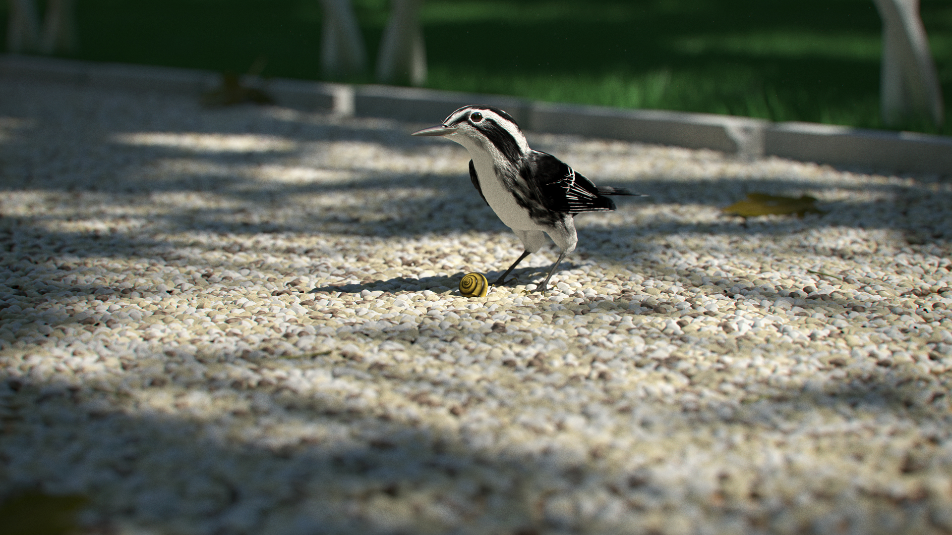
I wanted to do something with gravel and a bird seemed to be a logical addition to an otherwise boring pile of rocks. Later on a snail came along, it’s not entirely impossible that it had something to do with The Hobbit.
Rendered with Cycles at 2880x1620px and 400 samples. The final image was resized to half size.
Post-processing was done in Photoshop: sharpening, lens distortion, vignette, chromatic aberration, gradient darkening of the background, contrast/brightness adjustment and addition of film grain.
sharpening, lens distortion, vignette, chromatic aberration, gradient darkening of the background, contrast/brightness adjustment and addition of film grain
Beside, lately such things make me wonder, why? We have much more sophisticated light processing inside Bledner, but ppl still use other tools, despite that other tools work with light in very primitive way like gradients. And result picture looks definitely bettter. I suspect that is something not good in core of render. Something “big”, like light precision in all dynamic range due internal calculations (maybe exp(), square(), normals normalization, float point 32 bit range limit?). Or lack of dithering in preview window (still many 6-bit+FRC LCD panels, as my own)? I mean that maybe that limitation do not allow to tweak light in blender as slider change too “coarse”, and artists trying to move control slider of lights get missed that points, and Photoshop is opposite, as high-end grade program thay have many tricks under hood (dithering, better color matching when respect monitor color profile?).
Well, there is a point when tweaking lighting and material settings becomes way more work-intensive than doing it in Photoshop. On my old imac it took 10 hours to render the picture (btw, that’s 2 hours less with the new os-x ), so re-rendering for minute changes is crazy. And I couldn’t do it with only a few samples, because the noise makes the image useless for fine-tuning.
Then there is the fact that if you make a brushstroke in Photoshop, you know exactly what will happen. If you have a multiply layer, you’ll get a darker patch. If I change something in Blender, there will be a cascade of side-effects. For instance, with the default glass material there wasn’t enough glinting in the eye, but if I added more strength to the sky the scene became too blue (or the glossy parts when I used light paths). So I ended up rendering the eye separately.
And there is the artistic side. The background isn’t really darker in real life, I can’t tell the sun to not shine there without an elabarote lighting setup, but artistically it makes sense to push it back into darkness, because the bird is bright and I needed contrast. These kind of things are easier to do in post-production.
Some of that could have been done in the compositor, but not everything.
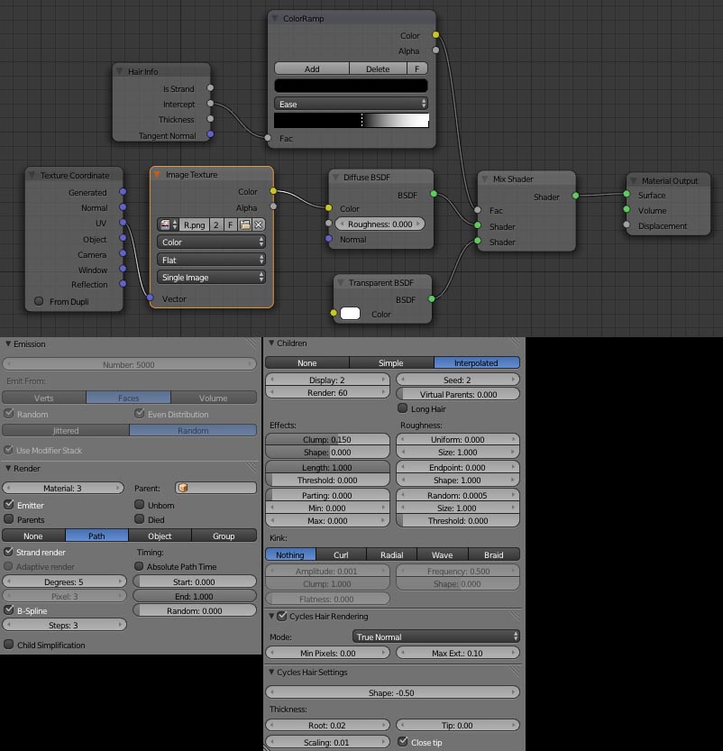
The flight and tail feathers are modelled as real feathers, and there are a bunch of them for variation. They are uv unwrapped from the top view and I painted them in texture paint mode. They are separated into 3 materials:
the shaft is a simple diffuse color,
and the rest is the left and right side of the feather
The left and right side only differ in the direction of the barbs so that they make a V shape.
The upper Mapping node tells which way the barbs point ( \ or / ), the lower doesn’t do anything, and there are two image textures, one for color and one for alpha masking the little cuts and irregularities in the feather.
The Feather node expanded: the Wave Texture is for the space between the barbs (the gray Transparent BSDF node), it’s not completly transparent. Google feather anatomy, I’m not good enough with words
The gradient texture gives this oily purple/green glossyness. I don’t think it shows up on the final render, but it looked cool.
And the white Transparent BSDF is for the alpha mask image. (Technically I could have used the alpha mask image instead of the Wave Texture but the picture was made as a study, I wanted to do new things.)
The body feathers are fur. There isn’t much to tell about the material, it’s from Andrew Price’s hair tutorial.
The most important, I think, were that I used rather thick hairs (root: 0.02 while the beak hair was 0.005), the clumping and that itsy-bitsy randomness in the children effects.
Of course i am avare tor such reasons, my very OT almost rethoric question was silly attempt to convince myself to prove that there is some not optimal thing inside render, not inside ppl mind. Speed and interactivity of 2d editors of course make some things much simpler from artist point of view.
In other words, i trying to understand how much we actually need things like Luxrender and some commercial renderers “light groups” wnen you render not 1 picture but a couple separated layers and can do some nice “composition tricks” like ability to interactive change light black body temperature , and built-in real-time tone mappping. We can use it now in compositor, but that require to wait final render, and settings compositor nodes. Personally i found “Exposure” slider in Color manager panel extreme useful, as it change things in Preview window in real time. But if you save final image in 8-bit color as most do, artist will lose color precision, and later Photoshop operatoins will be degraded, at very dark pixels at least. “Pro” ppl sure always save in float point formats, but average users as i am not aware of such things and need long learning time to discover it, and keep in mind when other many things need attention too, and 3D need lot of them.
For that nice bird example we have big dynamic range, dark green grass and almost 1.0 white hilight at head, such things( fitting brighness range) can be done in Ps very fast, but not in Cycles untill fiinal render will be done.
Yeah, because ease-of-use and faster/more flexible workflows has nothing to do with it at all. I paid a small fortune for Microsoft Office so I guess I am going to use it for every project now >_>