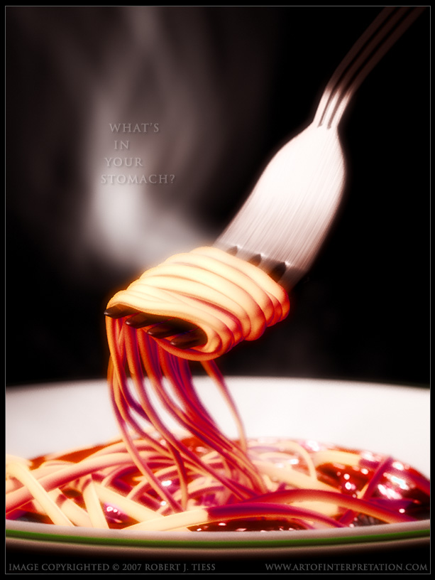
This one advances some ideas initially considered during my “World Hungers” project a few months ago.
Pure Blender 2.44 except for the title added in post.
Thank you for viewing my work,
RobertT
This one advances some ideas initially considered during my “World Hungers” project a few months ago.
Pure Blender 2.44 except for the title added in post.
Thank you for viewing my work,
RobertT
The top part of the image would have looked awesome. But the problem is the spaghetti in the sauce and dangling off the fork. Those spaghetti look a little too stiff and dry, not like spaghetti that’d been cooked soft.
Spagetti. Seriously?
From a purely objective standpoint, it’s a fine piece, but over the years, you’ve typecasted yourself for something more expressive.
Let’s look at your title: “What’s in your stomach?” From you, I was expecting one’s entire diet exploded onto a picture frame in cubism – you know… Robert style.
Had anyone else been the creator of this image, I’d say “hey, looks appetizing. Good colors and lighting, keep up the good work!” but I guess I was expecting something more bizarre when I saw both the title and the author of this thread.
Looks great except the fork looks a little to bent and the writing is a little to hard to read.
Really nice look, however I don’t like the red light. To me it makes the food look evil, whereas keeping to more a spaghetti yellow colour would make it very appetising.
I like the way the spaghetti is placed very much though.
Cuby
I guess if Picasso painted a picture of a plain house people would say the same thing.
But an artist should be able to branch out every once in a while and make something different. Otherwise it gets a bit cliche.
The spaghetti does look dry though. It doesn’t appetize me unfortunately. And the fork looks as though it has a crease in it?
But the colours and lighting are very nice, and so does the smoke. ![]()
yes, i like the smoke… i’d agree to the point that the noodles are dry looking and stiff. good work still!
As a blender newbie I look at this picture and say wow. The lighting is so deep in the picture. It may look simple at first but looking at it after a while there are many layers here. So, Robert, going to start selling your work or can I print it out and frame it? 
mmmm, tapeworms yummy.
seriously, you needed to add the text post pro?
m.a.
Yeah… really a bit disappointing coming from you, in art wise.
Other crits, the spaghetti looks bad, or actually it looks like it’s clay or something like that. It would look more apeticing if it had some of that tomato sause on it.
a very 'pun’ny picture. would luv to get it printed. it says a LOT and has everything …humor, imagination, abstract and as above…a very picasso a metaphorical type of referring to something … gr8 work man…send me a bigger resolution.
chela69
Dude dude dude… just because it’s not his normal style doesn’t mean anything. If it was his first post here you’d probably say it was awesome.
The whole point of this may be to do something different.
Its a very nice render, i could imagine it being a super market advert or something similar.
It’s a nice render, though I agree about the speghetti noodles looking dry.
My only real crit is that the steam implies moisture, yet the spaghetti doesn’t look moist. Real spaghetti is always moist and glistens a bit. Anyway, I’m sure Robert has an artistic explanation for it eh
I like it alot. Something different.
You should do more still life. Just to feel it more.
Hey Robert,
isn’t that sauce blood?
J.
This feels unfinished and maybe a bit rushed. The text really takes a lot from the image (boring font, non-purposeful alignment, all caps) and is distracting. It looks like a last-minute decision. The color is bad. But, then again, maybe not. The problem I really have is that I can’t tell if you’re trying to present a photo-realistic scene or if it’s supposed to be something more of an impression of reality.
I’m only stating my opinions this way because you’re one hell of an artist and, doggoneit, it’s about time you posted something that doesn’t make me want to take up knitting! 
There are some good aspects to it but, coming from you, it just doesn’t seem finished.
Yay, thanks for the posts, everyone! =)
This is a strange and different series for me, but one I have enjoyed so far.
This is very much part of a conscious decision to create something completely different from recent projects, so extra points for everyone who got that part 
I do notice, and not just here, the moment an artist does something “different” or post something that’s somehow consistent with what that artist has done before, there quickly follow comments focusing exclusively on those aspects of that artist’s work, instead of the actual ideas and images at hand.
I can see that as a missed opportunity for more meaningful discussions, appreciations, and interpretations. The artist can, in such a case, miss out on a more objective and direct analysis of the image. The viewer can misplace attention on past works instead of the present work. The image can be cheated its own rightful consideration because it suddenly has to contend with or surpass earlier images. I believe a lot of that energy might be better spent
As some of you know, I truly have little or no interest in doing completely photorealistic work. In this series the look is a little more real than usual, but it’s not intended to resemble a photo or anything. My main emphasis is the ideas inspiring each of these projects, and it’s exciting for me to try fresh (to me) ideas in new (to me) settings.
I sense, comparing my work to what I did one or two years ago, I have made some progress in a couple of areas, but I cannot have it be only about technical perfection. I actually want, I think even need my work to be imperfect for it to have any shred of my all-too-imperfect intentions left in it Yeah, it might sound silly, but I think that’s a substantial part of what appeals to me in what I see in other people’s art, those imperfections.
I just was telling someone on this forum some of this in a private message: To the right of my desk hangs “Persistence of Memory” by Dali. It’s not a perfect photoreal painting. The timepieces, the ants, the table, the bark, the land, are all imperfect, yet perfectly so. To the left hangs a Picasso (“Violin and Guitar”), while in the center is Escher’s two hands drawing each other.
Each are imperfect in their own ways yet incredibly amazing. Three totally different styles, subjects, and – it’s just amazing and inspiring to look at them I’m nowhere near their respective levels, but I’m enjoying what I’m doing at this point and I’m heading off into my own directions, wherever they may go.
My own goal is not sterile, soulless, perfect renders. I think there’s already more than enough of those in the CG world. I’m far more interested in the underlying ideas, exploring imperfect impressions, meanings, motions, emotions, and trying to work out all that good stuff in 3D/2D. And it’s never as easy as it looks, as you know and I’ve still got so much improvement to experience.
In this series, the theme is “Hunger,” and it’s a potent theme with lots of conceptual/visual/interpretive possibilities. I do like these kinds of series, even though they tend to reinforce the errant notion that I’m confined to one particular style or topic (even though my total Finished Projects history proves otherwise).
I do have several ongoing series of images (the heads/faces/personae from “Reflections,” the “Ray Rendered” toon series which I want to return to at some point, some nature themes a la “Haiku” and “Mount Reckon,” ancient sculptures/structures/statues, the abstracts, the organic-mechanic ones, this one, some animations and projects you never see).
They all take me in different directions, or sometimes back to the beginning, which keeps the Blending refreshing and constantly challenging
Thanks again for all your interest and kindness!
RobertT