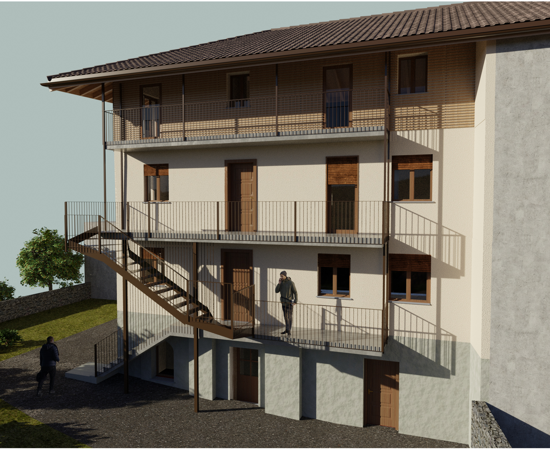
Hello everyone! So, this is a project I was working on for a client regarding the realisation of a new staircase that connects the first and the second floor.
The client was happy with this result since the goal was to get the visualise the concept of the hanging staircase (my job was to make the visualization no project choices).
I’m also quite happy since this is the first paid job and client is happy and stuff but I’d like to improve starting from this on.
My biggest focus I think should be on materials which seems to be a little bit too fake escpecially the ground.
That said I hope to improve and get some advice.
The ground looks fine to me. Where the ground meets the base of the building looks too sharp and clean. I think there are no thresholds for the 2 doors on the ground floor. The texture of the wall on the ground floor feels too rough or too large.
The texture of the wall in the lower right corner needs to change.
You should flip the images of the 2 people. Their shadows are falling to the right but the highlights on their bodies (in the original images) are also on the right. it looks unnatural. The side of their photo with highlights should be on the side where the light source is in your render.