Some recent interior renders in Blender. Some are work in progress. Who has tips for photo realism in cycles? Looking to take things to the next level. I’d like my work to be indistinguishable from the work coming out of the photo department here, but I’m not quite there yet.
1 Like
The materials - especially glass and metal parts (in lamps, figurine) etc. are too pristine for RL. Even the brand new things have some imperfections. Add some small amount of dust&dirt. I like the design, though 
1 Like
first step is to pick up a camera and start learning what makes a photography great…
… then stuff like this simply comes out of mind*
* with a little help of computer, Blender, Corona… and the wonderful creation of cosmos
Use microroughness on most (or all) rough/glossy surfaces. It makes a subtle difference, but definately adds to realism IMO.
I have a material on blendswap you can downllad to get the node.
1 Like
Hey thanks for the response. When you say microroughness, are you talking about something other than regular roughness maps? I’ve heard of the microfacet theory. (surfaces have small-scale detail of varying orientation.) but I’d be interested in looking into what you’re talking about. Do you have a link to the material?
Here you go
Basically in a similar way that reflection intensity can increase at glancing angles due to Fresnel effect - the sharpness of a reflection can also increase at glancing angles.
There is a whole thread on the subject in the Materials group (there is a link in the material comments) - along with the steps that lead to the development of the above material and associated microroughness node group.
2 Likes
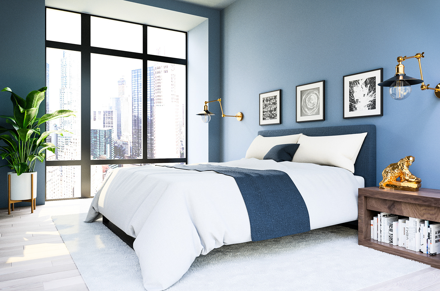
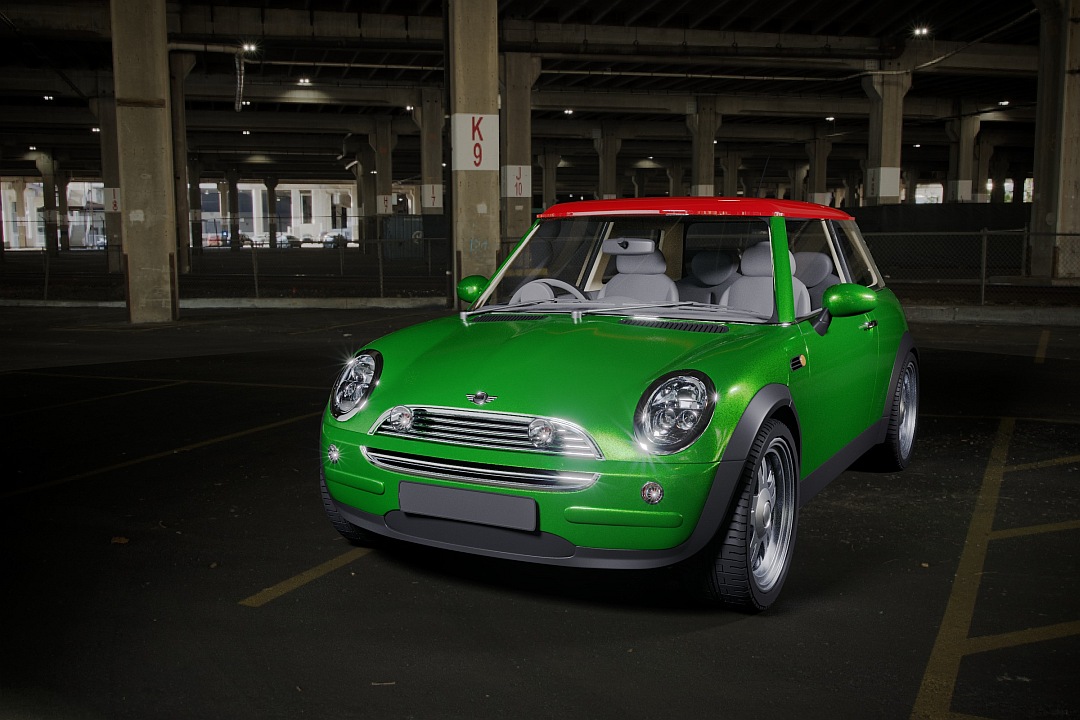
Hey, thanks for the reply! Since we’re discussing realism, and you’ve posted a nice photo: I do like your car model! Did you model that yourself? Very impressive. I will say I can’t help but notice your surfaces (particularly the interior and glass) are very sterile and lacking texture. (Other than the HDRI of course.) I can’t say mine are much better at this point, but I hope to drive this discussion more towards “tips for photo realism in cycles.”
I’ve come from a background in photography, so I appreciate your comment. I think as a foundation level fix it’s important to understand general principles of art. What in particular do you feel is lacking in my renders in terms of general composition?
Thanks again!
Cool I’ll check it out. Thanks! Do you feel like this is necessary for medium and wide shots? I would feel the roughness value would be indistinguishable from a custom node setup at that distance. I have a fear of over doing things in general, but I’ll have a look.
Another thing I’ve personally been experimenting with is imitating real-life camera defects using post-processing. For example, adding:
- the subtelest touch of chromatic aberration you can
- a bit of (circular, linear) vignette (multiply by a Spherical texture, with the size compensating for the aspect ratio)
- a couple percent of the Ghost glare (threshold: 0, mix: 1, then add in with fac ~0.01)
- a bit of Fog Glow (real: bloom threshold: 0 mix: 1, then add in with fac <= 0.5)
- chromatic additive noise (if your image is noiseless), with half the green taken out of the noise, fac ~0.005-0.05 depending on the brightness of the scene
Adding grunge to the scene also depends on how ‘used’ or ‘grounded’ you want the scene to feel.
If you want it to feel like an Ikea ad, then simply ruffle the carpet a bit, and add some (super-faint) fingerprints to glossy/refractive things.
If you want it to feel lived in, consider adding dust to things, keeping in mind which surfaces woud be cleaned, how often, and using what tools.
1 Like
It can make a difference yes, especially on floors/walls or high roughness materials where you may suffer from Fesnel halo effects.
There are loads of test renders in the thread.
The node group itself is easy. Just plug it into the roughness slot of the glossy shader and then just set the desired roughness value and falloff.
As far as I can tell, it doesnt really impact render times.
1 Like
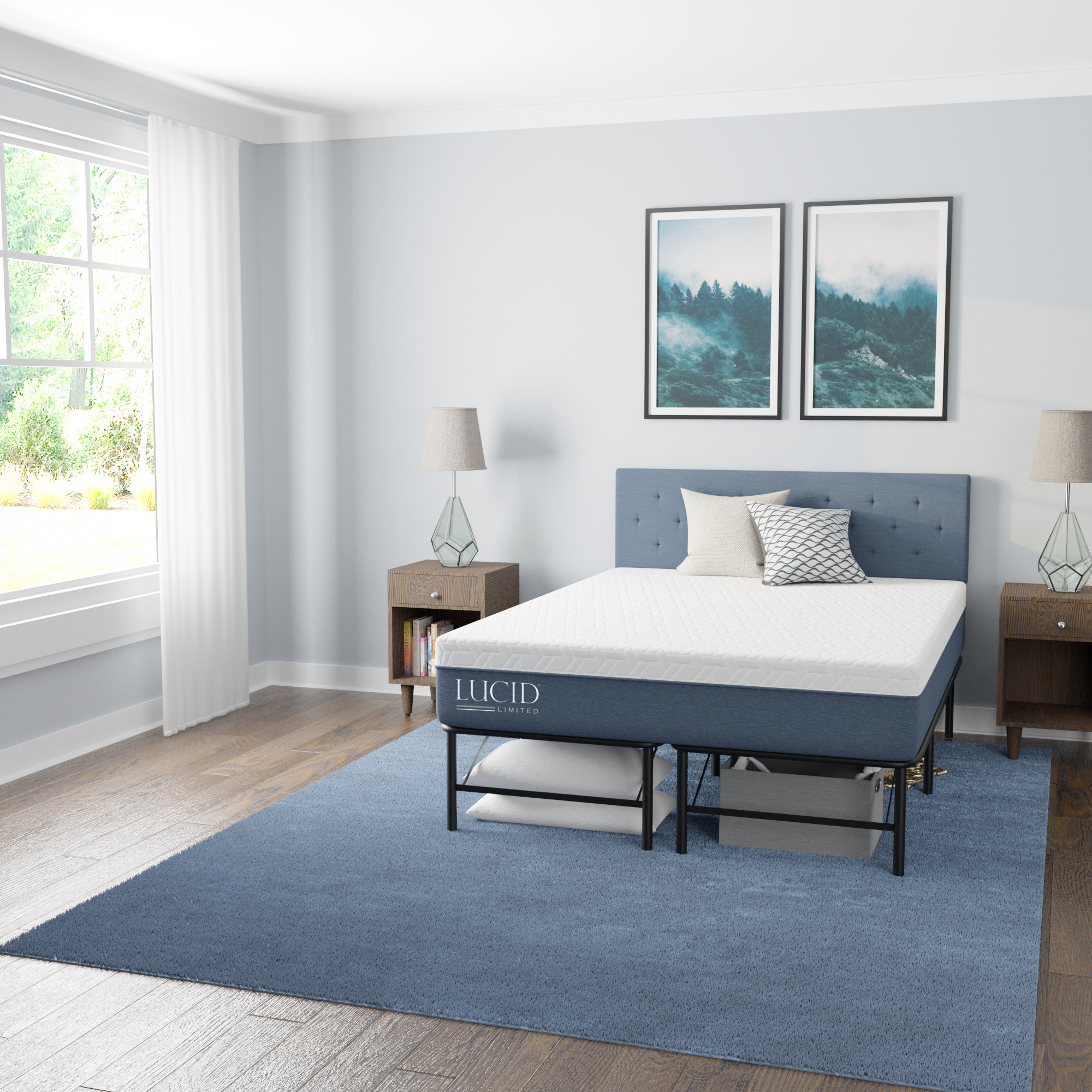
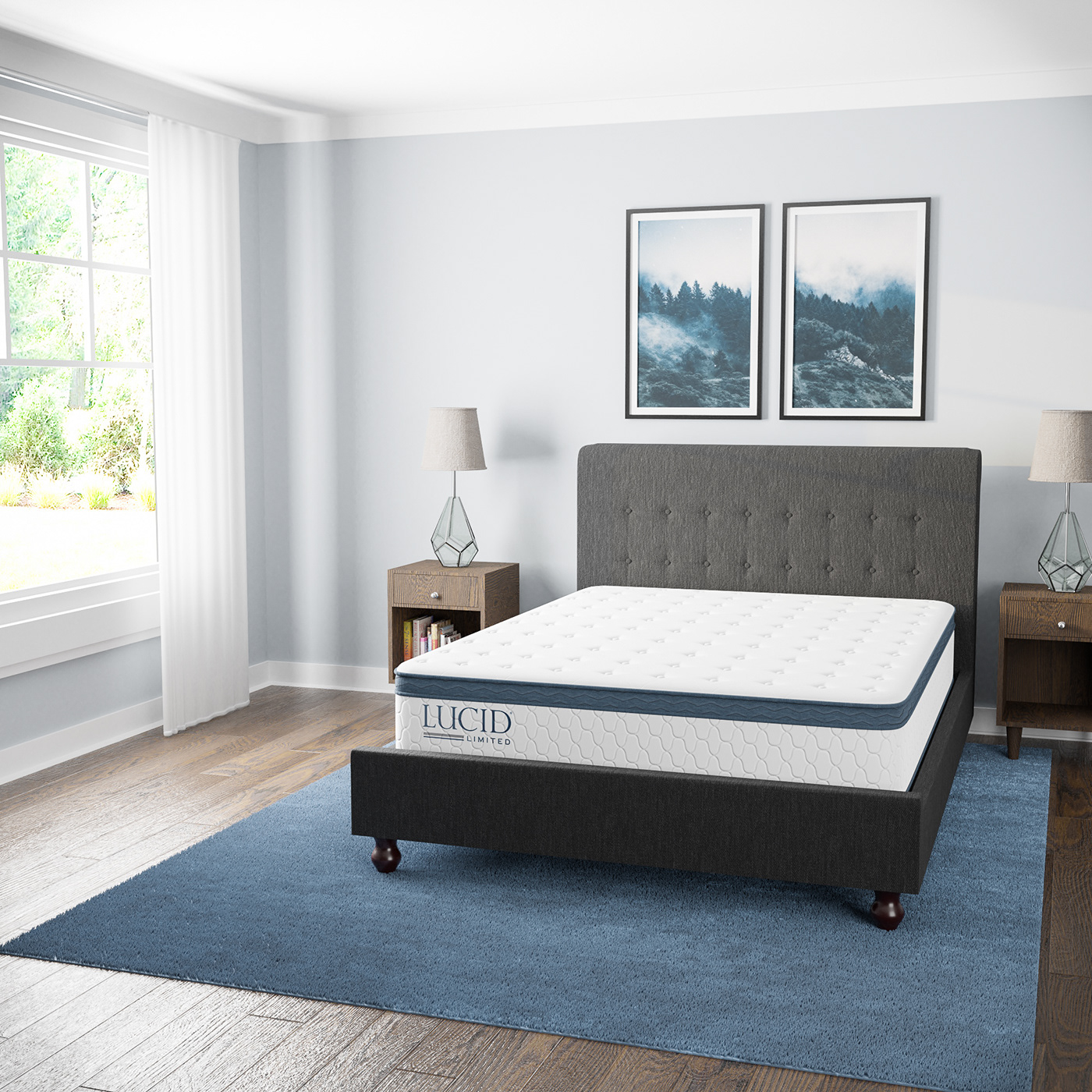
Thanks! I like your smart approach to texturing. Thinking about who/what’s in the environment, and what story they’ve left behind is a great reminder. Something I’ve definitely heard 1 million times, but often get too lazy to implement in a scene. My full time job is a 3D artist for a bedding and furniture company, so I’d say 80% of my renders are made to look brand new. I’ll try to keep things in terms of what’s realistically grounded. I feel it’s the eternal battle of CG to make things not look so perfect.
As for camera defects, I’d love to look into some of these subtle touches you’ve mentioned. I shy away from some, just due to the overuse I’ve seen around. (Particularly bloom and chromatic aberration) But some of these others you’ve mentioned sound very interesting! Thanks again.
The first thing that comes to mind is that all of them are overexposed, are you using the Filmic feature?
1 Like
Sweet. I guess I’ll have to check out the thread to learn more! Thanks again.
Yes, filmic is in use. The overexposure is coming in, in post. (As I’m adjusting the levels in photoshop.) I may have overdone it in some areas. I’ll try to keep that in check. Thanks!
Can you post just clean renders without any photoshop meddling?
While I do agree that chromatic aberration and bloom are a bit overused, it will add to the feel of the piece greatly if used subtly and with taste.
Bloom if I understand correctly has the most to do with how dirty the lens is. In a professional environment I would assume that means a small mix factor and radius for it.
Chromatic aberration shouldn’t really be noticeable. It should be implemented so that it displaces maybe a full pixel at the corners of your image. It also tends to soften up any over-crisp edges as a beneficial side-effect.
Again, I highly recommend having all of them, since they all happen in real cameras, just look carefully at real photos to gauge how much you should use to avoid stylization.
1 Like
It’s funny, it’s sort of an ongoing joke around here. The photographers will spend all of their time fixing things, (straitening edges, removing wrinkles in post, lens distortion corrections, removing chromatic aberation, removing haze, etc.) while I spend all of my time destroying things in the name of realism! Be glad we have the fun job as 3D artists.
In all seriousness though I love your comments. I’d love to look into some more real-world, “subtle with taste” camera effects in my post production workflow.
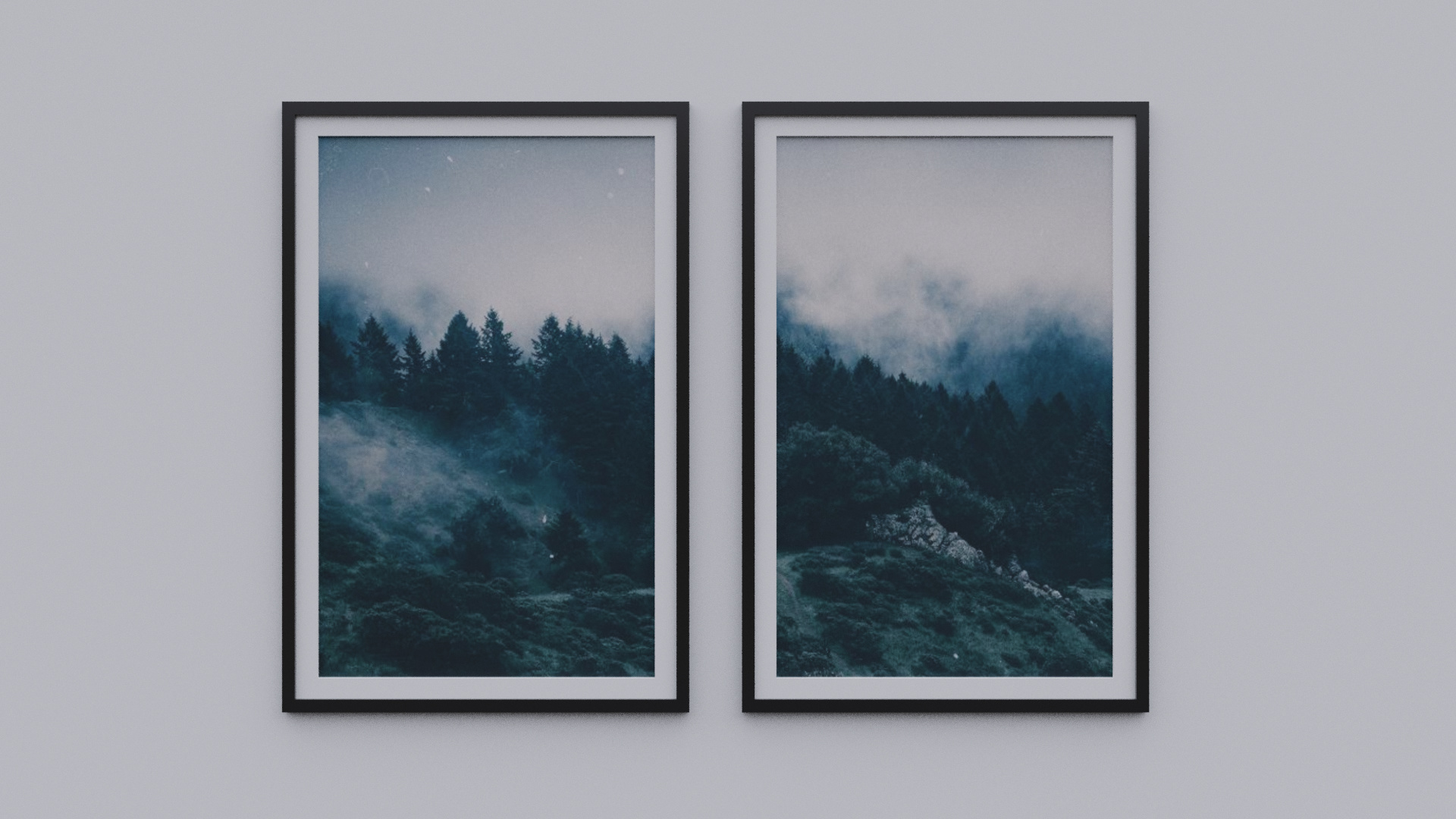
Sure. I don’t have access to all of the final renders, as they’re on a server at work, but here’s a work in progress for the pictures on the wall. As far as I’m aware I keep my color management in check other than some intentional overexposure in post. I do appreciate the comment though. It’s not the first time I’ve had that pointed out on blender artists. I think it’s a particularly noticeable aspect of the image. (In my defense, I do enjoy a good over-exposed scene outside the window.) I know some cameras these days, and some magic in post-production can gather all of the information, but as a stylistic choice I like to keep certain things blown out.
I will take that into consideration though. Thanks!
Original: Wide range of values captured. Rather dull and uninteresting.
Levels adjusted. No values are lost, but the image is tightened for greater dynamic range.
That’s much better. Even though the wall is white, you should never get absolute (255,255,255) white - areas with those values stand out a lot as if they’ve been “cut out” from the picture. Like with everything, it can be used in an “artistic” way but if you’re aiming for realism it’s better to avoid it. By the way, same is true for dark colors, i’m sure you’ve seen how odd that vantablack coating looks:
1 Like
So what does that look like?
Floor texture appears to be too bumpy. Bed tables seems like identical twins (same texture; if you have a seamless texture, you can use object info/random to shift it around), and the grain pattern looks a bit too strong - ignore this if you’re rendering from a reference.
Yeah, be careful about whites (not even snow is fully white and it’s a lot brighter than any paint/plaster/whatever wall you have), and make sure in general the albedo is about what a PBR cheat sheet would suggest.
Add microvariations; i.e. 5000 scale noise to just very slightly mix up HSV channels.
Add macrovariations; i.e. 0.5 scale noise as bump on everything - no surface is perfect. Just walk by some windows and observe how the reflections will shift around just a tad.
1 Like