Why mono colored icons for blender 2.8?

I am just curious, i’m trying to get used to 2.8,
And I wonder why there so much lack of color for icons ? (like in properties window).
I don’t know, i think colors are nice (i sold my b/w TV years ago).
Colors can be a visual aid to remember where stuff hangs around in the GUI.
So I wonder why it has become like this, as there has been put a lot of work into it.
It seams strange to me since well we normally dont render B/W either

Is it designed for visually impaired people now?.
Or is it some kind of minimalistic artistic design trend?.
Or is it retro, like in mimicking CGI green screens?
Or … ?

8 Likes

Read the first 50 posts or so, then you’ll understand: New icons for Blender 2.8

1 Like

Hum, you’re coming late to the battlefield :slight_smile:
Some people like the new ones, some the old ones.

The idea was to work on shape first and make the icons less distractive than the old ones.
At some point color could be added, the idea is also to make them themeable.

4 Likes

The icon colors depend on the theme.

If you like, you can configure icon colors.

Look for
“Blender User Preferences” // Themes // “User Interfaces”

Text and ‘Text Selected’ both influence icon colors.

Because it looks pretty, and everyone is turning a deaf ear to anyone who says otherwise or argues that the mono icons are worse at doing their job.

4 Likes

They look nice, but also are hard to notice.

I like the coloured ones, life is grey in grey enough.
It doesn’t have all to be minimalistic.

5 Likes

I would suggest to turn that negative frustration into a constructive thread of your own. Try to convince others of your vision and perhaps you are not in the minority after all.

5 Likes
  • mono looks more valuable, colored icons are often associated with kids toys.

  • high contrast icons can help making a program accessible for more people.

  • one colored icons allow you to make themes which are not competing with the colors of the icons.

  • Icon shading and coloring can be added later if needed, if the minimalistic icon fails, you are screwed no matter how many colors you might add to it.

  • mono color is like the grey background; less distraction

  • Themes can more easily be used for the color-coding.

1 Like

Every point except your first has been disproved in the other thread.

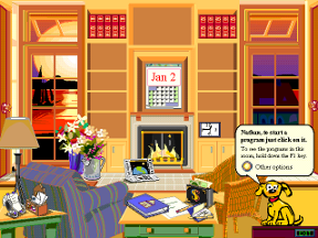
with colored icons it feels like Microsoft Bob.

2 Likes

Some basic 5-tone shading (black/dark gray/50% gray/ light gray/ white) would enable add much more clarity and information per icon without looking dumb

things like basic volume/“3d” illusion or some division.

Let’s pray someone more knowledgeable in UI/UX shares the sentiment and makes a good theme

1 Like

I pray they make it freely selectable. :slightly_smiling_face:

3 Likes

shaded mono icons are much better than plain flat ones. but i don’t think they are going to change all the work that was already put in, personally i think themed UI is not something u’ll do everyday or even care about that much, it’s the readability of the UI and comfort of working long hours is the most important ones.

2 Likes

As an UI designer I really don’t understand this decision to go for mono icons.
Many a people are visually oriented and spot color patterns very quickly.
This requires colored icons because the brain cannot identify mono patterns as quickly.
So mono icons make it actually harder to work with an UI, because your brain has to more work to find and identify the icons.

So I sincerely hope the designer(s) rethink this and at least give us the option to switch back to colored icons instead.

9 Likes

Flat colours allow for easier theming

Icons, like logos, need to be designed in a single colour. That doesnt mean that they can’t be coloured later, however. That is a point I don’t see anyone talking about. An icon, again, just like a logo, needs to be able to exist in a silhouette form and be recognizable as such. The reason being is that your graphic needs to be able to be readable on any substrate using any media. For example, when talking about a logo specifcally, you must consider things like vinyl cuts, stencils, stamps, wax seals, backlit signage, window decals, screen-printing, faxes, black and white prints, etc. Although in RGB colour space on screen you have fewer of these needs, this is still where you should start with icon design. With that said, there are restrictions, like theme backgrounds (what if your theme is 50% grey, or yellow, or whatever other combo), what about those who have colour blindness (which comes in various colour limitations on all ends of the spectrum, and are more common than most think), what about people who are seeing impaired (some use greyscale high contrast colour setups)? Etc. The list could go on.

A good designer starts with a single value and works with silhouettes before engaging in the complexities of colour and shading.

With all that said, I am not against some hits of colour, but I think peoples bigger issue is change in general. Not only have the icons changed in colour, but they have changed in placement, organization, shape/form, scale, etc. You just aren’t used to them yet - that will take a slight moment. I would look at other applications that are highly adopted, like photoshop, or any adobe software for that example - they have zero colour and are completely fine, because I have used the software long enough to acquaint myself with it.

1 Like

All of that is prohibitive because these are icons, not logos. ui elements. And they are tiny, in a situation where silhouette is the hardest thing to notice or read.

You can’t colour mono/flat icons to work with any theme. Find a colour that’s actually saturated, other than white or black, that works and has a readable silhouette on blender’s 2.7x theme gray. Or in a lighter theme. The only thing that lets icons work in any theme colour, is an outline

We, as human beings, identify shapes in 3D, too, espescially us artists that use a 3d package. One would expect us to be best at identifying 3d shapes, hence shading is one of the best ways to make an icon identifiable, way better than flat shapes.

Everybody needs to stop dismissing arguments because “oh its just change”.
There have been plenty of arguments presented that are devoid of personal prejudice in terms of change or what people ‘like’. Only looking at the pros and cons of designs for what the icons are for, i.e. how readable they are.

Photoshop has a) less icons and less stuff that has to be crammed into it’s ui in general, and b) an emboss which acts as an outline, and shading in its icons. Try again.
Also, highly adopted =/= automatically best ui, that mentality prevents any innovation or improvement.

4 Likes


Photoshop has more of fixed UI with certain tools , and even though they had to add these simple gifs for users which still hard to find the appropriate ones sometimes…blender UI is more dynamic and i might say complex, it needs more clarity in design, or you’ll be lost in sea of confusion.

4 Likes

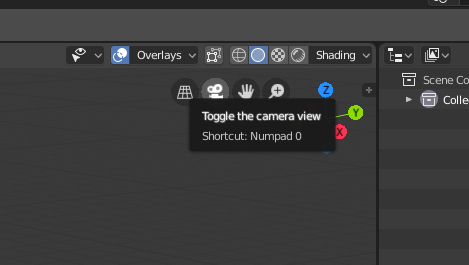
I’ll be the first to admit that I’m not the biggest fan of the monochrome look, but like everything else, I’m sure it’ll grow on me over time. I’m loving the new UI overall and starting to use 2.8 as my daily driver. However, something that would be nice is to simplify the icon descriptions when you roll your mouse over them. If I for instance hover over the View controls at the top of the 3D window, I get a clean, easy to glance at description like this:

51%20AM

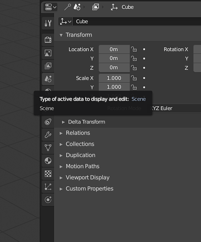
I can instantly see that button toggles the camera view and makes it quicker to learn and recognize. If I try the same with the new icons over in the properties pannel, I get this:

“Type of active data to display and edit” and then the real word I’m looking for “Scene”. These icons would be so much easier to get used to if it just said “Scene” or even “Scene Properties”.

Just my two cents

6 Likes

You can also put information with the color selection.
A traffic light that only shines brighter or darker is not so informative.